RSS

Monthly Archives: March 2012

Khan Academy and Interactive Content in Digital Education

Khan Academy and Interactive Content in Digital Education

Online education has received a lot of attention lately. Many factors have contributed to the rise in online educational content, including higher bandwidth, free video hosting (YouTube), mobile devices, growing and global audiences, improved customization mechanisms (scoring, similarity recommendations), gamification (earning badges, friendly competitions, etc.) and others. Interactivity is an important ingredient for any form of learning.

“I tell you and you forget. I show you and you remember. I involve you and you understand.” [Confucius, 500 BC]

During learning a student forms a mental model of the concepts. Understanding a concept means to have a model detailed enough to be able to answer questions, solve problems, predict a system’s behavior. The power of interactive graphics and models comes from the ability of the student to “ask questions” by modifying parameters and receive specific answers to help refine or correct the evolving mental model.

Digital solutions are bringing innovations to many of these areas. One of the most innovative approaches is the Khan Academy. What started as an experiment just a few years ago by way of recording short, narrated video lessons and sharing them via YouTube with family and friends has grown into a broad-based approach to revolutionize learning. Over the years, founder Sal Khan has developed a large collection of more than 3000 such videos. Backed by prominent endorsers such as Bill Gates the not-for-profit Khan Academy has developed a web-based infrastructure which can handle a large number of users and collect and display valuable statistics for students and teachers. The Khan Academy has received lots of media attention as well, with coverage on CBS 60 minutes, a TED talk and more. The videos have by now been seen more than 130 million times!

Another high profile experiment has been launched in the fall of 2011 at Stanford University, where three Computer Science courses have been made available online for free, including the Introductory Course to Artificial Intelligence by Sebastian Thrun and Peter Norvig. In a physical classroom a professor can teach several dozens to a few hundred students at most. In a virtual classroom these limits are obviously far higher. Exceeding all expectations, some 160.000 students in 190 countries had signed up for this first course!

The basic pillar of online learning continues to be the recorded video of a course unit. The student can watch the video whenever, wherever to learn at his own pace and schedule. One can pause, rewind, replay however often as needed to better understand the content. Of course, if that was the only way to interact, it would be fairly rudimentary. Unlike in a real classroom or with a personal tutor, one can’t ask the teacher in the video a question and receive an answer. One can’t try out variations of a model and see its impact.

Sample Khan Academy Profile Graph

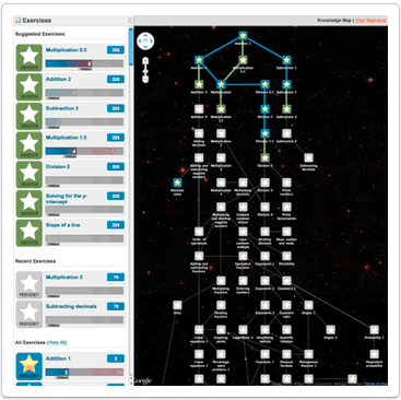
That’s where the tests come in. Testing a concept’s understanding usually involves a series of sample questions or problems which can only be solved repeatedly and reliably with such an understanding. Both Khan Academy and the Stanford AI course have test examples, exams and grading mechanisms to determine whether a student has likely understood a concept. In the Khan Academy, testable concepts revolve around mathematics, where an unlimited number of specific instances can be generated for test purposes. The answers to test questions are recorded and can be plotted.

Khan Academy Knowledge Map of testable concepts

The latter form of interactivity may be among the most useful. The system records how often you take tests, how long it takes you to answer, how often you get the answers right, etc. All this can then be plotted in some sort of dashboard. Both for yourself as individual student, or for an entire class if you are a coach. This shows at a glance where you or your students are struggling and how far along they have progressed.

Concepts are related to one another in a taxonomy so that one gets guidance as to which concepts to master first before building higher level concepts on top of the simpler ones. Statistical models can suggest the most plausible hints of what to try next based on prior observations.

Founder Sal Khan deserves a lot of respect for having almost single-handedly having recorded some 3000+ video lessons and changing the world of online education so much for the better with his not-for-profit organization. From an interactive content perspective, imagine if at the end of some Khan video lessons you could download an underlying model, play with the parameters and maybe even extend the model definition? I know this may not be feasible in all taught domains, but it seems as if there are many areas ripe for such additional interactivity. We’ll look at one in the next post.

 
1 Comment

Posted by on March 26, 2012 in Education


Tags: , , ,

Interactive Documents – Roambi Flow

Interactive Documents – Roambi Flow

One year ago I purchased my own iPad 2. When using it in meetings, it quickly became apparent how much potential there is to make presented information much more interactive. I posted last June about Interactive and Visual Information. In the meantime, more and more software is aiming at making documents more interactive, especially on the iPad to leverage mobility and touch.

In this post we will look at Roambi Flow, a product that lets you compose documents with interactive elements. Roambi is a set of business intelligence products by San Diego based company MeLLmo which has been designed from the ground up to take advantage of iOS features such as rich graphics and touch interface. On Roambi’s product website you will find detailed descriptions of each of these products.

Roambi Analytics Views

Roambi Analytics introduced a series of so called Views. Each of these views is interesting in its own and warrants a more in-depth coverage; I’ll just enumerate them briefly.

Blink gives you cube analytics displaying various measures in selected dimensions, swiping and scrolling through a data set.

Cardex is a visual metaphor for organizing sets of elementary reports and visually comparing them side-by-side like a mini comparison dashboard.

CataList lets you browse top-level lists and drill into a detailed view with sliders to see data points over time and display highlighted information.

Elements allows you to compose dashboards of connected, basic chart elements to explore multi-dimensional data.

Layers specializes on the display and navigation of hierarchically grouped data sets – such as continent, country, city – through the use of scroll, pinch and zoom gestures.

PieView is a variation of the Piechart theme. It’s main innovation is to allow the rotation of the entire piechart similar to the original Apple iPod click wheel. (It doesn’t eliminate the shortcomings of piecharts per se, but it makes them a little easier to live with and a lot more fun to explore.)

Squares is using the heat map concept in a very intuitive and easy to use way to display data organized along two main axes – such as the global sales performance of various products in various countries. Dragging along rows or columns highlights them one at a time, tapping on a row or column “explodes” its content to a matrix with more detail – in which one can again navigate, sort, etc.. Tap & Hold on the heat map generates a Fish-Eye view with more detail of the tapped element maximized. Moving while holding will move the fish-eye to areas of interest. (see image below)

SuperList is a generic view for lists with numeric information that allows to sort, filter, toggle between bars and numbers etc. Think of it as a starting point for tabular data display on the iPad.

Fish-Eye view in Squares, one of the Roambi Analytics views

Each view has a Help-style description with a short 1 min video overview in it. This goes to show that seeing these views in narrated action is much more intuitive and easier to understand than just reading about them. It’s literally leveraging some “show & tell”. The best way to explore these views is to download the free Roambi Viewer apps on the iPad and play with them. They come with stored sample data sets so you can visually explore the views even while you are offline. Roambi also features brief videos and tutorials on their website.

But back to Roambi Flow: You want your data to tell stories. This is best done through a combination of text explaining the context, perhaps some multimedia demonstrating the highlights and some interactive elements allowing the reader to visually explore on her own. This is where Roambi Flow comes in. It’s a publishing container that allows you to embed the above views (and other multi-media content) into regular text documents. The reader navigates the content at the top-level like a traditional book, either by clicking on the table of contents or by literally flipping through the pages. The app will even simulate the page turning like we are used to from Apple’s iBooks.

Page transition in Roambi Flow; Note the embedded, interactive element on the next page.

The individual elements can be double-tapped, which expands them to full-screen and then support their full visual exploration capabilities. The views can be linked to backend data sources to automatically stay in sync with up-to-date information. View displays can be bookmarked and shared with others. But the main point really is the fact that the reader does not only see a static image, but can interact and manipulate the views to obtain a richer understanding of the underlying data sets.

Roambi Flow page with two interactive view elements.

Given the rapid adoption of iPads in corporate environments it is straightforward to see such interactive documents spreading both within a company as well as in its external communications. Imagine reading the annual report, the sales pitch or the research paper when you can interact with the financials, the offered product or the proposed scientific model! With interactive content, reading will never be the same.

 
Leave a comment

Posted by on March 12, 2012 in Industrial


Tags: , , ,

 
%d bloggers like this: