
Note: A few months after writing this post, I realized that I made a mistake: I was Fooled by Randomness. The analysis below is still interesting and parts of it are still correct, but the main conclusion was wrong.
Tracking the Market
There is widespread consensus that investing money in the stock market, despite its ever-present risks of losses, over the long run beats many other forms of investments like bonds or treasuries. To mitigate the risk of one or a few individual stocks falling, the general advice is to diversify your portfolio and spread investment across many different companies and sectors. The quintessential diversification is to invest in index funds which track a large basket of securities such as the S&P 500 or the Dow Jones Industrial Average (30 stocks). Investing in index funds is a form of tracking the market.
Historical data shows annual returns in the order of 11.8% for the S&P 500 over the last 60 years. However, there are big swings as can be seen in the following chart (Source article on Investopedia):

Moreover, there seems to be a consensus that one of the best strategies is simply to “Buy & Hold”, i.e. not to attempt any forms of timing the market. It certainly is easy to implement and there are plenty of data sources to track historical performance. If you have a long-term time horizon (i.e. many years or even decades), it can be a very good approach to just set & forget. But from the historical data, can one derive strategies which systematically do better than Buy & Hold? Let’s first look at the conventional wisdom (which says you can’t time the market), then let’s look at the data (which suggests that you can).
Timing the Market
Nobody can predict the market, certainly not on a daily basis. Since the general trend is upwards, the main argument against timing is the risk of missing out on the best days (which can not be predicted and can happen at any time). For example, there was a recent article in VisualCapitalist with this line of reasoning, expressing visually how much one would fall short over time when missing the best 10, 20, or more days.

This strikes me as a form of cherry picking: “If you missed out on the best days, you would fall behind.” The inverse of this argument is also true: “If you missed out on the worst days, you would surge ahead.”
Let’s look at some data. Specifically, I downloaded the publicly available historical data of the Dow Jones Industrial Average (DJIA) with daily open close levels from 1980-2023. Then I did a similar analysis for the hypothetical returns of the DJIA relative to “missing out” on the best 10 vs. the worst 10 days:

One observation is that the extremes are clustered around just a few events. 14 (of 20) extremes happened in the days around just two events: The Oct-Nov 2008 recession (Lehman Brothers bankrupcty) and the onset of the Covid-19 pandemic (Mar-2020). These two periods mark very high volatility, where you have both some of the worst and some of the best days in quick succession.
We can now look at the cumulative returns of the both scenarios of missing the 10 best and worst days during that 44 year period 1980 – 2023 (ending 1-Nov-2023):

(This analysis ignores transaction cost of buying and selling, as well as tax impact based on holding period. It is not meant to be investment advice, just an analysis of the oft-cited consensus that “Buy & Hold is the best strategy” and “market timing is impossible”.)
While it’s true that Buy & Hold is better than the hypothetical “Best 10 days missed” approach (with a 2.1x higher return), it is also true that Buy & Hold is worse than the “Worst 10 days missed” approach (with a 0.42x return). In both cases, there is more than a factor of 2 difference to the Buy & Hold reference strategy! This is a stark demonstration of the Pareto principle that very few events disproportionately affect the outcome. Here the missing of the 10 best (worst) trading days in a period of more than 11,000 trading days (44 years) changes the outcome by more than a factor of two! In fact, just sitting out the single-worst day of 10/19/1987 (the infamous “Black Monday” crash of 1987, single day loss of 22.6%) would result in a 29.2% better return (1 / (1 – 0.226) = 1.292)! A single one in 11,000+ events accounts for a near 30% difference in outcome!
Of course, one cannot predict the best or worst days, so the above hypothetical analysis cannot be converted into an actionable strategy. The general trend is upwards, and there are more up than down days. As a result, you generally want to be in the market more than out of the market. Hence it is intuitive that Buy & Hold is a good strategy. And when there are continuously incoming funds, buying quickly is far better than waiting on the side lines – as this good market timing study by Schwab comparing five different strategies is showing in detail. But all this certainly does not imply that Buy & Hold is the best strategy over the long run.
Stock market performance by Month
There have been many analyses of how the stock market is doing, by day of week, by month, quarter, year, presidential election or incumbent party, interest rates etc. While nobody can predict the up or down movement on a daily basis, one gets the sense that there are cyclical factors influencing the markets. One of the obvious cycles is the time of year. It affects not only external factors like the weather and with it consumer behavior, but also the planning and budgeting cycles of most companies in some form or another. Not every year will be the same, of course, but certain patterns may emerge over the long run (decades).
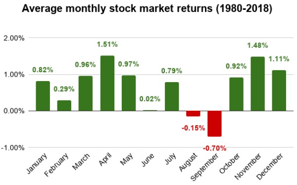
A good granularity into this is provided by looking at the stock market performance by month. One article on stockanalysis.com describes the average monthly stock return based on the S&P 500 from 1980- 2018:
Based on the DJIA data since 1980 I did a similar analysis for the monthly returns (1980-2023) as follows:
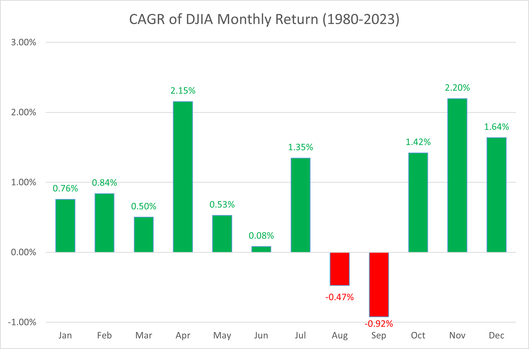
The details vary slightly, but the results are quite similar. A few things stand out:
- Most months yield positive average returns.
- April and November stand out as the two months with highest returns.
- August and September are the only ones with negative returns.
Note these are averages over ~40 years, and there are some counter-examples such as years with bad April or November returns as well as years with good August or September returns. (Note also that the Compound Aggregate Growth Rate CAGR is a bit different over long series than the arithmetic average, but this distinction is barely relevant for the modeling here.)
Just like one can’t predict the market day by day, one can’t predict what the return of the next month in any given year is going to be. But this raises the question as to whether one might be able to exploit seasonal changes for a higher long-term return. An analogy might be the weather: While you can’t guarantee that any given day in summer is warm and sunny, there is a higher probability of that than in the other seasons. If you were to bet on it with your annual vacation planning, over the long run you should have favorable results.
Investing with a Summer Break
While several articles clearly show the persistent differences in monthly returns, I was a bit surprised not to have seen that translated into some strategies to improve on Buy & Hold. There also seems to be some sloppy reasoning, for example from this article on monthly returns on MoneyChimp:
“From the results, it looks like some months really are significantly better than average. November through January is a particularly strong stretch; and September is the “danger” month, with an overall negative return. Surprisingly, October shows positive returns on average, although October 1987 and 2008 were pretty hard to forget.
Note that December has been better than January, which contradicts two popular myths: the December Selloff, and the January Effect.
But also notice that there are lots of exceptions to the pattern. There have been bad Januaries, and great Septembers. And of course the biggest trend of all is that the market goes up over time. So maybe the lesson here is the usual one, that long-term buy and hold is the winning strategy.”
The first sentence highlights a signal (some months are better than average, some are worse),
yet the last sentence all but ignores that signal (safe to stick with “the usual” lesson).
To me, the obvious strategy would be one of annual selling at the end of July, sitting out the market in August and September, then buying at the beginning of October and holding until next year. Let’s call this the “Summer Break” strategy. It would be actionable, easy to implement with only one buy/sell cycle per year and only calendar dates as deciding factors.
Based on the DJIA data I simulated the Summer Break strategy and plotted the returns of an initial $10,000 investment at the beginning of 1980 until 1-Nov-2023 for Summer Break (orange) and Buy & Hold (blue):
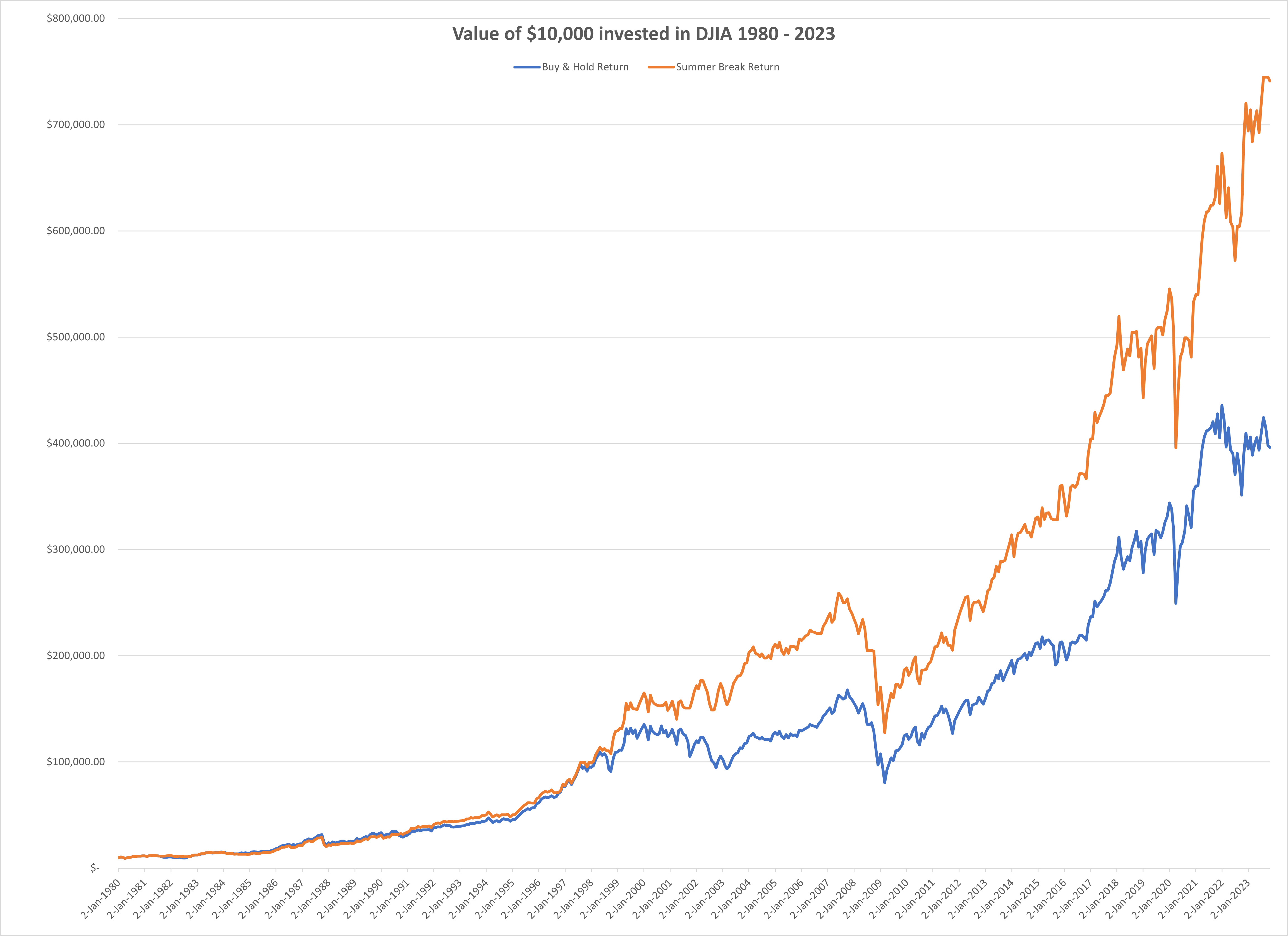
While the Buy & Hold strategy yields $396,288 the Summer Break strategy yields $741,185 which is 187% or nearly 2x of the reference (Buy & Hold).
Of course, there are some years where Buy & Hold performs better than Summer Break.
- In fact, the first 10 years Buy & Hold is slightly better (orange line often below blue line).
- Only in 1990 does Summer Break pull and stay ahead, with 1996 almost leveling both strategies.
- A select few years contribute the most to the difference, such as 2001 and 2002, when Summer Break leaps from 1.2x to 1.6x of Buy & Hold (see data callouts below).
The ratio and changes therein can be visualized as follows:

Criticism and Caveats
Critics might say it would take a long time to see the impact of this strategy. Past performance is not a guarantee of future results. And timing matters, i.e. if you miss the few years where there is a large difference you may not see the gains of this strategy for a long time. For example, if you started the Summer Break strategy right after the strong gains in 2001 and 2002, say on 1/1/2003, you would still be slightly behind the reference Buy & Hold strategy 19 years later. (Any 20-year or longer window, however, results in a higher return than Buy & Hold.)
These criticisims are all valid. However, they apply equally to the Buy & Hold strategy itself as well. For instance, historically, if you had bad timing on Buy & Hold, you could still have nominal losses after many years – for example it took 25 years to recover the previous high after the 1929 recession in 1954, or 18 years from 1964 to 1982. This is why above all investing in the stock market is considered to be more attractive the longer the time horizon, best measured in decades. (And why investing purely in stocks close to retirement may be too risky…)
There are of course constraints such as one not being able to achieve the exact sell price of the closing market, the overhead of trading cost, dividend payments or reinvestment, the tax impact of capital gains (especially when held for < 1 year), the inflation, etc. These factors are all ignored for this analysis. While they don’t change the fundamental conclusions here, they would certainly impact the specific returns achieved when applied in real markets.
Closing note: I thought this relatively straightforward analysis would be a good candidate for the new Advanced Data Analytics (ADA) plug-in of ChatGPT, which has received a lot of attention of late. So I started uploading the original .csv DJIA historical data file. ADA interpreted and described the data fine. However, when I aksed it to implement the Summer Break strategy (or variants thereof), it generated some Python code and produced charts, but they were incorrect. It frequently got thrown off by boundary conditions (like error due to not finding the last trading day before 1/1/1980 in the data). It did not properly aggregate the returns, and repeatedly set back to the original value at 100%. When I pointed this out, it said it would fix the code, but before long it just generated emtpy charts. I got the distinct impression of talking to an entity which understands some of the topic, but does not have a fully formed semantic model, and hence starts hallucinating some code together. I plan to dive deeper into this as a separate post, but found this a bit anti-climactic given all the hype out there.


")


")
")


")
")
