RSS

Category Archives: Medical

Weekly changes in the Coronavirus pandemic

Weekly changes in the Coronavirus pandemic

The global Coronavirus pandemic has caused a series of dramatic changes in markets, economy and policy over just a few weeks.

The known case counts have been tracked and published widely. It is a stunning demonstration of the power of exponential growth.

Mathematical tracking and modeling can help to predict and visualize the near-term and thus inform policy, similar to how meteorology relies on computer model forecasts of weather events.

I’m writing this on Sunday, Mar-15. Let’s look at the data of last few weeks and how the pandemic changed qualitatively. Underlying data comes from this GitHub repository of the Johns Hopkins CSSE.

8 weeks ago (Jan-19)

The Coronavirus outbreak originated in Wuhan, China about 8 weeks ago (mid January). The number of confirmed cases first exceeded 100 new cases on Jan-21. China imposed drastic lock down measures: On Jan-23 Wuhan city and on Jan-24, another 15 cities were shut down, putting 60+M people under lock down. Nevertheless, the number of confirmed cases continued to grow strongly for another 3-4 weeks, from under 1,000 to 70,000+ by Feb-16.

Here is the number of confirmed, active and recovered cases in China over the last 7 weeks.

Confirmed, Recovered and Active Cases in China over last 7 weeks

Active = confirmed – recovered – deaths. Although growing to about 3,000, the number of cases resulting in deaths does not change these graphs qualitatively.

It’s worth noting that the drastic lock-down measures were imposed at the beginning of the above timeline. This shows that even extremely drastic measures have a 3-4 week delay until they produce results in bending the case graph.

For the first 5 weeks (until Feb-23) there were hardly any confirmed cases outside of China.

Let’s look at the qualitative changes over the last 4 weeks.

4 weeks ago (Feb-16)

Two trends start to take shape:

  • The daily increase in new confirmed cases is shrinking dramatically
  • The number of recovered cases is growing exponentially (although at slower rate than the original confirmed cases)

As a result, the number of active cases begins to level off, peaks around 58,100 on Feb-17 and then starts to fall.

This is good news, as it demonstrates that the outbreak can be stopped and reversed. However, by this time it has begun spreading all over the world.

3 weeks ago (Feb-23)

China is still adding new cases, but at a slowing pace. On Feb-23 there are just over 77,000 confirmed cases, only a 10% increase from 1 week earlier. The recovered cases are growing faster than new cases, hence the active cases go down (first time under 50,000 on Feb-24).

Meanwhile, confirmed cases all over the world outside China are taking off, reaching nearly 2,000 by Feb-23. Italy has 155 confirmed cases and records the first 3 deaths.

Rest of world confirmed and active cases

2 weeks ago (Mar-1)

China has the outbreak under control:

  • The confirmed case count is just under 80,000. It will only grow another 1,000 for the next 2 weeks (81,003 as of today Mar-15).
  • There are more recovered cases (42,162) than active cases (34,898).

If China can keep up the lock-down measures, this is fast going in the right direction.

Outside of China the situation escalates quickly. By Mar-2, the confirmed case count for

  • World (without China) exceeds 10,000
  • Italy exceeds 2,000

The case counts in Italy show no signs of slowing down. The increase for the first time is greater than 300 new cases per day. In fact, today (2 weeks later) the increase has exploded 12-fold to 3,590 new cases in one day!

1 week ago (Mar-8)

For the first time, there are more active cases outside of than in China. Active cases on Mar-8:

  • World (without China): 24964
  • China: 20335

Moreover, China’s active case count continues to fall, while the world’s active cases grow exponentially.

Total confirmed cases in China and rest of world

There are very few countries (South Korea) which appear to be able to follow China’s path of controlling an epidemic in their country once it exceeds hundreds of cases.

South Korea’s increases are beginning to slow down, and Italy (7,375) surpasses South Korea (7,314) to rank highest in confirmed cases outside China.

Most other countries in the Top 10 confirmed cases at this point are seeing exponential growth with no sign of slowing down. What’s worse, they are only now beginning to implement lock-down measures. The WHO declares the coronavirus outbreak a global pandemic on Mar-11. That same day, Italy shuts down and closes all commercial activities, offices, cafes, shops. Only transportation, pharmacies, groceries will remain open. As we have seen, even if these measures were to be equally successful as in China, it would still take at least 2-3 weeks (i.e. end of March) before the active case load would flatten and peak out.

Today (Mar-15)

Today marks the first day with more confirmed cases outside (85,308) than in China (81,003). While 4 weeks ago China had 99% of all cases, it now has less than 50% of worldwide cases.

Just two days ago (Mar-13), Italy became the country with the most active cases (14,955), ahead of China in second place (13,569).

In this coming week, thanks to its continuing fall of active cases, China’s rank in active case count will drop behind several other countries like Iran, Spain, Germany, France, and the USA.

Active case in China and rest of world

What used to be a China problem is now a world problem. China has it under control. Most other countries are out of control.

Italy vs. USA

Confirmed Cases in Italy, USA and California

Source: Twitter, @sonyaharris_

This shows how similar the initial phase of exponential increase is, with different countries or states behind by a fixed number of days. (Here USA is 11 days behind Italy, CA is 7 days behind the entire US.) Without any drastic differences in interventions and with similar levels of testing, this table easily predicts the approximate number of confirmed cases. For example, the US will have 20,000+ confirmed cases by around Mar-25, with CA alone exceeding 20,000 cases by Apr-1.

Addendum

Summary of qualitative changes by timeline:

  • Jan-23: 600 confirmed cases, with 400 new on that day; Wuhan city shuts down
  • Feb-17: China active cases peak at 58,108 (3.5 weeks after shutdown).
  • Mar-1: China confirmed cases level off at 80,000. Over next 2 weeks, adds only ~1,000 more. More recovered cases (42,162) than active cases (34,898).
  • Mar-2: Rest of world > 10,000 and Italy > 2,000 confirmed cases.
  • Mar-8: More active cases (24,964) in rest of world than in China (20,335).
  • Mar-13: Italy has most active cases (14,955), ahead of China (13,569).
  • Mar-15: More confirmed cases (85,308) in rest of world than in China (81,003).
  • Last 4 weeks, China added ~10,500 confirmed cases.
    Rest of world added ~10,200 just yesterday!

Model Estimates (Source: Medium article with Wuhan timeline analysis):

  • Number of actual infections about 25x that of confirmed cases
  • 3-4 week delay between lock-down measures and peak of active cases
    (more with less aggressive lock-down)
  • Peak active cases about 100x (~60,000) the confirmed cases at lock-down (600)
  • Final confirmed cases level off at about 100-150x the number on day of lockdown
  • Early on, the number of actual infections is about 800x the number of reported deaths.
  • A single day of delaying drastic measures can increase confirmed cases by ~40%


(Optimistic) Predictions for the US as of 3/15:

  • Case counts: 3,806 confirmed, 3,664 active, 69 deaths, 73 recovered.
  • Estimated 55,200 (800x deaths) – 95,150 (25x confirmed) actual cases;
    we have between 50-100k actual cases and no severe lockdown measures in place yet!
  • Even if we locked down now (3/16) as severely as in Wuhan:
    • We would still expect another 3-4 weeks of active case growth with peak at ~360,000
    • We would expect a total of ~500,000 confirmed cases by ~ Apr-8
    • If we wait just one more day (3/17), make that ~700,000 cases (40% or 200,000 more)
      If we wait two more days (3/18), the total doubles to ~1,000,000 cases
  • Assuming 1% fatality, this puts us at 5,000-10,000 deaths.

I’m no medical expert, but all I’m reading recently points to the actual numbers trending far worse than the above optimistic scenario predictions. Even the CDC has floated predictions of final US deaths ranging from 500,000 – 1.7 million in the next 12-18 months. A million people in the US could die from this!! Not sure why anyone would still brush this aside as no big deal. Statements made reflecting such attitude will not age well.


Addendum 3/17

The case numbers in this pandemic change very rapidly, as do the respective rankings. Here are some more observations and predictions for the United States:

Observations:

  • Cases ~200,000 confirmed, 8,000 deaths, 83,000 recovered and 109,000 active

Ranks:

  • Confirmed cases: China, Italy, Iran, Spain, Germany; US (8th)
  • Active cases: Italy, Spain, Iran, Germany, China ; US (8th)
  • New cases: Italy, Germany, Spain, US (4th), Iran
  • Deaths: China, Italy, Iran, Spain, France, US (5th)
  • New Deaths: Italy, Spain, Iran, France, US (5th)

Relative Growth:

  • US used to be 11 days behind Italy’s total numbers, now (3/17) only 10 days behind, gap closing (see factors below)

Active cases for Italy and the US (actuals and exponential trendlines)


Predictions for the US:

Case counts:

  • Estimated Confirmed 28,000 by 3/22 ; 221,000 by 3/29 (from best-fit exponential trendline of last 14 days)


Ranks:

  • Tomorrow (3/18) the US will have more active cases than China!
    (China will be 7th behind France and the USA)
  • By next Sunday (3/22) US will be top ranked in new cases.
  • By end of March the US will be top ranked in active cases.


Contributing factors:

  • Population longer in denial, partly due to politicized atmosphere
  • Lock-down measures later in case growth and less drastic (each state individually)
  • US nearly the size of all EU, about 4x Germany or 5x Italy
  • US late in testing; today (3/17) not even all hospital cases get tests (delays actual numbers)
  • When tests become more widely available, numbers will grow at faster rate than model forecast
  • Italy ahead by 10 days, but last 4 days near linear growth (i.e. at inflection point) and
    recovered (and 1-6% death) cases will reduce active case count


This pandemic used to be a China story until early March. Now in mid March this is a European story. By end of March this will be a US story.

 
Leave a comment

Posted by on March 15, 2020 in Medical, Scientific


Data Visualizations in Healthcare

A couple of weeks ago I attended HIMSS 2017 in Orlando (Healthcare Information and Management Systems Society), the largest annual Healthcare IT event in the US. One of the big tenets of the show was system interoperability. There are lots of different vendors, few standards, and vast amounts of data being collected. There is an emerging set of APIs (such as HL7 FHIR) to ensure data can be shared among systems and follows a patient properly through the various providers she encounters during her episodes of care.

Somewhat serendipitously I came across a booth which had large prints of beautiful data visualizations on it. The booth was from Arcadia Healthcare Solutions. Given my background on data visualization and my being employed at Rennova Health Technology Solutions and responsible for our healthcare IT products and services, I was drawn to interpret these prints. They are also featured in an online data gallery, which I encourage you to explore.

One of these visualizations created by Jeff Solomon is called “The Health IT Space“. It displays highly aggregated data from various EHR (Electronic Health Record) systems. From the gallery:

The Electronic Health Record is a data gold mine. Each patient you see generates millions of detailed records in real time that can be extracted and analyzed for improved predictive algorithms, increased operational efficiency, better care quality, and so much more.

SmallAmbulatory

These graphs are stylized Entity Relationship diagrams from seven different EHRs. Nodes are data tables, and edges are relationships between these tables inferred from shared attributes.

MajorAmbulatory

The color-highlighted nodes are referring to patient data. The size of the node corresponds to the amount of records in the respective table.

LargeAmbulatory

Again, from the gallery description:

In each cluster, the core patient entity – the nucleus around which the rest of the data revolve – can be identified by its contrasting color. The tables containing the bulk of the clinically and operationally valuable data tend to form clusters of large, interconnected nodes, while a larger number of satellite tables house system configurations and other low-volume metadata that has very few relationships to the nucleus.

At the large end of entire health systems, the graph starts to look very busy:

LargeHealthSystem

It is pretty amazing how much data is being aggregated into these graphs. Nearly 5,000 database tables – hence the black areas where there are too many dots to separate them at this resolution. A combined number of 18 billion records! Nearly 300,000 relationships between these tables (again, the lines are too numerous to be distinguishable).

The Health IT Space
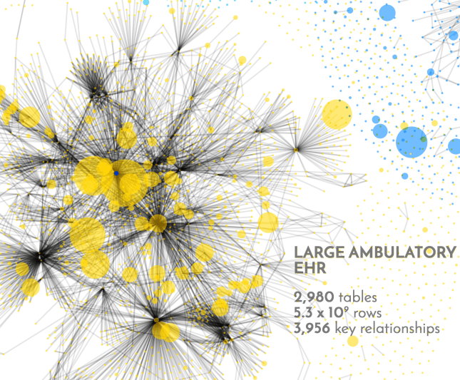
I find it somewhat humbling to review these graphs. Our own MedicalMime EHR falls into the small category by these standards. Major and Large EHRs are at least one, maybe two orders of magnitude larger and more complex.

Interpreting the large amount of data contained in the EHR opens up many ways to improve healthcare, both medically for the patient as well as operationally for the providers. Visualizations can help us to better understand patterns and trends which otherwise would remain hidden.

The entire big picture of the above visualization is indicated on the right. For a Hi-Res version please contact the friendly folks from Arcadia Health Solutions directly from their website.

Another big trend at HIMSS’17 was Artificial Intelligence. Machine learning and predictive analytics received a lot of attention. Solutions like IBM’s Watson Health promise to bring world-class expertise into ordinary physician practices through subscription to hosted specialty knowledge in the cloud – whether curated by scientists or machine-learned using statistical techniques from big data. Health Catalysts healthcare.ai is an open platform to make machine learning techniques more accessible and bring them to small SW houses, not just the large companies with large R&D budgets. While certainly overhyped at the moment, acceptance for obtaining a “second medical opinion from the cloud / app” to improve clinical decisions is rising.

 
Leave a comment

Posted by on May 20, 2017 in Medical


Apple’s Health App and HealthKit – Platforms for Next Gen Healthcare?

Business Analytics 3.0

mobile-applicationsGame on….I think we just witnessed a big next generation leap in Healthcare Data and Analytics.  Apple jumped into the health information business on June 2, 2014, launching both a new health app and a cloud-based health information platform with IOS 8.

The new App, called simply “Health”, will collect a number of body metrics including blood pressure, heart rate, and stats on diet and exercise.  Health will constantly monitor key health metrics (like blood sugar or blood pressure), and if any of them begin to move outside the healthy range, the app can send a notification to the user’s doctor.

The Health app will share all its information with a new cloud platform called “HealthKit.” The new health cloud platform is designed to act as a global repository for all the user’s health information. It will accept data collected by a variety of third-party devices and apps. For instance Nike is now working to…

View original post 526 more words

 
Leave a comment

Posted by on June 2, 2014 in Medical


Tags: ,

Visualizing Voting Preferences for World Values

The other day I listened to a presentation by Melinda Gates prepared for the United Nations to deliver an update about progress towards the Millennium Development Goals (MDG). The eight goals of the MDG had been embraced by the UN back in 2005 for the time target of 2015. So it is reasonable to see whether the world is on track to reach each of these eight goals. To summarize, from the MDG Wikipedia page:

  1. Eradicating extreme poverty and hunger
  2. Achieving universal primary education
  3. Promoting gender equality and empowering women
  4. Reducing child mortality rates
  5. Improving maternal health
  6. Combating HIV/AIDS, malaria, and other diseases
  7. Ensuring environmental sustainability
  8. Developing a global partnership for development

A good listing of reports, statistics and updates can be found on the UN website here.

Sample Vote for 6 of 16 MDG choices

Sample Vote for 6 of 16 MDG choices

At the end of Melinda’s presentation is a link to a UN global survey on the MDG goals after 2015. I took this survey and found the visualization of voting results quite interesting. First, one is asked to select six out of a list of sixteen (6 of 16) goals which one thinks have the highest impact for a future better world. (The survey methodology is described in more detail here.) Here is a sample vote:

A nice touch is that for each of the sixteen goals there is a different color and when you check that goal, one of the sixteen areas on the stylized globe is filled with that color. Personal data such as name is optional, but some demographic information is required, including age, gender, educational level and country. Next, one can look at a summary of all currently tallied votes and compare them interactively to ones own vote (checkmarks on the right).

WorldVoteOverview

It is perhaps not surprising that I voted very similar to others in similar demographic cohorts.

  • Country: I picked five of the Top five goals like all other voters living in the US. I included ‘Political freedoms’ in my top six, which in the US only ranks 11th.
  • Age: I shared five of the Top six goals with people in my age group (world-wide). The one I did not check was ranked 4th (Better job opportunities). When you mouse over one of the goals, the display changes to highlight this goal in all columns:
Interactive Vote Analysis with highlighted goal

Interactive Vote Analysis with highlighted goal

  • Gender: Here I picked four of the Top five goals (did not include the ‘Better job opportunities’).
  • Education: I voted very similar to people with very high HDI (Human Development Index, a visualization of which we covered in a previous post) with five of the Top six.

From the above, it seems somewhat surprising that voters in the US did not ascribe a higher value to ‘Better job opportunities’, given how much economic values and topics like unemployment seem to dominate the media. That said, these votes should be a reflection about which goals are most valuable for making the world a better place – not just your own home country. Worldwide it seems that other, more fundamental goals are judged by voters in the US to be more important than ‘Better Job opportunities’.

Another chart on the results page is showing a heat map of the world countries based on how many votes have been submitted. I thought it was interesting that Ghana had submitted about twice as many votes as all of the US, and Nigeria about 7x as many. The country with most voters at this time is India, but not far ahead of Nigeria.

CountryTotals

A fairly useless dynamic animation in this map is a map pin drop of four people who voted similarly to me. I found this too anecdotal to be of any real interest and downright annoying that I couldn’t turn it off. and just focus on the vote heat map. For example, the total number of votes should be displayed in the Legend. I vaguely remember that it was several hundred thousand from 194 countries prior to starting the survey, but couldn’t get that data to display again without clicking on the Vote Again:

MyWorldVotes

 
Leave a comment

Posted by on September 21, 2013 in Education, Medical, Scientific


Trends in Health Habits across the United States

Trends in Health Habits across the United States

This week Scientific American published an interesting article about trends in health habits across the United States. The article includes both a large composite chart as well as a page with an interactive chart. Both are well done and a great example of using a visualization to help telling a story. I personally find the most useful part of the graphic to be the comparison column on the right with shades of color indicating degree of improvement (blue) or deterioration (red).

US health habits 1995 vs. 2010 (Source: Scientific American)

From the article:

Americans are imbibing alcohol and overeating more yet are smoking less (black lines in center graphs).

Some of the behaviors have patterns; others do not. Obesity is heaviest in the Southeast (2010 maps). Smoking is concentrated there as well. Excess drinking is high in the Northeast.

Comparing 2010 and 1995 figures provides the greatest insight into trends (maps, far right). Heavy drinking has worsened in 47 states, and obesity has expanded in every state. Tobacco use has declined in all states except Oklahoma and West Virginia. The “good” habit, exercise, is up in many places—even in the Southeast, where it has lagged.

A more detailed visual analysis is possible using the interactive version of these graphs on the related subpage Bad Health Habits are on the rise. Here one can compare up to three arbitrary states against top, median, and bottom performing states by health habit.

The following examples show tobacco use, exercise and obesity by state with line charts for the three arbitrarily selected states of Florida, California and Hawaii.

Tobacco Trend By State

Exercise Trend By State

Obesity Trend By State

Leading the exercise statistics are citizens in states offering attractive outdoor sports opportunities, like Oregon or Hawaii. Such correlation seems intuitive in both causal directions: People interested in exercise tend to move to those states with the most attractive outdoor sports. And people living in those states may end up exercising more due to the opportunity.

When looking at the average trend line, exercise seems to have leveled off after a bump in the early 2000’s, whereas the decline in smoking over the last decade continues unabated.

15 years is half a generation. During that time, Americans have in almost every state smoked less, exercised more in many states, but obesity is sharply on the rise in every state! From a health and policy debate the latter seems to be the most alarming trend. Most people want the next generation to be better off than the previous one. This has to some extent been true with wealth, at least until the great recession of 2008. But these data show that at population levels, more wealth is not necessarily more health.

 
Leave a comment

Posted by on October 19, 2012 in Medical


Software continues to eat the world

Software continues to eat the world

One year ago Marc Andreessen, co-founder of Netscape and venture capital firm Andreessen-Horowitz, wrote an essay for the Wall Street Journal titled “Why Software Is Eating The World“. It is interesting to reflect back to this piece and some of the predictions made back at a time when Internet company LinkedIn had just gone public and Groupon was just filing for an IPO.

Andreessen’s observation was simply this: Software has become so powerful and computer infrastructure so cheap and ubiquitous that many industries are being disrupted by new business models enabled by that software. Examples listed were books (Amazon disrupting Borders), movie rental (NetFlix disrupting Blockbuster), music industry (Pandora, iTunes), animation movies (Pixar), photo-sharing services (disrupting Kodak), job recruiting (LinkedIn), telecommunication (Skype), video-gaming (Zynga) and others.

On the infrastructure side one can bolster this argument by pointing at the rapid development of new technologies such as cloud computing or big data analytics. Andreessen gave one example of the cost of running an Internet application in the cloud dropping by a factor of 100x in the last decade (from $150,000 / month in 2000 using LoudCloud to about $1500 / month in 2011 using Amazon Web Services). Microsoft now has infrastructure with Windows Azure where procuring an instance of a modern server at one (or even multiple) data center(s) takes only minutes and costs you less than $1 per CPU hour.

Likewise, the number of Internet users has grown from some 50 million around 2000 to more than 2 billion with broadband access in 2011. This is certainly one aspect fueling the enormous growth of social media companies like Facebook and Twitter. To be sure, not every high-flying startup goes on to be as successful after its IPO. Facebook trades at half the value of opening day after three months. Groupon trades at less than 20% of its IPO value some 9 months ago. But LinkedIn has sustained and even modestly grown its market capitalization. And Google and Apple both trade near or at their all-time high, with Apple today at $621b becoming the most valuable company of all time (non inflation-adjusted).

The growing dominance and ubiquitous reach of software shows in other areas as well. Take automobiles. Software is increasingly been used for comfort and safety in modern cars. In fact, self-driving cars – once the realm of science fiction such as flying hover cars – are now technically feasible and knocking on the door of broad industrial adoption. After driving 300.000 miles in test Google is now deploying its fleet of self-driving cars for the benefit of its employees. Engineers even take self-driving cars to the racetracks, such as up on Pikes Peak or the Thunderhill raceway. Performance is now at the level of very good drivers, with the benefit of not having the human flaws (drinking, falling asleep, texting, showing off, etc.) which cause so many accidents. Expert drivers still outperform the computer-driven cars. (That said, even human experts sometimes make mistakes with terrible consequences, such as this crash on Pikes Peak this year.) The situation is similar to how computers got so proficient at chess in the mid-nineties that finally even the world champion was defeated.

In this post I want to look at some other areas specifically impacting my own life, such as digital photography. I am not a professional photographer, but over the years my wife and I have owned dozens of cameras and have followed the evolution of digital photography and its software for many years. Of course, there is an ongoing development towards chips with higher resolution and lenses with better optic and faster controls. But the major innovation comes from better software. Things like High Dynamic Range (HDR) to compensate for stark contrast in lighting such as a portrait photo against a bright background. Or stitching multiple photos together to a panorama, with Microsoft’s PhotoSynth taking this to a new level by building 3D models from multiple shots of a scene.

One recent innovation comes in the form of the new Sony RX100 camera, which science writer David Pogue raved about in the New York Times as “the best pocket camera ever made”. My wife bought one a few weeks ago and we both have been learning all it can do ever since. Despite the many impressive features and specifications about lens, optics, chip, controls, etc. what I find most interesting is the software running on such a small device. The intelligent Automatic setting will decide most settings for your everyday use, while one can always direct priorities (aperture, shutter, program) or manually override most aspects. There are a great many menus and it is not trivial to get to use all capabilities of this camera, as it’s extremely feature-rich. Some examples of the more creative software come in modes such as ‘water color’ or ‘illustration’. The original image is processed right then and there to generate effects as if it was a painting or a drawing. Both original and processed photo are stored on the mini-SD card.

Flower close-up in ‘illustration’ mode

One interesting effect is to filter to just the main colors (Yellow, Red, Green, Blue). Many of these effects are shown on the display, with the aperture ring serving as a flexible multi-functional dial for more convenient handling with two hands. (Actually, the camera body is so small that it is a challenge to use all dials while holding the device; just like the BlackBerry keyboard made us write with two thumbs instead of ten fingers.) The point of such software features is not so much that they are radically new; you could do so with a good photo editing software for many years. The point is that with the ease and integration of having them at your fingertips you are much more likely to use them.

Example of suppressing all colors except yellow

The camera will allow registering of faces and detect those in images. You can set it up such that it will take a picture only when it detects a small/medium/large smile on the subject being photographed. One setting allows you to take self-portrait, with the timer starting to count down as soon as the camera detects one (or two) faces in the picture! It is an eerie experience when the camera starts to “understand” what is happening in the image!

There is an automatic panorama stitching mode where you just hold the button and swipe the camera left-right or up-down while the camera takes multiple shots. It automatically stitches them into one composite, so no more uploading of the individual photos and stitching on the computer required.

Beach panorama stitched on the camera using swipe-&-shoot

I have been experimenting with panorama photos since 2005 (see my collection or my Panoramas from the Panamerican Peaks adventure). It’s always been somewhat tedious and results were often mixed (lens distortions, lighting changes sun vs. cloud or objects moving during the individual frames, not holding the camera level, skipping a part of the horizon, etc.) despite crafty post-processing on the computer with image software. I have read about special 360 degree lenses to take high-end panoramas, but who wants to go to those lengths just for the occasional panorama photo? From my experience, nothing moves the needle as much as the ease and integration of taking panoramas right in the camera as the RX100 does.

Or take the field of healthcare. Big Data, Mobility and Cloud Computing make possible entirely new business models. Let’s just look at mobility. The smartphone is evolving into a universal healthcare device for measuring, tracking and visualizing medical information. Since many people have their smartphone with them at almost all times, one can start tracking and analyzing personal medical data over time. And for almost any medical measurement, “there is an app for that”. One interesting example is this optical heart-rate monitor app Cardiio for the iPhone. (Cardio + IO ?)

Screenshots of Cardiio iPhone app to optically track heart rate

It is amazing that this app can track your heart rate just by analyzing the changes of light reflected from your face with its built-in camera. Not even a plug-in required!

Another system comes from Withings, this one designed to turn the iPhone into a blood pressure monitor. A velcro sleeve with battery mount and cable plugs into the iPhone and an app controls the inflation of the sleeve, the measurement and some simple statistics.

Blood pressure monitor system from Withings for iPhone

Again, it’s fairly simple to just put the sleeve around one upper arm and push the button on the iPhone app. The results are systolic and diastolic blood pressure readings and heart rate.

Sample blood pressure and pulse measurement

Like many other monitoring apps this one also keeps track of the readings and does some simple form of visual plotting and averaging.

Plot of several blood pressure readings

There is also a separate app which will allow you to upload your data and create a more comprehensive record of your own health over time. Withings provides a few other medical devices such as scales to add body weight and body fat readings. The company tagline is “smart and connected things”.

One final example is an award-winning contribution from a student team from Australia called Stethocloud. This system is aimed at diagnosing pneumonia. It is comprised of an app for the iPhone, a simple stethoscope plug-in for the iPhone and on the back-end some server-based software analyzing the measurements in the Windows Azure cloud according to standards defined by the World Health Organization. The winning team (in Microsoft’s 2012 Imagine Cup) built a prototype in only 2 weeks and had only minimal upfront investments.

StethoCloud system for iPhone to diagnose pneumonia

This last example perhaps illustrates best the opportunities of new software technologies to bring unprecedented advances to healthcare – and to many other fields and industries. I think Marc Andreessen was spot on with his observation that software is eating the world. It certainly does in my world.

 
Leave a comment

Posted by on August 20, 2012 in Industrial, Medical, Socioeconomic


Tags: , , , , ,

Futuristic TouchScreen Visualization

Futuristic TouchScreen Visualization

Glass manufacturer Corning has published the second YouTube video in its series “A Day Made of Glass”. It provides a glimpse into the future of ubiquitous touchscreen glass displays, from the car dashboard to the kitchen refrigerator and wall-to-wall home display, the large school community table to the medical laboratory, even the glass wall in an outdoor theme park.

Corning Day Of Glass 2

Mashable writes in its story about the video that it “will blow your mind”. Hyperbole aside, it is worth watching (click on image above). The script goes through a typical day and shows various display applications; then it pauses the scenes and mentions the underlying technological challenges and whether the depicted displays are possible and feasible with today’s technology. From the video:

“Of course, this is not just a story about glass. It’s a story about a shift in the way we will communicate and use technology in the future. It’s a story about ubiquitous displays, open operating systems, shared applications, cloud media storage and unlimited bandwidth. We know there are many obstacles to be overcome before what we’ve just seen will become an attainable, reliable reality. But at Corning, we believe in this vision – and we are not waiting.”

Besides being a great corporate promotional piece, the 11 min video is a great example of how interactive, even immersive visualizations can change how we consume and interact with information and with one another.
Apple created a video back in 1987 titled “Knowledge Navigator” which seemed similarly futuristic at the time. Today, 25 years later, the iPad is in common use. Interactive touch screens have become the norm for smart phones since Apple launched the iPhone in 2007, just 5 years ago. Larger form factors exist, but are still expensive to build.

Regardless of how long it will take for touch screen displays to get bigger and become ubiquitous, the notion of interactive data visualization will only become more valuable.

 
Leave a comment

Posted by on February 5, 2012 in Industrial, Medical, Recreational, Scientific


Tags: , ,

Nonlinearity in Growth, Decay and Human Mortality

Nonlinearity in Growth, Decay and Human Mortality

Processes of Growth and Decay abound in natural and economic systems. Growth processes determine biological structure and pattern formation, selection of species or ideas, the outcome of economic competition and of savings in financial portfolios. In this post we will examine a few different types of quantitative growth / decay and their qualitatively different outcomes.

Growth

In the media we often hear about nonlinear, exponential, or explosive growth as popular references to seemingly unstoppable increases. Buzzwords like “tipping point” or “singularity” appear on book titles and web sites. Mathematical models can help analytical understanding of such dynamic processes, while visualization can support a more intuitive understanding.

Let’s look three different growth processes: Linear, exponential, and hyperbolic (rows below) by specifically considering three different quantities (columns below):
The absolute amount (as a function of time),
the absolute rate of increase (derivative of that function), and
the relative rate of increase (relative to the amount)

Amounts, Rates, and Relative Rates of three growth processes: Linear, Exponential, Hyperbolic

Linear growth (blue lines) is the result of a constant rate or increment per time interval. The relative rate (size of increment in relation to existing quantity) is decreasing to zero.

Exponential growth (red lines) is the result of a linearly growing rate or increment per time interval. The relative rate is a constant. Think accrual of savings with fixed interest rate. Urban legend has it that Albert Einstein once declared compound interest – an exponential growth process – to be “the most powerful force in the universe”. Our intuition is ill-suited to deal properly with exponential effects, and in many ways it seems hard to conceive of even faster growth processes. However, even with exponential growth it takes an infinite time to reach an infinitely large amount.

Hyperbolic growth (brown lines) is the result of a quadratically growing rate. In this type of growth even the relative rate is increasing. This can be caused by auto-catalytic effects, in other words, the larger the amount, the larger the growth of the rate. As a result, such growth leads to infinite values at a finite value of t – also called a discontinuity or singularity.

When multiple entities grow and compete for limited resources, their growth will determine the outcome as a distribution of the resource as follows:

  • Linear growth leads to coexistence of all competitors; their ratios determined by their linear growth rates.
  • Exponential growth leads to reversible selection of a winner (with the highest relative growth rate). Reversible since a competitor with a higher relative growth rate will win, regardless of when it enters the competition.
  • Hyperbolic growth leads to irreversible selection of a winner (first to dominate). Irreversible since the relative growth rate of the dominant competitor dwarfs that of any newcomer.

Such processes have been studied in detail in biology (population dynamics, genetics, etc.) It’s straightforward to imagine the combination of random fluctuations, exponential (or faster) growth and ‘Winner-take-all’ selection as the main driving processes of self-organized pattern formation in biology, such as in leopard spots or zebra stripes, all the way to the complex structure-formation process of morphogenesis and embryology.

Yet such processes tend to also occur in economics. For example, the competition for PC operating system platforms was won by Microsoft’s Windows due to the strong advantages of incumbents (applications, tools, developers, ecosystem, etc.) Similar effects can be seen with social networks, where competitors (like FaceBook) become disproportionately stronger as a result of the size of their network. I suspect that it also plays a central role in the evolution of inequality, which can be viewed as the dynamic formation of structure (viewed as the unequal allocation of wealth across a population).

Two popular technology concepts owe their existence to nonlinear growth processes:

  • Exponential Growth: The empirical Moore’s Law states that computer power doubles every 18 months or so (similar for storage capacity, transistors on chips and network bandwidth). This allows us to forecast fairly accurately when machines will have certain capacities which seem unimaginable only a few decades earlier. For example, computer power increases by a factor of 1000 in only 15 years, or a million-fold in 30 years or the span of just one human generation!
  • Hyperbolic Growth: Futurist Ray Kurzweil has observed that the doubling period of many aspects of our knowledge society is shrinking. From this observation of an “ever-accelerating rate of technological change” he concludes in his latest book that “The Singularity Is Near“, with profound technological and philosophical implications.

In many cases, empirical growth observations and measurements can be compared with mathematical models to either verify or falsify hypothesis about the underlying mechanisms controlling the growth processes. For example, world population growth has been tracked closely. To understand the strong increase of world population as a whole over the last hundred years or so one needs to look at the drivers (birth and mortality rates) and their key influencing factors (medical advances, agriculture). Many countries still have high birth rates, while medical advances and better farming methods have driven down the mortality rates. As a result, population has grown exponentially for many decades. (See also the wonderful 2min video visualization of this concept linked to from the previous post on “7 Billion“.) Short of increasing the mortality rate, it is evident that population stabilization (i.e. reduction of growth to zero) can only be achieved by reducing the birth rate. This in turn influences the policy debates, for example to empower women so they have less children (better education and economic prospects, access to contraception, etc.). Here is a graphic on world population growth rates:

Population growth rates in percent (source: Wikipedia, 2011 estimates)

Compare this to the World maps showing population age structure in the Global Trends 2025 post. There is a strong correlation between how old a population is and how high the birth rates are. (Note Africa standing out in both graphs.)

Decay

Conversely one can study processes of decay or decline, again with qualitatively different outcomes for given rates of decline such as linear or exponential. One interesting, mathematically inspired analysis related to decay processes comes from the ‘Gravity and Levity’ Blog in the post “Your body wasn’t built to last: a lesson from human mortality rates“. The article starts out with the observation that our likelihood of dying say in the next year doubles every 8 years. Since the mortality rate is increasing exponentially, the likelihood of survival is decreasing super-exponentially. The empirical data matches the rates forecast by the Gompertz Law of mortality almost perfectly.

Death and Survival Probability in the US (Source: Wolfram Alpha)

If the death rate were to grow exponentially – i.e. with a fixed increase per time interval – the resulting survival probability would follow an exponential distribution. If, however, the death rate is growing super-exponentially – i.e. with a doubling per fixed time interval – the survival probability follows a Gompertz distribution.

Lets look at a table similar to the above, this time contrasting three decay processes (rows below): Linear, Exponential, Super-Exponential. (Again we consider the amount, absolute rate and relative rate (columns below) as follows (constants chosen to match initial condition F[0] = 1):

Amounts, Rates, and Relative Rates of three decay processes: Linear, Exponential, Super-Exponential

The linear decay (blue lines) is characterized by a constant rate and reaches zero at a time proportional to the initial amount, at which the relative rate has a discontinuity.

The exponential decay (red lines) is characterized by a constant relative rate and thus leads to a steady, but long-lasting decay (like radio-active decay).

The super-exponential decay (brown lines) leads to the amount following a Gompertz distribution (matching the shape of the US survival probability chart above). For a while the decay rate remains very small near zero. Then it ramps up quickly and leads to a steep decline in the amount, which in turn reduces the rate down as well. The relative rate keeps growing exponentially.

The above linked article goes on to analyze two hypotheses on dominant causes of human death: The single lightning bolt and the accumulated lightning bolt model. If the major causes of death were singular or cumulative accidents (like lightning bolts or murders), the resulting survival probability curves would have a much longer tail. In other words, we would see at least some percentage of human beings living to ages beyond 130 or even 150 years. Since such cases are practically never observed, the underlying process must be different and the lightning bolt model is not able to explain human mortality.

Instead, a so called “cops and criminals” model is proposed based upon biochemical processes in the human body. “Cops” are cells who patrol the body and eliminate bad mutations (“criminals”) which when unchecked can lead to death. From the above post:

 The language of “cops and criminals” lends itself very easily to a discussion of the immune system fighting infection and random mutation.  Particularly heartening is the fact that rates of cancer incidence also follow the Gompertz law, doubling every 8 years or so.  Maybe something in the immune system is degrading over time, becoming worse at finding and destroying mutated and potentially dangerous cells.

Unfortunately, the full complexity of human biology does not lend itself readily to cartoons about cops and criminals.  There are a lot of difficult questions for anyone who tries to put together a serious theory of human aging.  Who are the criminals and who are the cops that kill them?  What is the “incubation time” for a criminal, and why does it give “him” enough strength to fight off the immune response?  Why is the police force dwindling over time?  For that matter, what kind of “clock” does your body have that measures time at all?

There have been attempts to describe DNA degradation (through the shortening of your telomeres or through methylation) as an increase in “criminals” that slowly overwhelm the body’s DNA-repair mechanisms, but nothing has come of it so far.  I can only hope that someday some brilliant biologist will be charmed by the simplistic physicist’s language of cops and criminals and provide us with real insight into why we age the way we do.

A web calculator for death and survival probability based on Gompertz Law can be found here.

 
Leave a comment

Posted by on January 12, 2012 in Medical, Scientific, Socioeconomic


Tags: , , ,

Visualizations to navigate Healthcare

Visualizations to navigate Healthcare

One of the more powerful visualization websites I have seen recently is called “Healthymagination” created by GE. It features about 2 dozen visualizations, most of them interactive, on healthcare related topics such as Cost of Getting Sick, Heart Disease Myths vs. Facts, U.S. Health Profiles by State and County, leading Causes of Death etc.

From the GE Visualization About page:

“At GE, we believe data visualization is a powerful way to simplify complexity.

We are committed to creating visualizations that advance the conversation about issues that shape our lives, and so we encourage visitors to download, post and share these visualizations.”

These are built using the Visualizing Player tool from the Visualizing.Org community, which we covered in a previous Blog post here.

One visualization I found particularly useful shows hospital quality. Imagine you just moved to a new area and want to find out which are good nearby hospitals. How would you find out? Ask friends? Ask your doctor? Try one and switch if you have a bad experience? In most cases, you would not base your decision on a lot of data, or at best a small set of anecdotal experience.

With the hospital quality visualization you have a much better tool to base your decision on facts. The interactive set of graphic visualizes performance of hospitals by 30 measures about the best kinds of treatments or practices for common conditions for which Americans enter hospitals and seek care. Here is an example:

Florida Hospital Performance Rating based on 30 measures, 2009 Data

This aggregates a lot of data. You can see how some hospitals outperform the average and show mostly green measures (such as the Centers in Atlantis and Aventura), while others have more average (yellow) or below average (red) cells (such as the Boca Raton Community Hospital). On this high-level you can already decide in favor of a specific hospital, if you can afford to go there. If you are going to a specific hospital, you can use its scorecard to look at specific areas. Let’s look at the Bethesda Memorial Hospital in Boynton Beach as an example:

Performance Scorecard of Bethesda Memorial Hospital in Boynton Beach

It has only one red measure, here on Heart Disease Discharge Instructions. From the legend on the right you can learn what this performance measure captures and that the national average is 86.6%. Hovering with the mouse over the red cell shows the score for this particular hospital, here 68.7%. As a patient you can use such data to obtain additional information if you or one of your loved ones has been treated for heart disease at this hospital.

You can also look at the national average scores of hospitals across the United States for each of the 30 measures:

National Average Scores for U.S. hospitals

From this chart you can see that for example regarding Children’s Asthma, the in-patient measures are near 100% and very good, whereas the home management plans (what to do after going home) are only at 60%. Whether this indicates a general pattern – hospitals perform lower on discharge instructions than on in-patient care – would need to be validated across more than just two arbitrary selected examples. But in any event, this is a classic example of how the Internet and especially interactive visualizations based on recent and public data empowers the consumer in all areas, especially in Healthcare.

 
2 Comments

Posted by on October 27, 2011 in Medical


Tags: , , ,

 
%d bloggers like this: