RSS

Category Archives: Linguistic

Keystroke Biometrics using Mathematica

Keystroke Biometrics using Mathematica

A few weeks ago Paul-Jean Letourneau posted an article on Wolfram’s Blog about using Mathematica to collect and analyze keystroke metrics as a way to identify individuals. The article analyzes how you type, measuring the time intervals between your typing the individual characters using a little interactive widget, collecting and visualizing the data while you repeatedly type in the word “wolfram”.

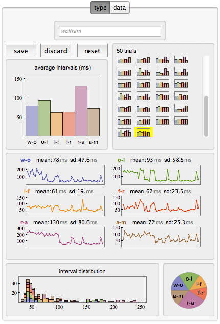
Keystroke metrics of 50 trials typing the word “wolfram”


It is somewhat interesting at this point to analyze one’s one typing style. For example there appears to be a bi-modal distribution of the time intervals between keystrokes, with the sequence “r-a” taking me almost twice as long (~130ms) as most other sequences (~60-70ms). There is also a ‘learning’ effect visible in my 50 trials, where the speed improves noticeably after about 20 repetitions or so. However, there are occasional relapses into a much slower typing pattern throughout the rest of the trials.

However, what I thought was more interesting is the subsequent analysis the author did across a set of 42 such series he obtained from his colleagues (noting humorously that “it just so happens that Wolfram is a company full of data nerds”). He then proceeds to analyze and visualize that data in various ways.

Distribution Histogram of keystroke intervals

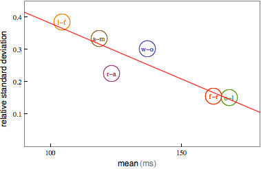
He observes the bimodal nature of the distribution with peaks around 75ms and 150ms for different pairs of characters. In fact, averaging over all those pair typing times, a correlation is found indicating that when people type slower they are more consistent.

(Negative) Correlation of pairwise typing speed and consistency

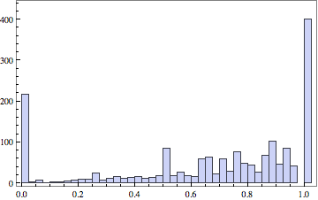
The analysis continues with the observation that each measurement can be seen as a point in a six-dimensional space (six pair-transitions in a word with seven characters). When a person types this same word 50 times you get a cluster of 50 points in six-dimensional space. Different individuals will produce different clusters. So one can use the (built-in) function FindClusters to determine such clusters. However, since people have a certain amount of inconsistency in their typing, it is possible that sometimes one person’s typing will show up in another person’s cluster and vice versa. To measure the quality of the clusters to distinguish individuals, one can implement various measures. The author implements the Rand-index, a measure of the similarity between two data-clusterings. This gives a numeric accuracy on a scale from 0 to 1 for the ability to distinguish between a pair of two people. When looking across all pairs of 42 people – there are 21*41=861 different pairs, but the author chose to look at all 42*42=1764 pairs, as the FindCluster results depend on the sequence input data, so Rand[i,j] may be different from Rand[j,i] – you get the following histogram of Rand quality scores:

Histogram of Rand quality score for all pairs

This clearly shows that keystroke metrics for one word are not sufficient to reliably distinguish between arbitrary pairs of people. The average quality score is only 0.67. On the other hand, about 400 (~23%) of those quality scores are a perfect 1.0, so for about a quarter of the pairs it alone would suffice to reliably distinguish the two people typing. About half as many scores are 0.0, meaning that the clusters overlap so much that no distinction is possible. The remaining scores are distributed mostly between 0.5 and 1.0, meaning you would just guess right more often than wrong.

The author wraps up the post with this paragraph:

Using this fun little typing interface, I feel like I actually learned something about the way my colleagues and I type. The time to type two letters with the same finger on the same hand takes twice as long as with different fingers. The faster you type, the more your typing speed will fluctuate. The more your typing speed fluctuates, the harder it will be to distinguish you from another person based on your typing style. Of course we’ve really just scratched the surface of what’s possible and what would actually be necessary in order to build a keystroke-based authentication system. But we’ve uncovered some trends in typing behavior that would help in building such a system.

An interactive CDF widget embedded in the article allows you to collect and visualize the timing of your own typing. Source code as well as the test data is also shared if you want to further explore the details of this interesting analysis.
 
1 Comment

Posted by on July 20, 2012 in Linguistic, Scientific


Tags: , , , , , ,

Venn Diagrams

Venn Diagrams

The private library Blog had a post with some word play relating to sound, spelling and meaning of words in the English language. From their post on Homographic Homophones:

English is one of the most difficult languages in the world for a non-native speaker to learn.  One of the reasons why this is so is that English has a large number of words that are pronounced the same as other words (i.e., they are homophones) even though they have quite different meanings.  Homophones such as parepair and pear, for example, have the same pronunciation but are spelled differently and have different meanings (heterographic homophones).  Other homophones — tender (locomotive),tender (feeling) and tender (resignation), for instance — are spelled the same and pronounced the same (homographic homophones) but have different meanings (i.e., they are homonyms).

Got all that?  Wikipedia has a nice Venn diagram that may help you sort it out:

Venn Diagram displaying meaning, spelling, and pronunciation of words (Source: Wikipedia)

Of course, you could also list the above combinations in a table. If you’re interested, Carol Moore has done just that on her Buzzy Bee riddle page.

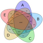
A beautifully symmetric 5 set Venn diagram drawn from ellipses has been proposed by Branko Grünbaum and drawn by Wikipedia contributor Cmglee:

Symmetrical_5-set_Venn_diagram (Source: Wikipedia)

Such set-based diagrams invite a more mathematical notation. Cmglee annotates his image with this snippet:

Labels have been simplified for greater readability; for example, A denotes A ∩ Bc ∩ Cc ∩ Dc ∩ Ec (or A ∩ ~B ∩ ~C ∩ ~D ∩ ~E), while BCE denotes Ac ∩ B ∩ C ∩ Dc ∩ E (or ~A ∩ B ∩ C ∩ ~D ∩ E).

If you search the Wolfram Demonstration Project for ‘Venn Diagram’, you get several interactive diagrams.

Venn Diagram Demonstration Projects (Source: Wolfram Demonstration Project)

These diagrams are interactive. For example, they allow you to click on any subset and then have that set highlighted and the corresponding mathematical set notation displayed accordingly. Interesting and fun to learn.

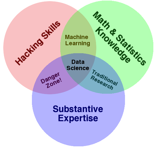
Speaking of fun: Venn diagrams are also effectively used in many different areas, two of which I’d like to leave you with here:

Data Science Venn Diagram (Source: drewconway.com)

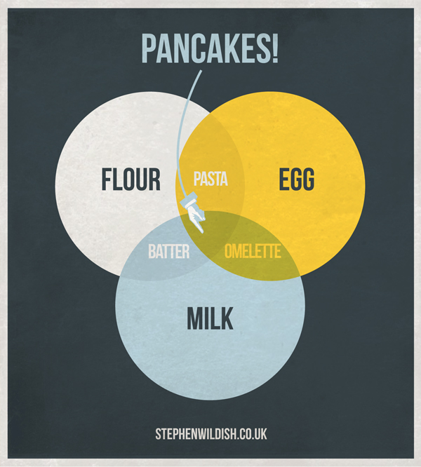
And last but not least, Stephen Wildish’s Pancake Venn Diagram:

 
Leave a comment

Posted by on June 10, 2012 in Linguistic, Scientific


Tags: , , ,

Visualizing Word Frequencies with Wordle

Jonathan Feinberg created a nice little app to generate and edit word clouds called “Wordle”. From the Wordle website:

Wordle is a toy for generating “word clouds” from text that you provide. The clouds give greater prominence to words that appear more frequently in the source text. You can tweak your clouds with different fonts, layouts, and color schemes. The images you create with Wordle are yours to use however you like. You can print them out, or save them to the Wordle gallery to share with your friends.

Here is a sample of a word cloud of a previous Visualign Blog post (Interactive and Visual Information):

Wordle generated word cloud of a previous Visualign post.

By default, common words of the English language (“the”, “is”, “and”, etc.) are stripped out to allow focus on substantive content words. One can also exclude individual words – such as the dominant word “information” above – and tweak many options. If one could create similar word clouds from recorded speech, this might be applied to visualize certain speech patterns and perhaps cure bad habits (such as repeating “Ummm” or other fill words).

Here is another sample screen shot of the Java applet after creating the word cloud from James Taylor’s RSS feed on Enterprise Decision Management:

Wordle Java applet with word cloud. Note the prominence of PMML (Predictive Model Markup Language).

While it’s not clear how to measure the impact or value of such word cloud visualizations, it does provide a novel way to use colors, frequencies, font sizes etc. to filter, highlight, and elucidate structure in textual data – something very close to Visualign’s philosophy.

 
Leave a comment

Posted by on June 28, 2011 in Linguistic


Tags: , ,

 
%d bloggers like this: