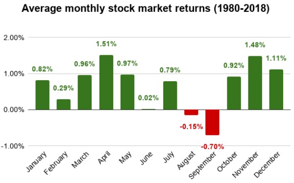
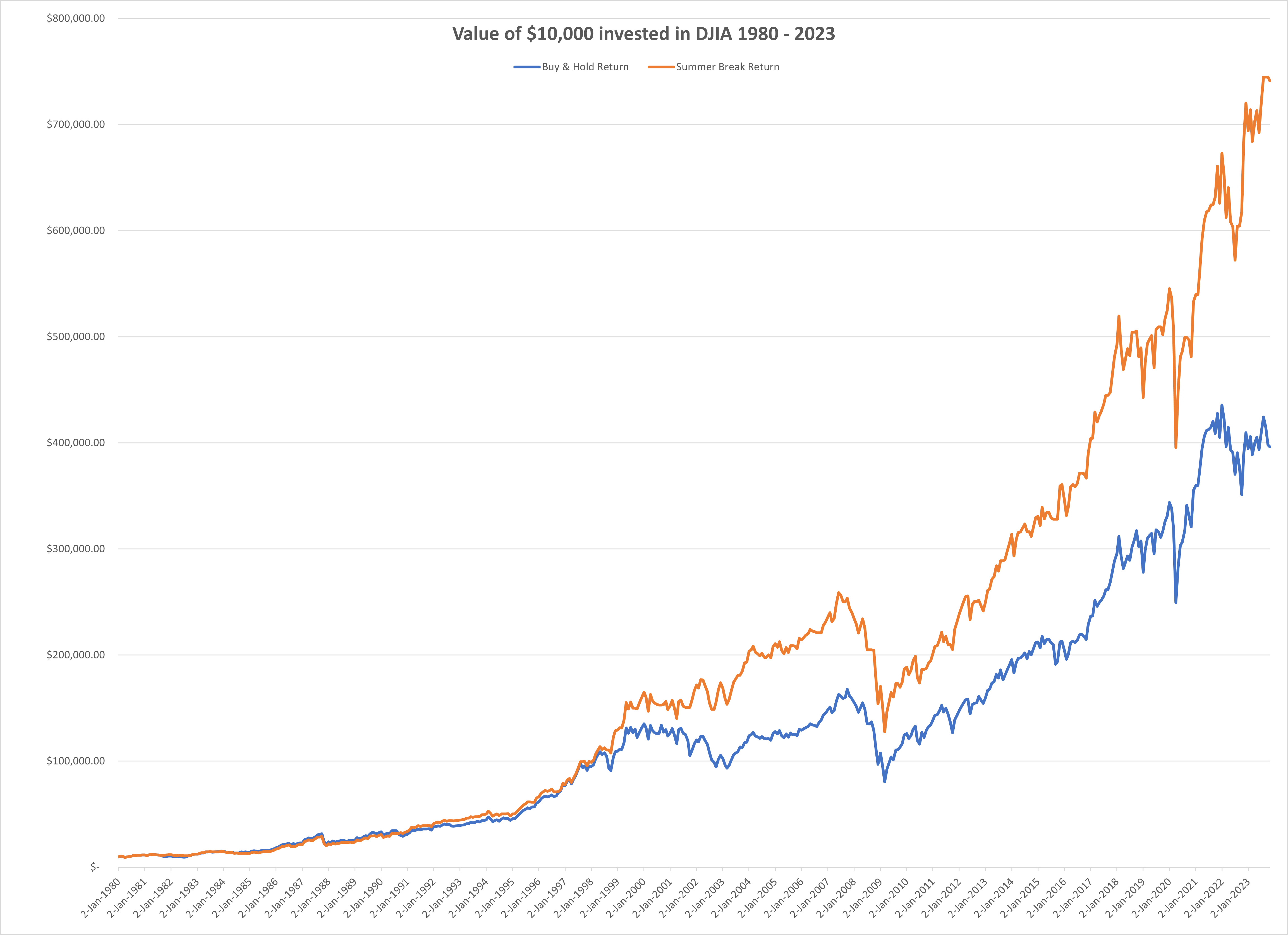
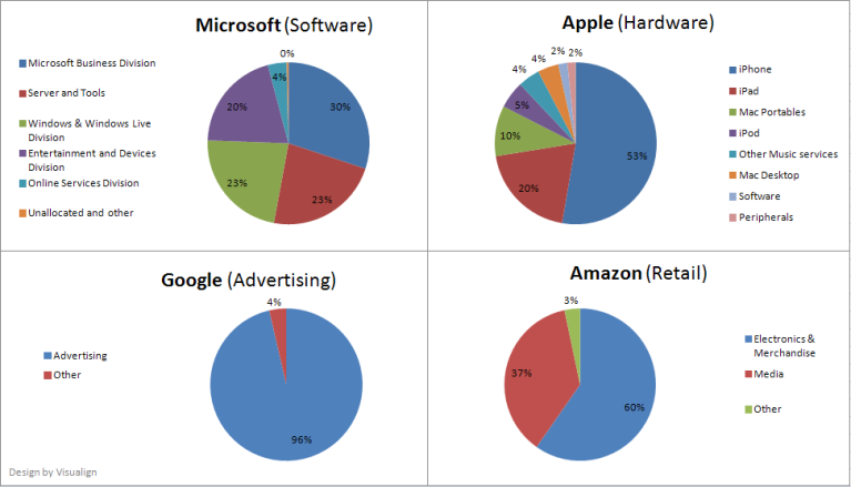
A few months ago I wrote about Stock Market Timing. It was an analysis of the stock market returns over the last 40+ years which yielded an observation about certain months having better returns than others, and a small number of months (two) actually showing negative average returns. The gist of the analysis was that if someone traded in a way to be out of the market those two negative months and in the market the rest of the year, they would have outperformed the market (i.e. the buy & hold approach).
The conjecture was that there might be underlying seasonal factors causing this difference in performance. If true, then a trading strategy should be able to exploit this pattern and come out ahead. One would not have to understand the causal nature of there factors in order to exploit them. But success would depend on the existence of such factors and their causal relationship holding for the future as well.
In the time since I have read two books on randomness:
- The Drunkard’s Walk How Randomness Rules our Lives by Leonard Mlodinov
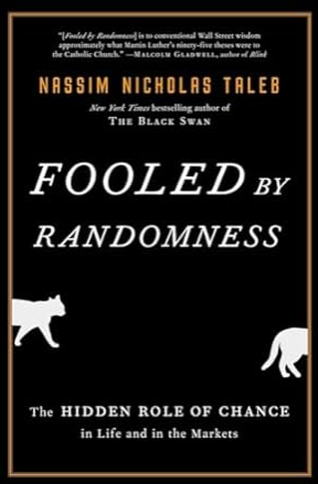
- Fooled by Randomness The Hidden Role of Chance in Life and in the Markets by Nassim Taleb

We are wired to seek patterns and meaning in the chaos of the world, even when they may not exist. [Nassim Taleb]
Listening to these audiobooks made me think again about the validity of the conclusions in the above post. While the postulated “summer break” trading approach clearly would have been successful for the last 40 years based on the observed data, the question stands whether it would continue to be successful in the future? This depends essentially on the question whether there are underlying factors with seasonal variation causing the pattern or whether the observed pattern is purely the result of randomness. Only in the former case (causal link) will this trading approach be likely to be successful.
I was also reminded of the insight that we often fall prey to confirmation bias: We seek out information confirming while failling to seek out evidence contradicting our thesis or beliefs. Somehow it feels nicer to confirm ones beliefs than to find reasons they are flawed. But after learning more about randomness, I started to have doubts about my earlier conclusion. I asked myself: What evidence would it take to falsify the conclusion of the superiority of the “summer break” trading strategy?
An easy way to find out what could happen is to use computer simulation. I thought if I ran a number of simulated stock market returns, what would their monthly returns look like? If typical random timeseries would show similar variations in monthly returns, that would make the observed market returns look more like random noise than a signal of underlying factors.
Enter stock market simulations. Many articles have likened stock market charts to random walks, typically using Markov Chains to simulate the timeseries of prices with random price swings up and down. For practical reasons, I chose to build on the model provided by Jason Cawley in a Wolfram demonstration project. From that site:
A decent first approximation of real market price activity is a lognormal random walk. But with a fixed volatility parameter, such models miss several stylized facts about real financial markets. Allowing the volatility to change through time according to a simple Markov chain provides a much closer approximation to real markets. Here the Markov chain has just two possible states: normal or elevated volatility. Either state tends to persist, with a small chance of transitioning to the opposite state at each time-step.
The model used above includes a handful of parameters such as an overall drift or the probability, strength and duration of a volatility period (called spike). Each scenario would have 20 runs over 250 steps (approximate number of trading days in a calendar year) and then visualize the trajectories of initial prices set to 100 for the 10, 30, 50, 70 and 90 percentile (when sorted by final valuation of the simulated stock). A typical image of such a scenario looks like this:
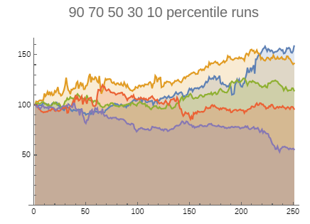
Changing the parameters will change the ampltiude of these charts, but their general shape remains similar. The demonstration site referenced above is interactive, i.e. you can change the parameter values and see in realtime how the curves adjust. This gives a much better feel for the type of shapes the model produces. They certainly look similar to real stock price charts. For example, when seeing a sample set of 10 timeseries, 5 of which model-generated and 5 real stock charts, it would be very difficult to tell them apart reliably.
To approximate the observed stock market timeseries over the last 40+ years, I made a few assumptions:
- Assume each month has 21 trading days, hence a year has 12 * 21 = 252 trading days.
- Set timeseries to 40 years * 252 trading days = 10,080 datapoints.
With the default modeling parameters picked by Jason Cawley, I ran dozens of simulations at 10,080 datapoints each. I then aggregated the monthly returns over those 40 simulated years to see what kind of variation would be observed per month. Here are some typical results:


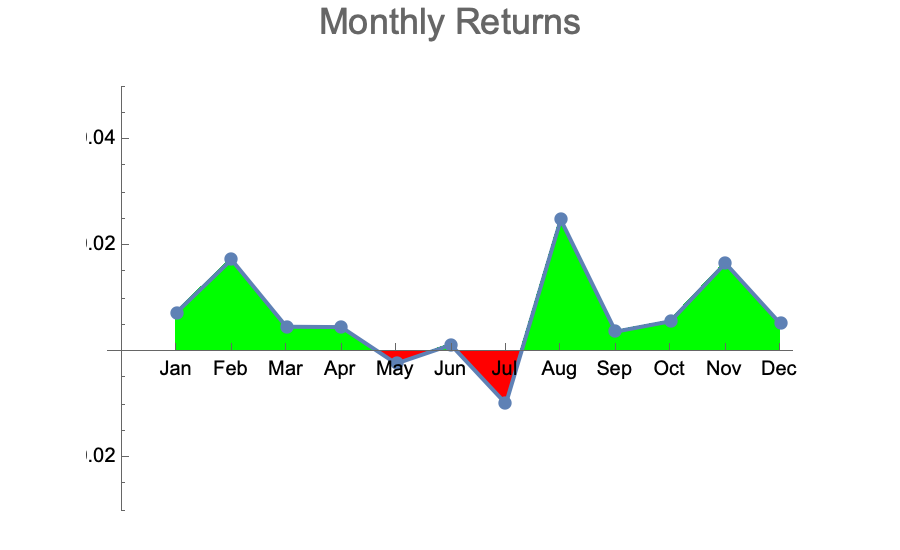
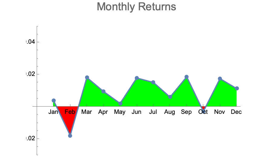
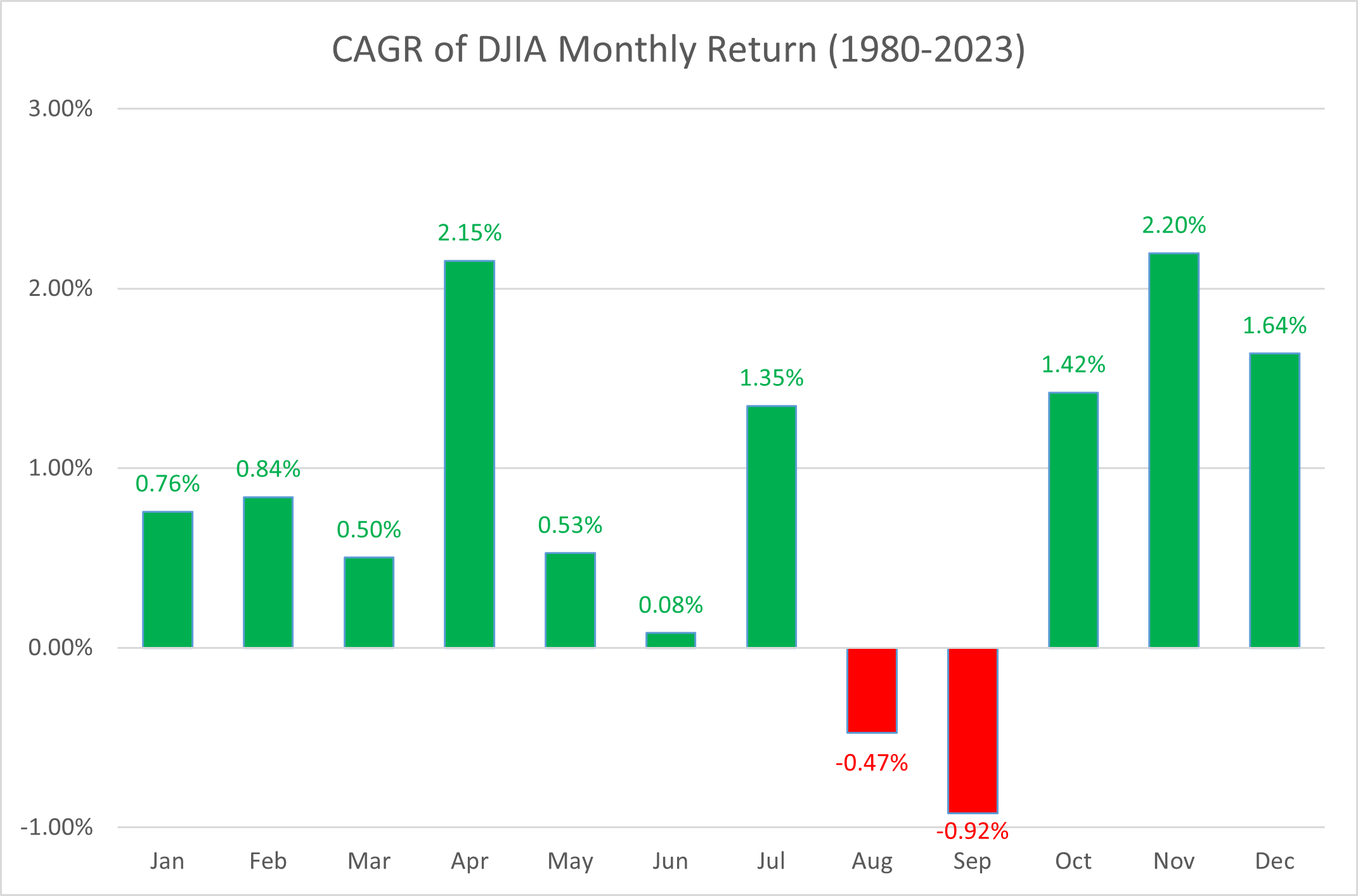
These are qualitatively very similar to the actually observed monthly returns of the DJI over the last 40 years:
- The majority of months are up with average returns between 0 and +2%
- A few months in the year are down with average returns between 0 and -2%
- The negative months are randomly distributed across the year
When we know that the data generator uses randomness, we are not surprised to see such variation and we don’t try to find underlying reasons which caused a particular generated pattern. With the actually observed stock market returns it’s an easy mistake to make.
Our desire for explanations often leads us to invent narratives that fit our preconceived notions, rather than accepting the randomness of events. [Nassim Taleb]
Varying the model parameters doesn’t change the outcome qualitatively. If the base trend is increased, as expected there are fewer or often no more months with negative average returns. If volatility is increased, the amplitude of average returns increases in both directions. There are further explorations one could make: Aggregating multiple individual runs into an aggregate index more closely ressembling the DJI (set of 30) or S&P 500 (set of 500). Yet the simulation experiment gave me the evidence that falsifies my earlier conclusion. At this point, I am ready to retract the conclusion postulated in the earlier post: The observed pattern is more likely just a random artefact and there is no underlying reason causing the fluctuations in average monthly returns. As such, the “summer break” trading strategy is no more likely to be successful in the future than any number of other strategies motivated by and retrofitted to randomly generated patterns.
The seduction of stories blinds us to the reality of randomness. [Nassim Taleb]
Occam’s razor, or the principle of parsimony, tells us that the simplest, most elegant explanation is usually the one closest to the truth. Randomness is simpler than underlying causal factors.
Hitchen’s razor states what can be asserted without evidence can also be dismissed without evidence. When it comes to data analytics, simulations based on randomness can provide valuable comparisons: If the observed data does not systematically and reliably differ from random noise, there is likely no signal! The Monte Carlo method should be a good friend of any data analyst!
I admit that I was wrong. I was fooled by randomness. This episode taught me to work against my own confirmation bias, as well as to use simulations based on randomness to see if it can provide counterfactual evidence and help distinguish between signal and noise.


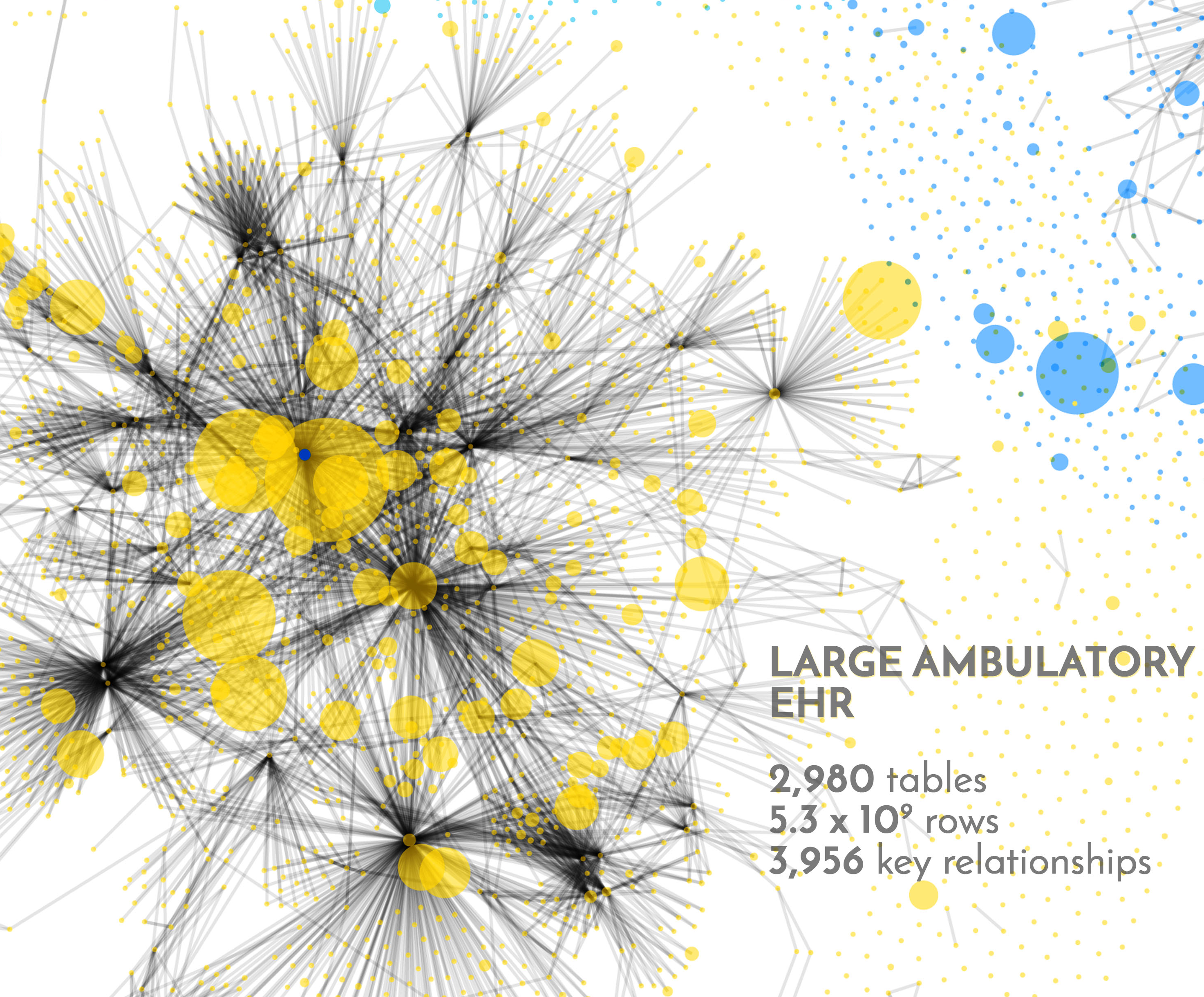

 I find it somewhat humbling to review these graphs. Our own MedicalMime EHR falls into the small category by these standards. Major and Large EHRs are at least one, maybe two orders of magnitude larger and more complex.