RSS

Tag Archives: inequality

World Inequality and the Elephant Curve

In December 2017 the World Inequality Lab (WIL) published its first World Inequality Report 2018. The lab consists of a five-member board and 20+ researchers, mostly from the Paris School of Economics (Thomas Piketty et al.) and the University of California at Berkeley (Emmanuel Saez et al.). Compared to previous work on economic inequality it is fair to say that research has significantly advanced over the last 5 years along several directions:

  • The free report itself is available both online as well as in various download formats and eight languages. It aims to become a data-driven foundation for societal and policy discussions about inequality.
  • All underlying data are openly published (via the World Wealth & Income Database WID) to support reproducibility and stimulate further research.
  • The methodology to aggregate data is encompassing more sources, more attributes (including age, gender, etc.) and better informed estimates, across a wider spectrum of countries and geographies (all important for policy discussions).
  • The visualizations have evolved beyond limited measures such as the Gini-Index and now typically include interactive charts (such as the for example at http://wid.world/country/usa/)

This report is quite detailed and holistic. Aside from the Executive Summary, Introduction, Conclusion and Appendices, it consists of the following five parts:

  1. AIM OF THE WORLD INEQUALITY REPORT 2018
  2. NEW FINDINGS ON GLOBAL INCOME INEQUALITY
  3. EVOLUTION OF PRIVATE AND PUBLIC CAPITAL OWNERSHIP
  4. NEW FINDINGS ON GLOBAL WEALTH INEQUALITY
  5. FUTURE OF GLOBAL INEQUALITY AND HOW IT SHOULD BE TACKLED

There are many interesting findings. Let me just provide three examples in this Blog, together with respective visualizations telling the “story in the data”.

Example 1: Inequality rising everywhere, but at different speeds

Here is a Figure E2a showing the Top 10% income shares across several large geographies over the period 1980-2016:

figure-e2a

From the report’s Executive Summary:

  • Since 1980, income inequality has increased rapidly in North America, China, India, and Russia. Inequality has grown moderately in Europe (Figure E2a). From a broad historical perspective, this increase in inequality marks the end of a postwar egalitarian regime which took different forms in these regions.

and further

  • The diversity of trends observed across countries since 1980 shows that income inequality dynamics are shaped by a variety of national, institutional and political contexts.

  • This is illustrated by the different trajectories followed by the former communist or highly regulated countries, China, India, and Russia (Figure E2a and b). The rise in inequality was particularly abrupt in Russia, moderate in China, and relatively gradual in India, reflecting different types of deregulation and opening-up policies pursued over the past decades in these countries.

  • The divergence in inequality levels has been particularly extreme between Western Europe and the United States, which had similar levels of inequality in 1980 but today are in radically different situations. While the top 1% income share was close to 10% in both regions in 1980, it rose only slightly to 12% in 2016 in Western Europe while it shot up to 20% in the United States. Meanwhile, in the United States, the bottom 50% income share decreased from more than 20% in 1980 to 13% in 2016 (Figure E3).

The latter is apparent from the supporting visualization in Figure E3, contrasting the Top 1% and Bottom 50% national income shares in the US with that of Western Europe:

figure-e3

figure-e3b

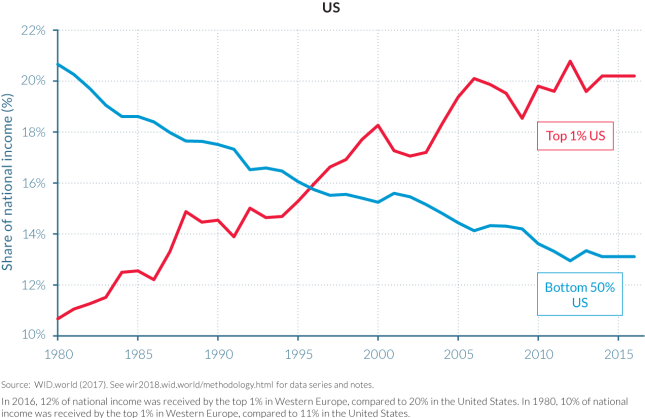
Although the y-axis does not start at 0% and is of different scale in both charts, the underlying story, i.e. the evolution of income shares of the rich (top 1%) and lower class (bottom 50%) over the last 35 years is apparent:

  • Income shares have changed significantly in the US:
    • The Top 1% nearly doubled their income share from 11% to 20%
    • The Bottom 50% saw their income share almost cut in half from 21% to 13%
  • Income shares have been fairly stable in Western Europe


Example 2: The elephant curve of global inequality

On this Blog we have written a lot about the Gini index. (See Gini posts) One of the limitations of the Gini index is that it reduces the entire inequality picture down to a single scalar value. Multiple distributions result in the same Gini index, which means that structural distribution changes may be masked out by a near constant Gini index.

For example, world inequality over the last 35 years has had both increasing effects (such as growth concentration at the top) as well as decreasing effects (raising hundreds of millions of people out of poverty in India and China). Visualizing the Gini index over time does not show this dynamic well.

Another chart to visualize this dynamic more clearly is the elephant curve – named after the shape of the animal. This curve lists all population groups in percentiles along the x-axis, sorted by increasing income from left to right. The first 99 % have the same x-axis spacing; the top 1% on the right is split into 10 subgroups of 0.1% each; the top 0.1% is again split into 10 subgroups of 0.01%, and finally the top 0.01% is again split into 10 subgroups of 0.001%. This gives a finer resolution near the top of the income distribution, highlighting the very disproportionate accrual of growth at the top. See Figure E4 for global inequality growth from 1980 – 2016:

figure-e4

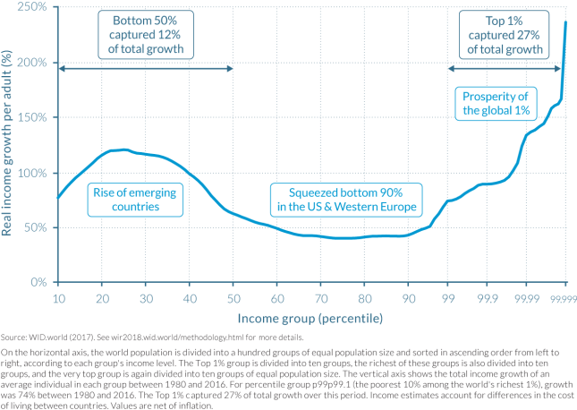
The big bump on the left (head of the elephant) represents the large number of people lifted out of poverty (mostly in India and China). The steep rise on the right (trunk of the elephant) represents the disproportionate gains at the top of the economic income distribution. Again, from the Executive Summary:

How has inequality evolved in recent decades among global citizens? We provide the first estimates of how the growth in global income since 1980 has been distributed across the totality of the world population. The global top 1% earners has captured twice as much of that growth as the 50% poorest individuals. The bottom 50% has nevertheless enjoyed important growth rates. The global middle class (which contains all of the poorest 90% income groups in the EU and the United States) has been squeezed.

To underscore the last statement, here is the elephant curve of income growth from 1980-2016 for just the US-Canada and Western Europe (Figure 2.1.2):

figure-212

Note how in this chart, without China and India, the left side is flat, indicating that the lower economic classes have only had average or negligible income growth.

How did this translate into shares of growth captured by different groups? The top 1% of earners captured 28% of total growth—that is, as much growth as the bottom 81% of the population. The bottom 50% earners captured 9% of growth, which is less than the top 0.1%, which captured 14% of total growth over the 1980–2016 period. These values, however, hide large differences in the inequality trajectories followed by Europe and North America. In the former, the top 1% captured as much growth as the bottom 51% of the population, whereas in the latter, the top 1% captured as much growth as the bottom 88% of the population. (See chapter 2.3 for more details.)

It is noteworthy that the closer to the top, the higher the cumulative income growth, especially in the US. For example, Table 2.4.2 below shows that since 1980, US income has more than

  • doubled for the Top 10% (growth = 121%)
  • tripled for the Top 1% (204%)
  • quadrupled for the Top 0.1% (320%)
  • quintupled for the Top 0.01% (453%) and
  • septupled for the Top 0.001% (636%)


table-242

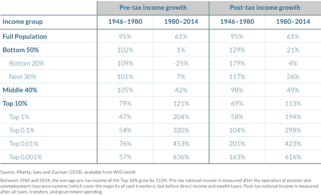
Another interesting finding from this is that pre-tax US income for the bottom 50% has essentially remained unchanged (growth = 1%) for an entire generation, with the bottom 20% even seeing their income shrink by 25%. Economic policies which exclude large portions of the population from growth for an entire generation are bound to increase tensions within that population, here primarily along the lines of economic class boundaries.

Example 3: Geographic breakdown of global income groups

In Part 2 the report looks at the share of Africans, Asians, Americans and Europeans in each of the global income groups and how this has changed over the last few decades. To illustrate, there are two snapshots in time, first at 1990 (Figure 2.1.5)

figure-215

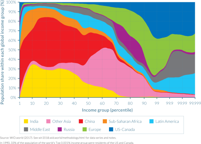
and then at 2016 (Figure 2.1.6):

figure-216

Comparing these two area charts reveals a few interesting developments at the level of entire geographic regions:

In 1990, Asians were almost not represented within top global income groups. Indeed, the bulk of the population of India and China are found in the bottom half of the income distribution. At the other end of the global income ladder, US-Canada is the largest contributor to global top-income earners. Europe is largely represented in the upper half of the global distribution, but less so among the very top groups. The Middle East and Latin American elites are disproportionately represented among the very top global groups, as they both make up about 20% each of the population of the top 0.001% earners. It should be noted that this overrepresentation only holds within the top 1% global earners: in the next richest 1% group (percentile group p98p99), their share falls to 9% and 4%, respectively. This indeed reflects the extreme level of inequality of these regions, as discussed in chapters 2.10 and 2.11. Interestingly, Russia is concentrated between percentile 70 and percentile 90, and Russians did not make it into the very top groups. In 1990, the Soviet system compressed income distribution in Russia.

In 2016, the situation is notably different. The most striking evolution is perhaps the spread of Chinese income earners, which are now located throughout the entire global distribution. India remains largely represented at the bottom with only very few Indians among the top global earners.

The position of Russian earners was also stretched throughout from the poorest to the richest income groups. This illustrates the impact of the end of communism on the spread of Russian incomes. Africans, who were present throughout the first half of the distribution, are now even more concentrated in the bottom quarter, due to relatively low growth as compared to Asian countries. At the top of the distribution, while the shares of both North America and Europe decreased (leaving room for their Asian counterparts), the share of Europeans was reduced much more. This is because most large European countries followed a more equitable growth trajectory over the past decades than the United States and other countries, as will be discussed in chapter 2.3.

There are, of course, many more findings in this report. It is great to see that such rigorous data-driven analysis is made available free of charge and easy to consume (desktop, iPad, etc.). One can hope that such foundational work will lead to a more educated civic discussion about the current status of economic inequality, the impact of various policy tools as well as the geographic developments on these inequalities.

 
Leave a comment

Posted by on February 16, 2018 in Socioeconomic


Tags: , ,

Digital Wages in the Gig Economy

Digital Wages in the Gig Economy

A small research team from the Oxford Internet Institute has recently issued a report based on a three year investigation into the worldwide geographies of the so-called Gig-Economy, online work which allows many talented people in the low and middle income countries of the world to compete on a global stage. From the Executive Summary:

Online gig work is becoming increasingly important to workers living in low- and middle-income countries. Our multi-year and multi-method research project shows that online gig work brings about rewards such as potential higher incomes and increased worker autonomy, but also risks such as social isolation, lack of work–life balance, discrimination, and predatory intermediaries. We also note that online gig work platforms mostly operate outside regulatory and normative frameworks that could benefit workers.

One of the eye-catching and very information rich visualizations comes from a related Blog post by the “Connectivity, Inclusion, and Inequality Group” called “Uneven Geographies of Digital Wages“.

odesk_donuts_wages_v3-01

Dollar Inflow and Median Wage by Country

The cartogram depicts each country as a circle and sizes each country according to dollar inflow to each country during March 2013 (on the freelance work oDesk.com platform, rebranded in 2015 to Upwork). The shading of the inner circle indicates the median hourly rate published by digital workers in that country. The graphic broadly reveals that median wages are, perhaps unsurprisingly low in developing countries and are significantly higher in wealthier countries.

Another Blog post on the geographies of online work adds several more visualizations (based on 2013 data, so a bit dated by now). For instance, one world map highlights the relationship between supply and demand. It distinguishes between countries with a positive balance of payment (i.e. countries in which more work is sold than bought) and countries with a negative balance of payment (countries in which more work is bought than is sold). The figure more clearly delineates the geography of supply and demand: with much of the world’s demand coming from only a few places in the Global North.

online-contracting-paymant-balance

Balance of payments

Another very interesting and dense visualization is a connectogram (see our previous post on Connectograms and the Circos tool) demonstrating the highly international trade in the online Gig-Economy: 89% of the trade measured by value happened between a client and a contractor who are in different countries. The network therefore attempts to illustrate the entirety of those international flows in one graph. It depicts countries as nodes (i.e. circles) and volumes of transactions between buyers and sellers in those countries as edges (i.e. the lines connecting countries). Country nodes are shaded according to the world region that they are in and sized according to the number of buyer transactions originating in them. Edges are coloured according to the flow of services: with the line shaded as the colour of the originating/selling region. Edges are also weighted according to the total volume of trade.

odesk_net_4_no-numbers

The Geographic Network of Sales

We see not just a complex many-to-many relationship of international trade, but also the large role that a few geographic relationships take (in particular, India and the Philippines selling to the United States).

Back to the Executive Summary of the above report:

The report’s central question is whether online gig work has any development potentials at the world’s economic margins. Its motive is to help platform operators to improve their positive impact, to help workers to take action to improve their situations, and to prompt policy makers and stakeholders interested in online gig work to revisit regulation as it applies to workers, clients, and platforms in their respective countries.

It is interesting to see these marketplaces evolve, in terms of the international, distributed nature, issues such as taxation, intermediation, opportunities and risks. There are also entirely new forms of social networks forming, based on blockchain powered token systems convertible into crypto-currencies (such as Steem). The core concept here is to eliminate not just geographical distance, but also risks from exchange rate fluctuations and predatory intermediaries. It remains to be seen to what degree this can act as a counterweight to technology-induced increasing inequality.


Leave a comment

Posted by on March 26, 2017 in Industrial, Socioeconomic


Tags:

Inequality and the World Economy

Inequality and the World Economy

The last edition of The Economist featured a 25-page special report on “The new politics of capitalism and inequality” headlined “True Progressivism“. It is the most recommended and commented story on The Economist this week.

We have looked at various forms of economic inequality on this Blog before, as well as other manifestations (market share, capitalization, online attention) and various ways to measure and visualize inequality (Gini-index). Hence I was curious about any new trends and perhaps ways to visualize global economic inequality. That said, I don’t intend to enter the socio-political debate about the virtues of inequality and (re-)distribution policies.

In the segment titled “For richer, for poorer” The Economist explains.

The level of inequality differs widely around the world. Emerging economies are more unequal than rich ones. Scandinavian countries have the smallest income disparities, with a Gini coefficient for disposable income of around 0.25. At the other end of the spectrum the world’s most unequal, such as South Africa, register Ginis of around 0.6.

Many studies have found that economic inequality has been rising over the last 30 years in many industrial and developing nations around the world. One interesting phenomenon is that while the Gini index of many countries has increased, the Gini index of world inequality has fallen. This is shown in the following image from The Economist.

Global and national inequality levels (Source: The Economist)

This is somewhat non-intuitive. Of course the countries differ widely in terms of population size and level of economic development. At a minimum it means that a measure like the Gini index is not simply additive when aggregated over a collection of countries.

Another interesting chart displays a world map with color coding the changes in inequality of the respective country.

Changes in economic inequality over the last 30 years (Source: The Economist)

It’s a bit difficult to read this map without proper knowledge of the absolute levels of inequality, such as we displayed in the post on Inequality, Lorenz-Curves and Gini-Index. For example, a look at a country like Namibia in South Africa indicates a trend (light-blue) towards less inequality. However, Namibia used to be for many years the country with the world’s largest Gini (1994: 0.7; 2004: 0.63; 2010: 0.58 according to iNamibia) and hence still has much larger inequality than most developed countries.

World Map of national Gini values (Source: Wikipedia)

So global Gini is declining, while in many large industrial countries Gini is rising. One region where regional Gini is declining as well is Latin-America. Between 1980-2000 Latin America’s Gini has grown, but in the last decade Gini has declined back to 1980 levels (~0.5), despite the strong economic growth throughout the region (Mexico, Brazil).

Gini of Latin America over the last 30 years (Source: The Economist)

Much of the coverage in The Economist tackles the policy debate and the questions of distribution vs. dynamism. On the one hand reducing Gini from very large inequality contributes to social stability and welfare. On the other hand, further reducing already low Gini diminishes incentives and thus potentially slows down economic growth.

In theory, inequality has an ambiguous relationship with prosperity. It can boost growth, because richer folk save and invest more and because people work harder in response to incentives. But big income gaps can also be inefficient, because they can bar talented poor people from access to education or feed resentment that results in growth-destroying populist policies.

In other words: Some inequality is desirable, too much of it is problematic. After growing over the last 30 years, economic inequality in the United States has perhaps reached a worrisome level as the pendulum has swung too far. How to find the optimal amount of inequality and how to get there seem like fascinating policy debates to have. Certainly an example where data visualization can help an otherwise dry subject.

 
1 Comment

Posted by on October 15, 2012 in Socioeconomic


Tags: , , ,

Olympic Medal Charts

Olympic Medal Charts

The 2012 London Olympic Games ended this weekend with a colorful closing ceremony. Media coverage was unprecedented, with other forms of competition around who had the most social media presence or which website had the best online coverage of the games.

In this post I’m looking at the medal counts over the history of the Olympic Games (summer games only, 27 events over the last 116 years, no games in 1916, 1940, and 1944). Nearly 11.000 athletes from 205 countries competed for more than 900 medals in 302 events. The New York Times has an interactive chart of the medal counts on their London 2012 Results page:

Bubble size represents the number of medals won by the country, bubble position is roughly based on a world map and bubble color indicates the continent. Moving the slider to a different year changes the bubbles, which gives a dynamic grow or shrink effect.

Below this chart is a table listing all gold, silver, bronze winners for each sport in that year, grouped by type of sport such as Gymnastics, Rowing or Swimming. Selecting a bubble will filter this to entries where the respective country won a medal. This shows the domination of some sports by certain countries, such as Diving (8 events, China won 6 gold and 10 total medals) or Cycling – Track (10 events, Great Britain won 7 gold and 9 total medals). In two sports, domination by one country was 100%: Badminton (5 events, China won 5 gold and 8 total medals), Table Tennis (4 events, China won 4 gold and 6 total medals).

There is also a summary table ranking the countries by total medals. For 2012, the United States clearly won that competition, winning more gold medals (46) than all but 3 other countries (China, Russia, Britain) won total medals.

Top 10 countries for medal count in 2012

Of course countries vary greatly by population size. It is remarkable that a relatively small nations such as Jamaica (~2.7 million) won 12 medals (4, 4, 4), while India (~1.25 billion) won only 6 medals (0, 2, 4). In that sense, Jamaica is about 1000x more medal-decorated per population size than India! In another New York Times graphic there is an option to compare medal count adjusted for population size, i.e. with the medal count normalized to a standard population size of say 100 million.

Directed graph comparing medal performance adjusted for country size

Selecting any node in this graph will highlight countries with better, worse or comparable relative medal performance. (There are different ways to rank based on how different medals are weighted.)

The Guardian Data Blog has taken this a step further and written a piece called “alternative medals table“. This post not only discusses multiple factors like population, GDP, or number of athletes and how to deal with them statistically; it also provides all the data and many charts in a Google Docs spreadsheet. One article combines GDP adjustment with cartographical mapping across Europe:

Medals GDP Adjusted and mapped for Europe

If you want to do your own analysis, you can get the data in shared spreadsheets. To do a somewhat more historic analysis, I used a different source, namely Wolfram’s curated data source accessible from within Mathematica. Of course, once you have all that data, you can examine it in many different directions. Did you know that 14853 Olympic medals were awarded so far in 27 summer Olympiads? The average was 550 medals, growing about 29 medals per event with nearly 1000 awarded in 2008 and 2012.

A lot of attention was paid to who would win the most medals in London. China seemed in contention for the top spot, but in the end the United States won the most medals, as it did in the last 5 Olympiads. Only 7 countries won the most medals at any Olympiad. Greece (1896), France (1900), the United Kingdom (1908), Sweden (1912), and Germany (1936) did so just once. The Soviet Union (which no longer exists) did it 8 times. And the United States did it 14 times. China, which is only participating since 1984, has yet to win the most medals of any Olympiad.

Aside from the top rank, I was curious about the distribution of medals over all countries. Both nations and events have increased, as is shown in the following paired bar chart:

Number of participating nations and total medals per Summer Games

The number of nations grew steadily with only two exceptions during the thirties and the seventies; presumably due to economic hardship many nations didn’t want to afford participation. 1980 also saw the Boycott of the Moscow Games by the United States and several other delegations over geopolitical disagreements. At just over 200 the number of nations seems to have stabilized.

The number of medals depends primarily on the number of events at each Olympiad. This year there were 302 events in 26 types of Sports. Total medal count isn’t necessarily exactly triple that since in some events there could be more than 1 Bronze (such as in Judo, Taekwondo, and Wrestling). Case in point, in 2012 there were 968 medals awarded, 62 more than 3 * 302 events.

What is the distribution of those medals over the participating nations? One measure would be the percentage of nations winning at least some medals. Another measure showing the degree of inequality in a distribution is the Gini index. Here I plotted the percentage of nations medaling and the Gini index of the medal distribution over all participating nations for every Olympiad:

Percentage and Gini-Index of medal distribution by nations

Up until 1932 3 out of 4 nations won at least some medals. Then the percentage dropped down to levels around 40% and lower since the sixties. That means 6 of 10 nations go home without any medals. During the same time period the inequality grew from Gini of about .65 to near .90 One exception were the Third Games in 1904 in St. Louis. With only 13 nations competing the United States dominated so many sports to yield an extreme Gini of .92 All of the last five Games resulted in a Gini of about .86, so this still very large amount of medal winning inequality seems to have stabilized.

It would be interesting to extend this to the level of participating athletes. Of course we know which athlete ranks at the top as the most decorated Olympic athlete of all time: Michael Phelps with 22 medals.

 
1 Comment

Posted by on August 15, 2012 in Recreational


Tags: , , , , , ,

Underestimating Wealth Inequality

Underestimating Wealth Inequality

What are people’s perceptions about estimated, desirable and actual levels of economic inequality? Behavioral economist Dan Ariely from Duke University and Michael Norton from Harvard Business School conducted a survey of ~5,500 respondents across the United States to find out. Their survey asked questions about wealth inequality (as compared to income inequality), also known as net worth, essentially the value of all things owned minus all things owed (assets minus debt).

Addendum 3/9/2013: A recently posted 6min video illustrating these findings went viral (4 million+ views). It is worth watching:

The authors published the paper here and Dan Ariely blogged about it here in Sep 2010. One of the striking results is summarized in this chart of the wealth distribution across five quintiles:

From their Legend:

The actual United States wealth distribution plotted against the estimated and ideal distributions across all respondents. Because of their small percentage share of total wealth, both the ‘‘4th 20%’’ value (0.2%) and the ‘‘Bottom 20%’’ value (0.1%) are not visible in the ‘‘Actual’’ distribution.

It turned out that most respondents described a fairly equal distribution as the ideal – something similar to the wealth distribution in a country like Sweden. They estimated – correctly – that the U.S. has higher levels of wealth inequality. However, they nevertheless grossly underestimated the actual inequality, which is far higher still. Especially the bottom two quintiles are almost non-existent in the actual distribution. There was much more consensus than disagreement across groups from different sides of the political spectrum about this. From the current policy debates one would not have expected that. They go on to ask the question:

Given the consensus among disparate groups on the gap between an ideal distribution of wealth and the actual level of wealth inequality, why are more Americans, especially those with low income, not advocating for greater redistribution of wealth?

In the last chapter of their paper the authors offer several explanations of this phenomenon. One of them is the observation that the apparent drastic under-estimation of the degree of inequality seems to reveal a lack of awareness of the size of the gap. This is something that Data Visualization and interactive charts can help address. For example, Catherine Mulbrandon’s Blog Visualizing Economics does a great job in that regard.

The authors go on to look at other aspects from the perspective of psychology and behavioral economics. While fascinating in its own right, this excursion is beyond the scope of my Data Visualization Blog. They conclude their paper with general observations

…suggesting that even given increased awareness of the gap between ideal and actual wealth distributions, Americans may remain unlikely to advocate for policies that would narrow this gap.

 
2 Comments

Posted by on December 12, 2011 in Socioeconomic


Tags: , , ,

Inequality on Twitter

Inequality on Twitter

A lot has been written about economic inequality as measured by distribution of income, wealth, capital gains, etc. In previous posts such as Inequality, Lorenz-Curves and Gini-Index or Visualizing Inequality we looked at various market inequalities (market share and capitalization, donations, etc.) and their respective Gini coefficients.

With the recent rise of social media we have other forms of economy, in particular the economy of time and attention. And we have at least some measures of this economy in the form of people’s activities, subscriptions, etc. Whether it’s Connections on LinkedIn, Friends on FaceBook, Followers on Twitter – all of the social media platforms have some social currencies for attention. (Influence is different from attention, and measuring influence is more difficult and controversial – see for example the discussions about Klout-scores.)

Another interesting aspect of online communities is that of participation inequality. Jakob Nielsen did some research on this and coined the well-known 90-9-1 rule:

“In most online communities, 90% of users are lurkers who never contribute, 9% of users contribute a little, and 1% of users account for almost all the action.”

The above linked article has two nice graphics illustrating this point:

Illustration of participation inequality in online communities (Source: Jakob Nielsen)

As a user of Twitter for about 3 years now I decided to do some simple analysis, wondering about the degrees of inequality I would find there. Imagine you want to spread the word about some new event and send out a tweet. How many people you reach depends on how many followers you have, how many of those retweet your message, how many followers they have, how many other messages they send out and so on. Let’s look at my first twitter account (“tlausser”); here are some basic numbers of my followers and their respective followers:

Followers of tlausser Followers on Twitter

Some of my followers have no followers themselves, one has nearly 100,000. On average, they have about 3600 followers; however, the total of about 385,000 followers is extremely unequally distributed. Here are three charts visualizing this astonishing degree of inequality:

Of 107 followers, the top 5 have ~75% of all followers that can be reached in two steps. The corresponding Gini index of 0.90 is an example of extreme inequality. From an advertising perspective, you would want to focus mostly on getting these 5% to react to your message (i.e. retweet). In a chart with linear scale the bottom half does barely register.

Most of my followers have between 100-1000 followers themselves, as can be seen from this log-scale Histogram.

What kind of distribution is the number of followers? It seems that Log[x] is roughly normal distributed.

As for participation inequality, let’s look at the number of tweets that those (107) followers send out.

Some of them have not tweeted anything, the chattiest has sent more than 16,000 tweets. On average, each follower has 1280 tweets; the total of 137,000 tweets is again highly unequally distributed for a Gini index of 0.77.

The top 10 make up about 2/3 of the entire conversation.

Again the bottom half hardly contributes to the number of tweets; however, the ramp in the top half is longer and not quite as steep as with the number of followers. Here is the log-scale Histogram:

I did the same type of analysis for several other Twitter Users in the central range (between 100-1000 follower). The results are similar, but certainly not yet robust enough to statistical sampling errors. (A larger scale analysis would require a higher twitter API limit than my free 350 per hour.)

These preliminary results indicate that there are high degrees of inequality regarding the number of tweets people send out and even more so regarding the number of followers they accumulate. How many tweets Twitter users send out over time is more evenly distributed. How many followers they get is less evenly distributed and thus leads to extremely high degrees of inequality. I presume this is caused in part due to preferential attachment as described in Barabasi’s book “Linked: The new science of networks“. Like with all forms of attention, who people follow depends a lot on who others are following. There is a very long tail of small numbers of followers for the vast majority of Twitter users.

That said, the degree of participation inequality I found was lower than the 90-9-1 rule, which corresponds to an extreme Gini index of about 0.96. Perhaps that’s a sign of the Twitter community having evolved over time? Or perhaps just a sign of my analysis sample being too small and not representative of the larger Twitterverse.

In some way these new media are refreshing as they allow almost anyone to publish their thoughts. However, it’s also true that almost all of those users remain in relative obscurity and only a very small minority gets the lion share of all attention. If you think economic inequality is too high, keep in mind that attention inequality is far higher. Both are impacting the policy debate in interesting ways.

Turning social media attention into income is another story altogether. In his recent Blog post “Turning social media attention into income“, author Srininvas Rao muses:

“The low barrier to entry created by social media has flooded the market with aspiring entrepreneurs, freelancers, and people trying to make it on their own. Standing out in it is only half the battle. You have to figure out how to turn social media attention into social media income. Have you successfully evolved from blogger to entrepreneur? What steps should I take next?”

 
10 Comments

Posted by on December 6, 2011 in Industrial, Scientific, Socioeconomic


Tags: , , ,

Share and Inequality of Mobile Phone Revenues and Volumes

Share and Inequality of Mobile Phone Revenues and Volumes

The analyst website Asymco.com visualizes various financial indicators of mobile phone companies in this interactive vendor bubble chart (follow link, select “Vendor Charts”). It covers the following 8 companies: Apple, HTC, LG, Motorola, Nokia, RIM, Samsung, Sony Ericsson. From the “vendor data” tab I downloaded the data and looked at the revenue and volume distributions for the last 4 years.

Revenue Share of Mobile Phones and corresponding Gini Index

Note the sharp reduction in inequality of revenue distribution in the 9/1/08 quarter, when Apple achieved nearly 10x in revenue (and volume) compared to the year before. While the iPhone 1 was introduced a year earlier in 2007, in commercial terms the iPhone 3G started to have strong market impact when introduced in the second half of 2008.

Volume Share of Mobile Phones and Gini Index

Volume inequality is considerably higher (average Gini = 0.61) than Revenue inequality (0.43) due to two dominant shippers (Nokia and Samsung), which continue to lead the peer group in volume. Only recently has the inequality been reduced, i.e. the volumes are distributed more evenly. Apple’s growth in volume share has come at the expense of other players (mainly Motorola and Sony Ericsson).

Volume share is a lagging indicator regarding a company’s innovation and success. It can be dominated for a long time by players who are past their prime and in financial distress (like Nokia). Revenue is more useful to predict a company’s future growth and success. But the real story is told when comparing Profit. Apple’s (Smart Phone) Profit dwarfs that of the other 7 competitors:

Profit Comparison between 8 Mobile Phone Vendors (Source: Asymco.com)

Click on the image to go to Asymco’s interactive chart (requires Flash). The bubble chart display over time is very revealing regarding Apple’s meteoric rise.

 
2 Comments

Posted by on October 22, 2011 in Financial, Industrial


Tags: , ,

Market Capitalization Inequality in the Steve Jobs era

The excellent analyst website asymco.com recently published a post titled Visualizing the Steve Jobs era. In it they display an area chart of the relative size of market capitalization of about 15 companies they have tracked for the last 15 years.

Since I had looked at the Gini index of a similar set of companies in an earlier post on Visualizing Inequality I contacted the author Dirk Schmidt. Thankfully he shared the underlying data. From that I calculated the Gini index for every quarter and overlaid a line chart with their area chart.

Share of Market Capitalization Area Chart overlaid with Gini Index

Dirk elaborated in his post and identified three distinct periods in his post:

  • Restructuring of Apple 1997-2000 – Gini remains very high near 0.85 due to MSFT dominance
  • iTunes era 2001-2006 – Gini decreases to ~ 0.55 due to AAPL increase and taking share from other established players
  • Mobile devices era 2007-2011 – Gini increases again to 0.65 due to increasing dominance of AAPL and irrelevance of smaller players

Regardless of the absolute value of the Gini index – note the caveat from the earlier post that it is very sensitive to the number of contributors – the trend in the Gini can be an interesting signal. One company dwarfing every other like a monopoly corresponds to high Gini (here 0.85 due to MSFT dominance). A return to lower Gini values (here down to ~0.5) signals stronger competition with multiple entrants. The recent reversal of the Gini trend (up to 0.65 due to AAPL dominance) is a sign that investors see less choices when it comes to buying shares in those tech companies. Whether that’s a leading indicator for consumers seeing less choices in the marketplace is another question…

 
Leave a comment

Posted by on September 29, 2011 in Financial, Industrial


Tags: , , ,

Visualizing Inequality

Visualizing Inequality

Measuring and visualizing inequality is often the starting point for further analysis of underlying causes. Only with such understanding can one systematically influence the degree of inequality or take advantage of it. In previous posts on this Blog we have already looked at some approaches, such as the Lorenz-Curve and Gini-Index or the Whale-Curve for Customer Profitability Analysis. Here I want to provide another visual method and look at various examples.

Inequality is very common in economics. Competitors have different share of and capitalization in a market. Customers have different profitability for a company. Employees have different incomes across the industry. Countries have different GDP in the world economy. Households have different income and wealth in a population.

The Gini Index is an aggregate measure for the degree of inequality of any given distribution. It ranges from 0.0 or perfect equality, i.e. every element contributes the same amount to 1.0 or the most extreme inequality, i.e. one element contributes everything and all other elements contribute nothing. (The previous post referenced above contains links to articles for the definition and calculation of the Gini index.)

There are several ways to visualize inequality, including the Lorenz-Curve. Here we look at one form of pie-charts for some discrete distributions. As a first example, consider the distribution of market capitalization among the Top-20 technology companies (Source: Nasdaq, Date: 9/17/11):

Market Cap of Top 20 Technology Companies on the Nasdaq

Apple, the largest company by far, is bigger than the bottom 10 combined. The first four (20%) companies – Apple, Microsoft, IBM, Google – are almost half of the entire size and thus almost the size of the other 16 (80%) combined. The pie-chart gives an intuitive sense of the inequality. The Gini Index gives a precise mathematical measure; for this discrete distribution it is 0.47

Another example is a look at the top PC shipments in the U.S. (Source: IDC, Date: Q2’11)

U.S. PC Shipments in Q2'11

There is a similar degree of inequality (Gini = 0.46). In fact, this degree of inequality (Gini index ~ 0.5) is not unusual for such distributions in mature industries with many established players. However, consider the tablet market, which is dominated by Apple’s iOS (Source: Strategy Analytics, Date: Q2’11)

Worldwide Tablet OS shipments in Q2'11

Apple’s iOS captures 61%, Android 30%, and the other 3 categories combined are under 10%. This is a much stronger degree of inequality with Gini = 0.74

To pick an example from a different industry, here are the top 18 car brands sold in the U.S. (Source: Market Data Center at WSJ.COM; Date: Aug-2011):

U.S. Total Car Sales in Aug-11

When comparing different the Gini index values for these kinds of distributions it is important to realize the impact of the number of elements. More elements in the distribution (say Top-50 instead of Top-20) usually increases the Gini index. This is due to the impact of additional very small players. Suppose for example, instead of the Top-18 you left out the two companies with the smallest sales, namely Saab and Subaru, and plotted only the Top-16. Their combined sales are less than 0.4% of the total, so one wouldn’t expect to miss much. Yet you get a Gini index of 0.49 instead of 0.54. So with discrete distributions and a relatively small number elements one risks comparing apples to oranges when there are different number of elements.

Consider as a last example a comparison of the above with two other distributions from my own personal experience – the list of base salaries of 30 employees reporting to me at one of my previous companies as well as the list of contributions to a recent personal charity fundraising campaign.

Gini Index Comparison

What’s interesting is that the salary distribution has by far the lowest amount of inequality. You wouldn’t believe that from the feelings of employees where many believe they are not getting their fair share and others are getting so much more… In fact, the skills and value contributions to the employer are probably far more unequal than the salaries! (Check out Paul Graham’s essays on “Great Hackers” for more on this topic!)
And when it comes to donations, the amount people are willing to give to charitable causes differs immensely. We have seen this already in a previous post on Gini-Index with recent U.S. political donations showing an astounding inequality of Gini index = 0.89. I challenge you to find a distribution across so many elements (thousands) which has greater inequality. If you find one, please comment on this Blog or email me as I’d like to know about it.

 
8 Comments

Posted by on September 22, 2011 in Industrial, Scientific, Socioeconomic


Tags: , ,

Inequality, Lorenz-Curves and Gini-Index

In a previous post we looked at inequality of profits and the useful abstraction of the Whale-Curve to analyze Customer Profitability. Here I want to focus on inequality and its measurement and visualization in a broader sense.

A fundamental graphical representation of the form of a distribution is given by the Lorenz-Curve. It plots the cumulative contribution to a quantity over a contributing population. It is often used in economics to depict the inequality of wealth or income distribution in a population.

Lorenz Curve (Source: Wikipedia)

The Lorenz-Curve shows the y% contribution of the bottom x% of the population. The x-axis has the population sorted by increasing contributions; (i.e. the poorest on the left and the richest on the right). Hence the Lorenz-Curve is always at or below the diagonal line, which represents perfect equality. (By contrast, the x-axis of the Whale-Curve sorts by decreasing profit contributions.)

The Gini-Index is defined as G =  A / (A + B) , G = 2A  or G = 1 – 2B

Since each axis is normalized to 100%, A + B = 1/2 and all of the above are equivalent. Perfect equality means G = 0. Maximum inequality G = 1 is achieved if one member of the population contributes everything and everybody else contributes nothing.

An interesting interactive graph demonstrating Lorenz-Curves and corresponding Gini-Index values can be found here at the Wolfram Demonstration project.

The GINI Index is often used to indicate the income or wealth inequality of countries. The corresponding values of the GINI index are typically between 0.25 and 0.35 for modern, developed countries and higher in developing countries such as 0.45 – 0.55 in Latin America and up to 0.70 in some African countries with extreme income inequality.

GINI index of world countries in 2009 (Source: Wikipedia)

Graphically, many different shapes of the Lorenz-Curve can lead to the same areas A and B, and hence many different distributions of inequality can lead to the same GINI index. How can one determine the GINI index? If one has all the data, one can numerically determine the value from all the differences for each member of the population. An example of that is shown here to determine the inequality of market share for 10 trucking companies.
Another approach is to model the actual distribution using a formal statistical distribution with known properties such as Pareto, Log-Normal or Weibull. With a given formal distribution one can often calculate the GINI index analytically. See for example the paper by Michel Lubrano on “The Econometrics of Inequality and Poverty“. In another example, Eric Kemp-Benedict shows in this paper on “Income Distribution and Poverty” how well various statistical distributions match the actually measured data. It is commonly held that at the high end of the income the Pareto distribution is a good model (with its inherent Power law characteristic), while overall the Log-Normal is the best approximation.

After studying several of these papers I started to ask myself: If x% of the population contribute y% to the total, what’s the corresponding GINI index? For example, for the famous “80-20 rule” with 20% of the population contributing 80% of the result, what’s the GINI index for the 80-20 rule?

To answer this question I created a simple model of inequality based on a Pareto distribution. Its shape parameter controls the curvature of the distribution, which in turn determines the GINI index. The latter is visualized as color-coded bands using a 2D contour plot in the following graphic:

GINI index contour plot based on Pareto distribution model

The sample data point “A” corresponds to the 80-20 rule, which leads to a GINI index of about 0.75 (strongly unequal distribution). Data point “B” is an example of an extremely unequal distribution, namely US political donations (data from 2010 according to a statistic from the Center of Responsive Politics recently cited by CNNMoney):

“…a relatively small number of Americans do wield an outsized influence when it comes to political donations. Only 0.04% of Americans give in excess of $200 to candidates, parties or political action committees — and those donations account for 64.8% of all contributions”

0.04% contribute 64.8% of the total! Here is another way of describing this: If you had 2500 donors, the top donor gives twice as much as the other 2499 combined. This extreme amount of inequality corresponds to a GINI index of 0.89 (needless to say that this does not seem like a very democratic process…)

As for US income I created a separate graphic with data points from the high end of the income spectrum (where the underlying Pareto distribution model is a good fit): The top 1% (who earn 18% of all income), top 0.1% (8%), and top 0.01% (3.5%).

GINI Index Contour Plot with high end US Income distribution data points

These 3 data points are taken from Timothy Noah’s “The United States of Inequality“, a 10-part article series on Slate, which in turn is based on data and research from 2008 by Emmanuel Saez and visualizations by Catherine Mulbrandon of VisualizingEconomics.com. This shows the 2008 US income inequality has a GINI Index of approximately 0.46, which is unusually high for a developed country. Income inequality has grown in the US since around 1970, and the above article series analyzes potential factors contributing to that – but that’s a topic for another post. In the spirit of visualizing data to create insight, I’ll just leave you with this link to the corresponding 10-part visual guide to inequality:

Postscript: In April 2012 I came across a nice interactive visualization on the DataBlick website created by Anya A’Hearn using Tableau. It shows the trends of US income inequality over the last 90 years with 7 different categories (Top x% shares) and makes a good showcase for the illustrative power of interactive graphics.

 
6 Comments

Posted by on September 2, 2011 in Financial, Industrial, Scientific, Socioeconomic


Tags: , ,

 
%d bloggers like this: