RSS

Tag Archives: economics

Visualizing Global Risks 2013

Visualizing Global Risks 2013

A year ago we looked at Global Trends 2025, a 2008 report by the National Intelligence Commission. The 120 page document made surprisingly little use of data visualization, given the well-funded and otherwise very detailed report.

By contrast, at the recent World Economic Forum 2013 in Davos, the Risk Response Network published the eighth edition of its annual Global Risks 2013 report. Its focus on national resilience fits well into the “Resilient Dynamism” theme of this year’s WEF Davos. Here is a good 2 min synopsis of the Global Risks 2013 report.

We will look at the abundant use of data visualization in this work, which is published in print as an 80-page .pdf file. The report links back to the companion website, which offers lots of additional materials (such as videos) and a much more interactive experience (such as the Data Explorer). The website is a great example of the benefits of modern layout, with annotations, footnotes, references and figures broken out in a second column next to the main text.

RiskCategories

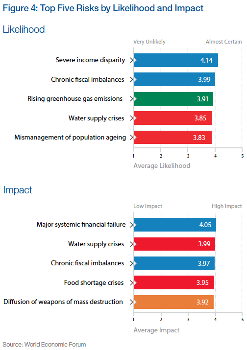
One of the main ways to understand risks is to quantify it in two dimensions, namely its likelihood and its impact, say on a scale from 1 (min) to 5 (max). Each risk can then be visualized by its position in the square spanned by those two dimensions. Often risk mitigation is prioritized by the product of these two factors. In other words, the further right and/or top a risk, the more important it becomes to prepare for or mitigate it.

This work is based on a comprehensive survey of more than 1000 experts worldwide on a range of 50 risks across 5 broad categories. Each of these categories is assigned a color, which is then used consistently throughout the report. Based on the survey results the report uses some basic visualizations, such as a list of the top 5 risks by likelihood and impact, respectively.

Source for all figures: World Economic Forum (except where noted otherwise)

Source for all figures: World Economic Forum (except where noted otherwise)

When comparing the position of a particular risk in the quadrant with the previous year(s), one can highlight the change. This is similar to what we have done with highlighting position changes in Gartner’s Magic Quadrant on Business Intelligence. Applied to this risk quadrant the report includes a picture like this for each of the five risk categories:

EconomicRisksChange

This vector field shows at a glance how many and which risks have grown by how much. The fact that a majority of the 50 risks show sizable moves to the top right is of course a big concern. Note that the graphic does not show the entire square from 1 through 5, just a sub-section, essentially the top-right quadrant.

On a more methodical note, I am not sure whether surveys are a very reliable instrument in identifying the actual risks, probably more the perception of risks. It is quite possible that some unknown risks – such as the unprecedented terrorist attacks in the US on 9/11 – outweigh the ones covered here. That said, the wisdom of crowds tends to be a good instrument at identifying the perception of known risks.

Note the “Severe income disparity” risk near the top-right, related to the phenomenon of economic inequality we have looked at in various posts on this Blog (Inequality and the World Economy or Underestimating Wealth Inequality).

A tabular form of showing the top 5 risks over the last seven consecutive years is given as well: (Click on chart for full-resolution image)

Top5RisksChanges

This format provides a feel for the dominance of risk categories (frequency of colors, such as impact of blue = economic risks) and for year over year changes (little change 2012 to 2013). The 2011 column on likelihood marks a bit of an outlier with four of five risks being green (= environmental) after four years without any green risk in the Top 5. I suspect that this was the result of the broad global media coverage after the April 2011 earthquake off the coast of Japan, with the resulting tsunami inflicting massive damage and loss of lives as well as the Fukushima nuclear reactor catastrophe. Again, this reinforces my belief that we are looking at perception of risk rather than actual risk.

Another aggregate visualization of the risk landscape comes in the form of a matrix of heat-maps indicating the distribution of survey responses.

SurveyResponseDistribution

The darker the color of the tile, the more often that particular likelihood/impact combination was chosen in the survey. There is a clear positive correlation between likelihood and impact as perceived by the majority of the experts in the survey. From the report:

Still it is interesting to observe how for some risks, particularly technological risks such as critical systems failure, the answers are more distributed than for others – chronic fiscal imbalances are a good example. It appears that there is less agreement among experts over the former and stronger consensus over the latter.

The report includes many more variations on this theme, such as scatterplots of risk perception by year, gender, age, region of residence etc. Another line of analysis concerns the center of gravity, i.e. the degree of systemic connectivity between risks within each category, as well as the movement of those centers year over year.

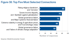
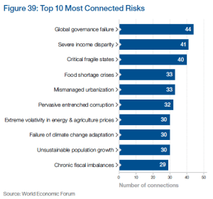
Another set of interesting visualizations comes from the connections between risks. From the report:

Top5Connections

Top10ConnectedRisks

Finally, the survey asked respondents to choose pairs of risks which they think are strongly interconnected. They were asked to pick a minimum of three and maximum of ten such connections.

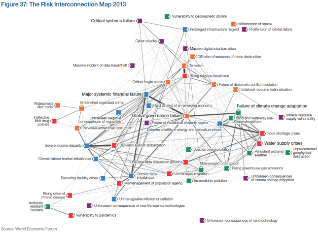
Putting together all chosen paired connections from all respondents leads to the network diagram presented in Figure 37 – the Risk Interconnection Map. The diagram is constructed so that more connected risks are closer to the centre, while weakly connected risks are further out. The strength of the line depends on how many people had selected that particular combination.

529 different connections were identified by survey respondents out of the theoretical maximum of 1,225 combinations possible. The top selected combinations are shown in Figure 38.

It is also interesting to see which are the most connected risks (see Figure 39) and where the five centres of gravity are located in the network (see Figure 40).

One such center of gravity graph (for geopolitical risks) is shown here:RiskInterconnections

The Risk Interconnection Map puts it all together:

RiskInterconnectionMap

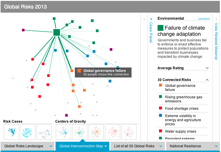
Such fairly complex graphs are more intuitively understood in an interactive format. This is where the online Data Explorer comes in. It is a very powerful instrument to better understand the risk landscape, risk interconnections, risk rankings and national resilience analysis. There are panels to filter, the graphs respond to mouse-overs with more detail and there are ample details to explain the ideas behind the graphs.

DataExplorer

There are many more aspects to this report, including the appendices with survey results, national resilience rankings, three global risk scenarios, five X-factor risks, etc. For our purposes here suffice it to say that the use of advanced data visualizations together with online exploration of the data set is a welcome evolution of such public reports. A decade ago no amount of money could have bought the kind of interactive report and analysis tools which are now available for free. The clarity of the risk landscape picture that’s emerging is exciting, although the landscape itself is rather concerning.

 
1 Comment

Posted by on January 31, 2013 in Industrial, Socioeconomic


Tags: , , , , , , ,

Faceplant with Facebook?

With the Facebook IPO coming up this Friday there is a lot of attention around its business model and financials. I’m not an expert in this area, but my hunch is that a lot of people will lose a lot of money by chasing after Facebook shares. Why?

I think there are two types of answers. One from reasoning and one from intuition.

For reasoning one needs to look at a more technical assessment of the business model and financials. Some have written extensively about the comparative lack of innovation in Facebook’s business model and core product. Some have compared Facebook’s performance in advertising to Google – the estimates are that Google’s ad performance is 100x better than that of Facebook. Some have pointed out that many of Facebook’s core metrics such as visits/person, pages/visit or Click-Through-Rates have been declining for two years and go as far as calling this the Facebook ad scam. One can question the wisdom of the Instagram acquisition, buying a company with 12 employees and zero revenues for $1B. One can question the notion that the 28 year old founder will have 57% of the voting rights of the public company. One could look at stories about companies discontinuing their ad Facebook efforts such as the Forbes article about GM pulling a $10m account because they found it ineffective. The list goes on.

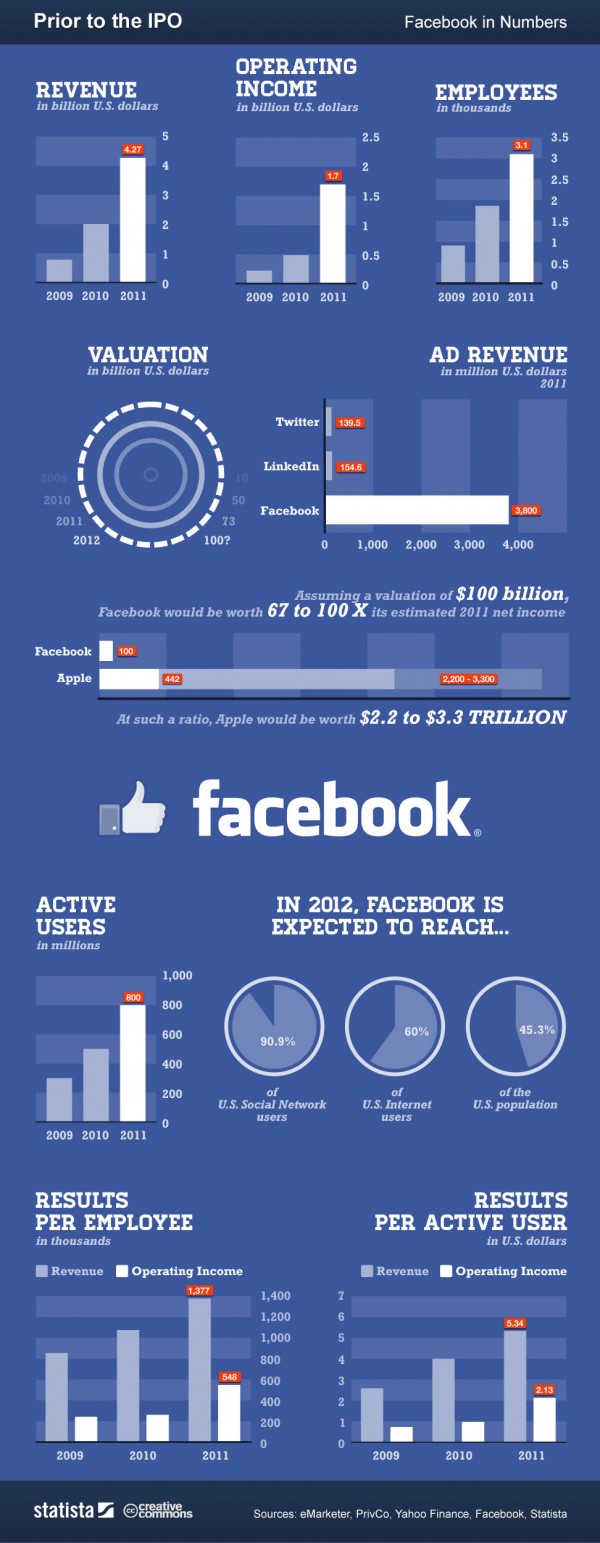
Here is a more positive leaning infographic from an article looking at “Facebook: Business Model, Hardware Patents and IPO“:

Analysis Infographic of pre-IPO Facebook (source: Gina Smith, anewdomain.net)

To value a startup at 100x last year’s income seems just extremely high – but then Amazon’s valuation is in similarly lofty territory. As for reasoning and predicting the financial success of Facebook’s IPO, people can cite numbers to justify their beliefs both ways. At the end of the day, it’s unpredictable and nobody can know for sure.

The other answer to why I am not buying into the hype is more intuitive and comes from my personal experience. Here is a little thought experiment as to how valuable a company is for your personal life: Imagine for a moment if the company with all its products and services would disappear overnight. How much of an impact would it have for you as an individual? If I think about companies like Apple, Google, Microsoft, or Amazon the impact for me would be huge. I use their products and services every day. Think about it:

No Apple = no iPhone, no iPad, no iTunes music on the iPod or via AppleTV on our home stereo. That would be a dramatic setback.

No Google = no Google search, no GMail, no YouTube, no Google maps, no Google Earth. Again, very significant impact for me personally. Not to mention the exciting research at Google in very different areas such as self-driving vehicles.

No Facebook = no problem (at least for me). I deactivated my own Facebook account months ago simply because it cost me a lot of time and I got very little value out of it. In fact, I got annoyed with compulsively looking at updates from mere acquaintances about mundane details of their lives. Why would I care? I finally got around to actually deleting my account, although Facebook makes that somewhat cumbersome (which probably inflates the account numbers somewhat).

I’m not saying Facebook isn’t valuable to some people. Having nearly 1B user accounts is very impressive. Hosting by far the largest photo collection on the planet is extraordinary. Facebook exploded because it satisfied our basic need of sharing, just like Google did with search, Amazon did with shopping or eBay did with selling. But the entry barrier to sharing is small (see LinkedIn, Twitter or Pinterest) and Facebook doesn’t seem to be particularly well positioned for mobile.
I strongly suspect that Facebook’s valuation is both initially inflated – the $50 per account estimate of early social networks doesn’t scale up with the demographics of the massive user base – as well as lately hyped up by greedy investors who sense an opportunity to make a quick buck. My hunch is that FB will trade below its IPO price within the first year, possibly well below. But then again, I have been surprised before…

I’m not buying the hype. What am I missing? Let me know what you think!

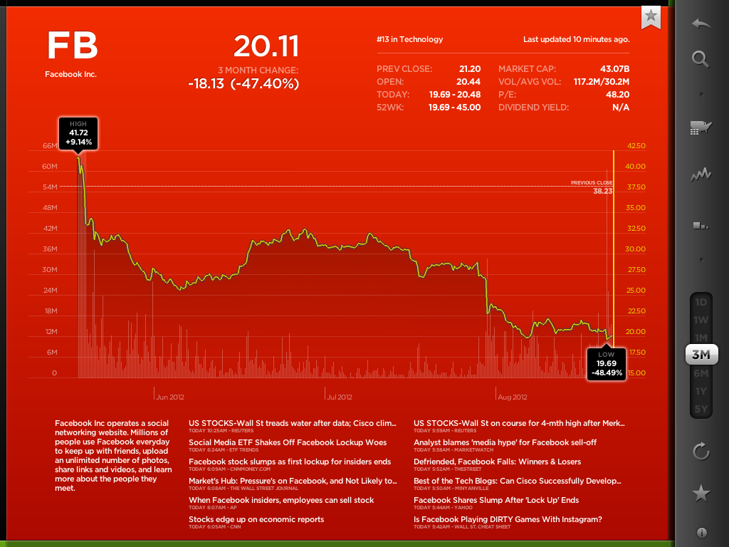
UPDATE 8/16/2012: Well, here we are after one quarter, and Facebook’s stock valuation hasn’t done so well. Look at the first 3 month chart of FB:

First 3 month of Facebook stock price (Screenshot of StockTouch on iPad)

What started as a $100b market valuation is now at $43b. One has to hand it to Mark Zuckerberg, he really extracted maximum value out of those shares. It turns out sitting on the sidelines was the right move for investors in this case.

 
2 Comments

Posted by on May 16, 2012 in Financial, Socioeconomic


Tags: , , , , , , ,

Sankey Diagrams

Sankey Diagrams

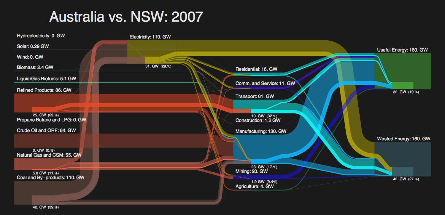
Whenever you want to show the flow of a quantity (such as energy or money) through a network of nodes you can use Sankey diagrams:

“A Sankey diagram is a directional flow chart where the width of the streams is proportional to the quantity of flow, and where the flows can be combined, split and traced through a series of events or stages.”
(source: CHEMICAL ENGINEERING Blog)

One area where this can be applied very well is that of costing. By modeling the flow of cost through a company one can analyze the aggregated cost and thus determine the profitability of individual products, customers or channels. Using the principles of activity-based costing one can create a cost-assignment network linking cost pools or accounts (as tracked in the General Ledger) via the employees and their activities to the products and customers. Such a Cost Flow can then be visualized using a Sankey diagram:

Cost Flow from Accounts via Expenses and Activities to Products

The direction of flow (here from left to right) is indicated by the color assignment from nodes to its outflowing streams. Note also the intuitive notion of zero-loss assignment: For each node the sum of the in- and outflowing streams (= height of that node) remains the same. Hence all the cost is accounted for, nothing is lost. If you stacked all nodes on top of one another they would rise to the same height. (Random data for illustration purposes only.)

The above diagram was created in Mathematica using modified source code originally from Sam Calisch who had posted it in 2011 here. Sam also included a “SankeyNotes.pdf” document explaining the details of the algorithms encoded in the source, such as how to arrange the node lists and how to draw the streams.

I find these a perfect example of how a manual drawing can go a long ways to illustrate the ideas behind an algorithm, which makes it a lot easier to understand and reuse the source code. Thanks to Sam for this code and documentation. Sam by the way used the code to illustrate the efficiency of energy use (vs. waste) in Australia:

Energy Flow comparison between New South Wales and Australia (Sam Calisch)

Note the sub-flows within each stream to compare a part (New South Wales) against the whole (Australia).

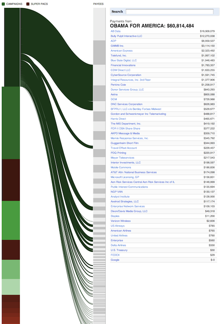
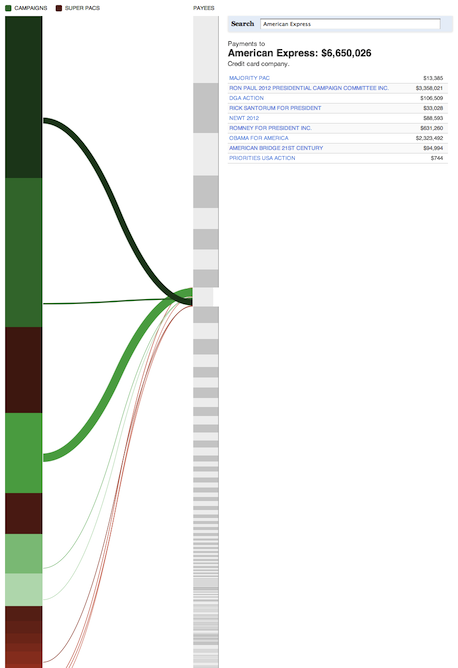
Another interesting use of Sankey Diagrams has been published a few weeks ago on ProPublica about campaign finance flow. This is particularly useful as it is interactive (click on image to get to interactive version).

Tangled Web of Campaign Finance Flow

Note the campaigns in green and the Super-PACs in brown color. The data is sourced from FEC and the New York Times Campaign Finance API. Note that in the interactive version you can click on any source on the left or any destination on the right to see the outgoing and incoming streams.

Finance Flow From Obama-For-America

Finance Flow to American Express

Here are some more examples. Sankey diagrams are also used in Google Flow Analytics (called Event Flow, Goal Flow, Visitor Flow). I wouldn’t be surprised to see Sankey Diagrams make their way into modern data visualization tools such as Tableau or QlikView, perhaps even into Excel some day… Here are some Visio shapes and links to other resources.

 
3 Comments

Posted by on May 14, 2012 in Financial, Industrial


Tags: , , ,

Quarterly Comparison: Apple, Microsoft, Google, Amazon

Quarterly Comparison: Apple, Microsoft, Google, Amazon

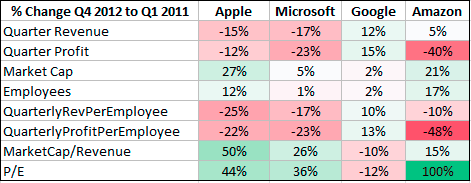
Last quarter we looked at the financials and underlying product & service portfolios of four of the biggest technology companies in the post “Side by Side: Apple, Microsoft, Google, Amazon“. With the recent reporting of results for Q1 2012 it is a good time to revisit this subject.

Comparison of Financials Q4 2011 and Q1 2012 for Apple, Microsoft, Google, and Amazon.

Market cap has grown roughly by 25% for both Apple and Amazon, whereas Microsoft and Google only added 5% or less. A sequential quarter comparison can be misleading due to seasonal changes, which impact different industries and business models in a different way. For example, Google’s ad revenue is somewhat less impacted by seasonal shopping than the other companies.

Sequential quarter comparison of financials

Apple and Microsoft seem to be impacted in a similar way by seasonal changes. For Amazon, which already has by far the lowest margin of all four companies, operating income decreased by 40% while it increased its headcount by 17%. This leads to much lower income per employee and with increased stock price to a doubling of its already very high P/E ratio. I’m not a stock market analyst, but Amazon’s P/E ratio of now near 200 seems extraordinarily high. By comparison, the other companies look downright cheap: Apple 8.8, Microsoft 10.5, Google 14.5

Horace Dediu from asymco.com has also revisited this topic in his post “Which is best: hardware, software, or services?“. What’s striking is that all three companies (except Amazon) now have operating margins between 30-40% – very high for such large businesses – with Apple taking the top near 40%. Over the last 5 years, Apple has doubled it’s margin (20% to 40%), whereas Microsoft (35-40%) and Google (30-35%) remained near their levels.

(Source: Asymco.com)

Long term the most important aspect of a business is not how big it has become, but how profitable it is. In that regard Amazon is the odd one out. Their operating income last quarter was about 1% of revenue. Amazon needs to move $100 worth of goods to earn $1. They employ 65,000 people and had revenue of $13.2b last quarter, yet only earned $130m during that time! Apple earns more money just with their iPad covers! Amazon’s strategy is to subsidize the initial Kindle Fire sale and hoping to make money on the additional purchases over the lifetime of the product. In light of these numbers, do you think Amazon has a future with it’s Kindle Fire tablet against the iPad?

But what really struck me about the extreme differences in profitability is this comparison of Apple and Microsoft product lines (source: @asymco twitter):

(source: @asymco twitter)

This shows what an impressive and sustained success the iPhone has been. And the iPad is on track to grow even faster. Horace Dediu guesses that Apple’s iPad will be a bigger profit generator than Windows in one quarter, and a bigger profit generator than Google (yes, all of Google) in three quarters. We will check on those predictions when the time comes…

 
3 Comments

Posted by on May 2, 2012 in Financial, Industrial


Tags: , , , , , ,

Side by Side: Apple, Microsoft, Google, Amazon

Side by Side: Apple, Microsoft, Google, Amazon

Ed Bott at ZDNet.com wrote a post with the title: Microsoft, Apple, and Google: where does the money come from? He looked at the quarterly reports of these companies (links to sources in the article) and displayed a pie-chart of the revenue mix for each of them. Inspired by that, I added a fourth company – Amazon (source: 10-K for 2011) – and aggregated those pie-charts into one graphic.

Revenue Mix for Apple, Microsoft, Google, and Amazon

All four are large consumer-oriented technology companies; like millions of customers, I use many of their products and services every day. They each operate with different businesses models:

  • Microsoft: Software
  • Apple: Hardware
  • Google: Advertising
  • Amazon: Retail

Yet as a consumer I rarely think about these differences. All of them use state-of-the-art technologies like cloud-computing and mobile devices to achieve integrated end-to-end experiences geared to increase revenues in personal computing (Microsoft), smart mobile devices (Apple), online search (Google) or shopping (Amazon). And arguably all of them derive major competitive advantage from their software, such as Apple’s iOS which introduced the touch interface.

Perhaps most surprising is Google’s almost singular reliance on advertising, which makes it a very different business model. They offer all their technology for free – from search to mapping to operating systems and social media – to grow and retain online attention as enabling condition for advertising revenue. For a business this big the near complete dependence on one source of revenue is unusual; perhaps its time for Google’s leadership to seriously consider a diversification strategy? Without it Google is arguably more prone to disruption (such as from Facebook) than the other companies. Speaking of disruption: Apple derives almost 3/4 of its revenue (73%) from iPhone and iPad, neither of which existed 5 years ago. As Ed Bott points out, those two products now drive an astonishing $33.5b revenue per quarter!

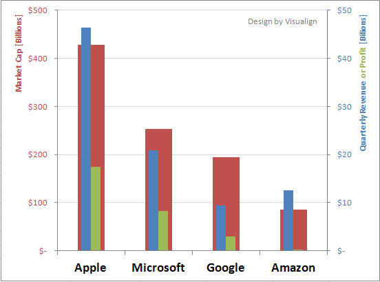
To compare the companies by their absolute numbers, here is a bar chart of market capitalization, revenue and profit: (all in billions of Dollars and for Q4 2011, market cap as of 2/3/12)

Market Cap, Revenue and Profit for Apple, Microsoft, Google, and Amazon

Market cap of these four companies combined is approaching $ 1 trillion. Much has been written about the differences in market valuations relative to revenue and most importantly profit. The markets undervalue Apple and overvalue Google and Amazon. Let’s compare these dimensions (and number of employees) in the following radar plot:

Relative business performance for Apple, Microsoft, Google, and Amazon

The plot shows the relative performance of all with the highest in each dimension normalized to 100%. Amazon shows by far the smallest profit in the last quarter. Given it’s retail nature, it’s profit margins have always been smaller; and CEO Jeff Bezos has long emphasized the strategy of investing in future growth at the expense of present profits. Microsoft continues to enjoy very solid profit margins in a large, well diversified business. Google has incredible talent and for now is the undisputed king of online advertising. But Apple leads in all three factors, and it achieves 2x Microsoft’s results with less than half the number of employees! Apple’s profit is 1.5 times that of the other three combined! And it makes more than 60% of the profit with less than 20% of the employees. In fact, Apple’s market capitalization is now higher than $10m per employee! It must feel pretty special to be one of them these days…

Postscript: On Feb-13 analyst Horace Dediu at Asymco.com published an article with time-series data for the above companies (except Amazon) over the last 18 quarters (since 2007). It shows the evolution over time as depicted in this chart:

Apple Microsoft Google - Revenue and Operating Income 2007-2011

The article is called “The World’s Biggest Startup“. It’s main point is this: Microsoft and Google both grew their businesses steadily, but did not change their type of business. Apple did some of that in its established business segments, but more importantly and disruptively it added new categories (iPhone and iPad) for dramatic growth. That’s what startups do. Just so happens that Apple – whose stock today for the first time hit $500 – is also the most highly capitalized company in the world (around $460B). If Apple is a startup now, what will they look like when they are fully established?

 
6 Comments

Posted by on February 6, 2012 in Financial, Industrial


Tags: , , , , , ,

Global Trends 2025

Global Trends 2025

If you like to do some big-picture thinking, here is a document put together by the National Intelligence Council and titled “Global Trends”. It is published every five years to analyze trends and forecast likely scenarios of worldwide development fifteen years into the future. The most recent is called “Global Trends 2025” and was published in November 2008. It’s a 120 page document which can be downloaded for free in PDF format here.

To get a feel for the content, here are the chapter headers:

  1. The Globalizing Economy
  2. The Demographics of Discord
  3. The New Players
  4. Scarcity in the Midst of Plenty?
  5. Growing Potential for Conflict
  6. Will the International System Be Up to the Challenges?
  7. Power-Sharing in a Multipolar World

From the NIC Global Trends 2025 project website:

Some of our preliminary assessments are highlighted below:

  • The whole international system—as constructed following WWII—will be revolutionized. Not only will new players—Brazil, Russia, India and China— have a seat at the international high table, they will bring new stakes and rules of the game.
  • The unprecedented transfer of wealth roughly from West to East now under way will continue for the foreseeable future.
  • Unprecedented economic growth, coupled with 1.5 billion more people, will put pressure on resources—particularly energy, food, and water—raising the specter of scarcities emerging as demand outstrips supply.
  • The potential for conflict will increase owing partly to political turbulence in parts of the greater Middle East.

As interesting as the topic may be, from a data visualization perspective the report is somewhat underwhelming. I counted just 5 maps and 5 charts in the entire document. The maps are interesting, such as the following on World Age Structure:

World Age Structure 2005

World Age Structure 2025 (Projected)

These maps show the different age of countries’ populations by geographical region. The Northern countries have less young people, and the aging trend is particularly strong for Eastern Europe and Japan. In 2025 almost all of the countries with very young population will be in Sub-Saharan Africa and the Arab Peninsula. Population growth will slow as a result; there will be approximately 8 billion people alive in 2025, 1 billion more than the 7 billion today.

In this day and age one is spoiled by interactive charts such as the Bubble-Charts of Gapminder’s Trendalyzer. Wouldn’t it be nice to have an interactive chart where you could set the Age intervals and perhaps filter in various ways (geographic regions, GDP, population, etc.) and then see the dynamic change of such colored world-maps over time? How much more insight would this convey about the changing demographics and relative sizes of age cohorts? Or perhaps display interactive population pyramids such as those found here by Jorge Camoes?

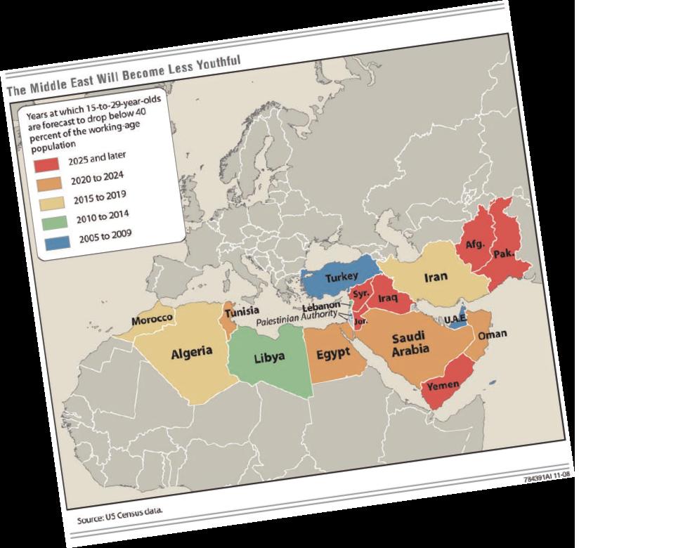
Another somewhat misguided ‘graphical angle’ are the slightly rotated graphics on the chapter headers. For example, Chapter 2 starts with this useful color-coded map of the Youth in countries of the Middle East. But why rotate it slightly and make the fonts less readable?

Youth in the Middle East (from Global Trends 2025 report)

I don’t want to be too critical; it’s just that reports put together with so much systematic research and focusing on long-range, international trends should employ more state-of-the-art visualizations, in particular interactive charts rather than just pages and pages of static text…

 
2 Comments

Posted by on January 4, 2012 in Industrial, Socioeconomic


Tags: , , ,

Underestimating Wealth Inequality

Underestimating Wealth Inequality

What are people’s perceptions about estimated, desirable and actual levels of economic inequality? Behavioral economist Dan Ariely from Duke University and Michael Norton from Harvard Business School conducted a survey of ~5,500 respondents across the United States to find out. Their survey asked questions about wealth inequality (as compared to income inequality), also known as net worth, essentially the value of all things owned minus all things owed (assets minus debt).

Addendum 3/9/2013: A recently posted 6min video illustrating these findings went viral (4 million+ views). It is worth watching:

The authors published the paper here and Dan Ariely blogged about it here in Sep 2010. One of the striking results is summarized in this chart of the wealth distribution across five quintiles:

From their Legend:

The actual United States wealth distribution plotted against the estimated and ideal distributions across all respondents. Because of their small percentage share of total wealth, both the ‘‘4th 20%’’ value (0.2%) and the ‘‘Bottom 20%’’ value (0.1%) are not visible in the ‘‘Actual’’ distribution.

It turned out that most respondents described a fairly equal distribution as the ideal – something similar to the wealth distribution in a country like Sweden. They estimated – correctly – that the U.S. has higher levels of wealth inequality. However, they nevertheless grossly underestimated the actual inequality, which is far higher still. Especially the bottom two quintiles are almost non-existent in the actual distribution. There was much more consensus than disagreement across groups from different sides of the political spectrum about this. From the current policy debates one would not have expected that. They go on to ask the question:

Given the consensus among disparate groups on the gap between an ideal distribution of wealth and the actual level of wealth inequality, why are more Americans, especially those with low income, not advocating for greater redistribution of wealth?

In the last chapter of their paper the authors offer several explanations of this phenomenon. One of them is the observation that the apparent drastic under-estimation of the degree of inequality seems to reveal a lack of awareness of the size of the gap. This is something that Data Visualization and interactive charts can help address. For example, Catherine Mulbrandon’s Blog Visualizing Economics does a great job in that regard.

The authors go on to look at other aspects from the perspective of psychology and behavioral economics. While fascinating in its own right, this excursion is beyond the scope of my Data Visualization Blog. They conclude their paper with general observations

…suggesting that even given increased awareness of the gap between ideal and actual wealth distributions, Americans may remain unlikely to advocate for policies that would narrow this gap.

 
2 Comments

Posted by on December 12, 2011 in Socioeconomic


Tags: , , ,

The Observatory of Economic Complexity

The Observatory of Economic Complexity

In this second part we will look at the online interactive visualizations as a companion to the first part’s Atlas of Economic Complexity. It’s interesting that the authors chose the title “Observatory”, as if to convey that with a good (perhaps optical) instrument you can reveal otherwise hidden structure. To repeat one of the fundamental tenets of this Blog: Interactive graphics allow the user to explore data sets and thus to develop a better understanding of the structure and potentially create otherwise inaccessible insights. This is a good example.

The two basic dimensions for exploration of trade data are products and countries. The most recent world trade data is from 2009 and it ranges back between 20 to 50 years (varying by country). I worked with three types of charts: TreeMaps, Stacked Area Charts, and the Product Space network diagram. Let’s start with Germany’s Exports in 2009:

Hovering the cursor over a node highlights it’s details, here “Printing Presses”, a product type where Germany enjoys a high degree of Revealed Comparative Advantage (RCA). (For details on RCA or any other aspects of the product space concept and network diagram, please see the previous post on the Atlas of Economic Complexity.) We can now explore which other countries are exporting printing presses:

While Germany clearly dominates this world market with 55% at $2.7b in 2009 with RCA = 5.6, the time slider at the bottom (with data since 1975) reveals that it has actually held an even bigger lead for most of the last 35 years. For example, with it’s exports in Printing Presses Germany commanded 72% at 3.7b in 2001 with RCA = 6.3 From the timeline one can also see how the United States captured about 20% of this (then much smaller) market for a brief period between 1979 and 1983. During this time its RCA for Printing Presses was just a bit above 1.0 – which shows as a black square in the Product Space – but the United States has since lost this advantage and not seen any significant exports in this product type. Printing Presses being a fairly complex product, only a handful of countries are exporting them, almost all of them European and Japan. There might be an interesting correlation between complexity and inequality, as the capabilities for the production of complex products tend to cluster in a few countries worldwide which then dominate world exports accordingly.

Another powerful instrument are Stacked Area Charts. Here you can see how a country’s Imports or Exports evolve over time, either in terms of absolute value or relative share of product types. For example, let’s look at the last 30 years (1978-2008) of Export data for the United States:

This GIF file (click if not animated) shows several frames. In Value display style one can see the absolute size and how Exports grew roughly 10-fold from about $100b to $1t over the course of those 30 years. The Share display style focuses on relative size, with all Exports always representing 100%. In the Observatory one can hover over any product type and thus highlight that color band to see the evolution of this product type’s Exports over time. In the highlighted example here, we can see how ‘Cereal and Vegetable Oil’ (yellow band) shrank from around 15% in the late seventies to around 5% since the late nineties. ‘Chemicals and Health Related Products’ (purple band) has remained more or less constant around a 10% Export share. ‘Electronics’ bloomed in the mid eighties from less than 10% to 15-20% and stayed on the high end of that range until around the year 2000 before shrinking in the last decade down to about 10%.

As a final example, look at the relative size of imports of the United States over the last 40 years, (1968 – 2008, sorted by final value):

The biggest category is crude petroleum products at the bottom. During the two oil shocks in the seventies the percentage peaked near 30% of all imports. Then it went down and stayed below 10% between 1985 – 2005. Since then it’s percentage has been steadily rising and reached about 15% again. (The data isn’t enough up-to-date to illustrate the impact of the 2008 recession.) Such high expenses are crowding out other categories. When the consumer pays more at the pump there is less to spend for other product types. Another interesting aspect of this last chart is that the bottom two bands represent opposite ends of the product complexity spectrum: Petroleum (brown) on the low end, cars (blue) on the high end.

As always, the real power of interactive visualizations comes from interacting with them. So I encourage you to explore these data at the Observatory of Economic Complexity.

Caveats: I noticed a couple of minor areas which seem to be either incomplete, counter-intuitive, poor design choices or simply implementation bugs. To start, there is no help or documentation of the visualization tool itself. Many of the diagram types on the left are grayed out and it is not always apparent what selection of products, countries or chart type will enable certain subselections. For example, there is a chart type “Predictive Tools” with two subtypes “Density Bars” and “Stepping Stone” that always seem to be grayed out? The same applies to Maps (presumably geographic maps) – all subtypes are grayed out. Perhaps I am missing something – would appreciate any comments if that’s the case.

In the TreeMaps for import and export one can not see the overall value of the overall trade (top-level rectangle) or any of the categories (second-level rectangles). Only the tooltips will show the value of a specific product type or country (third-level rectangle). The color legend is designed for the product space and designates the 34 communities of product types. When you hover the mouse over one product type, say garments (in green), then all imports / exports other than that product type are grayed out. When you show a product import / export chart, however, those same colors are used to designate groups of countries with color indicating continents (blue for Europe, red for the Americas, green for Asia etc.). Yet when you hover over the product icon in the legend (say garment), then only it’s corresponding color’s countries remains highlighted, which doesn’t make sense and can be misleading.
When you play the timeline in a TreeMap, the frequent change in layout can be confusing. A change from one year to the next played back and forth slowly or multiple times can be instructive, but a quick series of too many changes (particularly without seeing the labels) is just confusing.

In the stacked area charts when you click on Build Visualization it always comes up in “Value” style, even if “Share” is selected. To get to the Share style, you have to select Value and then Share again.

TreeMaps and Stacked Area Charts critically depend on the availability of data for all products / countries displayed. For years before 1990 there appear to be pockets of only sparsely available data, which then falsely suggests world market dominance of those products or countries. For example, the TreeMap for Imports in Printing Presses for 1983 shows the United States with 97% taking practically the entire market. In 1984, it’s share shrinks to a more balanced 28% despite growing very rapidly; simply because data for other countries from Europe, Asia etc. seems to not be available prior to 1984. In such cases it would have been better to show the rest as gray rectangle instead of leaving it out (if world import data are available) or just not display any chart for years with grossly incomplete data.

Navigation is somewhat limited. For example, looking at a country chart (say United Kingdom), it would be great to click on any product type (say crude petroleum) and get to a corresponding Stacked Area Chart diagram for that product type. One can do so using the drop-down boxes on the right, but that’s less intuitive.

There are two export formats (PDF and SVG). The vector graphics is a good choice since the fonts can be rendered fine even in the small print. I obtained poor results with PDF, however, as often the texts in TreeMaps were not aligned properly and printed on top of one another.

None of the above is a serious problem or even a showstopper. It would be great, however, if there was a feedback link to provide such info back to the authors and help improve the utility of this observatory.

 
1 Comment

Posted by on November 14, 2011 in Industrial, Scientific, Socioeconomic


Tags: , ,

The Atlas of Economic Complexity

The Atlas of Economic Complexity

Here is a recipe: Bring together renowned faculties like the MIT Media Lab and Harvard’s Center for International Development. Combine novel ideas about economic measures with years of solid economic research. Leverage large sets of world trade data. Apply network graph theory algorithms and throw in some stunning visualizations. The result: The Atlas of Economic Complexity, a revolutionary way of looking at world trade and understanding variations in countries paths to prosperity.

The main authors are Professors Ricardo Hausmann from Harvard and Cesar Hidalgo from MIT (whose graphic work on Human Development Indices we have reviewed here). The underlying research began in 2006 with the idea of the product space which was published in Science in 2007. This post is the first in a two-part series covering both the atlas (theory, documentation) as well as the observatory (interactive visualization) of economic complexity. This research is an excellent example of how the availability of large amounts of data, computing power and free distribution via the Internet enable entirely new ways of looking at and understanding our world.

The Atlas of Economic Complexity is rooted in a set of ideas about how to measure economies based not just on the quantity of products traded, but also on the required knowledge and capabilities to produce them. World Trade data allows us to measure import and export product quantities directly, leading to indicators such as GDP, GDP per capita, Growth of GDP etc. However, we have no direct way to measure the knowledge required to create the products. A central observation is that complex products require more capabilities to produce, and countries who manufacture more complex products must possess more of these capabilities than others who do not. From Part I of the Atlas:

Ultimately, the complexity of an economy is related to the multiplicity of useful knowledge embedded in it. For a complex society to exist, and to sustain itself, people who know about design, marketing, finance, technology, human resource management, operations and trade law must be able to interact and combine their knowledge to make products. These same products cannot be made in societies that are missing parts of this capability set. Economic complexity, therefore, is expressed in the composition of a country’s productive output and reflects the structures that emerge to hold and combine knowledge.

Can we analyze world trade data in such a way as to tease out relative rankings in terms of these capabilities?

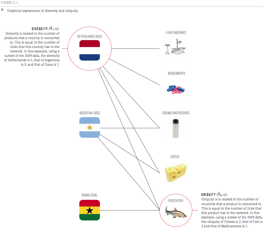
To this end, the authors start by looking at the trade web of countries exporting products. For each country, they examine how many different products it is capable of producing; this is called the country’s Diversity. And for each product, they look at how many countries can produce it; this is called the product’s Ubiquity. Based on these two measures, Diversity and Ubiquity, they introduce two complexity measures: The Economic Complexity Index (ECI, for a country) and the Product Complexity Index (PCI, for a product).

The mechanics of how these measures are calculated are somewhat sophisticated. Yet they encode some straightforward observations and are explained with some examples:

Take medical imaging devices. These machines are made in few places, but the countries that are able to make them, such as the United States or Germany, also export a large number of other products. We can infer that medical imaging devices are complex because few countries make them, and those that do tend to be diverse. By contrast, wood logs are exported by most countries, indicating that many countries have the knowledge required to export them. Now consider the case of raw diamonds. These products are extracted in very few places, making their ubiquity quite low. But is this a reflection of the high knowledge-intensity of raw diamonds? Of course not. If raw diamonds were complex, the countries that would extract diamonds should also be able to make many other things. Since Sierra Leone and Botswana are not very diversified, this indicates that something other than large volumes of knowledge is what makes diamonds rare.

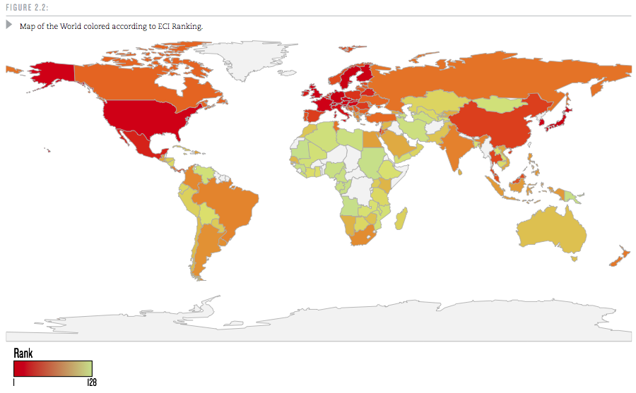
A useful question is this: If a good cannot be produced in a country, where else can it be produced? Countries with higher economic complexity tend to produce more complex products which can not easily be produced elsewhere. The algorithms are specified in the Atlas, but we will skip over these details here. Let’s take a look at the ranking of some 128 world countries (selected above minimum population size and trade volume as well as for reliable trade data availability).

Why is Economic Complexity important? The Atlas devotes an entire chapter to this question. The most important finding here is that ECI is a better predictor of a country’s future growth than many other commonly used indicators that measure human capital, governance or competitiveness.

Countries whose economic complexity is greater than what we would expect, given their level of income, tend to grow faster than those that are “too rich” for their current level of economic complexity. In this sense, economic complexity is not just a symptom or an expression of prosperity: it is a driver.

They include a lot of scatter-plots and regression analysis measuring the correlation between the above and other indicators. Again, the interested reader is referred to the original work.

Another interesting question is how Economic Complexity evolves. In some ways this is like a chicken & egg problem: For a complex product you need a lot of capabilities. But for any capability to provide value you need some products that require it. If a new product requires several capabilities which don’t exist in a country, then starting the production of such a product in the country will be hard. Hence, a country’s products tend to evolve along the already existing capabilities. Measuring the similarities in required capabilities directly would be fairly complicated. However, as a first approximation, one can deduce that products which are more often produced by the same country tend to require similar capabilities.

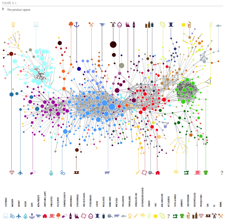
So the probability that a pair of products is co-exported carries information about how similar these products are. We use this idea to measure the proximity between all pairs of products in our dataset (see Technical Box 5.1 on Measuring Proximity). The collection of all proximities is a network connecting pairs of products that are significantly likely to be co-exported by many countries. We refer to this network as the product space and use it to study the productive structure of countries.

Then the authors proceed to visualize the Product Space. It is a graph with some 774 nodes (products) and edges representing the proximity values between those nodes. Only the top 1% strongest proximity edges are shown to keep the average degree of the graph below 5 (showing too many connections results in visual complexity). Network Science Algorithms are used to discover the highly connected communities into which the products naturally group. Those 34 communities are then color-coded. Using a combination of Minimum-Spanning-Tree and Force-Directed layout algorithms the network is then laid out and manually optimized to minimize edge crossings. The resulting Product Space graph looks like this:

Here the node size is determined by world trade volume in the product. If you step back for a moment and reflect on how much data is aggregated in such a graph it is truly amazing! One variation of the graph determines size by the Product Complexity as follows:

In this graph one can see that products within a community are of similar complexity, supporting the idea that they require similar capabilities, i.e. have high proximity. From these visualizations one can now analyze how a country moves through product space over time. Specifically, in the report there are graphs for the four countries Ghana, Poland, Thailand, and Turkey over three points in time (1975, 1990, 2009). From the original document I put together a composite showing the first two countries, Ghana and Poland.

While Ghana’s ECI doesn’t change much, Poland grows into many products similar to those where they started in 1975. This clearly increases Poland’s ECI and contributes to the strong growth Poland has seen since 1975. (Black squares show products produced by the country with a Revealed Comparative Advantage RCA > 1.0.)

In all cases we see that new industries –new black squares– tend to lie close to the industries already present in these countries. The productive transformation undergone by Poland, Thailand and Turkey, however, look striking compared to that of Ghana. Thailand and Turkey, in particular, moved from mostly agricultural societies to manufacturing powerhouses during the 1975-2009 period. Poland, also “exploded” towards the center of the product space during the last two decades, becoming a manufacturer of most products in both the home and office and the processed foods community and significantly increasing its participation in the production of machinery. These transformations imply an increase in embedded knowledge that is reflected in our Economic Complexity Index. Ultimately, it is these transformations that underpinned the impressive growth performance of these countries.

The Atlas goes on to provide rankings of countries along five axes such as ECI, GDP per capita Growth, GDP Growth etc. The finding that higher ECI is a strong driver for GDP growth allows for predictions about GDP Growth until 2020. In that ranking there are Sub-Saharan East Africa countries on the top (8 of the Top 10), led by Uganda, Kenya and Tanzania. Here is the GDP Growth ranking in graphical form – the band around the Indian Ocean is where the most GDP Growth is going to happen during this decade.

Each country has its own Product Space map. It shows which products and capability sets the country already has, which other similar products it could produce with relatively few additional capabilities and where it is more severely lacking. As such it can provide both the country or a multi-national firm looking to expand with useful information. The authors sum up the chapter on how this Atlas can be used as follows:

A map does not tell people where to go, but it does help them determine their destination and chart their journey towards it. A map empowers by describing opportunities that would not be obvious in the absence of it. If the secret to development is the accumulation of productive knowledge, at a societal rather than individual level, then the process necessarily requires the involvement of many explorers, not just a few planners. This is why the maps we provide in this Atlas are intended for everyone to use.

We will look at the rich visualizations of the data sets in this Atlas in a forthcoming second installment of this series.

 
6 Comments

Posted by on November 10, 2011 in Industrial, Scientific, Socioeconomic


Tags: , , ,

TreeMap of the Market

TreeMap of the Market

SmartMoney has an interactive visual tool on their website called “Map of the Market”. It is an application of the TreeMap concept developed by Ben Shneiderman which I have blogged about before here.

The map lets you watch more than 500 stocks at once, with data updated every 15 minutes. Each colored rectangle in the map represents an individual company. The rectangle’s size reflects the company’s market cap and the color shows price performance. (Green means the stock price is up; red means it’s down. Dark colors are neutral). Move the mouse over a company rectangle and a little panel will pop up with more information.

Map Of The Market (Source: SmartMoney website)

For example, the above map shows the 26 week performance with the Top 5 Losers highlighted (hovered over RIMM). More information from the corresponding Map Instructions page.

This map is also quite similar in concept to the StockTouch iPad app which I covered here. StockTouch displays 900 companies, grouped into 9 sectors. The above Map of the Market is a free service, with an available upgrade to one showing 1000 companies for a subscription fee. While interesting in its own right, however, this is not about the business model of how to monetize the use of such information.

It might be interesting to put together a time-lapse video showing this map for every close of business day throughout one year. Not only would one see the up and down movement by color, but also the gradual shifts in the cumulative size of various sectors due to the area in the tree map.

Another fascinating set of tree map uses is on display at the Gallery of the Hive Group website. Their interactive tree map product HoneyComb has been used in many different industries. The Gallery shows many examples, ranging from sales performance to manufacturing / quality applications to public interest uses such as browsing Olympic Games results or data on Earthquakes. See the following example screenshot (click to interact on the Hive Group website):

TreeMap of Earthquakes (Source: HiveGroup)

While you won’t get the full benefit of seeing the details of all 540 items in one view, you can filter using the panel controls on the right or change the grouping and size and color attributes. This shows for example that the most powerful earthquakes are generally not the most deadly ones and vice versa.

Interacting with these sample tree maps again drives home the fundamental notion that interactive visualizations lead to quicker grasp and better understanding of data sets. This is similar to how walking around and seeing an object from different perspectives gives you a better idea of it’s 3-D structure than seeing it just in one 2-D picture. With multiple ways of interacting it feels almost as if you’re walking inside the data set to see it from multiple angles and perspectives. You have to do it yourself to appreciate the difference it makes.

Lastly, a good article on some of the pitfalls of tree map design with lots of links to good/bad examples comes from the folks at Juice Analytics in their Blog post titled “10 lessons in Treemap Design“.

 
4 Comments

Posted by on October 29, 2011 in Financial, Industrial


Tags: , ,

 
%d bloggers like this: