
A year ago we looked at Global Trends 2025, a 2008 report by the National Intelligence Commission. The 120 page document made surprisingly little use of data visualization, given the well-funded and otherwise very detailed report.
By contrast, at the recent World Economic Forum 2013 in Davos, the Risk Response Network published the eighth edition of its annual Global Risks 2013 report. Its focus on national resilience fits well into the “Resilient Dynamism” theme of this year’s WEF Davos. Here is a good 2 min synopsis of the Global Risks 2013 report.
We will look at the abundant use of data visualization in this work, which is published in print as an 80-page .pdf file. The report links back to the companion website, which offers lots of additional materials (such as videos) and a much more interactive experience (such as the Data Explorer). The website is a great example of the benefits of modern layout, with annotations, footnotes, references and figures broken out in a second column next to the main text.

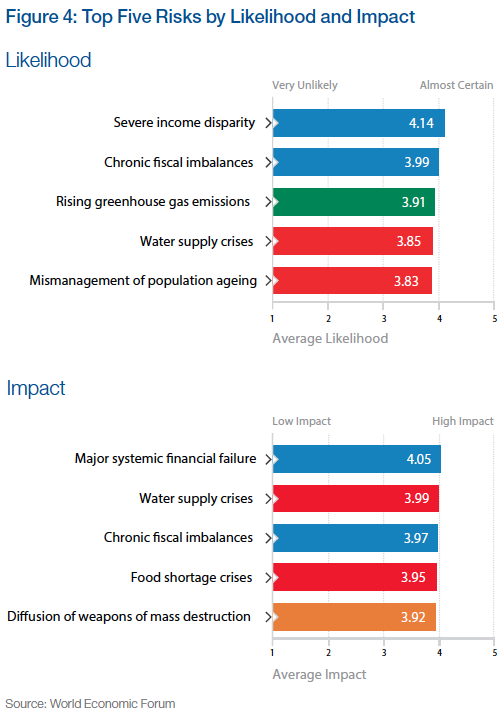
One of the main ways to understand risks is to quantify it in two dimensions, namely its likelihood and its impact, say on a scale from 1 (min) to 5 (max). Each risk can then be visualized by its position in the square spanned by those two dimensions. Often risk mitigation is prioritized by the product of these two factors. In other words, the further right and/or top a risk, the more important it becomes to prepare for or mitigate it.
This work is based on a comprehensive survey of more than 1000 experts worldwide on a range of 50 risks across 5 broad categories. Each of these categories is assigned a color, which is then used consistently throughout the report. Based on the survey results the report uses some basic visualizations, such as a list of the top 5 risks by likelihood and impact, respectively.
Source for all figures: World Economic Forum (except where noted otherwise)
When comparing the position of a particular risk in the quadrant with the previous year(s), one can highlight the change. This is similar to what we have done with highlighting position changes in Gartner’s Magic Quadrant on Business Intelligence. Applied to this risk quadrant the report includes a picture like this for each of the five risk categories:

This vector field shows at a glance how many and which risks have grown by how much. The fact that a majority of the 50 risks show sizable moves to the top right is of course a big concern. Note that the graphic does not show the entire square from 1 through 5, just a sub-section, essentially the top-right quadrant.
On a more methodical note, I am not sure whether surveys are a very reliable instrument in identifying the actual risks, probably more the perception of risks. It is quite possible that some unknown risks – such as the unprecedented terrorist attacks in the US on 9/11 – outweigh the ones covered here. That said, the wisdom of crowds tends to be a good instrument at identifying the perception of known risks.
Note the “Severe income disparity” risk near the top-right, related to the phenomenon of economic inequality we have looked at in various posts on this Blog (Inequality and the World Economy or Underestimating Wealth Inequality).
A tabular form of showing the top 5 risks over the last seven consecutive years is given as well: (Click on chart for full-resolution image)

This format provides a feel for the dominance of risk categories (frequency of colors, such as impact of blue = economic risks) and for year over year changes (little change 2012 to 2013). The 2011 column on likelihood marks a bit of an outlier with four of five risks being green (= environmental) after four years without any green risk in the Top 5. I suspect that this was the result of the broad global media coverage after the April 2011 earthquake off the coast of Japan, with the resulting tsunami inflicting massive damage and loss of lives as well as the Fukushima nuclear reactor catastrophe. Again, this reinforces my belief that we are looking at perception of risk rather than actual risk.
Another aggregate visualization of the risk landscape comes in the form of a matrix of heat-maps indicating the distribution of survey responses.

The darker the color of the tile, the more often that particular likelihood/impact combination was chosen in the survey. There is a clear positive correlation between likelihood and impact as perceived by the majority of the experts in the survey. From the report:
Still it is interesting to observe how for some risks, particularly technological risks such as critical systems failure, the answers are more distributed than for others – chronic fiscal imbalances are a good example. It appears that there is less agreement among experts over the former and stronger consensus over the latter.
The report includes many more variations on this theme, such as scatterplots of risk perception by year, gender, age, region of residence etc. Another line of analysis concerns the center of gravity, i.e. the degree of systemic connectivity between risks within each category, as well as the movement of those centers year over year.
Another set of interesting visualizations comes from the connections between risks. From the report:


Finally, the survey asked respondents to choose pairs of risks which they think are strongly interconnected. They were asked to pick a minimum of three and maximum of ten such connections.
Putting together all chosen paired connections from all respondents leads to the network diagram presented in Figure 37 – the Risk Interconnection Map. The diagram is constructed so that more connected risks are closer to the centre, while weakly connected risks are further out. The strength of the line depends on how many people had selected that particular combination.
529 different connections were identified by survey respondents out of the theoretical maximum of 1,225 combinations possible. The top selected combinations are shown in Figure 38.
It is also interesting to see which are the most connected risks (see Figure 39) and where the five centres of gravity are located in the network (see Figure 40).
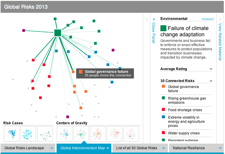
One such center of gravity graph (for geopolitical risks) is shown here: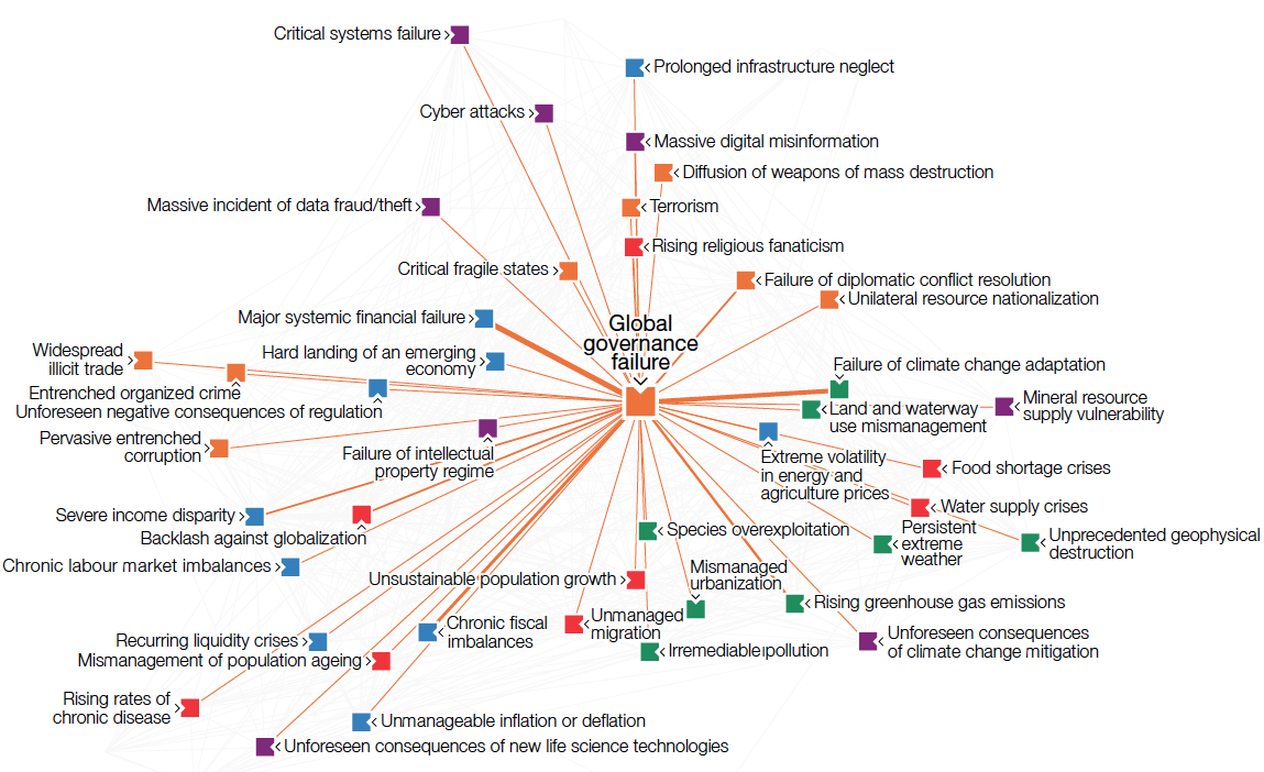
The Risk Interconnection Map puts it all together:

Such fairly complex graphs are more intuitively understood in an interactive format. This is where the online Data Explorer comes in. It is a very powerful instrument to better understand the risk landscape, risk interconnections, risk rankings and national resilience analysis. There are panels to filter, the graphs respond to mouse-overs with more detail and there are ample details to explain the ideas behind the graphs.
There are many more aspects to this report, including the appendices with survey results, national resilience rankings, three global risk scenarios, five X-factor risks, etc. For our purposes here suffice it to say that the use of advanced data visualizations together with online exploration of the data set is a welcome evolution of such public reports. A decade ago no amount of money could have bought the kind of interactive report and analysis tools which are now available for free. The clarity of the risk landscape picture that’s emerging is exciting, although the landscape itself is rather concerning.


