Processes of Growth and Decay abound in natural and economic systems. Growth processes determine biological structure and pattern formation, selection of species or ideas, the outcome of economic competition and of savings in financial portfolios. In this post we will examine a few different types of quantitative growth / decay and their qualitatively different outcomes.
Growth
In the media we often hear about nonlinear, exponential, or explosive growth as popular references to seemingly unstoppable increases. Buzzwords like “tipping point” or “singularity” appear on book titles and web sites. Mathematical models can help analytical understanding of such dynamic processes, while visualization can support a more intuitive understanding.
Let’s look three different growth processes: Linear, exponential, and hyperbolic (rows below) by specifically considering three different quantities (columns below):
The absolute amount (as a function of time),
the absolute rate of increase (derivative of that function), and
the relative rate of increase (relative to the amount)
Linear growth (blue lines) is the result of a constant rate or increment per time interval. The relative rate (size of increment in relation to existing quantity) is decreasing to zero.
Exponential growth (red lines) is the result of a linearly growing rate or increment per time interval. The relative rate is a constant. Think accrual of savings with fixed interest rate. Urban legend has it that Albert Einstein once declared compound interest – an exponential growth process – to be “the most powerful force in the universe”. Our intuition is ill-suited to deal properly with exponential effects, and in many ways it seems hard to conceive of even faster growth processes. However, even with exponential growth it takes an infinite time to reach an infinitely large amount.
Hyperbolic growth (brown lines) is the result of a quadratically growing rate. In this type of growth even the relative rate is increasing. This can be caused by auto-catalytic effects, in other words, the larger the amount, the larger the growth of the rate. As a result, such growth leads to infinite values at a finite value of t – also called a discontinuity or singularity.
When multiple entities grow and compete for limited resources, their growth will determine the outcome as a distribution of the resource as follows:
- Linear growth leads to coexistence of all competitors; their ratios determined by their linear growth rates.
- Exponential growth leads to reversible selection of a winner (with the highest relative growth rate). Reversible since a competitor with a higher relative growth rate will win, regardless of when it enters the competition.
- Hyperbolic growth leads to irreversible selection of a winner (first to dominate). Irreversible since the relative growth rate of the dominant competitor dwarfs that of any newcomer.
Such processes have been studied in detail in biology (population dynamics, genetics, etc.) It’s straightforward to imagine the combination of random fluctuations, exponential (or faster) growth and ‘Winner-take-all’ selection as the main driving processes of self-organized pattern formation in biology, such as in leopard spots or zebra stripes, all the way to the complex structure-formation process of morphogenesis and embryology.
Yet such processes tend to also occur in economics. For example, the competition for PC operating system platforms was won by Microsoft’s Windows due to the strong advantages of incumbents (applications, tools, developers, ecosystem, etc.) Similar effects can be seen with social networks, where competitors (like FaceBook) become disproportionately stronger as a result of the size of their network. I suspect that it also plays a central role in the evolution of inequality, which can be viewed as the dynamic formation of structure (viewed as the unequal allocation of wealth across a population).
Two popular technology concepts owe their existence to nonlinear growth processes:
- Exponential Growth: The empirical Moore’s Law states that computer power doubles every 18 months or so (similar for storage capacity, transistors on chips and network bandwidth). This allows us to forecast fairly accurately when machines will have certain capacities which seem unimaginable only a few decades earlier. For example, computer power increases by a factor of 1000 in only 15 years, or a million-fold in 30 years or the span of just one human generation!
- Hyperbolic Growth: Futurist Ray Kurzweil has observed that the doubling period of many aspects of our knowledge society is shrinking. From this observation of an “ever-accelerating rate of technological change” he concludes in his latest book that “The Singularity Is Near“, with profound technological and philosophical implications.
In many cases, empirical growth observations and measurements can be compared with mathematical models to either verify or falsify hypothesis about the underlying mechanisms controlling the growth processes. For example, world population growth has been tracked closely. To understand the strong increase of world population as a whole over the last hundred years or so one needs to look at the drivers (birth and mortality rates) and their key influencing factors (medical advances, agriculture). Many countries still have high birth rates, while medical advances and better farming methods have driven down the mortality rates. As a result, population has grown exponentially for many decades. (See also the wonderful 2min video visualization of this concept linked to from the previous post on “7 Billion“.) Short of increasing the mortality rate, it is evident that population stabilization (i.e. reduction of growth to zero) can only be achieved by reducing the birth rate. This in turn influences the policy debates, for example to empower women so they have less children (better education and economic prospects, access to contraception, etc.). Here is a graphic on world population growth rates:
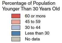
Compare this to the World maps showing population age structure in the Global Trends 2025 post. There is a strong correlation between how old a population is and how high the birth rates are. (Note Africa standing out in both graphs.)
Decay
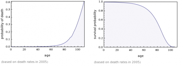
Conversely one can study processes of decay or decline, again with qualitatively different outcomes for given rates of decline such as linear or exponential. One interesting, mathematically inspired analysis related to decay processes comes from the ‘Gravity and Levity’ Blog in the post “Your body wasn’t built to last: a lesson from human mortality rates“. The article starts out with the observation that our likelihood of dying say in the next year doubles every 8 years. Since the mortality rate is increasing exponentially, the likelihood of survival is decreasing super-exponentially. The empirical data matches the rates forecast by the Gompertz Law of mortality almost perfectly.
If the death rate were to grow exponentially – i.e. with a fixed increase per time interval – the resulting survival probability would follow an exponential distribution. If, however, the death rate is growing super-exponentially – i.e. with a doubling per fixed time interval – the survival probability follows a Gompertz distribution.
Lets look at a table similar to the above, this time contrasting three decay processes (rows below): Linear, Exponential, Super-Exponential. (Again we consider the amount, absolute rate and relative rate (columns below) as follows (constants chosen to match initial condition F[0] = 1):
The linear decay (blue lines) is characterized by a constant rate and reaches zero at a time proportional to the initial amount, at which the relative rate has a discontinuity.
The exponential decay (red lines) is characterized by a constant relative rate and thus leads to a steady, but long-lasting decay (like radio-active decay).
The super-exponential decay (brown lines) leads to the amount following a Gompertz distribution (matching the shape of the US survival probability chart above). For a while the decay rate remains very small near zero. Then it ramps up quickly and leads to a steep decline in the amount, which in turn reduces the rate down as well. The relative rate keeps growing exponentially.
The above linked article goes on to analyze two hypotheses on dominant causes of human death: The single lightning bolt and the accumulated lightning bolt model. If the major causes of death were singular or cumulative accidents (like lightning bolts or murders), the resulting survival probability curves would have a much longer tail. In other words, we would see at least some percentage of human beings living to ages beyond 130 or even 150 years. Since such cases are practically never observed, the underlying process must be different and the lightning bolt model is not able to explain human mortality.
Instead, a so called “cops and criminals” model is proposed based upon biochemical processes in the human body. “Cops” are cells who patrol the body and eliminate bad mutations (“criminals”) which when unchecked can lead to death. From the above post:
The language of “cops and criminals” lends itself very easily to a discussion of the immune system fighting infection and random mutation. Particularly heartening is the fact that rates of cancer incidence also follow the Gompertz law, doubling every 8 years or so. Maybe something in the immune system is degrading over time, becoming worse at finding and destroying mutated and potentially dangerous cells.
Unfortunately, the full complexity of human biology does not lend itself readily to cartoons about cops and criminals. There are a lot of difficult questions for anyone who tries to put together a serious theory of human aging. Who are the criminals and who are the cops that kill them? What is the “incubation time” for a criminal, and why does it give “him” enough strength to fight off the immune response? Why is the police force dwindling over time? For that matter, what kind of “clock” does your body have that measures time at all?
There have been attempts to describe DNA degradation (through the shortening of your telomeres or through methylation) as an increase in “criminals” that slowly overwhelm the body’s DNA-repair mechanisms, but nothing has come of it so far. I can only hope that someday some brilliant biologist will be charmed by the simplistic physicist’s language of cops and criminals and provide us with real insight into why we age the way we do.
A web calculator for death and survival probability based on Gompertz Law can be found here.


