
Half a year ago my wife bought me the Suunto Ambit multi-function sport watch and heart rate monitor. It is a fantastic device, with very precise GPS, lots of add-on functionality and an interesting online portal and community.
There is some configuration and setup involved, such as pairing the Ambit with your heart rate belt and in the case of cycling with a cadence pod. You charge the batteries by plugging it into a USB port, which is also the way how you upload the data form the device to your computer or a website.
While the device itself and its programmability is quite advanced, I want to focus here on the associated online portal called Movescount.com where you can upload and visualize all your data for free – and share it with friends or the community if you’re so inclined. This amount of personal data collecting and analyzing is a fairly recent phenomenon, often referred to as Personal Analytics.
Each recorded session with the Suunto can be uploaded and classified into one of many sports, such as hiking, cycling, basketball, or indoor exercise. Each session is called a move, and with the portal you can collectively visualize all your moves. The current theme at movescount.com has a black background with mostly orange bars and charts. One of the first controls to organize your moves is either a list or a calendar control.

Calendar Control for Moves
This already gives you a good overview over the type of sports activities and the distribution over weekday and weekends. A summary display is available in various forms, such as the following simple bar charts.

Summary information about heart rate zones
Another display format summarizes your selected moves, such as all moves in a particular month together with commensurate calorie consumption and breakdown of hours by type of move.

Moves Summary Display
You can now select either a single or multiple moves (or group by the type of move) and display more information about this particular move. Note the x-axis can be set to display either distance or time and one can zoom in on any part of the entire recorded move. One can alos overlay multiple measures in the same chart by selecting more than one factor, although I find this to lead to very busy and confusing charts.
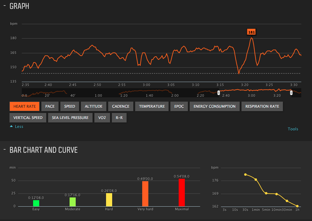
Graph and BarChart details per move
There are many individual measurements available for display, some based on individual sensors (like heart rate or GPS location or temperature or altitude / air pressure), others based on calculations and estimates (such as speed, recovery parameter “R&R”, EPOC or VO2).
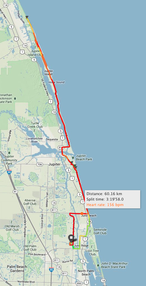
Of particular interest to me as a cyclist is the ability to overlay the GPS-track on a Google map. Not only is it a very detailed recording of the route, but it is color-coded based on the currently selected measure. For example, the color-range shows the heart rate in the same colors as the above bar charts. One can clearly see where one is just warming up at the beginning (low heart rate, green color) or where one is riding up “into the red”, i.e. towards the limits of one’s own heart rate. Selecting points along the route displays some information about that particular point of the ride.
One interesting feature would be a time-geo correlation of any portable photo camera when taking pictures along the ride. Based on synchronized time one could then easily geo-code the photos even without any GPS capability within the camera itself.
The Suunto Ambit can do a lot more, including customizing the display mode and storing your configurations in so-called apps. One idea I have for this is to display an estimate of the total calorie consumption for a known route when continuing at the current pace (but I haven’t played with the programming yet). The Ambit seems to be particularly well suited to hiking, mountain biking or skiing due to its altimeter; however I don’t get to leverage that in flat Florida. Only the few bridges over the Intracoastal waterway show up as bumps in the vertical – with the corresponding acceleration of the heart rate on the uphill side.
One of the downsides is the fact that the heart rate sensor worn around the chest does not work in the water. Hence any swimming in the Ocean or the pool can not be measured precisely. (I replace the measurements with estimates.) And sure enough, just recently Suunto announced the new Ambit 2, which overcomes this limitation. Such is the world of new electronic toys, that the half-life of their innovation is getting shorter and shorter.

Bubble Chart of set of rides
Measures in Bubble Chart
One last chart I wanted to point out is the flexible bubble chart. Shown above is a selection of all my rides in the first half of 2013 (47 rides minus two outliers, very long rides which would have changed the scale and compressed the rest of the chart). This gives a good feel for the distribution and variance of personal rides over a longer period of time – from the quick half hour duration to the more typical rides of a good 2 hours. Note that one can select any of about 30 measures in any of the three drop-down boxes (X-Axis, Y-Axis, Bubble-Size).
One side-effect of measuring and visualizing so many moves is that we find some interesting differences in our respective exercise habits and corresponding energy consumption. While I burn most of my calories on the bicycle, my wife gets more exercise out of indoor circuit exercises and Yoga than I do. For me, after literally decades of recreational cycling, I can raise my heart rate to much higher levels for extended periods of time on the bike compared to indoor circuit exercises. In a way that is not surprising, given the strength and oxygen consumption of the large leg muscles compared to smaller shoulder and arm muscles. But I would not have expected the difference to be so pronounced and could not have quantified it nearly as precisely as without such personal analytics.
It can be expected that the field of healthcare and personal analytics will converge and provide much more personalized data and insight into the specific life of any patient. Medical indicators like heart rate, blood sugar, blood pressure or factors like exercise and diet will become much more quantifiable and individually tracked over time. The hope is that this will also lead to better, more personal and generally more preventive care and medical treatments to any personal condition.


 Summits")


