RSS

Monthly Archives: December 2011

Underestimating Wealth Inequality

Underestimating Wealth Inequality

What are people’s perceptions about estimated, desirable and actual levels of economic inequality? Behavioral economist Dan Ariely from Duke University and Michael Norton from Harvard Business School conducted a survey of ~5,500 respondents across the United States to find out. Their survey asked questions about wealth inequality (as compared to income inequality), also known as net worth, essentially the value of all things owned minus all things owed (assets minus debt).

Addendum 3/9/2013: A recently posted 6min video illustrating these findings went viral (4 million+ views). It is worth watching:

The authors published the paper here and Dan Ariely blogged about it here in Sep 2010. One of the striking results is summarized in this chart of the wealth distribution across five quintiles:

From their Legend:

The actual United States wealth distribution plotted against the estimated and ideal distributions across all respondents. Because of their small percentage share of total wealth, both the ‘‘4th 20%’’ value (0.2%) and the ‘‘Bottom 20%’’ value (0.1%) are not visible in the ‘‘Actual’’ distribution.

It turned out that most respondents described a fairly equal distribution as the ideal – something similar to the wealth distribution in a country like Sweden. They estimated – correctly – that the U.S. has higher levels of wealth inequality. However, they nevertheless grossly underestimated the actual inequality, which is far higher still. Especially the bottom two quintiles are almost non-existent in the actual distribution. There was much more consensus than disagreement across groups from different sides of the political spectrum about this. From the current policy debates one would not have expected that. They go on to ask the question:

Given the consensus among disparate groups on the gap between an ideal distribution of wealth and the actual level of wealth inequality, why are more Americans, especially those with low income, not advocating for greater redistribution of wealth?

In the last chapter of their paper the authors offer several explanations of this phenomenon. One of them is the observation that the apparent drastic under-estimation of the degree of inequality seems to reveal a lack of awareness of the size of the gap. This is something that Data Visualization and interactive charts can help address. For example, Catherine Mulbrandon’s Blog Visualizing Economics does a great job in that regard.

The authors go on to look at other aspects from the perspective of psychology and behavioral economics. While fascinating in its own right, this excursion is beyond the scope of my Data Visualization Blog. They conclude their paper with general observations

…suggesting that even given increased awareness of the gap between ideal and actual wealth distributions, Americans may remain unlikely to advocate for policies that would narrow this gap.

 
2 Comments

Posted by on December 12, 2011 in Socioeconomic


Tags: , , ,

Inequality on Twitter

Inequality on Twitter

A lot has been written about economic inequality as measured by distribution of income, wealth, capital gains, etc. In previous posts such as Inequality, Lorenz-Curves and Gini-Index or Visualizing Inequality we looked at various market inequalities (market share and capitalization, donations, etc.) and their respective Gini coefficients.

With the recent rise of social media we have other forms of economy, in particular the economy of time and attention. And we have at least some measures of this economy in the form of people’s activities, subscriptions, etc. Whether it’s Connections on LinkedIn, Friends on FaceBook, Followers on Twitter – all of the social media platforms have some social currencies for attention. (Influence is different from attention, and measuring influence is more difficult and controversial – see for example the discussions about Klout-scores.)

Another interesting aspect of online communities is that of participation inequality. Jakob Nielsen did some research on this and coined the well-known 90-9-1 rule:

“In most online communities, 90% of users are lurkers who never contribute, 9% of users contribute a little, and 1% of users account for almost all the action.”

The above linked article has two nice graphics illustrating this point:

Illustration of participation inequality in online communities (Source: Jakob Nielsen)

As a user of Twitter for about 3 years now I decided to do some simple analysis, wondering about the degrees of inequality I would find there. Imagine you want to spread the word about some new event and send out a tweet. How many people you reach depends on how many followers you have, how many of those retweet your message, how many followers they have, how many other messages they send out and so on. Let’s look at my first twitter account (“tlausser”); here are some basic numbers of my followers and their respective followers:

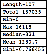
Followers of tlausser Followers on Twitter

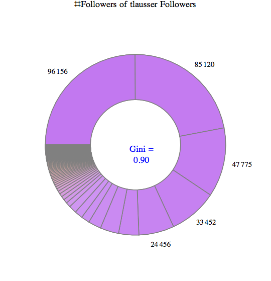
Some of my followers have no followers themselves, one has nearly 100,000. On average, they have about 3600 followers; however, the total of about 385,000 followers is extremely unequally distributed. Here are three charts visualizing this astonishing degree of inequality:

Of 107 followers, the top 5 have ~75% of all followers that can be reached in two steps. The corresponding Gini index of 0.90 is an example of extreme inequality. From an advertising perspective, you would want to focus mostly on getting these 5% to react to your message (i.e. retweet). In a chart with linear scale the bottom half does barely register.

Most of my followers have between 100-1000 followers themselves, as can be seen from this log-scale Histogram.

What kind of distribution is the number of followers? It seems that Log[x] is roughly normal distributed.

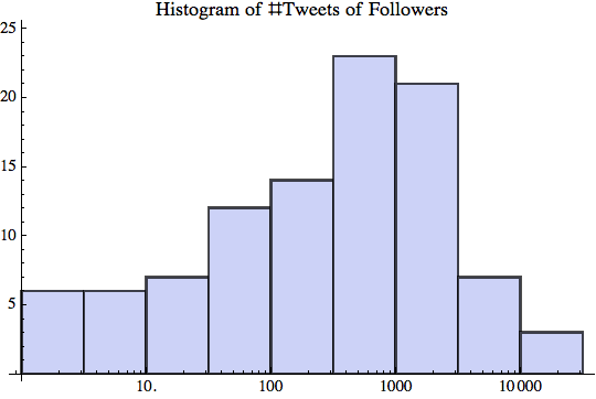
As for participation inequality, let’s look at the number of tweets that those (107) followers send out.

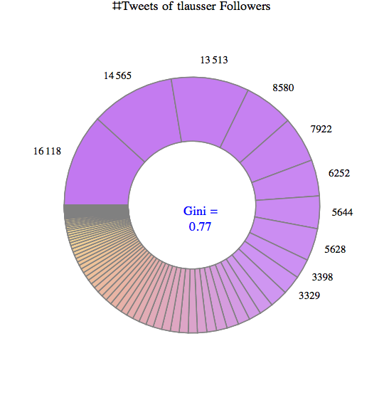
Some of them have not tweeted anything, the chattiest has sent more than 16,000 tweets. On average, each follower has 1280 tweets; the total of 137,000 tweets is again highly unequally distributed for a Gini index of 0.77.

The top 10 make up about 2/3 of the entire conversation.

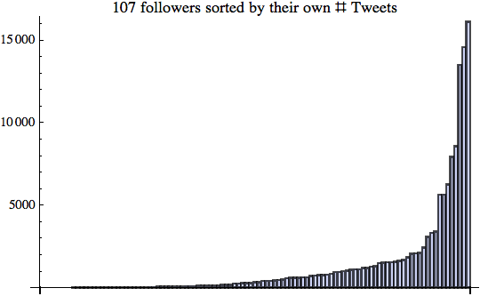
Again the bottom half hardly contributes to the number of tweets; however, the ramp in the top half is longer and not quite as steep as with the number of followers. Here is the log-scale Histogram:

I did the same type of analysis for several other Twitter Users in the central range (between 100-1000 follower). The results are similar, but certainly not yet robust enough to statistical sampling errors. (A larger scale analysis would require a higher twitter API limit than my free 350 per hour.)

These preliminary results indicate that there are high degrees of inequality regarding the number of tweets people send out and even more so regarding the number of followers they accumulate. How many tweets Twitter users send out over time is more evenly distributed. How many followers they get is less evenly distributed and thus leads to extremely high degrees of inequality. I presume this is caused in part due to preferential attachment as described in Barabasi’s book “Linked: The new science of networks“. Like with all forms of attention, who people follow depends a lot on who others are following. There is a very long tail of small numbers of followers for the vast majority of Twitter users.

That said, the degree of participation inequality I found was lower than the 90-9-1 rule, which corresponds to an extreme Gini index of about 0.96. Perhaps that’s a sign of the Twitter community having evolved over time? Or perhaps just a sign of my analysis sample being too small and not representative of the larger Twitterverse.

In some way these new media are refreshing as they allow almost anyone to publish their thoughts. However, it’s also true that almost all of those users remain in relative obscurity and only a very small minority gets the lion share of all attention. If you think economic inequality is too high, keep in mind that attention inequality is far higher. Both are impacting the policy debate in interesting ways.

Turning social media attention into income is another story altogether. In his recent Blog post “Turning social media attention into income“, author Srininvas Rao muses:

“The low barrier to entry created by social media has flooded the market with aspiring entrepreneurs, freelancers, and people trying to make it on their own. Standing out in it is only half the battle. You have to figure out how to turn social media attention into social media income. Have you successfully evolved from blogger to entrepreneur? What steps should I take next?”

 
10 Comments

Posted by on December 6, 2011 in Industrial, Scientific, Socioeconomic


Tags: , , ,

 
%d bloggers like this: