RSS

Tag Archives: Gini

Inequality and the World Economy

Inequality and the World Economy

The last edition of The Economist featured a 25-page special report on “The new politics of capitalism and inequality” headlined “True Progressivism“. It is the most recommended and commented story on The Economist this week.

We have looked at various forms of economic inequality on this Blog before, as well as other manifestations (market share, capitalization, online attention) and various ways to measure and visualize inequality (Gini-index). Hence I was curious about any new trends and perhaps ways to visualize global economic inequality. That said, I don’t intend to enter the socio-political debate about the virtues of inequality and (re-)distribution policies.

In the segment titled “For richer, for poorer” The Economist explains.

The level of inequality differs widely around the world. Emerging economies are more unequal than rich ones. Scandinavian countries have the smallest income disparities, with a Gini coefficient for disposable income of around 0.25. At the other end of the spectrum the world’s most unequal, such as South Africa, register Ginis of around 0.6.

Many studies have found that economic inequality has been rising over the last 30 years in many industrial and developing nations around the world. One interesting phenomenon is that while the Gini index of many countries has increased, the Gini index of world inequality has fallen. This is shown in the following image from The Economist.

Global and national inequality levels (Source: The Economist)

This is somewhat non-intuitive. Of course the countries differ widely in terms of population size and level of economic development. At a minimum it means that a measure like the Gini index is not simply additive when aggregated over a collection of countries.

Another interesting chart displays a world map with color coding the changes in inequality of the respective country.

Changes in economic inequality over the last 30 years (Source: The Economist)

It’s a bit difficult to read this map without proper knowledge of the absolute levels of inequality, such as we displayed in the post on Inequality, Lorenz-Curves and Gini-Index. For example, a look at a country like Namibia in South Africa indicates a trend (light-blue) towards less inequality. However, Namibia used to be for many years the country with the world’s largest Gini (1994: 0.7; 2004: 0.63; 2010: 0.58 according to iNamibia) and hence still has much larger inequality than most developed countries.

World Map of national Gini values (Source: Wikipedia)

So global Gini is declining, while in many large industrial countries Gini is rising. One region where regional Gini is declining as well is Latin-America. Between 1980-2000 Latin America’s Gini has grown, but in the last decade Gini has declined back to 1980 levels (~0.5), despite the strong economic growth throughout the region (Mexico, Brazil).

Gini of Latin America over the last 30 years (Source: The Economist)

Much of the coverage in The Economist tackles the policy debate and the questions of distribution vs. dynamism. On the one hand reducing Gini from very large inequality contributes to social stability and welfare. On the other hand, further reducing already low Gini diminishes incentives and thus potentially slows down economic growth.

In theory, inequality has an ambiguous relationship with prosperity. It can boost growth, because richer folk save and invest more and because people work harder in response to incentives. But big income gaps can also be inefficient, because they can bar talented poor people from access to education or feed resentment that results in growth-destroying populist policies.

In other words: Some inequality is desirable, too much of it is problematic. After growing over the last 30 years, economic inequality in the United States has perhaps reached a worrisome level as the pendulum has swung too far. How to find the optimal amount of inequality and how to get there seem like fascinating policy debates to have. Certainly an example where data visualization can help an otherwise dry subject.

 
1 Comment

Posted by on October 15, 2012 in Socioeconomic


Tags: , , ,

Inequality on Twitter

Inequality on Twitter

A lot has been written about economic inequality as measured by distribution of income, wealth, capital gains, etc. In previous posts such as Inequality, Lorenz-Curves and Gini-Index or Visualizing Inequality we looked at various market inequalities (market share and capitalization, donations, etc.) and their respective Gini coefficients.

With the recent rise of social media we have other forms of economy, in particular the economy of time and attention. And we have at least some measures of this economy in the form of people’s activities, subscriptions, etc. Whether it’s Connections on LinkedIn, Friends on FaceBook, Followers on Twitter – all of the social media platforms have some social currencies for attention. (Influence is different from attention, and measuring influence is more difficult and controversial – see for example the discussions about Klout-scores.)

Another interesting aspect of online communities is that of participation inequality. Jakob Nielsen did some research on this and coined the well-known 90-9-1 rule:

“In most online communities, 90% of users are lurkers who never contribute, 9% of users contribute a little, and 1% of users account for almost all the action.”

The above linked article has two nice graphics illustrating this point:

Illustration of participation inequality in online communities (Source: Jakob Nielsen)

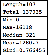
As a user of Twitter for about 3 years now I decided to do some simple analysis, wondering about the degrees of inequality I would find there. Imagine you want to spread the word about some new event and send out a tweet. How many people you reach depends on how many followers you have, how many of those retweet your message, how many followers they have, how many other messages they send out and so on. Let’s look at my first twitter account (“tlausser”); here are some basic numbers of my followers and their respective followers:

Followers of tlausser Followers on Twitter

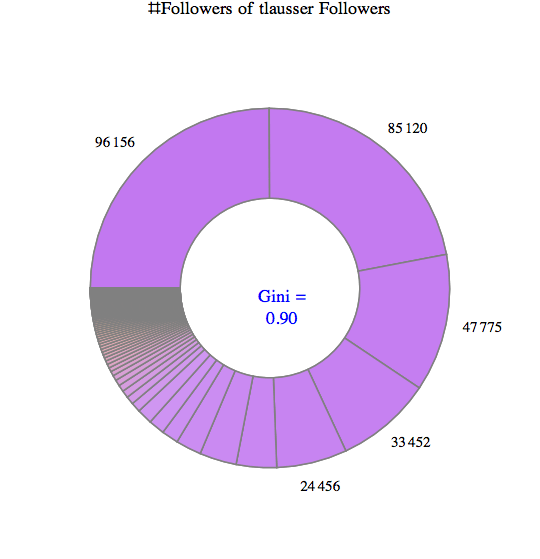
Some of my followers have no followers themselves, one has nearly 100,000. On average, they have about 3600 followers; however, the total of about 385,000 followers is extremely unequally distributed. Here are three charts visualizing this astonishing degree of inequality:

Of 107 followers, the top 5 have ~75% of all followers that can be reached in two steps. The corresponding Gini index of 0.90 is an example of extreme inequality. From an advertising perspective, you would want to focus mostly on getting these 5% to react to your message (i.e. retweet). In a chart with linear scale the bottom half does barely register.

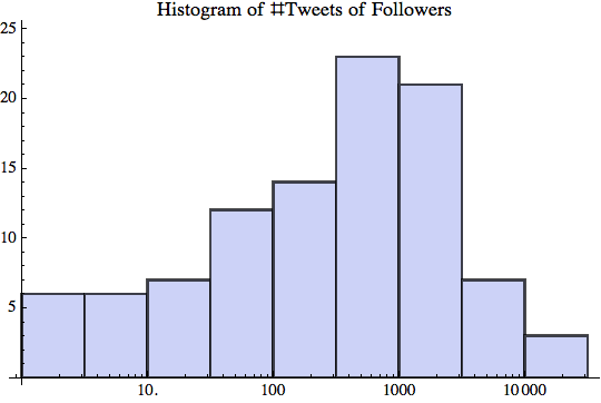
Most of my followers have between 100-1000 followers themselves, as can be seen from this log-scale Histogram.

What kind of distribution is the number of followers? It seems that Log[x] is roughly normal distributed.

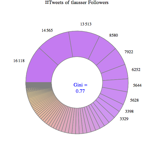
As for participation inequality, let’s look at the number of tweets that those (107) followers send out.

Some of them have not tweeted anything, the chattiest has sent more than 16,000 tweets. On average, each follower has 1280 tweets; the total of 137,000 tweets is again highly unequally distributed for a Gini index of 0.77.

The top 10 make up about 2/3 of the entire conversation.

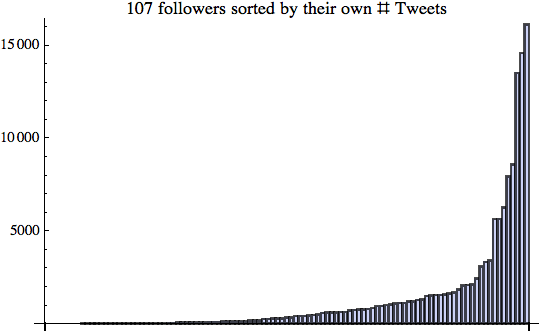
Again the bottom half hardly contributes to the number of tweets; however, the ramp in the top half is longer and not quite as steep as with the number of followers. Here is the log-scale Histogram:

I did the same type of analysis for several other Twitter Users in the central range (between 100-1000 follower). The results are similar, but certainly not yet robust enough to statistical sampling errors. (A larger scale analysis would require a higher twitter API limit than my free 350 per hour.)

These preliminary results indicate that there are high degrees of inequality regarding the number of tweets people send out and even more so regarding the number of followers they accumulate. How many tweets Twitter users send out over time is more evenly distributed. How many followers they get is less evenly distributed and thus leads to extremely high degrees of inequality. I presume this is caused in part due to preferential attachment as described in Barabasi’s book “Linked: The new science of networks“. Like with all forms of attention, who people follow depends a lot on who others are following. There is a very long tail of small numbers of followers for the vast majority of Twitter users.

That said, the degree of participation inequality I found was lower than the 90-9-1 rule, which corresponds to an extreme Gini index of about 0.96. Perhaps that’s a sign of the Twitter community having evolved over time? Or perhaps just a sign of my analysis sample being too small and not representative of the larger Twitterverse.

In some way these new media are refreshing as they allow almost anyone to publish their thoughts. However, it’s also true that almost all of those users remain in relative obscurity and only a very small minority gets the lion share of all attention. If you think economic inequality is too high, keep in mind that attention inequality is far higher. Both are impacting the policy debate in interesting ways.

Turning social media attention into income is another story altogether. In his recent Blog post “Turning social media attention into income“, author Srininvas Rao muses:

“The low barrier to entry created by social media has flooded the market with aspiring entrepreneurs, freelancers, and people trying to make it on their own. Standing out in it is only half the battle. You have to figure out how to turn social media attention into social media income. Have you successfully evolved from blogger to entrepreneur? What steps should I take next?”

 
10 Comments

Posted by on December 6, 2011 in Industrial, Scientific, Socioeconomic


Tags: , , ,

Inequality, Lorenz-Curves and Gini-Index

In a previous post we looked at inequality of profits and the useful abstraction of the Whale-Curve to analyze Customer Profitability. Here I want to focus on inequality and its measurement and visualization in a broader sense.

A fundamental graphical representation of the form of a distribution is given by the Lorenz-Curve. It plots the cumulative contribution to a quantity over a contributing population. It is often used in economics to depict the inequality of wealth or income distribution in a population.

Lorenz Curve (Source: Wikipedia)

The Lorenz-Curve shows the y% contribution of the bottom x% of the population. The x-axis has the population sorted by increasing contributions; (i.e. the poorest on the left and the richest on the right). Hence the Lorenz-Curve is always at or below the diagonal line, which represents perfect equality. (By contrast, the x-axis of the Whale-Curve sorts by decreasing profit contributions.)

The Gini-Index is defined as G =  A / (A + B) , G = 2A  or G = 1 – 2B

Since each axis is normalized to 100%, A + B = 1/2 and all of the above are equivalent. Perfect equality means G = 0. Maximum inequality G = 1 is achieved if one member of the population contributes everything and everybody else contributes nothing.

An interesting interactive graph demonstrating Lorenz-Curves and corresponding Gini-Index values can be found here at the Wolfram Demonstration project.

The GINI Index is often used to indicate the income or wealth inequality of countries. The corresponding values of the GINI index are typically between 0.25 and 0.35 for modern, developed countries and higher in developing countries such as 0.45 – 0.55 in Latin America and up to 0.70 in some African countries with extreme income inequality.

GINI index of world countries in 2009 (Source: Wikipedia)

Graphically, many different shapes of the Lorenz-Curve can lead to the same areas A and B, and hence many different distributions of inequality can lead to the same GINI index. How can one determine the GINI index? If one has all the data, one can numerically determine the value from all the differences for each member of the population. An example of that is shown here to determine the inequality of market share for 10 trucking companies.
Another approach is to model the actual distribution using a formal statistical distribution with known properties such as Pareto, Log-Normal or Weibull. With a given formal distribution one can often calculate the GINI index analytically. See for example the paper by Michel Lubrano on “The Econometrics of Inequality and Poverty“. In another example, Eric Kemp-Benedict shows in this paper on “Income Distribution and Poverty” how well various statistical distributions match the actually measured data. It is commonly held that at the high end of the income the Pareto distribution is a good model (with its inherent Power law characteristic), while overall the Log-Normal is the best approximation.

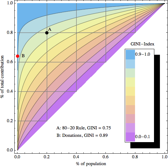
After studying several of these papers I started to ask myself: If x% of the population contribute y% to the total, what’s the corresponding GINI index? For example, for the famous “80-20 rule” with 20% of the population contributing 80% of the result, what’s the GINI index for the 80-20 rule?

To answer this question I created a simple model of inequality based on a Pareto distribution. Its shape parameter controls the curvature of the distribution, which in turn determines the GINI index. The latter is visualized as color-coded bands using a 2D contour plot in the following graphic:

GINI index contour plot based on Pareto distribution model

The sample data point “A” corresponds to the 80-20 rule, which leads to a GINI index of about 0.75 (strongly unequal distribution). Data point “B” is an example of an extremely unequal distribution, namely US political donations (data from 2010 according to a statistic from the Center of Responsive Politics recently cited by CNNMoney):

“…a relatively small number of Americans do wield an outsized influence when it comes to political donations. Only 0.04% of Americans give in excess of $200 to candidates, parties or political action committees — and those donations account for 64.8% of all contributions”

0.04% contribute 64.8% of the total! Here is another way of describing this: If you had 2500 donors, the top donor gives twice as much as the other 2499 combined. This extreme amount of inequality corresponds to a GINI index of 0.89 (needless to say that this does not seem like a very democratic process…)

As for US income I created a separate graphic with data points from the high end of the income spectrum (where the underlying Pareto distribution model is a good fit): The top 1% (who earn 18% of all income), top 0.1% (8%), and top 0.01% (3.5%).

GINI Index Contour Plot with high end US Income distribution data points

These 3 data points are taken from Timothy Noah’s “The United States of Inequality“, a 10-part article series on Slate, which in turn is based on data and research from 2008 by Emmanuel Saez and visualizations by Catherine Mulbrandon of VisualizingEconomics.com. This shows the 2008 US income inequality has a GINI Index of approximately 0.46, which is unusually high for a developed country. Income inequality has grown in the US since around 1970, and the above article series analyzes potential factors contributing to that – but that’s a topic for another post. In the spirit of visualizing data to create insight, I’ll just leave you with this link to the corresponding 10-part visual guide to inequality:

Postscript: In April 2012 I came across a nice interactive visualization on the DataBlick website created by Anya A’Hearn using Tableau. It shows the trends of US income inequality over the last 90 years with 7 different categories (Top x% shares) and makes a good showcase for the illustrative power of interactive graphics.

 
6 Comments

Posted by on September 2, 2011 in Financial, Industrial, Scientific, Socioeconomic


Tags: , ,

 
%d bloggers like this: