RSS

Monthly Archives: October 2012

Superstorm Sandy – Visualizing Hurricanes

Superstorm Sandy – Visualizing Hurricanes

Time-lapse animation of Sandy Oct-28 from geostationary orbit, 1 frame per minute, 11 hours of daylight. Although “only” a category 1 hurricane, this superstorm has enormous size. Tropical storm force winds extend out over an area 900 miles in diameter.

Living in South Florida makes you alert to tropical storms during hurricane season from May to November. Exactly 7 years ago, at the end of October 2005, the eye of category 3 hurricane Wilma swept over our home in West Palm Beach in South Florida – the most powerful natural weather event I have ever witnessed. After avoiding a direct hit since then, we got a massive rain event from Isaac earlier this year, but again avoided a direct hit. To be sure, often the flooding associated with hurricanes is worse than the wind damage. For example, when hurricane Katrina hit New Orleans in August 2005, most of the devastation came from flooding after the levees were breached. But the first question is always where the storms will make landfall and how strong they are when they hit your area.

Tropical storms are being tracked and forecast in great detail, in particular by the National Hurricane Center of the National Weather Service. There are many great visualizations illustrating the path, windspeed, rainfall, extent of tropical storm force winds, etc. Due to the convenience for browsing, I have almost completely switched to following hurricane or weather updates from the iPad. (In this case I’m using the Hurr Tracker app from EZ Apps.)

Last week a new tropical storm emerged in the Carribean and was named ‘Sandy’. A few days ago with Sandy’s center over the Bahamas, the path looked like this:

Path of hurricane Sandy as of Oct-25 (Hurr Tracker iPad app)

Note the use of color for wind speed and the cone of uncertainty in the lower segment, as well as the rings around the center indicating the size of the area with storm-force winds.

Naturally curious whether South Florida was likely to get hit, another image gave us some relief:

5 Day tracking map for hurricane Sandy

Now a few days later, while we did get some strong northerly winds and pounding surf leading to beach erosion, Sandy was not a particularly disturbing event for South Florida. At the same time, however, Sandy is forecast to make landfall on the Jersey shore within about 24 hours during the night from Monday to Tuesday.

One interesting set of maps with a color code displaying the probability of an area experiencing winds of a certain speed, say at least tropical storm force winds (>= 39 mph). The following map was issued this afternoon and indicates the very large area (mostly offshore) with near 100% probability of exceeding tropical storm force winds in purple.

Tropical storm force wind speed probabilities for hurricane Sandy as of Oct-28

This indicates how large Sandy is – an area the size of Texas with tropical storm force winds! Meteorologists are concerned for the Northeast due to Sandy converging with two other weather events, a storm from the West and cold air coming down from the North. This is expected to intensify the weather system, similar to the Perfect Storm of 1991. Due to the timing around Halloween this is why Sandy was also called a ‘Frankenstorm’.

One of the most chilling pictures is this animated GIF from WeatherBELL. A story in the Atlantic earlier today writes this:

Dr. Ryan Maue, a meteorologist at WeatherBELL, put out this animated GIF of the storm’s approach yesterday. “This is unprecedented –absolutely stunning upper-level configuration pinwheeling #Sandy on-shore like ping-pong ball,” he tweeted. It shows how cold air to the north and west of the storm spin Sandy into the mid-atlantic coastline.

(Click the image if the animation doesn’t play in your browser.)

Animation of hurricane Sandy moving into the NorthEast (Source: WeatherBELL)

Understandably this forecast of superstorm Sandy has the authorities worried. The full moon tomorrow exacerbates the tides and New York City is expecting up to 11 ft storm surge. Cities across the Northeast are taking precautions as of this writing. For example, the New York City subway metro transit system is shutting down tonight and several hundred thousand people in low-lying coastal areas are under mandatory evacuation order. More than 5000 flights to the area on Monday have been cancelled. Take a look at the expected 5 day precipitation forecast in the Northeast. Some areas may get up to 10 inches of rain and/or snow!

5 day precipitation forecast with Sandy’s impact for the Northeast

The first priority is to use such visualizations to communicate the weather impact and allow people to take necessary precautions. One can use similar hurricane charts to visualize other uncertain events, such as the future outcomes of development projects. We will look at this in an upcoming post on this Blog.


Addendum 11/4/12: The NYTimes has provided some interactive graphics detailing the location and size of power outages caused by superstorm Sandy in the New York and New Jersey area. The New York City outages have been summarized in this chart, normalized to the percentage of all customers. As can be seen, the efforts to restore power over the first 6 days have been fairly successful, especially in Manhattan and Staten Island, less so in Westchester.

6 day tracking map of power outages caused by Sandy in New York City

 
Leave a comment

Posted by on October 28, 2012 in Recreational, Scientific


Tags: , ,

Trends in Health Habits across the United States

Trends in Health Habits across the United States

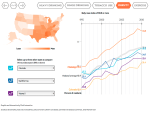
This week Scientific American published an interesting article about trends in health habits across the United States. The article includes both a large composite chart as well as a page with an interactive chart. Both are well done and a great example of using a visualization to help telling a story. I personally find the most useful part of the graphic to be the comparison column on the right with shades of color indicating degree of improvement (blue) or deterioration (red).

US health habits 1995 vs. 2010 (Source: Scientific American)

From the article:

Americans are imbibing alcohol and overeating more yet are smoking less (black lines in center graphs).

Some of the behaviors have patterns; others do not. Obesity is heaviest in the Southeast (2010 maps). Smoking is concentrated there as well. Excess drinking is high in the Northeast.

Comparing 2010 and 1995 figures provides the greatest insight into trends (maps, far right). Heavy drinking has worsened in 47 states, and obesity has expanded in every state. Tobacco use has declined in all states except Oklahoma and West Virginia. The “good” habit, exercise, is up in many places—even in the Southeast, where it has lagged.

A more detailed visual analysis is possible using the interactive version of these graphs on the related subpage Bad Health Habits are on the rise. Here one can compare up to three arbitrary states against top, median, and bottom performing states by health habit.

The following examples show tobacco use, exercise and obesity by state with line charts for the three arbitrarily selected states of Florida, California and Hawaii.

Tobacco Trend By State

Exercise Trend By State

Obesity Trend By State

Leading the exercise statistics are citizens in states offering attractive outdoor sports opportunities, like Oregon or Hawaii. Such correlation seems intuitive in both causal directions: People interested in exercise tend to move to those states with the most attractive outdoor sports. And people living in those states may end up exercising more due to the opportunity.

When looking at the average trend line, exercise seems to have leveled off after a bump in the early 2000’s, whereas the decline in smoking over the last decade continues unabated.

15 years is half a generation. During that time, Americans have in almost every state smoked less, exercised more in many states, but obesity is sharply on the rise in every state! From a health and policy debate the latter seems to be the most alarming trend. Most people want the next generation to be better off than the previous one. This has to some extent been true with wealth, at least until the great recession of 2008. But these data show that at population levels, more wealth is not necessarily more health.

 
Leave a comment

Posted by on October 19, 2012 in Medical


Inequality and the World Economy

Inequality and the World Economy

The last edition of The Economist featured a 25-page special report on “The new politics of capitalism and inequality” headlined “True Progressivism“. It is the most recommended and commented story on The Economist this week.

We have looked at various forms of economic inequality on this Blog before, as well as other manifestations (market share, capitalization, online attention) and various ways to measure and visualize inequality (Gini-index). Hence I was curious about any new trends and perhaps ways to visualize global economic inequality. That said, I don’t intend to enter the socio-political debate about the virtues of inequality and (re-)distribution policies.

In the segment titled “For richer, for poorer” The Economist explains.

The level of inequality differs widely around the world. Emerging economies are more unequal than rich ones. Scandinavian countries have the smallest income disparities, with a Gini coefficient for disposable income of around 0.25. At the other end of the spectrum the world’s most unequal, such as South Africa, register Ginis of around 0.6.

Many studies have found that economic inequality has been rising over the last 30 years in many industrial and developing nations around the world. One interesting phenomenon is that while the Gini index of many countries has increased, the Gini index of world inequality has fallen. This is shown in the following image from The Economist.

Global and national inequality levels (Source: The Economist)

This is somewhat non-intuitive. Of course the countries differ widely in terms of population size and level of economic development. At a minimum it means that a measure like the Gini index is not simply additive when aggregated over a collection of countries.

Another interesting chart displays a world map with color coding the changes in inequality of the respective country.

Changes in economic inequality over the last 30 years (Source: The Economist)

It’s a bit difficult to read this map without proper knowledge of the absolute levels of inequality, such as we displayed in the post on Inequality, Lorenz-Curves and Gini-Index. For example, a look at a country like Namibia in South Africa indicates a trend (light-blue) towards less inequality. However, Namibia used to be for many years the country with the world’s largest Gini (1994: 0.7; 2004: 0.63; 2010: 0.58 according to iNamibia) and hence still has much larger inequality than most developed countries.

World Map of national Gini values (Source: Wikipedia)

So global Gini is declining, while in many large industrial countries Gini is rising. One region where regional Gini is declining as well is Latin-America. Between 1980-2000 Latin America’s Gini has grown, but in the last decade Gini has declined back to 1980 levels (~0.5), despite the strong economic growth throughout the region (Mexico, Brazil).

Gini of Latin America over the last 30 years (Source: The Economist)

Much of the coverage in The Economist tackles the policy debate and the questions of distribution vs. dynamism. On the one hand reducing Gini from very large inequality contributes to social stability and welfare. On the other hand, further reducing already low Gini diminishes incentives and thus potentially slows down economic growth.

In theory, inequality has an ambiguous relationship with prosperity. It can boost growth, because richer folk save and invest more and because people work harder in response to incentives. But big income gaps can also be inefficient, because they can bar talented poor people from access to education or feed resentment that results in growth-destroying populist policies.

In other words: Some inequality is desirable, too much of it is problematic. After growing over the last 30 years, economic inequality in the United States has perhaps reached a worrisome level as the pendulum has swung too far. How to find the optimal amount of inequality and how to get there seem like fascinating policy debates to have. Certainly an example where data visualization can help an otherwise dry subject.

 
1 Comment

Posted by on October 15, 2012 in Socioeconomic


Tags: , , ,

 
%d bloggers like this: