The other day I listened to a presentation by Melinda Gates prepared for the United Nations to deliver an update about progress towards the Millennium Development Goals (MDG). The eight goals of the MDG had been embraced by the UN back in 2005 for the time target of 2015. So it is reasonable to see whether the world is on track to reach each of these eight goals. To summarize, from the MDG Wikipedia page:
- Eradicating extreme poverty and hunger
- Achieving universal primary education
- Promoting gender equality and empowering women
- Reducing child mortality rates
- Improving maternal health
- Combating HIV/AIDS, malaria, and other diseases
- Ensuring environmental sustainability
- Developing a global partnership for development
A good listing of reports, statistics and updates can be found on the UN website here.

Sample Vote for 6 of 16 MDG choices
At the end of Melinda’s presentation is a link to a UN global survey on the MDG goals after 2015. I took this survey and found the visualization of voting results quite interesting. First, one is asked to select six out of a list of sixteen (6 of 16) goals which one thinks have the highest impact for a future better world. (The survey methodology is described in more detail here.) Here is a sample vote:
A nice touch is that for each of the sixteen goals there is a different color and when you check that goal, one of the sixteen areas on the stylized globe is filled with that color. Personal data such as name is optional, but some demographic information is required, including age, gender, educational level and country. Next, one can look at a summary of all currently tallied votes and compare them interactively to ones own vote (checkmarks on the right).

It is perhaps not surprising that I voted very similar to others in similar demographic cohorts.
- Country: I picked five of the Top five goals like all other voters living in the US. I included ‘Political freedoms’ in my top six, which in the US only ranks 11th.
- Age: I shared five of the Top six goals with people in my age group (world-wide). The one I did not check was ranked 4th (Better job opportunities). When you mouse over one of the goals, the display changes to highlight this goal in all columns:
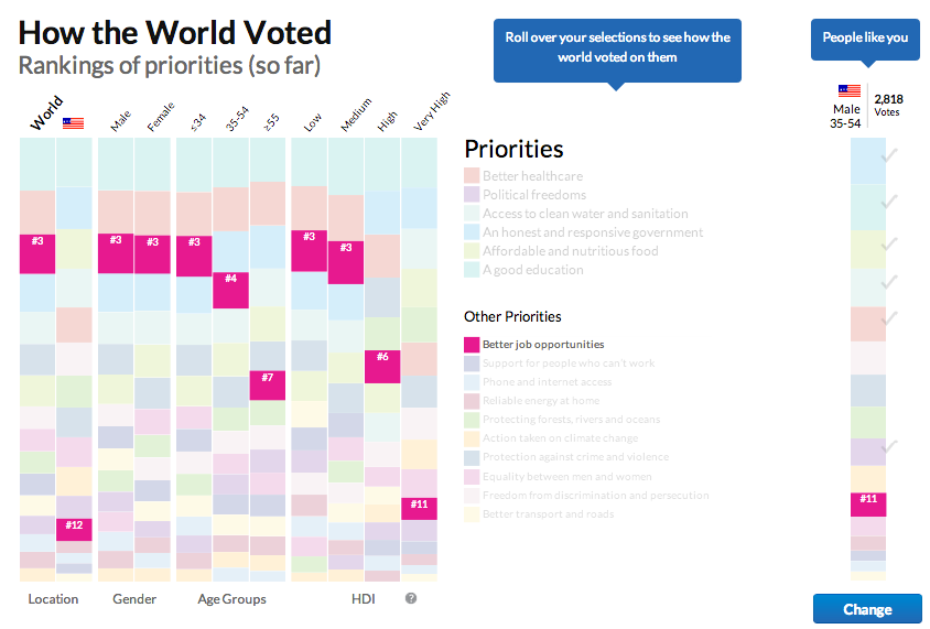
Interactive Vote Analysis with highlighted goal
- Gender: Here I picked four of the Top five goals (did not include the ‘Better job opportunities’).
- Education: I voted very similar to people with very high HDI (Human Development Index, a visualization of which we covered in a previous post) with five of the Top six.
From the above, it seems somewhat surprising that voters in the US did not ascribe a higher value to ‘Better job opportunities’, given how much economic values and topics like unemployment seem to dominate the media. That said, these votes should be a reflection about which goals are most valuable for making the world a better place – not just your own home country. Worldwide it seems that other, more fundamental goals are judged by voters in the US to be more important than ‘Better Job opportunities’.
Another chart on the results page is showing a heat map of the world countries based on how many votes have been submitted. I thought it was interesting that Ghana had submitted about twice as many votes as all of the US, and Nigeria about 7x as many. The country with most voters at this time is India, but not far ahead of Nigeria.
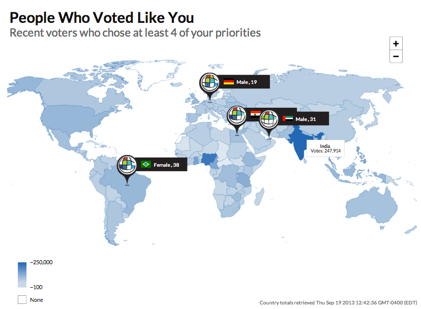
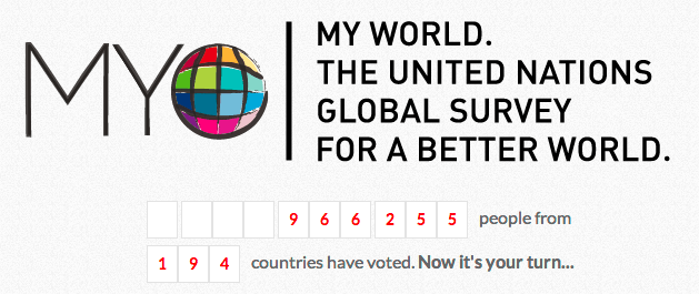
A fairly useless dynamic animation in this map is a map pin drop of four people who voted similarly to me. I found this too anecdotal to be of any real interest and downright annoying that I couldn’t turn it off. and just focus on the vote heat map. For example, the total number of votes should be displayed in the Legend. I vaguely remember that it was several hundred thousand from 194 countries prior to starting the survey, but couldn’t get that data to display again without clicking on the Vote Again: