While browsing the web for some Mathematica resources I came across Paul Nylander’s website on Fractals and other computer-created illustrations. Amazing stuff! Here are just a few images from his website. He has lots of information and often source-code with the images as well. Go check it out.
Category Archives: Art
Flight Pattern Visualization
Aaron Koblin, an artist specializing in data and digital technologies and currently leader of the Data Arts team in Google’s Creative Lab, collaborated with Wired Magazine and FlightView Software to create beautiful graphics and illustrations of flights based upon tracking data by the FAA.
The following YouTube video is a time-lapse movie of flights over the US during a 24 hour period in 2008. One can clearly see the airspace come alive on the East Coast in the early morning hours and then calm down over night.
It is amazing how much data is aggregated into such a visualization – covering over 200.000 flights! Aaron’s website has a section about the flight patterns project which is well worth exploring. There are other graphs where you can set filters for aircraft type, manufacturer, altitude etc. Some of these graphics have been sold as wallpaper or prints and graced various art exhibitions. There is beauty in properly visualized data.
TreeMaps
Around 1990 Ben Shneiderman invented TreeMaps as a way to visualize a hierarchy of nodes in a constrained space, for example a rectangle of fixed size. TreeMaps have since been integrated in various tools and are used for interactive graphics in several newspapers and magazines, such as the BBC and NYTimes in the following two examples.
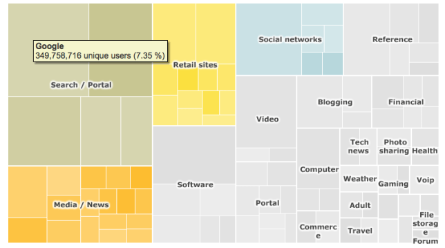
Top 100 Internet sites (Source: BBC online article in Jan 2010)

TreeMap for the TOP 100 Internet Sites as of Jan 2010. In the interactive version (Flash-based) hovering over a rectangle will display the underlying data.
Trucks, Vans, S.U.V. sales in the US (Source: NYTimes article in Feb 2007)
A history of TreeMaps with many beautiful examples has been compiled by Ben Shneiderman here. My favorite is this variation of a circular TreeMap by Kai Wetzel, a graph showing disk usage by folder with color code showing age of files.

Circular TreeMap showing disk usage (size) and file age (color) of a hierarchical directory structure.
Who says visualizing complex information can’t be informative and aesthetically pleasing at the same time?


