RSS

Tag Archives: map

The Atlas of Economic Complexity

The Atlas of Economic Complexity

Here is a recipe: Bring together renowned faculties like the MIT Media Lab and Harvard’s Center for International Development. Combine novel ideas about economic measures with years of solid economic research. Leverage large sets of world trade data. Apply network graph theory algorithms and throw in some stunning visualizations. The result: The Atlas of Economic Complexity, a revolutionary way of looking at world trade and understanding variations in countries paths to prosperity.

The main authors are Professors Ricardo Hausmann from Harvard and Cesar Hidalgo from MIT (whose graphic work on Human Development Indices we have reviewed here). The underlying research began in 2006 with the idea of the product space which was published in Science in 2007. This post is the first in a two-part series covering both the atlas (theory, documentation) as well as the observatory (interactive visualization) of economic complexity. This research is an excellent example of how the availability of large amounts of data, computing power and free distribution via the Internet enable entirely new ways of looking at and understanding our world.

The Atlas of Economic Complexity is rooted in a set of ideas about how to measure economies based not just on the quantity of products traded, but also on the required knowledge and capabilities to produce them. World Trade data allows us to measure import and export product quantities directly, leading to indicators such as GDP, GDP per capita, Growth of GDP etc. However, we have no direct way to measure the knowledge required to create the products. A central observation is that complex products require more capabilities to produce, and countries who manufacture more complex products must possess more of these capabilities than others who do not. From Part I of the Atlas:

Ultimately, the complexity of an economy is related to the multiplicity of useful knowledge embedded in it. For a complex society to exist, and to sustain itself, people who know about design, marketing, finance, technology, human resource management, operations and trade law must be able to interact and combine their knowledge to make products. These same products cannot be made in societies that are missing parts of this capability set. Economic complexity, therefore, is expressed in the composition of a country’s productive output and reflects the structures that emerge to hold and combine knowledge.

Can we analyze world trade data in such a way as to tease out relative rankings in terms of these capabilities?

To this end, the authors start by looking at the trade web of countries exporting products. For each country, they examine how many different products it is capable of producing; this is called the country’s Diversity. And for each product, they look at how many countries can produce it; this is called the product’s Ubiquity. Based on these two measures, Diversity and Ubiquity, they introduce two complexity measures: The Economic Complexity Index (ECI, for a country) and the Product Complexity Index (PCI, for a product).

The mechanics of how these measures are calculated are somewhat sophisticated. Yet they encode some straightforward observations and are explained with some examples:

Take medical imaging devices. These machines are made in few places, but the countries that are able to make them, such as the United States or Germany, also export a large number of other products. We can infer that medical imaging devices are complex because few countries make them, and those that do tend to be diverse. By contrast, wood logs are exported by most countries, indicating that many countries have the knowledge required to export them. Now consider the case of raw diamonds. These products are extracted in very few places, making their ubiquity quite low. But is this a reflection of the high knowledge-intensity of raw diamonds? Of course not. If raw diamonds were complex, the countries that would extract diamonds should also be able to make many other things. Since Sierra Leone and Botswana are not very diversified, this indicates that something other than large volumes of knowledge is what makes diamonds rare.

A useful question is this: If a good cannot be produced in a country, where else can it be produced? Countries with higher economic complexity tend to produce more complex products which can not easily be produced elsewhere. The algorithms are specified in the Atlas, but we will skip over these details here. Let’s take a look at the ranking of some 128 world countries (selected above minimum population size and trade volume as well as for reliable trade data availability).

Why is Economic Complexity important? The Atlas devotes an entire chapter to this question. The most important finding here is that ECI is a better predictor of a country’s future growth than many other commonly used indicators that measure human capital, governance or competitiveness.

Countries whose economic complexity is greater than what we would expect, given their level of income, tend to grow faster than those that are “too rich” for their current level of economic complexity. In this sense, economic complexity is not just a symptom or an expression of prosperity: it is a driver.

They include a lot of scatter-plots and regression analysis measuring the correlation between the above and other indicators. Again, the interested reader is referred to the original work.

Another interesting question is how Economic Complexity evolves. In some ways this is like a chicken & egg problem: For a complex product you need a lot of capabilities. But for any capability to provide value you need some products that require it. If a new product requires several capabilities which don’t exist in a country, then starting the production of such a product in the country will be hard. Hence, a country’s products tend to evolve along the already existing capabilities. Measuring the similarities in required capabilities directly would be fairly complicated. However, as a first approximation, one can deduce that products which are more often produced by the same country tend to require similar capabilities.

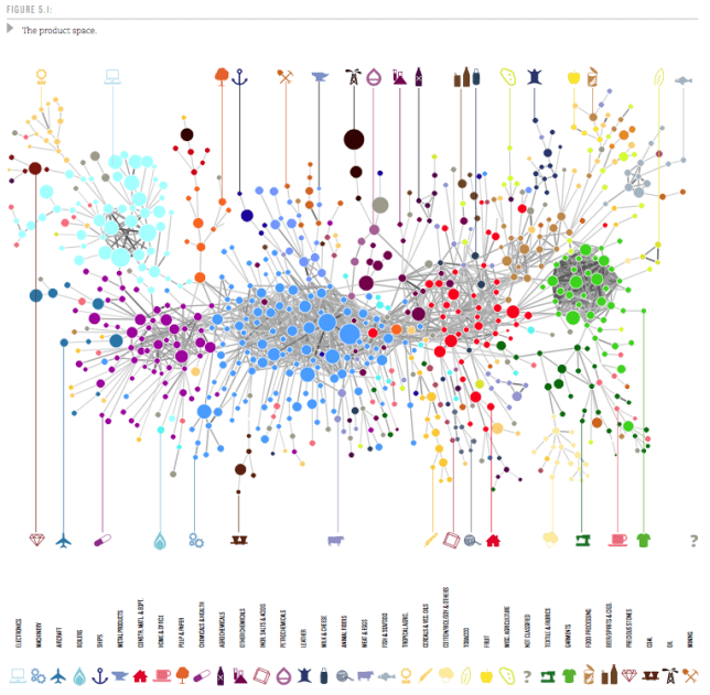
So the probability that a pair of products is co-exported carries information about how similar these products are. We use this idea to measure the proximity between all pairs of products in our dataset (see Technical Box 5.1 on Measuring Proximity). The collection of all proximities is a network connecting pairs of products that are significantly likely to be co-exported by many countries. We refer to this network as the product space and use it to study the productive structure of countries.

Then the authors proceed to visualize the Product Space. It is a graph with some 774 nodes (products) and edges representing the proximity values between those nodes. Only the top 1% strongest proximity edges are shown to keep the average degree of the graph below 5 (showing too many connections results in visual complexity). Network Science Algorithms are used to discover the highly connected communities into which the products naturally group. Those 34 communities are then color-coded. Using a combination of Minimum-Spanning-Tree and Force-Directed layout algorithms the network is then laid out and manually optimized to minimize edge crossings. The resulting Product Space graph looks like this:

Here the node size is determined by world trade volume in the product. If you step back for a moment and reflect on how much data is aggregated in such a graph it is truly amazing! One variation of the graph determines size by the Product Complexity as follows:

In this graph one can see that products within a community are of similar complexity, supporting the idea that they require similar capabilities, i.e. have high proximity. From these visualizations one can now analyze how a country moves through product space over time. Specifically, in the report there are graphs for the four countries Ghana, Poland, Thailand, and Turkey over three points in time (1975, 1990, 2009). From the original document I put together a composite showing the first two countries, Ghana and Poland.

While Ghana’s ECI doesn’t change much, Poland grows into many products similar to those where they started in 1975. This clearly increases Poland’s ECI and contributes to the strong growth Poland has seen since 1975. (Black squares show products produced by the country with a Revealed Comparative Advantage RCA > 1.0.)

In all cases we see that new industries –new black squares– tend to lie close to the industries already present in these countries. The productive transformation undergone by Poland, Thailand and Turkey, however, look striking compared to that of Ghana. Thailand and Turkey, in particular, moved from mostly agricultural societies to manufacturing powerhouses during the 1975-2009 period. Poland, also “exploded” towards the center of the product space during the last two decades, becoming a manufacturer of most products in both the home and office and the processed foods community and significantly increasing its participation in the production of machinery. These transformations imply an increase in embedded knowledge that is reflected in our Economic Complexity Index. Ultimately, it is these transformations that underpinned the impressive growth performance of these countries.

The Atlas goes on to provide rankings of countries along five axes such as ECI, GDP per capita Growth, GDP Growth etc. The finding that higher ECI is a strong driver for GDP growth allows for predictions about GDP Growth until 2020. In that ranking there are Sub-Saharan East Africa countries on the top (8 of the Top 10), led by Uganda, Kenya and Tanzania. Here is the GDP Growth ranking in graphical form – the band around the Indian Ocean is where the most GDP Growth is going to happen during this decade.

Each country has its own Product Space map. It shows which products and capability sets the country already has, which other similar products it could produce with relatively few additional capabilities and where it is more severely lacking. As such it can provide both the country or a multi-national firm looking to expand with useful information. The authors sum up the chapter on how this Atlas can be used as follows:

A map does not tell people where to go, but it does help them determine their destination and chart their journey towards it. A map empowers by describing opportunities that would not be obvious in the absence of it. If the secret to development is the accumulation of productive knowledge, at a societal rather than individual level, then the process necessarily requires the involvement of many explorers, not just a few planners. This is why the maps we provide in this Atlas are intended for everyone to use.

We will look at the rich visualizations of the data sets in this Atlas in a forthcoming second installment of this series.

 
6 Comments

Posted by on November 10, 2011 in Industrial, Scientific, Socioeconomic


Tags: , , ,

Implementation of TreeMap

Implementation of TreeMap

After posting on TreeMaps twice before (TreeMap of the Market and original post here) I wanted to better understand how they can be implemented.

In his book “Visualize This” – which we reviewed here – author Nathan Yau has a short chapter on TreeMaps, which he also published on his FlowingData Blog here. He is working with the statistical programming language R and uses a library which implements TreeMaps. While this allows for very easy creation of a TreeMap with just a few lines of code, from the perspective of how the TreeMap is constructed this is still a black box.

I searched for existing implementations of TreeMaps in Mathematica (which I am using for many visualization projects). Surprisingly I didn’t find any implementations, despite the 20 year history of both the Mathematica platform and the TreeMap concept. So I decided to learn by implementing a TreeMap algorithm myself.

Let’s recap: A TreeMap turns a tree of numeric values into a planar, space-filling map. A rectangular area is subdivided into smaller rectangles with sizes in relation to the values of the tree nodes. The color can be mapped based on either that same value or some other corresponding value.

One algorithm for TreeMaps is called slice-and-dice. It starts at the top-level and works recursively down to the leaf level of the tree. Suppose you have N values at any given level of the tree and a corresponding rectangle.
a) Sort the values in descending order.
b) Select the first k values (0<k<N) which sum to at least the split-ratio of the values total.
c) Split the rectangle into two parts according to split-ratio along its longer side (to avoid very narrow shapes).
d) Allocate the first k values to the split-off part, the remaining N-k values to the rest of the rectangle.
e) Repeat as long as you have sublists with more than one value (N>1) at current level.
f) For each node at current level, map its sub-tree onto the corresponding rectangle (until you reach leaf level).

As an example, consider the list of values {6,5,4,3,2,1}. Their sum is 21. If we have a split-ratio parameter of say 0.4, then we split the values into {6,5} and {4,3,2,1} since the ratio (6+5)/21 = 0.53 > 0.4, then continue with {6,5} in the first portion of the rectangle and with {4,3,2,1} in the other portion.

Let's look at the results of such an algorithm. Here I'm using a two-level tree with a branching factor of 6 and random values between 0 (dark) and 100 (bright). The animation is iterating through various split-ratios from 0.1 to 0.9:

Notice how the layout changes as a result of the split-ratio parameter. If it’s near 0 or 1, then we tend to get thinner stripes; when it’s closer to 0.5 we get more square shaped containers (i.e. lower aspect ratios).

The recursive algorithm becomes apparent when we use a tree with two levels. You can still recognize the containers from level 1 which are then sub-divided at level 2:

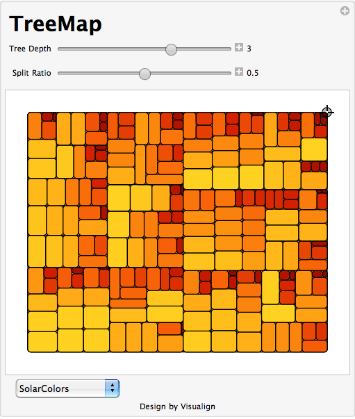
One of the fundamental tenets of this Blog is that interactive visualizations lead to better understanding of structure in the data or of the dynamic properties of a model. You can interact with this algorithm in the TreeMap model in Computable Document Format (CDF). Simply click on the graphic above and you get redirected to a site where you can interact with the model (requires one-time loading of the free CDF Browser Plug-In). You can change the shape of the outer rectangle, adjust the tree level and split-ratio and pick different color-schemes. The values are shown as Tooltips when you hover over the corresponding rectangle. You also have access to the Mathematica source code if you want to modify it further. Here is a TreeMap with three levels:

Of course a more complete implementation would allow to vary the color-controlling parameter, to filter the values and to re-arrange the dimensions as different levels of the tree. Perhaps someone can start with this Mathematica code and take it to the next level. The previous TreeMap post points to several tools and galleries with interactive applications so you can experiment with that.

Lastly, I wanted to point out a good article by the creator of TreeMaps, Ben Shneiderman. In this 2006 paper called “Discovering Business intelligence Using Treemap Visualizations” he cites various BI applications of TreeMaps. Several studies have shown that TreeMaps allow users to recognize certain patterns in the data (like best and worst performing sales reps or regions) faster than with other more traditional chart techniques. No wonder that TreeMaps are finding their way into more and more tools and Dashboard applications.

 
4 Comments

Posted by on November 9, 2011 in Industrial, Scientific


Tags: , , ,

Bubble Charts and GapMinder’s Trendalyzer

Bubble Charts are a powerful way to visualize data over time. They typically consist of a set of circles moving dynamically around in a two-dimensional box. One of the best illustrations of these charts comes from the GapMinder foundation. From their website mission statement:

The initial activity was to pursue the development of the Trendalyzer software. Trendalyzer sought to unveil the beauty of statistical time series by converting boring numbers into enjoyable, animated and interactive graphics. The current version of Trendalyzer is available since March 2006 as Gapminder World, a web-service displaying time series of development statistics for all countries.

In March 2007, Google acquired Trendalyzer from the Gapminder Foundation and the team of developers who formerly worked for Gapminder joined Google in California in April 2007.

Some of you may have seen Hans Rosling’s TED talks which leverage this tool. (For example, his 2007 talk on new insights on poverty or his 2010 talk on the good news of the decade about child mortality.) Some reviewers have said that in his talks, “data comes to live and sings” to the audience.

Snapshot of selected Nations Wealth and Health information for a given year.

Let’s look at the Trendalyzer above with data on the Nation’s Health and Wealth to illustrate the power of Bubble Charts:

  • Each Bubble corresponds to one nation X (say China)
  • Each Axis represents one scalar variable of the nation (here the wealth and health of nation X)
  • Position of bubble indicates the data point of the two axis variables at a given time (1960)
  • Size of bubble indicates a third scalar variable (population size of nation X)
  • Color of bubble indicates a category of the nation X, such as continent or other classification
  • Trajectory of bubble indicates the change over time (here ~ 50 years from 1960 to 2009 in annual steps)
  • With the Trendalyzer you can interact with the data in a variety of ways. You can change the two dimensions of nations data you care about. You can set the axis to linear or logarithmic to adjust the range of motion along the axis based on the data. You can select a subset of nations to highlight their bubbles. You can check to track the trajectory of bubbles over time. You can change the classification and it’s corresponding color scheme. You can manually slide time back and forth or start an automatic run through time. Here is another snapshot of the same data set:

    50 year time trace of nations wealth and health with 7 selected countries highlighted.

    This one graph alone shows a lot of interesting trends. India and China (light blue and red) both rapidly improved life expectancy between 1960 and 1980, and in the next three decades steadily improved GDP/capita. During the cold war both Russia (orange) and the United States (yellow) slowly improved wealth, but only the US increased health as well; and after the collapse of the Soviet Union in the 90’s Russia regressed in its GDP/capita back to nearly 1960 levels before slowly gaining again in the following decade. The three African countries (dark blue) both started in very different positions and each had unique trajectories. Zimbabwe started out with the highest life expectancy, but then had a devastating decade in the 90’s with the HIV epidemic taking its toll and reducing life expectancy down from 60 to around 40, followed by a backslide into more extreme poverty over the following decade. Nigeria, Africa’s most populous nation, has improved more steadily and now overtaken Zimbabwe both on average health and wealth. South Africa had slow gains in wealth throughout, but after sizable gains in health until the early 90’s, a precipitous decline brought that nation’s health back down again to near 1960 levels.

    Despite the extraordinary amount of information aggregated in such a graph, even more insight comes from interacting with the data and seeing the dynamic change in size and position over a time series. This is the central theme of this Blog: Creating insight from rich data visualizations through interaction and display of changes in real time. I encourage you to do so with the Trendalyzer tool at the Gapminder World website (requires Flash).

     
    3 Comments

    Posted by on July 28, 2011 in Industrial, Scientific, Socioeconomic


    Tags: , ,

    Flight Pattern Visualization

    Aaron Koblin, an artist specializing in data and digital technologies and currently leader of the Data Arts team in Google’s Creative Lab, collaborated with Wired Magazine and FlightView Software to create beautiful graphics and illustrations of flights based upon tracking data by the FAA.

    Flight Patterns over the US by Aaron Koblin

    The following YouTube video is a time-lapse movie of flights over the US during a 24 hour period in 2008. One can clearly see the airspace come alive on the East Coast in the early morning hours and then calm down over night.

    It is amazing how much data is aggregated into such a visualization – covering over 200.000 flights! Aaron’s website has a section about the flight patterns project which is well worth exploring. There are other graphs where you can set filters for aircraft type, manufacturer, altitude etc. Some of these graphics have been sold as wallpaper or prints and graced various art exhibitions. There is beauty in properly visualized data.

     
    1 Comment

    Posted by on July 26, 2011 in Art, Industrial


    Tags: , ,

    Visual Human Development Index

    Alex Simoes, MIT Media Lab student working with Professor Cesar Hidalgo, developed a graphical representation of the Human Development Index (HDI). The so-called HDI trees are based on data published in the United Nations 2010 edition of the Human Development Report. The interactive version on their website allows for comparisons between two countries, or between two years of one country.

    Human Development Index – HDI Tree Representation

    From Hidalgo’s website:

    The HDI Tree aggregates data in the Human Development Index graphically instead of numerically. A long standing criticism of the Human Development Index is that, because it averages indicators of Income, Health and Education, it is possible for countries to obtain the same score with different combinations of indicators. This creates the possibility of substituting Education for Health, Health for Income or Income for Education.

    The HDI tree deals with the numerical aggregation problem by using a graphical representation in which the total value of a country’s HDI is presented together with that of its components and subcomponents. This way it is possible to see immediately the contribution of each dimension to the value of a country’s HDI.

    Moreover, the HDI tree represents an alternative way of branding the idea of Human Development and communicating its message graphically to a wide audience. For more on the HDI tree, see the original report or this summary document.

    Inevitably, there are times when one wishes to collapse multiple dimensions or factors into one numerical score. However, one loses the details underlying the score. Such tree-like visual representations of aggregate information can be used for compound measurements used in business, such as the Balanced Scorecard.

    Note: Hidalgo’s gallery features many more interesting projects, such as Disease Network Data visualizing disease associations or the Product Space visualizing economic capabilities of countries based on their trading activities.

    Addendum: I did some more research on this and found a great summary on the HDI tree posted under the title “Visualizing Human Development” at Visualizing.org. One particularly interesting chart is a summary of 35 African nations, showing their respective HDI tree for both 1970 and 2005.

    From the original summary paper “A Visual HDI” by C. Hidalgo:

    The Development Tree also facilitates searching and comparing features over large volumes of data. For example, consider Figure [above], a chart in which the HDI trees of 35 African Nations are shown for both 1975 and 2005. This figure shows information on 420 numerical values (35 countries x 2 years x 6 values). In this chart, however, there are several observations that are easy to spot despite the large amount of information being presented. For instance, it is relatively easy to find out what are the countries in the set with higher levels of development. Algeria, Botswana, Libya, Mauritius, Morocco, South Africa and Tunisia in this case. Moreover, their increases are also rather conspicuous. Also, the lopsidedness of some nations also becomes conspicuous, as it can be seen in the examples of Botswana, South Africa and Swaziland, regarding the life dimension, and that of Libya in 1970, regarding high Income, or of Congo DRC in 2005, regarding low income.

    Again, I can easily picture applications of this visual representation of an aggregate score in a typical business environment. Consider an internal ranking of employees based on an aggregation of several orthogonal dimensions such as skill, teamwork, communication, innovation and business savvy. You could look at a dozen of these employees and their respective visual aggregate tree scores to spot trends, outliers, and relative strengths. Another example is the Balanced Scorecard approach mentioned above. Suppose you are aggregating measures about Finance, Schedule, Quality, Innovation, and People into the score of an Engineering organization. Then you could picture the tree for aggregate performance of this business unit over time (quarters or years) to spot trends.

     
    2 Comments

    Posted by on July 6, 2011 in Socioeconomic


    Tags: , , ,

    Visualizing Word Frequencies with Wordle

    Jonathan Feinberg created a nice little app to generate and edit word clouds called “Wordle”. From the Wordle website:

    Wordle is a toy for generating “word clouds” from text that you provide. The clouds give greater prominence to words that appear more frequently in the source text. You can tweak your clouds with different fonts, layouts, and color schemes. The images you create with Wordle are yours to use however you like. You can print them out, or save them to the Wordle gallery to share with your friends.

    Here is a sample of a word cloud of a previous Visualign Blog post (Interactive and Visual Information):

    Wordle generated word cloud of a previous Visualign post.

    By default, common words of the English language (“the”, “is”, “and”, etc.) are stripped out to allow focus on substantive content words. One can also exclude individual words – such as the dominant word “information” above – and tweak many options. If one could create similar word clouds from recorded speech, this might be applied to visualize certain speech patterns and perhaps cure bad habits (such as repeating “Ummm” or other fill words).

    Here is another sample screen shot of the Java applet after creating the word cloud from James Taylor’s RSS feed on Enterprise Decision Management:

    Wordle Java applet with word cloud. Note the prominence of PMML (Predictive Model Markup Language).

    While it’s not clear how to measure the impact or value of such word cloud visualizations, it does provide a novel way to use colors, frequencies, font sizes etc. to filter, highlight, and elucidate structure in textual data – something very close to Visualign’s philosophy.

     
    Leave a comment

    Posted by on June 28, 2011 in Linguistic


    Tags: , ,

     
    %d bloggers like this: