RSS

Tag Archives: treemap

Treemap of Top 1 Percent Occupations

Treemap of Top 1 Percent Occupations

On Jan 15, 2012 the New York Times published an interactive Treemap graphic with the title: “The Top 1 Percent: What Jobs Do They Have?”

Treemap of Top 1 Percent Professions (Source: New York Times)

It is a good example of the Treemap chart we have covered in previous posts (Treemap of the Market and Implementation of Treemap). From the chart legend:

“Rectangles are sized according to the number of people in the top 1 percent. Color shows the percentage of people within that occupation and industry in the top 1 percent.”

There are approx. 1.4 million households in the top 1 percent; they earn a minimum of about $500k per year, with an average annual income around $1.5m (according to this recent compilation of 10 fun facts about the top 1 percent).

The largest and darkest area in the Treemap are Physicians. Chief Executives and Public Administrators as well as Lawyers are also doing very well, not surprisingly, especially in Security, commodity broker and investment companies. The graphic nicely conveys the general notion that big money is in health, financial and legal services.

One thing to keep in mind is that the chart counts the number of individual workers living in households with an overall income in the top 1 percent nationwide. This skews the picture a bit, since an individual with a low-earning occupation can still live in a top 1 percent household through being married to a top-earning spouse. If you looked at individuals only, the number of top 1 percent earners in occupations such as teacher, receptionist, waiter, etc. would certainly be much smaller.

P.S: I stumbled across this particular chart from Sha Hwang’s “UltraMapping” at PInterest, which is a great collection of maps and other graphics for design inspiration.

UltraMapping collection of maps (source: Sha Hwang via Pinterest)

 
Leave a comment

Posted by on February 2, 2012 in Industrial, Socioeconomic


Tags: , ,

Implementation of TreeMap

Implementation of TreeMap

After posting on TreeMaps twice before (TreeMap of the Market and original post here) I wanted to better understand how they can be implemented.

In his book “Visualize This” – which we reviewed here – author Nathan Yau has a short chapter on TreeMaps, which he also published on his FlowingData Blog here. He is working with the statistical programming language R and uses a library which implements TreeMaps. While this allows for very easy creation of a TreeMap with just a few lines of code, from the perspective of how the TreeMap is constructed this is still a black box.

I searched for existing implementations of TreeMaps in Mathematica (which I am using for many visualization projects). Surprisingly I didn’t find any implementations, despite the 20 year history of both the Mathematica platform and the TreeMap concept. So I decided to learn by implementing a TreeMap algorithm myself.

Let’s recap: A TreeMap turns a tree of numeric values into a planar, space-filling map. A rectangular area is subdivided into smaller rectangles with sizes in relation to the values of the tree nodes. The color can be mapped based on either that same value or some other corresponding value.

One algorithm for TreeMaps is called slice-and-dice. It starts at the top-level and works recursively down to the leaf level of the tree. Suppose you have N values at any given level of the tree and a corresponding rectangle.
a) Sort the values in descending order.
b) Select the first k values (0<k<N) which sum to at least the split-ratio of the values total.
c) Split the rectangle into two parts according to split-ratio along its longer side (to avoid very narrow shapes).
d) Allocate the first k values to the split-off part, the remaining N-k values to the rest of the rectangle.
e) Repeat as long as you have sublists with more than one value (N>1) at current level.
f) For each node at current level, map its sub-tree onto the corresponding rectangle (until you reach leaf level).

As an example, consider the list of values {6,5,4,3,2,1}. Their sum is 21. If we have a split-ratio parameter of say 0.4, then we split the values into {6,5} and {4,3,2,1} since the ratio (6+5)/21 = 0.53 > 0.4, then continue with {6,5} in the first portion of the rectangle and with {4,3,2,1} in the other portion.

Let's look at the results of such an algorithm. Here I'm using a two-level tree with a branching factor of 6 and random values between 0 (dark) and 100 (bright). The animation is iterating through various split-ratios from 0.1 to 0.9:

Notice how the layout changes as a result of the split-ratio parameter. If it’s near 0 or 1, then we tend to get thinner stripes; when it’s closer to 0.5 we get more square shaped containers (i.e. lower aspect ratios).

The recursive algorithm becomes apparent when we use a tree with two levels. You can still recognize the containers from level 1 which are then sub-divided at level 2:

One of the fundamental tenets of this Blog is that interactive visualizations lead to better understanding of structure in the data or of the dynamic properties of a model. You can interact with this algorithm in the TreeMap model in Computable Document Format (CDF). Simply click on the graphic above and you get redirected to a site where you can interact with the model (requires one-time loading of the free CDF Browser Plug-In). You can change the shape of the outer rectangle, adjust the tree level and split-ratio and pick different color-schemes. The values are shown as Tooltips when you hover over the corresponding rectangle. You also have access to the Mathematica source code if you want to modify it further. Here is a TreeMap with three levels:
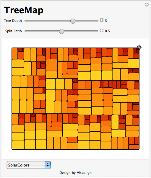
Of course a more complete implementation would allow to vary the color-controlling parameter, to filter the values and to re-arrange the dimensions as different levels of the tree. Perhaps someone can start with this Mathematica code and take it to the next level. The previous TreeMap post points to several tools and galleries with interactive applications so you can experiment with that.

Lastly, I wanted to point out a good article by the creator of TreeMaps, Ben Shneiderman. In this 2006 paper called “Discovering Business intelligence Using Treemap Visualizations” he cites various BI applications of TreeMaps. Several studies have shown that TreeMaps allow users to recognize certain patterns in the data (like best and worst performing sales reps or regions) faster than with other more traditional chart techniques. No wonder that TreeMaps are finding their way into more and more tools and Dashboard applications.
 
4 Comments

Posted by on November 9, 2011 in Industrial, Scientific


Tags: , , ,

TreeMap of the Market

TreeMap of the Market

SmartMoney has an interactive visual tool on their website called “Map of the Market”. It is an application of the TreeMap concept developed by Ben Shneiderman which I have blogged about before here.

The map lets you watch more than 500 stocks at once, with data updated every 15 minutes. Each colored rectangle in the map represents an individual company. The rectangle’s size reflects the company’s market cap and the color shows price performance. (Green means the stock price is up; red means it’s down. Dark colors are neutral). Move the mouse over a company rectangle and a little panel will pop up with more information.

Map Of The Market (Source: SmartMoney website)

For example, the above map shows the 26 week performance with the Top 5 Losers highlighted (hovered over RIMM). More information from the corresponding Map Instructions page.

This map is also quite similar in concept to the StockTouch iPad app which I covered here. StockTouch displays 900 companies, grouped into 9 sectors. The above Map of the Market is a free service, with an available upgrade to one showing 1000 companies for a subscription fee. While interesting in its own right, however, this is not about the business model of how to monetize the use of such information.

It might be interesting to put together a time-lapse video showing this map for every close of business day throughout one year. Not only would one see the up and down movement by color, but also the gradual shifts in the cumulative size of various sectors due to the area in the tree map.

Another fascinating set of tree map uses is on display at the Gallery of the Hive Group website. Their interactive tree map product HoneyComb has been used in many different industries. The Gallery shows many examples, ranging from sales performance to manufacturing / quality applications to public interest uses such as browsing Olympic Games results or data on Earthquakes. See the following example screenshot (click to interact on the Hive Group website):

TreeMap of Earthquakes (Source: HiveGroup)

While you won’t get the full benefit of seeing the details of all 540 items in one view, you can filter using the panel controls on the right or change the grouping and size and color attributes. This shows for example that the most powerful earthquakes are generally not the most deadly ones and vice versa.

Interacting with these sample tree maps again drives home the fundamental notion that interactive visualizations lead to quicker grasp and better understanding of data sets. This is similar to how walking around and seeing an object from different perspectives gives you a better idea of it’s 3-D structure than seeing it just in one 2-D picture. With multiple ways of interacting it feels almost as if you’re walking inside the data set to see it from multiple angles and perspectives. You have to do it yourself to appreciate the difference it makes.

Lastly, a good article on some of the pitfalls of tree map design with lots of links to good/bad examples comes from the folks at Juice Analytics in their Blog post titled “10 lessons in Treemap Design“.

 
4 Comments

Posted by on October 29, 2011 in Financial, Industrial


Tags: , ,

TreeMaps

Around 1990 Ben Shneiderman invented TreeMaps as a way to visualize a hierarchy of nodes in a constrained space, for example a rectangle of fixed size. TreeMaps have since been integrated in various tools and are used for interactive graphics in several newspapers and magazines, such as the BBC and NYTimes in the following two examples.

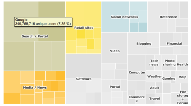
Top 100 Internet sites (Source: BBC online article in Jan 2010)

TreeMap for the TOP 100 Internet Sites as of Jan 2010. In the interactive version (Flash-based) hovering over a rectangle will display the underlying data.

Trucks, Vans, S.U.V. sales in the US (Source: NYTimes article in Feb 2007)

Composite TreeMap of Truck, Van, S.U.V. sales performance in the US by manufacturer..

A history of TreeMaps with many beautiful examples has been compiled by Ben Shneiderman here. My favorite is this variation of a circular TreeMap by Kai Wetzel, a graph showing disk usage by folder with color code showing age of files.

Circular TreeMap showing disk usage (size) and file age (color) of a hierarchical directory structure.

Who says visualizing complex information can’t be informative and aesthetically pleasing at the same time?

 
3 Comments

Posted by on June 22, 2011 in Art, Industrial, Scientific


Tags:

 
%d bloggers like this: