Most sales processes go through a series of stages, from first contact through successive engagement of the potential client to the close. One can think of these as special cases of attrition-based workflows. These are very typical in online (B2C eCommerce) or tele-marketing (call centers) and companies usually collect a lot of data around the conversion rates at each step. How can one visualize such workflows?
One metaphor for these processes is that of a sales funnel. A lot of leads feed in on one side, and at each stage fewer pass through to the next. It is then straightforward to want to visualize such funnels, such as shown here by Tableau.

Tutorial video explaining how to create a funnel chart using Tableau (Source: Tableau Training Video)
Aside from the somewhat tedious steps involved – custom field calculations, left-right duplication of the chart, etc. – it turns out, however, that funnel charts are not easy to interpret. For example, it is not well suited to answer the following questions:
- What’s the percentage reduction at each step?
- Comparing two or more funnels, which has better conversions at each step?
- What are the absolute numbers in each step?
- Are the conversion rates above or below targets at each step?
Ash Maurya from Spark59 wrote a very useful article on this topic entitled “Why not the funnel chart?“. In it he looks specifically at comparisons of funnels (current vs. prior time intervals or A|B testing).
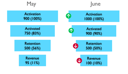
Time Series comparison of funnel performance (Source: Ash Maurya’s Spark59 Blog)
In a next step he shows that the funnel shape doesn’t add to the readability. Instead simple bar charts can do just as well:
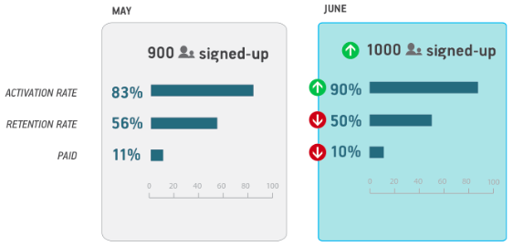
Same information with Bar Charts (Source: Ash Maurya’s Spark59 Blog)
For a multi-step funnel, the problem remains that with the first step set to 100%, subsequent steps often have fairly small percentages and thus are hard to read and compare. Suppose you are sending emails to 100,000 users, 30% of which click on a link in the email, of which only 10% (3% of total) proceed to register, of which only 10% (0.3% of total) proceed to subscribe to a service. Bars with 3% or even 0.3% of the original length will be barely visible. One interesting variation is to normalize each step in the funnel such that the new, expected conversion number (or that from the prior period) is scaled back to 100%. In that scenario it is easy to see which steps are performing above or below expectations. (Here big jump in Registrations from Jan to Feb, then small drop in Mar.)
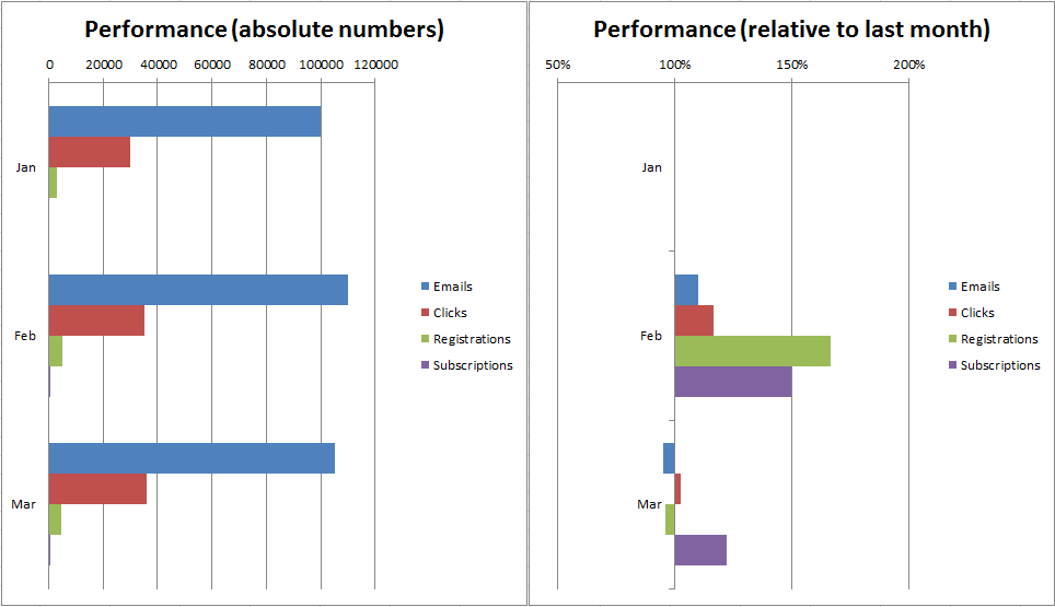
Bar Charts with absolute vs. relative numbers
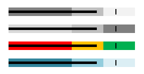
Next, Ash Maurya uses the Bullet Chart as introduced by Stephen Few in 2008. The Bullet Chart is a variation of a Bar Chart that uses grey-scale bands to indicate performance bands (such as poor – ok – good) as well as a target to see whether the performance was above or below expectations. The target bar allows to combine two charts into just one, giving a compact representation of the relative performance:

Bullet Chart showing funnel performance (Source: Spark59 Blog)
Various authors have looked at how to create such bullet charts in Excel. For example Peltier Tech has looked at this in this article called “How to make horizontal bullet graphs in Excel“. There is still quite some effort involved in creating such charts, as Excel doesn’t directly support bullet charts. Adding color may make sense, although it quickly leads to overuse of color when used in a dashboard (as Stephen Few points out in his preference for grey scales).
Bullet Graphs in Excel (Source: Peltier’s Excel Blog)
Another interesting approach comes from Chandoo with an approximation of a bullet graph in cells (as compared to a separate Excel chart object). In this article “Excel Bullet Graphs” he shows how to use conditional formatting and custom formulae to build bullet graphs in a series of cells which can then be included in a table, one chart in each row of the table.

In-Cell Bullet Graph in Excel (Source: Chandoo’s Blog)
It is somewhat surprising that modern data visualization tools do not yet widely support bullet charts out of the box.
Measuring how marketing efforts influence conversions can be difficult, especially when your customers interact with multiple marketing channels over time before converting. To that end, Google has introduced multi-channel funnels (MCF) in Google Analytics, as well as released an API to report on MCFs. This enables new sets of graphs, which we may cover in a separate post.

DJK
February 7, 2017 at 6:33 pm
How did you get the different levels of the funnel to have different colors? I followed the tutorial but was unable to do it with area charts, only bar charts etc.
Thanks
visualign
March 5, 2017 at 6:31 pm
It’s been a while since I did follow the steps in the Tableau video. I think one of the key aspects was that it is a duplicated bar chart, not an area chart, with custom calculations for the changes in width based on the funnel metrics.
Ultimately this post was about different ways to visualize funnels, primarily using bullet graphs.
Darren
November 14, 2018 at 2:37 am
Hi how would you visualise a monthly conversion rate where the current month conversion is always lower than the previous monthspirely because the process involved takes 2 months so the latest month conversion is always low but on a graph looks like it’s plummeted.
Agnieszka Pałka
August 17, 2020 at 10:10 am
Hi, amazing job done here! Thank you, really useful!