RSS

Category Archives: Industrial

6 year growth: Apple, Microsoft, Google, Amazon

6 year growth: Apple, Microsoft, Google, Amazon

Back in 2012 we did a side-by-side comparison of the four largest technology companies and their quarterly growth and other financial metrics. A year later in 2013 the four companies were again compared using Wolfram Alpha to generate lots of charts and tables by simply typing in “Google vs. Amazon vs. Apple vs. Microsoft” in the search bar.

Today, six years later, this same exercise reveals very strong growth. The big companies are getting (much) bigger. Here are some comparisons:

QuaerterlyRevenue20122018

With the underlying numbers:

NumberComparison

(Market cap as of market close on 2/3/2012 and 6/1/2018; sources the respective 10-Q filings; scales are the same for left and right charts. Google refers to its parent Alphabet, Inc.)

When taken together, over the last six years the four companies have grown as follows:

  • Revenue more than doubled (+112%, 13.3% annualized)
  • Income grew only moderately (+31%, 4.6% annualized)
  • Market cap tripled (+202%, 20.2% annualized)
  • Employees almost quadrupled (+276%, 24.7% annualized)

Of course, the $ numbers need to be inflation-adjusted, but US inflation rates were around 2% or less between 2012-2018, which amounts to about 10% over that period of time. Hence inflation is not qualitatively influencing this analysis or comparison.

Amazon grew the most, with its market cap growing more than 9 fold (+833%) and its employees more than 8-fold (+763%) to more than half a million people. Back in 2012, all four combined just exceeded $1 trillion in market cap; this has swollen to $3.3 trillion.

These are the biggest nominal market cap values in history. When comparing them to the GDP of countries, they would each rank in the Top-20. According to 2018 GDP projections by the International Monetary Fund, Apple would rank 18 behind the Netherlands (17th, $945,327 million), the other three companies would rank 19 behind Turkey (18th, $909,855 million). The market cap of these four companies combined would rank 5th behind Germany (4th, $4,211,635 million). In other words, only the top four countries by GDP (United States, China, Japan and Germany) are bigger than the market cap of Apple, Microsoft, Google and Amazon combined.

These corporations are transnational entities with a global customer base. Arguably, their size and economic power has grown so rapidly that the legal, tax and trade frameworks governing their operations can’t always keep up. Similarly, when companies get so large and rich, they can buy startups and entice talent to join them at a rate newer entrants or even governments cannot match. Apple’s cash position at the end of Q3’2017 was roughly $270 billion (source Asymco). It is not obvious that consumers always benefit from companies growing that large (see monopoly and anti-trust laws). Thankfully, the current technology oligopoly leads to healthy competition.

As before, there remain significant differences in the revenue segmentation across these four companies:

RevenueBySegment

Arguably, Microsoft has the broadest diversification and hence the most stability against disruptive innovation. Its three segments are not only roughly equal in size, but in turn contain a variety of different sub-segments. Productivity and Business Processes includes Office, Exchange, Skype, LinkedIn, Dynamics; Intelligent cloud includes Windows Server, SQL Server, Azure and Consulting Services; Personal Computing includes Windows, Devices, XBox and Search/Advertising. Microsoft’s Azure cloud services have closed the gap to Amazon’s AWS business and recently overtaken it by quarterly revenue.

If consumers were to search somewhere else than using Google, shop somewhere else than Amazon or buy no more iPhones, these companies would all shrink by an order of magnitude. Microsoft stands well positioned by comparison.

The following radar plot shows the above table numbers in a different perspective:

RadarPlot20122018

For each metric, 100% corresponds to the maximum of the four companies. Amazon has the most employees, Apple is the largest in quarterly revenue, profit and market cap. Some comments on the 2012 – 2018 changes:

  • Employees: Microsoft only added +35% of employees; Apple and Google more than doubled at about +160%; Amazon exploded by adding +763% to an almost 9-fold increase from 65,600 to 566,000.
    While Microsoft had more than twice as many employees as Apple in 2012, they are the same size now (~123,000).
  • Profits: While the green line (market cap) in the radar plot almost looks like an even-sized  rectangle, the red line (profit) is much tilted towards Apple and leaves comparatively little for Amazon.
  • Revenue per employee: Apple still takes the price in this rank (~$2million/year), with Google ($1.47million/year) and Microsoft ($0.87million/year). Amazon “only” earns $0.36million/year. In that metric, Amazon slipped from rank 2 to the bottom and Apple’s lead is not as strong as it was in 2012.

Much has been speculated about the future of the biggest technology companies and the nature of the next disruptions such as cloud, augmented reality (AR) and artificial intelligence (AI). Perhaps the biggest disruptor for this elite club of technology companies is Facebook, which only went public six years ago. FB currently has a $562 billion market cap. It is now bigger than these four were back in 2012, and about 70% of the size they are now. My own skepticism at the time of the Facebook IPO was proven wrong by its continued and strong growth. Their base of about 2 billion free accounts is by far the largest of any company ever. That said, I personally still have no Facebook account, while I’m using the products and services of each of the top four companies nearly every day! It will be interesting to see which one first breaks the $1 trillion market cap threshold.

Addendum 11/19/2018:

A lot has happened over the last 6 months. First, the above mentioned run-up continued and produced AAPL in early Aug-2018 as the first company to be publicly traded company worth $1 trillion. AMZN followed suit soon thereafter in early Sep-2018, but only stayed at that lofty valuation for a day or so. Here is a snapshot of the valuations as of Aug-31, 2018:

IMG_3399

Later in the fall the tides turned, and four of the above five stocks are now in correction territory. Here is the above snapshot for today, Nov-19, 2018:

IMG_3704

Here are the changes for all five companies summarized:

Screen Shot 2018-11-19 at 9.20.11 PM

Microsoft appears to have weathered the recent turbulence much better than the other companies. MSFT is down only 6.8% over the last 10 weeks; AAPL and GOOG each lost 16-20%, which at these valuations amounts to $217B and $140B, respectively! And AMZN and FB each lost about 25% of their market cap.

The combined total market value loss of the five companies is near $788B or $157 each on average. It is amazing to see how volatile the tech market has become in recent months. [Note on 11/21: Coincidentally, the New York Times ran a headline story the next day 11/20 titled The Tech Stock Fall Lost These 5 Companies $800 Billion in Market Value; the only difference was they excluded Microsoft and included Netflix.]

The earlier post pointed out that Microsoft was very well positioned, strongly diversified in its business, under fresh leadership of its CEO Satya Nadella since 2015, investing in new technologies (cloud, AI, AR) and much more conservative personnel expansion during the good times. They are now number #2 and maybe on track to pass AAPL again on their way to becoming the most valuable company in the world.


Leave a comment

Posted by on June 3, 2018 in Financial, Industrial


Digital Wages in the Gig Economy

Digital Wages in the Gig Economy

A small research team from the Oxford Internet Institute has recently issued a report based on a three year investigation into the worldwide geographies of the so-called Gig-Economy, online work which allows many talented people in the low and middle income countries of the world to compete on a global stage. From the Executive Summary:

Online gig work is becoming increasingly important to workers living in low- and middle-income countries. Our multi-year and multi-method research project shows that online gig work brings about rewards such as potential higher incomes and increased worker autonomy, but also risks such as social isolation, lack of work–life balance, discrimination, and predatory intermediaries. We also note that online gig work platforms mostly operate outside regulatory and normative frameworks that could benefit workers.

One of the eye-catching and very information rich visualizations comes from a related Blog post by the “Connectivity, Inclusion, and Inequality Group” called “Uneven Geographies of Digital Wages“.

odesk_donuts_wages_v3-01

Dollar Inflow and Median Wage by Country

The cartogram depicts each country as a circle and sizes each country according to dollar inflow to each country during March 2013 (on the freelance work oDesk.com platform, rebranded in 2015 to Upwork). The shading of the inner circle indicates the median hourly rate published by digital workers in that country. The graphic broadly reveals that median wages are, perhaps unsurprisingly low in developing countries and are significantly higher in wealthier countries.

Another Blog post on the geographies of online work adds several more visualizations (based on 2013 data, so a bit dated by now). For instance, one world map highlights the relationship between supply and demand. It distinguishes between countries with a positive balance of payment (i.e. countries in which more work is sold than bought) and countries with a negative balance of payment (countries in which more work is bought than is sold). The figure more clearly delineates the geography of supply and demand: with much of the world’s demand coming from only a few places in the Global North.

online-contracting-paymant-balance

Balance of payments

Another very interesting and dense visualization is a connectogram (see our previous post on Connectograms and the Circos tool) demonstrating the highly international trade in the online Gig-Economy: 89% of the trade measured by value happened between a client and a contractor who are in different countries. The network therefore attempts to illustrate the entirety of those international flows in one graph. It depicts countries as nodes (i.e. circles) and volumes of transactions between buyers and sellers in those countries as edges (i.e. the lines connecting countries). Country nodes are shaded according to the world region that they are in and sized according to the number of buyer transactions originating in them. Edges are coloured according to the flow of services: with the line shaded as the colour of the originating/selling region. Edges are also weighted according to the total volume of trade.

odesk_net_4_no-numbers

The Geographic Network of Sales

We see not just a complex many-to-many relationship of international trade, but also the large role that a few geographic relationships take (in particular, India and the Philippines selling to the United States).

Back to the Executive Summary of the above report:

The report’s central question is whether online gig work has any development potentials at the world’s economic margins. Its motive is to help platform operators to improve their positive impact, to help workers to take action to improve their situations, and to prompt policy makers and stakeholders interested in online gig work to revisit regulation as it applies to workers, clients, and platforms in their respective countries.

It is interesting to see these marketplaces evolve, in terms of the international, distributed nature, issues such as taxation, intermediation, opportunities and risks. There are also entirely new forms of social networks forming, based on blockchain powered token systems convertible into crypto-currencies (such as Steem). The core concept here is to eliminate not just geographical distance, but also risks from exchange rate fluctuations and predatory intermediaries. It remains to be seen to what degree this can act as a counterweight to technology-induced increasing inequality.


Leave a comment

Posted by on March 26, 2017 in Industrial, Socioeconomic


Tags:

10 years of BI Magic Quadrant

Every February the Gartner group publishes its Magic Quadrant (MQ) report on the Business Intelligence segment. As covered in previous years (2012, 2013, 2014), its centerpiece is a 2-dimensional quadrant of the Vision (x-axis) vs. Execution (y-axis) space. When this year’s report came out about 3 weeks ago, it completed a decade worth of data (each year from 2008 to 2017) on about 20-25 companies each year. Here is the latest 2017 picture (with trajectory from previous year):

BI_MQ_2017.png

I have collected the MQ position data in a simple Google Docs spreadsheet here. The usual disclaimers are worth repeating:

  • Gartner does not publish the x,y coordinates as they caution against using them directly for interpretation.
  • To approximate the data, I screen-scraped them from images revealed by Google search, which introduces both inaccuracies and the possibility of (my) clerical transcription error.
  • Changes in the x,y coordinate for one company from one year to the next are a combination of how that company evolved as well as how Gartner’s formula (also not published) may have changed. For example, from 2015 to 2016 many companies “deteriorated” in the ranking as can be seen from the following graphic:

bi_mq_2016

  • It is unlikely that so many companies deteriorate in their execution in unison. More likely, the formula changed and shifted the evaluation landscape upwards, meaning companies that stayed the same on the previously used factors now slipped downwards. (I read somewhere that Gartner wanted to have only 3 companies in the leader quadrant – an instance of curve-fitting if you will.) Whatever the reason, this shift removed all but three companies from the upper rectangle on execution.
  • That said, relative changes between companies in the same year are still meaningful, as they are all graded on the same formula.

Naturally, it is of interest to study the current leaders – Microsoft, Tableau and Qlik. Here is the dynamic evolution of these three competitors MQ positions over the last decade as GIF:

mq_leaders
mq_leaders_allFrom the entire trajectory (left) one can see that all of them have been leaders for many years.

Tableau joined the leader board in Feb-2013 from the status as challenger. It went public in May-2013 (ticker symbol DATA) and has grown into a company with close to $1B in annual revenue and > 3000 employees. It has had particularly consistent ratings on Execution scores since then. Many of the visualization metaphors it has introduced are commoditized by now, with a desktop designer tool for both Windows and Mac, a robust server product as well as a free public cloud-based option. For any company of such size it is a challenge to grow fast enough and it needs to both stay ahead of the competition as well as diversify into adjacent markets. Its stock price reached lofty heights of $127 (roughly $10B market cap) by mid-2015, but saw a drop to ~$80 by year-end 2015 and then cut in half one month later ($41 on Feb-1, 2016), from where it has only modestly recovered to around $52. Most SW products nowadays are offered as a service, which Tableau still hasn’t transitioned to as much as others have. That said, it’s Aug-2016 hiring of Adam Selipsky from Amazon Web Services indicates this transition and focus on Tableau Online and scale.

Microsoft is in a unique position for many reasons: It has a very healthy and diverse product portfolio across Windows, Office, Server, Cloud, and others. Most of these help build out a complete BI stack, helping it in the Vision dimension. Furthermore, it can subsidize the development of a large product and offer it free to capture market share. Unlike Tableau, the Power BI price point is near zero, which has helped it acquire a large community of developers, which in turn provides a growing gallery of solutions and plug-in visualization components. Lastly, Power BI is very well integrated with products such as Excel, SharePoint and SQL Server. Many enterprises already invested in the Microsoft stack will find it very easy to leverage the BI functionality.

I don’t have personal experience with QlikView, but enjoy reading on Andrei Pandre’s visualization Blog about it. Qlik was always a bit different, focusing on complex analytics more than mainstream tooling, and it having been taken private in Mar-2016 seems to have reduced its leadership status.

Another Blog I quite enjoy reading is blog.AtScale.com. (such as the 2017 article on the BI MQ by author Bruno Aziza).

I would summarize various factors influencing the BI solutions over the last few years:

  • Visualization tools and galleries – BI tools have reached a high level of maturity around the  generation of dashboards with interconnected components as well as complex interactive visuals such as treemaps or animated bubble charts. Composing the visual presentation is often the smallest part of a BI project, with proper data-mining often taking an order of magnitude more effort and resources.
  • ETL Commoditization – the need to support data-wrangling as part of the solution, not a mix of add-on tools. Microsoft’s SSIS, Tableau’s Maestro, Alteryx Designer Tools, etc.
  • Hybrid Cloud and On-Premise solution – Most enterprises want a combination of some (often historically invested) On-Premise data store / analytics capabilities with newer (typically subscription-based) Cloud-based services.
  • Big Data abilities and Stream processing – Need to integrate popular data visualization tools (Excel, Tableau, Power BI, QlikView) with big data platforms such as Hadoop. Furthermore, ability to analyze data as it is ingested in real-time without the time-consuming post-processing for dimensional analysis (data cubes)
  • Predictive Analytics and Machine Learning – Move focus from reporting (past, what happened?) via alerting (present, what’s happening?) to predicting (future, what will happen?)


Two weeks ago I attended the HIMSS’17 conference in Orlando (HIMSS = Healthcare Information Management System Society). I was particularly interested in the Clinical and Business Intelligence track and exhibitors in that space. My overall impression is that adoption of BI tools in Healthcare is still somewhat limited, with the bigger operational challenges around system interoperability and data exchanges, as well as adoption of digital tools (tablets, portals, Electronic Health Record, etc.) by patients, physicians, and providers.

I did see specialty solution providers such as Dimensional Insight. While impressive, their approach seems decidedly old school and traditional. I doubt that any company can sustain a lead in this space by maintaining a focus on their proprietary core technology (such as their Diver platform / data-cube technology). Proper componentization, standard interface support (such as HL7 FHIR) and easy-to-integrate building blocks will win broader practical acceptance than closed-system proprietary approaches.

There are some really interesting systems being applied to healthcare such as IBM’s Watson Health or the new Healthcare.ai platform from Health Catalyst. But that is a story for another Blog post…

 
Leave a comment

Posted by on March 5, 2017 in Industrial


Magic Quadrant Business Intelligence 2014

Over the last two years we have posted some visualization and interpretation of Gartner’s Magic Quadrant Analysis on BI companies. The previous articles in 2012 and 2013.

A Blog reader contacted me about the 2014 update; he sent me the {x,y} coordinate data for 2014 and so it was relatively straightforward to update the public Tableau workbook for it. Here is the image of all 29 companies with their changes from 2013 to 2014:

Gartner’s Magic Quadrant for Business intelligence, changes from 2013 to 2014

Gartner’s Magic Quadrant for Business intelligence, changes from 2013 to 2014

With the slider controls for Execution and Vision as well as the changes thereof, it is easy to filter the dashboard interactively. For example, there were a dozen companies who improved in their execution score (moving up in the quadrant):

Subset of companies who improved execution over the last year.

Subset of companies who improved execution over the last year.

Most of the companies improving their execution are niche players, with SAP being the only leader improving its execution score.

Most of the leaders improved in their vision score (moving right in the quadrant), including Tableau, QlikTech, Tibco and SAS.

Subset of companies who improved vision over the last year.

Subset of companies who improved vision over the last year.


7 companies, most of them leaders, lost ground on both execution and vision (moving to the bottom-left):

Companies who lost ground on both execution and vision in 2014

Companies who lost ground on both execution and vision in 2014


Lastly, I have updated the Public Tableau workbook with the Magic Quadrant as originally published in 2012 with the data for 2013 and 2014. (Click here for the interactive drawing.)

Public Tableau workbook with 7 years of BI Magic Quadrant data.

Public Tableau workbook with 7 years of BI Magic Quadrant data.

 
1 Comment

Posted by on September 28, 2014 in Industrial


Tags: , , , ,

Visualizing Conversion Rates (Funnels, Bullet Charts)

Most sales processes go through a series of stages, from first contact through successive engagement of the potential client to the close. One can think of these as special cases of attrition-based workflows. These are very typical in online (B2C eCommerce) or tele-marketing (call centers) and companies usually collect a lot of data around the conversion rates at each step. How can one visualize such workflows?

One metaphor for these processes is that of a sales funnel. A lot of leads feed in on one side, and at each stage fewer pass through to the next. It is then straightforward to want to visualize such funnels, such as shown here by Tableau.

Tutorial video explaining how to create a funnel chart using Tableau

Tutorial video explaining how to create a funnel chart using Tableau (Source: Tableau Training Video)

Aside from the somewhat tedious steps involved – custom field calculations, left-right duplication of the chart, etc. – it turns out, however, that funnel charts are not easy to interpret. For example, it is not well suited to answer the following questions:

  • What’s the percentage reduction at each step?
  • Comparing two or more funnels, which has better conversions at each step?
  • What are the absolute numbers in each step?
  • Are the conversion rates above or below targets at each step?

Ash Maurya from Spark59 wrote a very useful article on this topic entitled “Why not the funnel chart?“. In it he looks specifically at comparisons of funnels (current vs. prior time intervals or A|B testing).

Time Series comparison of funnel performance (Source: Ash Maurya's Spark59 Blog)

Time Series comparison of funnel performance (Source: Ash Maurya’s Spark59 Blog)

In a next step he shows that the funnel shape doesn’t add to the readability. Instead simple bar charts can do just as well:

Same information with Bar Charts (Source: Ash Maurya's Spark59 Blog)

Same information with Bar Charts (Source: Ash Maurya’s Spark59 Blog)

For a multi-step funnel, the problem remains that with the first step set to 100%, subsequent steps often have fairly small percentages and thus are hard to read and compare. Suppose you are sending emails to 100,000 users, 30% of which click on a link in the email, of which only 10% (3% of total) proceed to register, of which only 10% (0.3% of total) proceed to subscribe to a service. Bars with 3% or even 0.3% of the original length will be barely visible. One interesting variation is to normalize each step in the funnel such that the new, expected conversion number (or that from the prior period) is scaled back to 100%. In that scenario it is easy to see which steps are performing above or below expectations. (Here big jump in Registrations from Jan to Feb, then small drop in Mar.)

Bar Charts with absolute vs. relative numbers

Bar Charts with absolute vs. relative numbers

Next, Ash Maurya uses the Bullet Chart as introduced by Stephen Few in 2008. The Bullet Chart is a variation of a Bar Chart that uses grey-scale bands to indicate performance bands (such as poor – ok – good) as well as a target to see whether the performance was above or below expectations. The target bar allows to combine two charts into just one, giving a compact representation of the relative performance:

Funnel Chart showing funnel performance (Source: Ash Maurya's Spark59 Blog)

Bullet Chart showing funnel performance (Source: Spark59 Blog)

Various authors have looked at how to create such bullet charts in Excel. For example Peltier Tech has looked at this in this article called “How to make horizontal bullet graphs in Excel“. There is still quite some effort involved in creating such charts, as Excel doesn’t directly support bullet charts. Adding color may make sense, although it quickly leads to overuse of color when used in a dashboard (as Stephen Few points out in his preference for grey scales).

Funnel Graphs in Excel (Source: Peltier's Excel Blog)

Bullet Graphs in Excel (Source: Peltier’s Excel Blog)

Another interesting approach comes from Chandoo with an approximation of a bullet graph in cells (as compared to a separate Excel chart object). In this article “Excel Bullet Graphs” he shows how to use conditional formatting and custom formulae to build bullet graphs in a series of cells which can then be included in a table, one chart in each row of the table.

In-Cell Funnel Graph in Excel (Source: Chandoo's Blog)

In-Cell Bullet Graph in Excel (Source: Chandoo’s Blog)

It is somewhat surprising that modern data visualization tools do not yet widely support bullet charts out of the box.

Measuring how marketing efforts influence conversions can be difficult, especially when your customers interact with multiple marketing channels over time before converting. To that end, Google has introduced multi-channel funnels (MCF) in Google Analytics, as well as released an API to report on MCFs. This enables new sets of graphs, which we may cover in a separate post.

 
4 Comments

Posted by on March 31, 2013 in Industrial


Tags: , , ,

Magic Quadrant Business Intelligence 2013

It’s that time of the year again: Gartner has released its report on Business Intelligence and Analytics platforms. One year ago we looked at how the data in the Magic Quadrant – the two-dimensional space of execution vs. vision – can be used to visualize movement over time. In fact, the article Gartner’s Magic Quadrant for Business Intelligence became the most viewed post on this Blog.

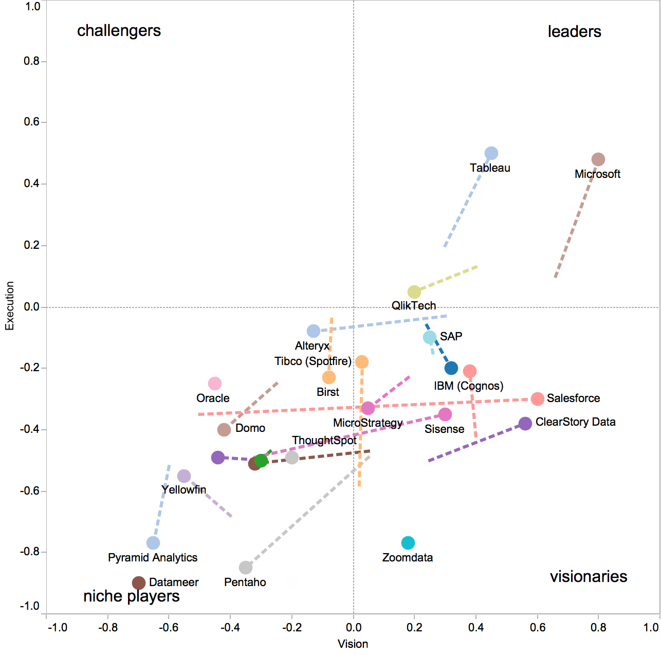
I had also uploaded a Tableau visualization to Tableau Public, where everyone can interact with the trajectory visualization and download the workbook and the underlying data to do further analysis. This year I wanted to not only add the 2013 data, but also provide a more powerful way of analyzing the dynamic changes, such as filtering the data. For example, consider the moves from 2012 to 2013 of some 21 vendors:

Gartner's Magic Quadrant for Business intelligence, changes from 2012 to 2013

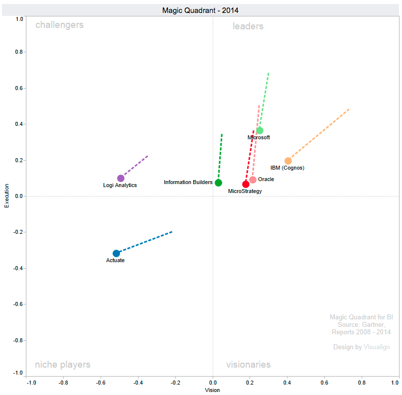
Gartner’s Magic Quadrant for Business intelligence, changes from 2012 to 2013

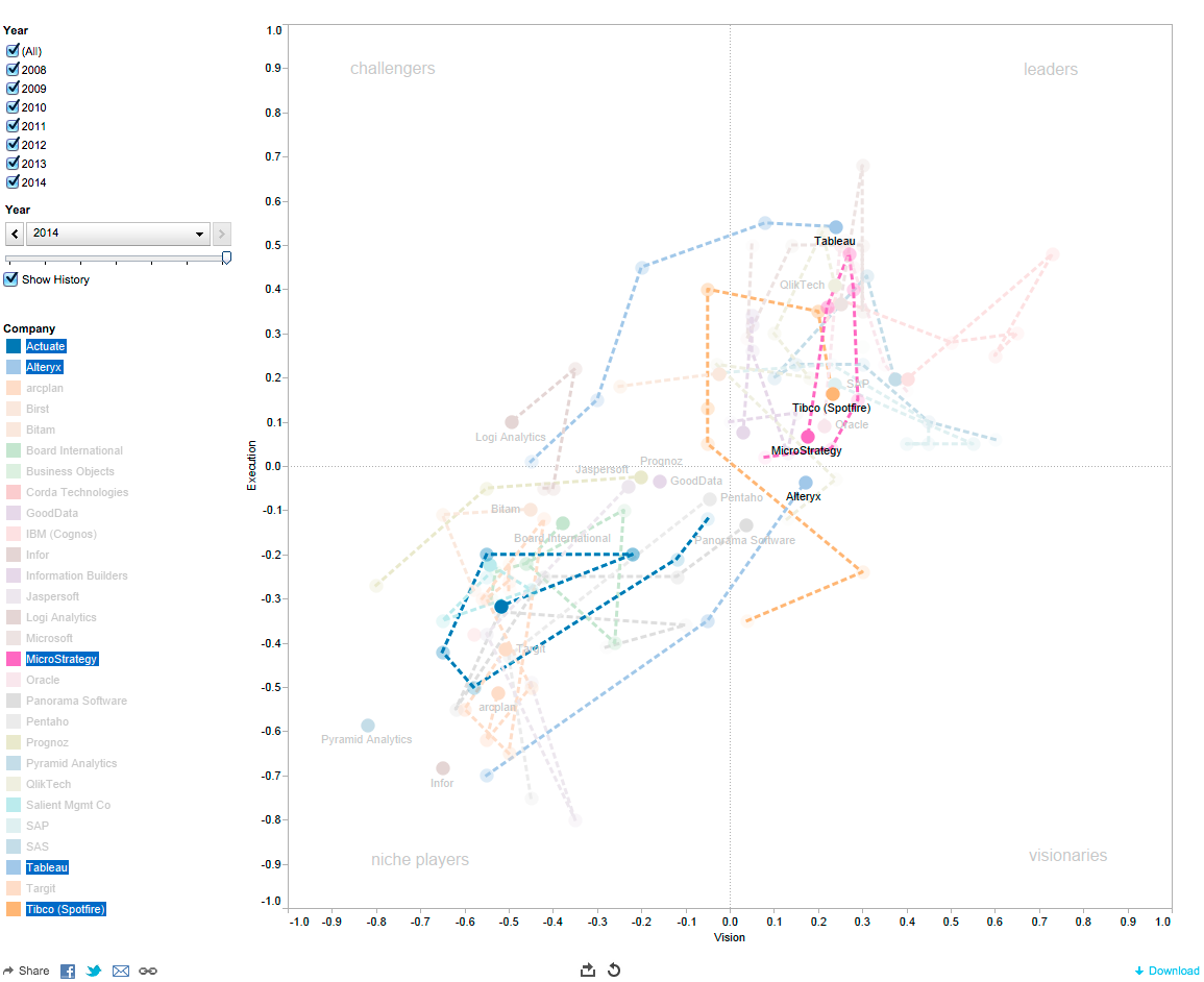
It might be helpful to filter the vendors in this diagram, for example to show just niche players, or just those who improved in both vision and execution scores. To that end, I created a simple Tableau dashboard with four filters: A range of values for the scores of both vision and execution scores, as well as a range of values for the changes in both scores. The underlying data is also displayed for reference, which can then be used to sort companies by ordering along those values.

Here is an example of the dashboard set to display the subset of 15 companies who increased either both or at least one of their vision or execution scores without lowering the other one.

Subset of companies who improved vision and/or execution over the last year.

Subset of companies who improved vision and/or execution over the last year.

That’s more than 70% of platforms, with the increase in vision being more pronounced than that of execution. That’s considerably more than in the previous years (2013: 15; 2012: 6; 2011: 6; 2010: 3; 2009: 9) – making this collective move to the top-right perhaps a theme of this year’s report.

Who changed Quadrants? Who moved in which dimension?

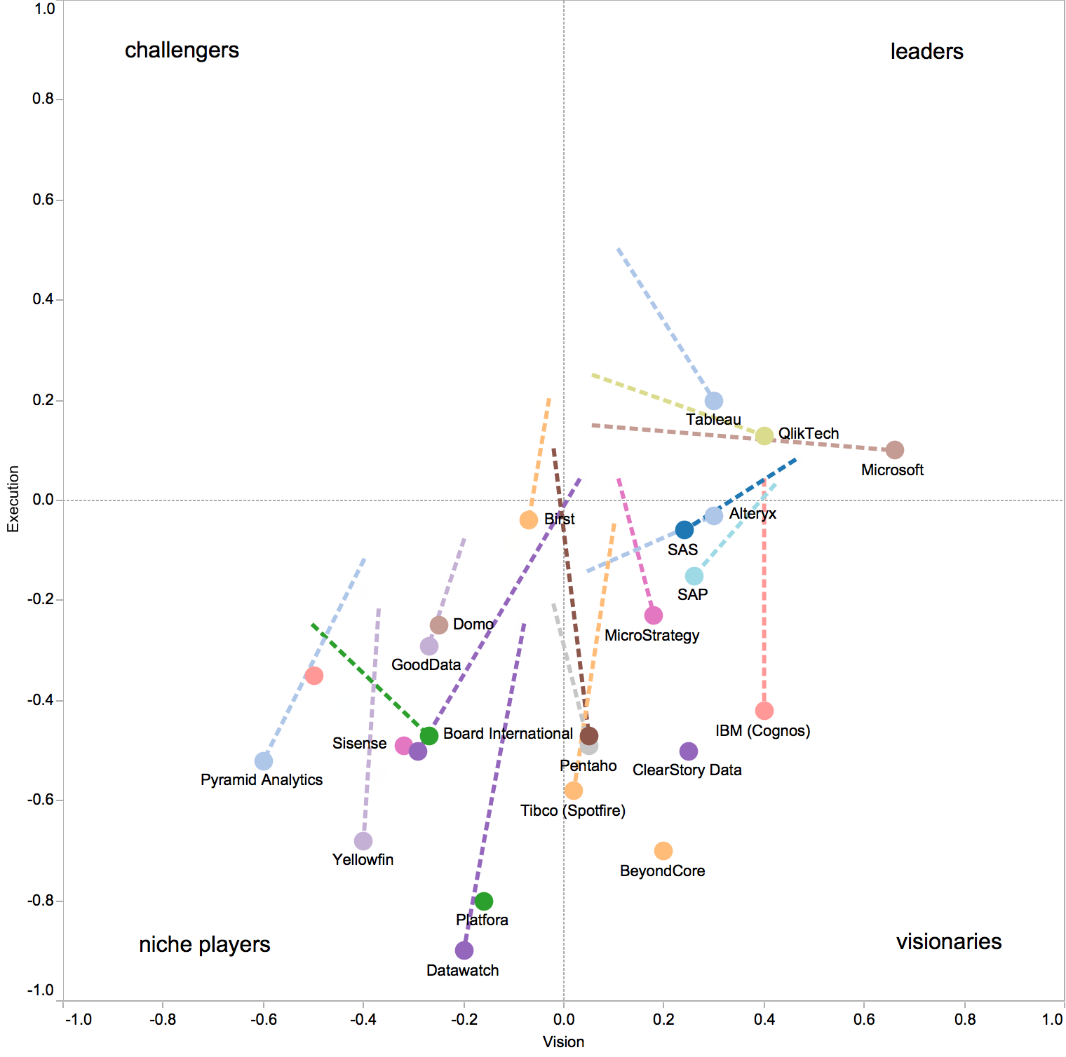
Last year Tibco (Spotfire) and Tableau were the only two platforms changing quadrants, then becoming challengers. This year both of them “turned right” in their trajectory and crossed over into the leaders quadrant due to strong increases in their vision capabilities. (QlikTech had been on a similar trajectory, but already crossed into the leader quadrant in 2012. It also strengthened both execution and vision again this year.)

Another new challenger is LogiXML. Thanks to ease of use, enhancements from customer feedback and a focus on the OEM market its ability to execute increased substantially. From the Gartner report summary on LogiXML:

Ease of use goes hand-in-hand with cost as a key strength for LogiXML, which is reflected by its customers rating it above average in the survey. The company includes interfaces for business users and IT developers to create reports and dashboards. However, its IT-oriented, rapid development environment seems to be most compelling for its customers. The environment features extensive prebuilt elements for creating content with minimal coding, while its components and engine are highly embeddable, making LogiXML a strong choice for OEMs.

A few other niche players almost broke into new quadrants, including Alteryx (which had the biggest overall increase and almost broke into the visionary quadrant), as well as Actuate and Panorama Software.

The latter two stayed the same with regards to execution (as did SAP) – while all three of them moved strongly to the right to improve on the vision score (forming the Top 3 of vision improvement).

Information Builders and Oracle stayed where they were, changing neither their execution nor vision scores.

Microsoft and Pentaho stayed about the same on vision, but increased substantially in their execution scores.  This propelled Microsoft to the top of the heap on the execution score, while it moved Pentaho from near the bottom of the heap to at least a more viable niche player position. Microsoft’s integration of BI capabilities in Excel, SQL Server and SharePoint as well as leveraging of cloud services and attractive price points make it a strong contender especially in the SMB space. Improvements of its ubiquitous Excel platform give it a unique position in the BI market. From the Gartner report:

Nowhere will Microsoft’s packaging strategy likely have a greater impact on the BI market than as a result of its recent and planned enhancements to Excel. Finally, with Office 2013, Excel is no longer the former 1997, 64K row-limited, tab-limited spreadsheet. It finally begins to deliver on Microsoft’s long-awaited strategic road map and vision to make Excel not only the most widely deployed BI tool, but also the most functional business-user-oriented BI capability for reporting, dashboards and visual-based data discovery analysis. Over the next year, Microsoft plans to introduce a number of high-value and competitive enhancements to Excel, including geospatial and 3D analysis, and self-service ETL with search across internal and external data sources.

The report then goes on to praise Microsoft for further enhancements (queries across relational and Hadoop data sources) that contribute to its strong product vision score and “positive movement in overall vision position”. This does not seem consistent with the presented Magic Quadrant, where Microsoft only moved to the top (execution), not to the right (vision). Perhaps another reason for Gartner to publish the underlying coordinate data and finally adopt this line of visualization with trajectories.

Deteriorate2013

Dashboard with filters revealing two platforms deteriorating in both vision and execution

Only two vendors saw their scores deteriorate in both dimensions: MicroStrategy gave up some ranks, but remains in the leader quadrant. The report cites a steep sales decline in 3Q12 and the increased importance of predictive and prescriptive analytics in this years evaluation among the reasons:

MicroStrategy has the lowest usage of predictive analytics of all vendors in the Magic Quadrant. A reason for this behavior might be the user interface that is overfocused on report design conventions and lacks proper data mining workbench capabilities, such as analysis flow design, thus failing to appeal to power users. To address this matter, MicroStrategy should deliver a new high-end user interface for advanced users, or consumerize the analytic capabilities for mainstream usage by embedding them in Visual Insight.

The other vendor moving to the bottom-left is arcplan, which is now at the bottom of the heap in the niche players quadrant.

Who moved to the top-left?

With the dashboard at hand, you can also go back and do similar queries not just for the current year 2013, but any of the five previous years. For example, who has moved to the top-left – improved execution at the expense of reduced vision – over the years?

In 2013 those were Targit, Jaspersoft, Board International. All three of them had a sharp drop in Execution in the previous year 2012. A plausible scenario of what happened is that these companies lost their focus on execution, dropped the scores and in an attempt to turn-around focused on executing well with a smaller set of features (hence lower vision).

In 2012 the only vendor to display a move to the top-left was QlikTech. They had some sales issues the prior year as well, although their trajectory in 2011 was only modestly lower in execution, mostly towards higher vision.

In 2011 Actuate and Information Builders moved to the top-left. Both had trajectories to the bottom-left the prior year (2010), with especially Actuate losing a lot of ground. With the Year slider on the top-left of the dashboard one can then play out the trajectory while the company filters remain, thus showing only the filtered subset and their history. Actuate completed a remarkable turn-around since then and is now positioned back roughly where it was back in 2010.

Dashboard with analysis of top-left moving companies.

Dashboard with analysis of top-left moving companies.


(Click on the image above or here to go to the interactive Public Tableau website.)

In 2010 there were five vendor moving to the top-left: Oracle, SAS, QlikTech, Tibco (Spotfire) and Panorama Software. Although in that case none of them did show a decrease in execution the previous year. That focus on execution may simply have been the result of the economic downturn in 2009.

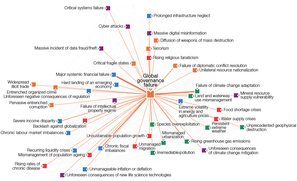
Such exploratory analysis is hard to conceive without proper interactive data visualization. Given the focus of all the vendors it covers in this report, it seems somewhat anachronistic that Gartner in its report does not leverage the capabilities of such interactive visualization itself. In the previous post on Global Risks we have seen how much value that can add to such thorough analysis. (Much of this dashboard should be applicable for risk analysis as well, just that the two-dimensional space changes from platform vision vs. execution to risk likelihood vs. impact!) If Gartner does not want to drop on its own execution and vision scores, they better adopt such visualization. It’s time.

 
3 Comments

Posted by on February 12, 2013 in Industrial


Tags: , , , ,

Visualizing Global Risks 2013

Visualizing Global Risks 2013

A year ago we looked at Global Trends 2025, a 2008 report by the National Intelligence Commission. The 120 page document made surprisingly little use of data visualization, given the well-funded and otherwise very detailed report.

By contrast, at the recent World Economic Forum 2013 in Davos, the Risk Response Network published the eighth edition of its annual Global Risks 2013 report. Its focus on national resilience fits well into the “Resilient Dynamism” theme of this year’s WEF Davos. Here is a good 2 min synopsis of the Global Risks 2013 report.

We will look at the abundant use of data visualization in this work, which is published in print as an 80-page .pdf file. The report links back to the companion website, which offers lots of additional materials (such as videos) and a much more interactive experience (such as the Data Explorer). The website is a great example of the benefits of modern layout, with annotations, footnotes, references and figures broken out in a second column next to the main text.

RiskCategories

One of the main ways to understand risks is to quantify it in two dimensions, namely its likelihood and its impact, say on a scale from 1 (min) to 5 (max). Each risk can then be visualized by its position in the square spanned by those two dimensions. Often risk mitigation is prioritized by the product of these two factors. In other words, the further right and/or top a risk, the more important it becomes to prepare for or mitigate it.

This work is based on a comprehensive survey of more than 1000 experts worldwide on a range of 50 risks across 5 broad categories. Each of these categories is assigned a color, which is then used consistently throughout the report. Based on the survey results the report uses some basic visualizations, such as a list of the top 5 risks by likelihood and impact, respectively.

Source for all figures: World Economic Forum (except where noted otherwise)

Source for all figures: World Economic Forum (except where noted otherwise)

When comparing the position of a particular risk in the quadrant with the previous year(s), one can highlight the change. This is similar to what we have done with highlighting position changes in Gartner’s Magic Quadrant on Business Intelligence. Applied to this risk quadrant the report includes a picture like this for each of the five risk categories:

EconomicRisksChange

This vector field shows at a glance how many and which risks have grown by how much. The fact that a majority of the 50 risks show sizable moves to the top right is of course a big concern. Note that the graphic does not show the entire square from 1 through 5, just a sub-section, essentially the top-right quadrant.

On a more methodical note, I am not sure whether surveys are a very reliable instrument in identifying the actual risks, probably more the perception of risks. It is quite possible that some unknown risks – such as the unprecedented terrorist attacks in the US on 9/11 – outweigh the ones covered here. That said, the wisdom of crowds tends to be a good instrument at identifying the perception of known risks.

Note the “Severe income disparity” risk near the top-right, related to the phenomenon of economic inequality we have looked at in various posts on this Blog (Inequality and the World Economy or Underestimating Wealth Inequality).

A tabular form of showing the top 5 risks over the last seven consecutive years is given as well: (Click on chart for full-resolution image)

Top5RisksChanges

This format provides a feel for the dominance of risk categories (frequency of colors, such as impact of blue = economic risks) and for year over year changes (little change 2012 to 2013). The 2011 column on likelihood marks a bit of an outlier with four of five risks being green (= environmental) after four years without any green risk in the Top 5. I suspect that this was the result of the broad global media coverage after the April 2011 earthquake off the coast of Japan, with the resulting tsunami inflicting massive damage and loss of lives as well as the Fukushima nuclear reactor catastrophe. Again, this reinforces my belief that we are looking at perception of risk rather than actual risk.

Another aggregate visualization of the risk landscape comes in the form of a matrix of heat-maps indicating the distribution of survey responses.

SurveyResponseDistribution

The darker the color of the tile, the more often that particular likelihood/impact combination was chosen in the survey. There is a clear positive correlation between likelihood and impact as perceived by the majority of the experts in the survey. From the report:

Still it is interesting to observe how for some risks, particularly technological risks such as critical systems failure, the answers are more distributed than for others – chronic fiscal imbalances are a good example. It appears that there is less agreement among experts over the former and stronger consensus over the latter.

The report includes many more variations on this theme, such as scatterplots of risk perception by year, gender, age, region of residence etc. Another line of analysis concerns the center of gravity, i.e. the degree of systemic connectivity between risks within each category, as well as the movement of those centers year over year.

Another set of interesting visualizations comes from the connections between risks. From the report:

Top5Connections

Top10ConnectedRisks

Finally, the survey asked respondents to choose pairs of risks which they think are strongly interconnected. They were asked to pick a minimum of three and maximum of ten such connections.

Putting together all chosen paired connections from all respondents leads to the network diagram presented in Figure 37 – the Risk Interconnection Map. The diagram is constructed so that more connected risks are closer to the centre, while weakly connected risks are further out. The strength of the line depends on how many people had selected that particular combination.

529 different connections were identified by survey respondents out of the theoretical maximum of 1,225 combinations possible. The top selected combinations are shown in Figure 38.

It is also interesting to see which are the most connected risks (see Figure 39) and where the five centres of gravity are located in the network (see Figure 40).

One such center of gravity graph (for geopolitical risks) is shown here:RiskInterconnections

The Risk Interconnection Map puts it all together:

RiskInterconnectionMap

Such fairly complex graphs are more intuitively understood in an interactive format. This is where the online Data Explorer comes in. It is a very powerful instrument to better understand the risk landscape, risk interconnections, risk rankings and national resilience analysis. There are panels to filter, the graphs respond to mouse-overs with more detail and there are ample details to explain the ideas behind the graphs.

DataExplorer

There are many more aspects to this report, including the appendices with survey results, national resilience rankings, three global risk scenarios, five X-factor risks, etc. For our purposes here suffice it to say that the use of advanced data visualizations together with online exploration of the data set is a welcome evolution of such public reports. A decade ago no amount of money could have bought the kind of interactive report and analysis tools which are now available for free. The clarity of the risk landscape picture that’s emerging is exciting, although the landscape itself is rather concerning.

 
1 Comment

Posted by on January 31, 2013 in Industrial, Socioeconomic


Tags: , , , , , , ,

Software continues to eat the world

Software continues to eat the world

One year ago Marc Andreessen, co-founder of Netscape and venture capital firm Andreessen-Horowitz, wrote an essay for the Wall Street Journal titled “Why Software Is Eating The World“. It is interesting to reflect back to this piece and some of the predictions made back at a time when Internet company LinkedIn had just gone public and Groupon was just filing for an IPO.

Andreessen’s observation was simply this: Software has become so powerful and computer infrastructure so cheap and ubiquitous that many industries are being disrupted by new business models enabled by that software. Examples listed were books (Amazon disrupting Borders), movie rental (NetFlix disrupting Blockbuster), music industry (Pandora, iTunes), animation movies (Pixar), photo-sharing services (disrupting Kodak), job recruiting (LinkedIn), telecommunication (Skype), video-gaming (Zynga) and others.

On the infrastructure side one can bolster this argument by pointing at the rapid development of new technologies such as cloud computing or big data analytics. Andreessen gave one example of the cost of running an Internet application in the cloud dropping by a factor of 100x in the last decade (from $150,000 / month in 2000 using LoudCloud to about $1500 / month in 2011 using Amazon Web Services). Microsoft now has infrastructure with Windows Azure where procuring an instance of a modern server at one (or even multiple) data center(s) takes only minutes and costs you less than $1 per CPU hour.

Likewise, the number of Internet users has grown from some 50 million around 2000 to more than 2 billion with broadband access in 2011. This is certainly one aspect fueling the enormous growth of social media companies like Facebook and Twitter. To be sure, not every high-flying startup goes on to be as successful after its IPO. Facebook trades at half the value of opening day after three months. Groupon trades at less than 20% of its IPO value some 9 months ago. But LinkedIn has sustained and even modestly grown its market capitalization. And Google and Apple both trade near or at their all-time high, with Apple today at $621b becoming the most valuable company of all time (non inflation-adjusted).

The growing dominance and ubiquitous reach of software shows in other areas as well. Take automobiles. Software is increasingly been used for comfort and safety in modern cars. In fact, self-driving cars – once the realm of science fiction such as flying hover cars – are now technically feasible and knocking on the door of broad industrial adoption. After driving 300.000 miles in test Google is now deploying its fleet of self-driving cars for the benefit of its employees. Engineers even take self-driving cars to the racetracks, such as up on Pikes Peak or the Thunderhill raceway. Performance is now at the level of very good drivers, with the benefit of not having the human flaws (drinking, falling asleep, texting, showing off, etc.) which cause so many accidents. Expert drivers still outperform the computer-driven cars. (That said, even human experts sometimes make mistakes with terrible consequences, such as this crash on Pikes Peak this year.) The situation is similar to how computers got so proficient at chess in the mid-nineties that finally even the world champion was defeated.

In this post I want to look at some other areas specifically impacting my own life, such as digital photography. I am not a professional photographer, but over the years my wife and I have owned dozens of cameras and have followed the evolution of digital photography and its software for many years. Of course, there is an ongoing development towards chips with higher resolution and lenses with better optic and faster controls. But the major innovation comes from better software. Things like High Dynamic Range (HDR) to compensate for stark contrast in lighting such as a portrait photo against a bright background. Or stitching multiple photos together to a panorama, with Microsoft’s PhotoSynth taking this to a new level by building 3D models from multiple shots of a scene.

One recent innovation comes in the form of the new Sony RX100 camera, which science writer David Pogue raved about in the New York Times as “the best pocket camera ever made”. My wife bought one a few weeks ago and we both have been learning all it can do ever since. Despite the many impressive features and specifications about lens, optics, chip, controls, etc. what I find most interesting is the software running on such a small device. The intelligent Automatic setting will decide most settings for your everyday use, while one can always direct priorities (aperture, shutter, program) or manually override most aspects. There are a great many menus and it is not trivial to get to use all capabilities of this camera, as it’s extremely feature-rich. Some examples of the more creative software come in modes such as ‘water color’ or ‘illustration’. The original image is processed right then and there to generate effects as if it was a painting or a drawing. Both original and processed photo are stored on the mini-SD card.

Flower close-up in ‘illustration’ mode

One interesting effect is to filter to just the main colors (Yellow, Red, Green, Blue). Many of these effects are shown on the display, with the aperture ring serving as a flexible multi-functional dial for more convenient handling with two hands. (Actually, the camera body is so small that it is a challenge to use all dials while holding the device; just like the BlackBerry keyboard made us write with two thumbs instead of ten fingers.) The point of such software features is not so much that they are radically new; you could do so with a good photo editing software for many years. The point is that with the ease and integration of having them at your fingertips you are much more likely to use them.

Example of suppressing all colors except yellow

The camera will allow registering of faces and detect those in images. You can set it up such that it will take a picture only when it detects a small/medium/large smile on the subject being photographed. One setting allows you to take self-portrait, with the timer starting to count down as soon as the camera detects one (or two) faces in the picture! It is an eerie experience when the camera starts to “understand” what is happening in the image!

There is an automatic panorama stitching mode where you just hold the button and swipe the camera left-right or up-down while the camera takes multiple shots. It automatically stitches them into one composite, so no more uploading of the individual photos and stitching on the computer required.

Beach panorama stitched on the camera using swipe-&-shoot

I have been experimenting with panorama photos since 2005 (see my collection or my Panoramas from the Panamerican Peaks adventure). It’s always been somewhat tedious and results were often mixed (lens distortions, lighting changes sun vs. cloud or objects moving during the individual frames, not holding the camera level, skipping a part of the horizon, etc.) despite crafty post-processing on the computer with image software. I have read about special 360 degree lenses to take high-end panoramas, but who wants to go to those lengths just for the occasional panorama photo? From my experience, nothing moves the needle as much as the ease and integration of taking panoramas right in the camera as the RX100 does.

Or take the field of healthcare. Big Data, Mobility and Cloud Computing make possible entirely new business models. Let’s just look at mobility. The smartphone is evolving into a universal healthcare device for measuring, tracking and visualizing medical information. Since many people have their smartphone with them at almost all times, one can start tracking and analyzing personal medical data over time. And for almost any medical measurement, “there is an app for that”. One interesting example is this optical heart-rate monitor app Cardiio for the iPhone. (Cardio + IO ?)

Screenshots of Cardiio iPhone app to optically track heart rate

It is amazing that this app can track your heart rate just by analyzing the changes of light reflected from your face with its built-in camera. Not even a plug-in required!

Another system comes from Withings, this one designed to turn the iPhone into a blood pressure monitor. A velcro sleeve with battery mount and cable plugs into the iPhone and an app controls the inflation of the sleeve, the measurement and some simple statistics.

Blood pressure monitor system from Withings for iPhone

Again, it’s fairly simple to just put the sleeve around one upper arm and push the button on the iPhone app. The results are systolic and diastolic blood pressure readings and heart rate.

Sample blood pressure and pulse measurement

Like many other monitoring apps this one also keeps track of the readings and does some simple form of visual plotting and averaging.

Plot of several blood pressure readings

There is also a separate app which will allow you to upload your data and create a more comprehensive record of your own health over time. Withings provides a few other medical devices such as scales to add body weight and body fat readings. The company tagline is “smart and connected things”.

One final example is an award-winning contribution from a student team from Australia called Stethocloud. This system is aimed at diagnosing pneumonia. It is comprised of an app for the iPhone, a simple stethoscope plug-in for the iPhone and on the back-end some server-based software analyzing the measurements in the Windows Azure cloud according to standards defined by the World Health Organization. The winning team (in Microsoft’s 2012 Imagine Cup) built a prototype in only 2 weeks and had only minimal upfront investments.

StethoCloud system for iPhone to diagnose pneumonia

This last example perhaps illustrates best the opportunities of new software technologies to bring unprecedented advances to healthcare – and to many other fields and industries. I think Marc Andreessen was spot on with his observation that software is eating the world. It certainly does in my world.

 
Leave a comment

Posted by on August 20, 2012 in Industrial, Medical, Socioeconomic


Tags: , , , , ,

Sankey Diagrams

Sankey Diagrams

Whenever you want to show the flow of a quantity (such as energy or money) through a network of nodes you can use Sankey diagrams:

“A Sankey diagram is a directional flow chart where the width of the streams is proportional to the quantity of flow, and where the flows can be combined, split and traced through a series of events or stages.”
(source: CHEMICAL ENGINEERING Blog)

One area where this can be applied very well is that of costing. By modeling the flow of cost through a company one can analyze the aggregated cost and thus determine the profitability of individual products, customers or channels. Using the principles of activity-based costing one can create a cost-assignment network linking cost pools or accounts (as tracked in the General Ledger) via the employees and their activities to the products and customers. Such a Cost Flow can then be visualized using a Sankey diagram:

Cost Flow from Accounts via Expenses and Activities to Products

The direction of flow (here from left to right) is indicated by the color assignment from nodes to its outflowing streams. Note also the intuitive notion of zero-loss assignment: For each node the sum of the in- and outflowing streams (= height of that node) remains the same. Hence all the cost is accounted for, nothing is lost. If you stacked all nodes on top of one another they would rise to the same height. (Random data for illustration purposes only.)

The above diagram was created in Mathematica using modified source code originally from Sam Calisch who had posted it in 2011 here. Sam also included a “SankeyNotes.pdf” document explaining the details of the algorithms encoded in the source, such as how to arrange the node lists and how to draw the streams.

I find these a perfect example of how a manual drawing can go a long ways to illustrate the ideas behind an algorithm, which makes it a lot easier to understand and reuse the source code. Thanks to Sam for this code and documentation. Sam by the way used the code to illustrate the efficiency of energy use (vs. waste) in Australia:

Energy Flow comparison between New South Wales and Australia (Sam Calisch)

Note the sub-flows within each stream to compare a part (New South Wales) against the whole (Australia).

Another interesting use of Sankey Diagrams has been published a few weeks ago on ProPublica about campaign finance flow. This is particularly useful as it is interactive (click on image to get to interactive version).

Tangled Web of Campaign Finance Flow

Note the campaigns in green and the Super-PACs in brown color. The data is sourced from FEC and the New York Times Campaign Finance API. Note that in the interactive version you can click on any source on the left or any destination on the right to see the outgoing and incoming streams.

Finance Flow From Obama-For-America

Finance Flow to American Express

Here are some more examples. Sankey diagrams are also used in Google Flow Analytics (called Event Flow, Goal Flow, Visitor Flow). I wouldn’t be surprised to see Sankey Diagrams make their way into modern data visualization tools such as Tableau or QlikView, perhaps even into Excel some day… Here are some Visio shapes and links to other resources.

 
3 Comments

Posted by on May 14, 2012 in Financial, Industrial


Tags: , , ,

Quarterly Comparison: Apple, Microsoft, Google, Amazon

Quarterly Comparison: Apple, Microsoft, Google, Amazon

Last quarter we looked at the financials and underlying product & service portfolios of four of the biggest technology companies in the post “Side by Side: Apple, Microsoft, Google, Amazon“. With the recent reporting of results for Q1 2012 it is a good time to revisit this subject.

Comparison of Financials Q4 2011 and Q1 2012 for Apple, Microsoft, Google, and Amazon.

Market cap has grown roughly by 25% for both Apple and Amazon, whereas Microsoft and Google only added 5% or less. A sequential quarter comparison can be misleading due to seasonal changes, which impact different industries and business models in a different way. For example, Google’s ad revenue is somewhat less impacted by seasonal shopping than the other companies.

Sequential quarter comparison of financials

Apple and Microsoft seem to be impacted in a similar way by seasonal changes. For Amazon, which already has by far the lowest margin of all four companies, operating income decreased by 40% while it increased its headcount by 17%. This leads to much lower income per employee and with increased stock price to a doubling of its already very high P/E ratio. I’m not a stock market analyst, but Amazon’s P/E ratio of now near 200 seems extraordinarily high. By comparison, the other companies look downright cheap: Apple 8.8, Microsoft 10.5, Google 14.5

Horace Dediu from asymco.com has also revisited this topic in his post “Which is best: hardware, software, or services?“. What’s striking is that all three companies (except Amazon) now have operating margins between 30-40% – very high for such large businesses – with Apple taking the top near 40%. Over the last 5 years, Apple has doubled it’s margin (20% to 40%), whereas Microsoft (35-40%) and Google (30-35%) remained near their levels.

(Source: Asymco.com)

Long term the most important aspect of a business is not how big it has become, but how profitable it is. In that regard Amazon is the odd one out. Their operating income last quarter was about 1% of revenue. Amazon needs to move $100 worth of goods to earn $1. They employ 65,000 people and had revenue of $13.2b last quarter, yet only earned $130m during that time! Apple earns more money just with their iPad covers! Amazon’s strategy is to subsidize the initial Kindle Fire sale and hoping to make money on the additional purchases over the lifetime of the product. In light of these numbers, do you think Amazon has a future with it’s Kindle Fire tablet against the iPad?

But what really struck me about the extreme differences in profitability is this comparison of Apple and Microsoft product lines (source: @asymco twitter):

(source: @asymco twitter)

This shows what an impressive and sustained success the iPhone has been. And the iPad is on track to grow even faster. Horace Dediu guesses that Apple’s iPad will be a bigger profit generator than Windows in one quarter, and a bigger profit generator than Google (yes, all of Google) in three quarters. We will check on those predictions when the time comes…

 
3 Comments

Posted by on May 2, 2012 in Financial, Industrial


Tags: , , , , , ,

 
%d bloggers like this: