One year ago Marc Andreessen, co-founder of Netscape and venture capital firm Andreessen-Horowitz, wrote an essay for the Wall Street Journal titled “Why Software Is Eating The World“. It is interesting to reflect back to this piece and some of the predictions made back at a time when Internet company LinkedIn had just gone public and Groupon was just filing for an IPO.
Andreessen’s observation was simply this: Software has become so powerful and computer infrastructure so cheap and ubiquitous that many industries are being disrupted by new business models enabled by that software. Examples listed were books (Amazon disrupting Borders), movie rental (NetFlix disrupting Blockbuster), music industry (Pandora, iTunes), animation movies (Pixar), photo-sharing services (disrupting Kodak), job recruiting (LinkedIn), telecommunication (Skype), video-gaming (Zynga) and others.
On the infrastructure side one can bolster this argument by pointing at the rapid development of new technologies such as cloud computing or big data analytics. Andreessen gave one example of the cost of running an Internet application in the cloud dropping by a factor of 100x in the last decade (from $150,000 / month in 2000 using LoudCloud to about $1500 / month in 2011 using Amazon Web Services). Microsoft now has infrastructure with Windows Azure where procuring an instance of a modern server at one (or even multiple) data center(s) takes only minutes and costs you less than $1 per CPU hour.
Likewise, the number of Internet users has grown from some 50 million around 2000 to more than 2 billion with broadband access in 2011. This is certainly one aspect fueling the enormous growth of social media companies like Facebook and Twitter. To be sure, not every high-flying startup goes on to be as successful after its IPO. Facebook trades at half the value of opening day after three months. Groupon trades at less than 20% of its IPO value some 9 months ago. But LinkedIn has sustained and even modestly grown its market capitalization. And Google and Apple both trade near or at their all-time high, with Apple today at $621b becoming the most valuable company of all time (non inflation-adjusted).
The growing dominance and ubiquitous reach of software shows in other areas as well. Take automobiles. Software is increasingly been used for comfort and safety in modern cars. In fact, self-driving cars – once the realm of science fiction such as flying hover cars – are now technically feasible and knocking on the door of broad industrial adoption. After driving 300.000 miles in test Google is now deploying its fleet of self-driving cars for the benefit of its employees. Engineers even take self-driving cars to the racetracks, such as up on Pikes Peak or the Thunderhill raceway. Performance is now at the level of very good drivers, with the benefit of not having the human flaws (drinking, falling asleep, texting, showing off, etc.) which cause so many accidents. Expert drivers still outperform the computer-driven cars. (That said, even human experts sometimes make mistakes with terrible consequences, such as this crash on Pikes Peak this year.) The situation is similar to how computers got so proficient at chess in the mid-nineties that finally even the world champion was defeated.
In this post I want to look at some other areas specifically impacting my own life, such as digital photography. I am not a professional photographer, but over the years my wife and I have owned dozens of cameras and have followed the evolution of digital photography and its software for many years. Of course, there is an ongoing development towards chips with higher resolution and lenses with better optic and faster controls. But the major innovation comes from better software. Things like High Dynamic Range (HDR) to compensate for stark contrast in lighting such as a portrait photo against a bright background. Or stitching multiple photos together to a panorama, with Microsoft’s PhotoSynth taking this to a new level by building 3D models from multiple shots of a scene.
One recent innovation comes in the form of the new Sony RX100 camera, which science writer David Pogue raved about in the New York Times as “the best pocket camera ever made”. My wife bought one a few weeks ago and we both have been learning all it can do ever since. Despite the many impressive features and specifications about lens, optics, chip, controls, etc. what I find most interesting is the software running on such a small device. The intelligent Automatic setting will decide most settings for your everyday use, while one can always direct priorities (aperture, shutter, program) or manually override most aspects. There are a great many menus and it is not trivial to get to use all capabilities of this camera, as it’s extremely feature-rich. Some examples of the more creative software come in modes such as ‘water color’ or ‘illustration’. The original image is processed right then and there to generate effects as if it was a painting or a drawing. Both original and processed photo are stored on the mini-SD card.
One interesting effect is to filter to just the main colors (Yellow, Red, Green, Blue). Many of these effects are shown on the display, with the aperture ring serving as a flexible multi-functional dial for more convenient handling with two hands. (Actually, the camera body is so small that it is a challenge to use all dials while holding the device; just like the BlackBerry keyboard made us write with two thumbs instead of ten fingers.) The point of such software features is not so much that they are radically new; you could do so with a good photo editing software for many years. The point is that with the ease and integration of having them at your fingertips you are much more likely to use them.
The camera will allow registering of faces and detect those in images. You can set it up such that it will take a picture only when it detects a small/medium/large smile on the subject being photographed. One setting allows you to take self-portrait, with the timer starting to count down as soon as the camera detects one (or two) faces in the picture! It is an eerie experience when the camera starts to “understand” what is happening in the image!
There is an automatic panorama stitching mode where you just hold the button and swipe the camera left-right or up-down while the camera takes multiple shots. It automatically stitches them into one composite, so no more uploading of the individual photos and stitching on the computer required.
I have been experimenting with panorama photos since 2005 (see my collection or my Panoramas from the Panamerican Peaks adventure). It’s always been somewhat tedious and results were often mixed (lens distortions, lighting changes sun vs. cloud or objects moving during the individual frames, not holding the camera level, skipping a part of the horizon, etc.) despite crafty post-processing on the computer with image software. I have read about special 360 degree lenses to take high-end panoramas, but who wants to go to those lengths just for the occasional panorama photo? From my experience, nothing moves the needle as much as the ease and integration of taking panoramas right in the camera as the RX100 does.
Or take the field of healthcare. Big Data, Mobility and Cloud Computing make possible entirely new business models. Let’s just look at mobility. The smartphone is evolving into a universal healthcare device for measuring, tracking and visualizing medical information. Since many people have their smartphone with them at almost all times, one can start tracking and analyzing personal medical data over time. And for almost any medical measurement, “there is an app for that”. One interesting example is this optical heart-rate monitor app Cardiio for the iPhone. (Cardio + IO ?)
It is amazing that this app can track your heart rate just by analyzing the changes of light reflected from your face with its built-in camera. Not even a plug-in required!
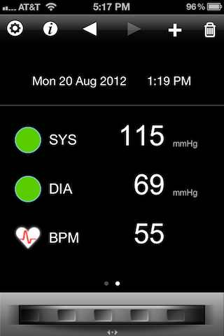
Another system comes from Withings, this one designed to turn the iPhone into a blood pressure monitor. A velcro sleeve with battery mount and cable plugs into the iPhone and an app controls the inflation of the sleeve, the measurement and some simple statistics.
Again, it’s fairly simple to just put the sleeve around one upper arm and push the button on the iPhone app. The results are systolic and diastolic blood pressure readings and heart rate.
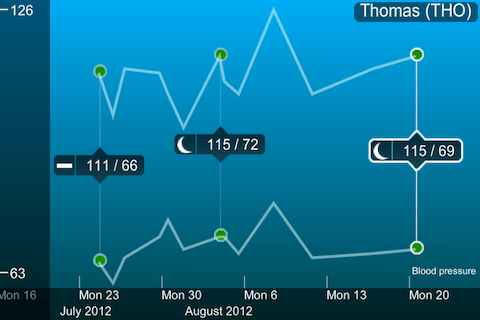
Like many other monitoring apps this one also keeps track of the readings and does some simple form of visual plotting and averaging.
There is also a separate app which will allow you to upload your data and create a more comprehensive record of your own health over time. Withings provides a few other medical devices such as scales to add body weight and body fat readings. The company tagline is “smart and connected things”.
One final example is an award-winning contribution from a student team from Australia called Stethocloud. This system is aimed at diagnosing pneumonia. It is comprised of an app for the iPhone, a simple stethoscope plug-in for the iPhone and on the back-end some server-based software analyzing the measurements in the Windows Azure cloud according to standards defined by the World Health Organization. The winning team (in Microsoft’s 2012 Imagine Cup) built a prototype in only 2 weeks and had only minimal upfront investments.
This last example perhaps illustrates best the opportunities of new software technologies to bring unprecedented advances to healthcare – and to many other fields and industries. I think Marc Andreessen was spot on with his observation that software is eating the world. It certainly does in my world.


