RSS

Tag Archives: geographical map

Global Trends 2025

Global Trends 2025

If you like to do some big-picture thinking, here is a document put together by the National Intelligence Council and titled “Global Trends”. It is published every five years to analyze trends and forecast likely scenarios of worldwide development fifteen years into the future. The most recent is called “Global Trends 2025” and was published in November 2008. It’s a 120 page document which can be downloaded for free in PDF format here.

To get a feel for the content, here are the chapter headers:

  1. The Globalizing Economy
  2. The Demographics of Discord
  3. The New Players
  4. Scarcity in the Midst of Plenty?
  5. Growing Potential for Conflict
  6. Will the International System Be Up to the Challenges?
  7. Power-Sharing in a Multipolar World

From the NIC Global Trends 2025 project website:

Some of our preliminary assessments are highlighted below:

  • The whole international system—as constructed following WWII—will be revolutionized. Not only will new players—Brazil, Russia, India and China— have a seat at the international high table, they will bring new stakes and rules of the game.
  • The unprecedented transfer of wealth roughly from West to East now under way will continue for the foreseeable future.
  • Unprecedented economic growth, coupled with 1.5 billion more people, will put pressure on resources—particularly energy, food, and water—raising the specter of scarcities emerging as demand outstrips supply.
  • The potential for conflict will increase owing partly to political turbulence in parts of the greater Middle East.

As interesting as the topic may be, from a data visualization perspective the report is somewhat underwhelming. I counted just 5 maps and 5 charts in the entire document. The maps are interesting, such as the following on World Age Structure:

World Age Structure 2005

World Age Structure 2025 (Projected)

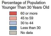
These maps show the different age of countries’ populations by geographical region. The Northern countries have less young people, and the aging trend is particularly strong for Eastern Europe and Japan. In 2025 almost all of the countries with very young population will be in Sub-Saharan Africa and the Arab Peninsula. Population growth will slow as a result; there will be approximately 8 billion people alive in 2025, 1 billion more than the 7 billion today.

In this day and age one is spoiled by interactive charts such as the Bubble-Charts of Gapminder’s Trendalyzer. Wouldn’t it be nice to have an interactive chart where you could set the Age intervals and perhaps filter in various ways (geographic regions, GDP, population, etc.) and then see the dynamic change of such colored world-maps over time? How much more insight would this convey about the changing demographics and relative sizes of age cohorts? Or perhaps display interactive population pyramids such as those found here by Jorge Camoes?

Another somewhat misguided ‘graphical angle’ are the slightly rotated graphics on the chapter headers. For example, Chapter 2 starts with this useful color-coded map of the Youth in countries of the Middle East. But why rotate it slightly and make the fonts less readable?

Youth in the Middle East (from Global Trends 2025 report)

I don’t want to be too critical; it’s just that reports put together with so much systematic research and focusing on long-range, international trends should employ more state-of-the-art visualizations, in particular interactive charts rather than just pages and pages of static text…

 
2 Comments

Posted by on January 4, 2012 in Industrial, Socioeconomic


Tags: , , ,

7 Billion

7 Billion

World population has just reached 7 Billion this week. Exploring the growth of population and related aspects such as consumption, land use, urbanization etc. lends itself very well to data visualization. In this context, the National Geographic Society has released a free iPad app called “7 Billion” together with its Special Series: 7 Billion website.

The iPad app features some interesting charts under the heading “The Shape Of Seven Billion”. These visualizations come in the form of cartograms, a type of map that ignores a country’s true physical size and scales the size according to other data. Here they show population (current 2011 vs. 1960, when world population was around 3 Billion).

Population Cartogram 2011 (Source: National Geographic iPad App 7 Billion)

The position of countries is roughly preserved, the size is proportionate to the country population, and the color legend shows the amount of growth since 1960. The strongest growth (red, more than 300%) happened in Africa and the Middle East. Europe, Russia and Japan had the least amount of growth (blue, under 50%). India and China are by far the most populous countries, with India growing faster than China.

Another interesting cartogram illustrates consumption (as measured in Gross Domestic Product, GDP). Here the reference year is 1980 and is shown first in black & white:

Consumption Chart 1980 (Source: National Geographic, iPad App 7-Billion)

Compare this to the current Consumption or GDP distribution as of 2011:

World Consumption Chart 2011 (Source: National Geographic iPad App 7 Billion)

The size of the countries here is proportionate to their GDP (in constant international dollars using purchase power parity rates). The color scale has red (more than $40,000 per capita) and blue (less than $3,000 per capita) on both ends of the spectrum. While the United States is clearly dominating this picture, Europe has about the same size and China isn’t far behind. However, China has had the world’s largest GDP increase of 1,506% since 1980 (~15 fold increase), whereas the GDP of the U.S. grew by 119% (a bit more than doubled) during the same period of time.

Ideally on would be able to see this cartogram animated over time with sizes of countries shrinking or growing and changing colors over time, similar to the Bubble Charts we looked at earlier on this Blog.

There are many other interesting charts in this interactive eBook style app. For example, here is a chart showing the population growth over time – a good visualization of the power of exponential growth.

World Population Growth and Projection (Source: National Geographic 7 Billion iPad App)

One graphic aims at explaining the main drivers behind the explosive growth over the last two centuries after relatively slow growth for millennia – the improvements in health care and resulting drop in death rate led to a period of far greater birth rates than death rates.

Population Growth as Function of Birth Rate minus Death Rate

An interesting visualization idea has been published in a video by NPR using buckets for each continents and visualizing birth rate as water drops into the bucket and death rates as drops out of the bucket. It is obvious that when more water is dropping in on the top (births) than dropping out at the bottom (deaths), then the buckets fill up.

As a final example, consider this chart visualizing our even faster growing environmental impact: Since there is not just the Population size, but at least two other factors – Affluence and Technology – the multiplicative impact is growing even faster. With the use of three dimensions and the formula I = P * A * T this yields a simple but effective illustration.

Multiplicative Human Impact through Population, Affluence and Technology

Of course a short Blog post can’t do justice to all aspects of an app or eBook. There is a lot more to this app than shown here. But I hope you got an impression as to how interactive graphics can help communicate abstract and quantitative ideas in a more intuitive way.

 
3 Comments

Posted by on November 4, 2011 in Socioeconomic


Tags: , ,

Number of Neighbors for World Countries

Number of Neighbors for World Countries

One important geographical aspect in economy is whether a country is land-locked. Another aspect is the number of neighbors a given country shares a border with. If we sort all 239 world countries, 75 (31%, almost one third) of them are island countries such as Madagascar or Australia where this number is zero. On the opposite end are countries with the most border connections. Here are the top 6 countries in descending order: China (16), Russia (14), Brazil (10), Sudan, Germany, and Democratic Republic of Congo (9 each). All other countries have 8 or less neighbors. Here is a visual breakdown:

The histogram shows the high frequency of island states; the range from 1 to 5 neighbors is fairly common, with a steep drop off in the frequency of 6 or more neighbors. Here is a world map with the same color-code:

WorldMap color-coded by number of neighboring countries

Large countries tend to have more neighbors (Russia (14), China (16), Brazil (10)), but there are obvious exceptions to this tendency (Canada (1), United States (2)). The number of neighbors depends not just on the size of the country itself, but on it’s neighbors’ sizes as well; for example, a small country such as Austria (land area size world rank: 116th) has a rather high number of 8 neighbors because many of them in turn are relatively small (Switzerland, Liechtenstein, Slovenia, etc.).

The average number of neighbors is about 2.7 and there are 323 such border relationships. These can be visualized as graphs with countries as vertices and borders as edges. (Note that to simplify the graphs I excluded all 75 islands = disconnected vertices except Australia.) There are two main partitions of this graph following the land-border geography: One with Europe, Asia and Africa and one with the Americas.

Border-Connected Countries in Europe, Asia, Africa

With the graph layout changed from “Spring Embedding” to “Spring Electrical Embedding” one obtains this interesting variation of the same graph which looks like a sword fish:

The "EurAsiAfrica Sword-fish"

The other partition of the Americas can be visualized in a circular embedding layout:

Europe, Asia, Africa (left) and Americas (right)

It is also interesting to look at the numbers for lengths of pairwise borders between two countries:

  • Number: 323 border-pairs
  • Minimum: 0.34 [km]
  • Maximum: 8893 [km]
  • Mean: 789.6 [km]
  • Total: 255048 [km]
  • Most pairwise borders are between 100 – 1000 km long, but they can as short as 1/3 km (China – Macau) or almost 9000 km (Canada – United States).

    When we look at the entire border length for each country, we see familiar names on top of the ranking:
    China: 22147 [km], Russia: 20293 [km], Brazil: 16857 [km], India: 14103 [km], Kazakhstan: 12185 [km], United States: 12034 [km]. It seems likely that the first four, the so called “BRIC” countries, owe part of their economic strength to their geography: Size, length of borders and number of neighbors influence the number of local trading partners and routes to them. There are many more correlations one can analyze such as between border length / number of neighbors and GDP / length of road network etc. One thing seems likely when it comes to the economy of world countries: Size matters, and so does Geography!

    Epilog: This analysis was all performed using Wolfram’s Mathematica 8. The built-in curated CountryData provides access to more than 200 properties of the world countries, including things like Population, Area, GDP, etc. Some cleaning of the borders lengths data was required to deal with different spellings of the same country. (If you’re interested in the data or source-code, please contact me via email.) List manipulation and mathematical operations such as summation are very easy to do in the functional programming paradigm of Mathematica. Graphs are first-order data structures with numerous vertex and edge operators. Charting is also fairly powerful with BarCharts, ListPlots and more advanced graph charting options. Which other software provides all this flexibility in one integrated package?

     
    6 Comments

    Posted by on October 6, 2011 in Recreational, Socioeconomic


    Tags: , , , ,

    Oregon Coast Bike Map

    Oregon Coast Bike Map

    A good example of visualization for recreational purposes is the Oregon Coast Bike Map created by the Oregon Department of Transportation and published here. Here is a sample page of this 13 page document:

    Sample Page from the Oregon Coast Bike Map

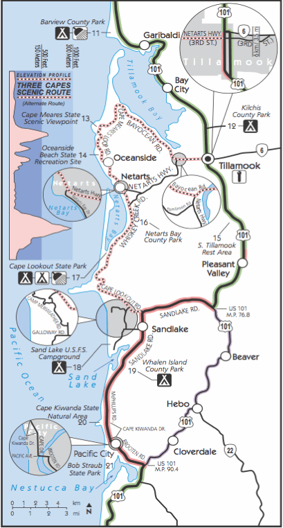
    The map is full of useful information relevant to cyclists such as weather, traffic, campgrounds, attractions, etc. What I find particularly useful is the indication of distances and elevation profile. Unlike motorized traffic hills tend to slow cyclists down a lot, so estimating ride time to a goal not only depends on the distance, but also on the vertical elevation gain en route to that goal. For example, consider this enlarged area (inset C of above page) of the beautiful “3 Capes” region near Tillamook:

    Inset of 3 Capes Region

    Note the use of color to indicate type of road and traffic as well as shaded bands in elevation profile. I think this is a good example of creating insight by visualizing data. I should know, as I was riding this stretch 2 years ago in August of 2009 during my Panamerican Peaks cycling and climbing adventure. Not having the benefit of such a detailed map I decided to embark on the 3 capes route late in the afternoon, only to get caught by sunset in NetArts as the unexpected hills slowed me down…

    Another excellent map also designed by ODOT is the Columbia River Gorge Bike Map. Check it out for another example of good visualization for recreational purposes.

     
    Leave a comment

    Posted by on August 30, 2011 in Recreational


    Tags: ,

     
    %d bloggers like this: