World population has just reached 7 Billion this week. Exploring the growth of population and related aspects such as consumption, land use, urbanization etc. lends itself very well to data visualization. In this context, the National Geographic Society has released a free iPad app called “7 Billion” together with its Special Series: 7 Billion website.
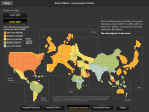
The iPad app features some interesting charts under the heading “The Shape Of Seven Billion”. These visualizations come in the form of cartograms, a type of map that ignores a country’s true physical size and scales the size according to other data. Here they show population (current 2011 vs. 1960, when world population was around 3 Billion).
The position of countries is roughly preserved, the size is proportionate to the country population, and the color legend shows the amount of growth since 1960. The strongest growth (red, more than 300%) happened in Africa and the Middle East. Europe, Russia and Japan had the least amount of growth (blue, under 50%). India and China are by far the most populous countries, with India growing faster than China.
Another interesting cartogram illustrates consumption (as measured in Gross Domestic Product, GDP). Here the reference year is 1980 and is shown first in black & white:
Compare this to the current Consumption or GDP distribution as of 2011:
The size of the countries here is proportionate to their GDP (in constant international dollars using purchase power parity rates). The color scale has red (more than $40,000 per capita) and blue (less than $3,000 per capita) on both ends of the spectrum. While the United States is clearly dominating this picture, Europe has about the same size and China isn’t far behind. However, China has had the world’s largest GDP increase of 1,506% since 1980 (~15 fold increase), whereas the GDP of the U.S. grew by 119% (a bit more than doubled) during the same period of time.
Ideally on would be able to see this cartogram animated over time with sizes of countries shrinking or growing and changing colors over time, similar to the Bubble Charts we looked at earlier on this Blog.
There are many other interesting charts in this interactive eBook style app. For example, here is a chart showing the population growth over time – a good visualization of the power of exponential growth.
One graphic aims at explaining the main drivers behind the explosive growth over the last two centuries after relatively slow growth for millennia – the improvements in health care and resulting drop in death rate led to a period of far greater birth rates than death rates.
An interesting visualization idea has been published in a video by NPR using buckets for each continents and visualizing birth rate as water drops into the bucket and death rates as drops out of the bucket. It is obvious that when more water is dropping in on the top (births) than dropping out at the bottom (deaths), then the buckets fill up.
As a final example, consider this chart visualizing our even faster growing environmental impact: Since there is not just the Population size, but at least two other factors – Affluence and Technology – the multiplicative impact is growing even faster. With the use of three dimensions and the formula I = P * A * T this yields a simple but effective illustration.
Of course a short Blog post can’t do justice to all aspects of an app or eBook. There is a lot more to this app than shown here. But I hope you got an impression as to how interactive graphics can help communicate abstract and quantitative ideas in a more intuitive way.


3 responses to “7 Billion”