RSS

Monthly Archives: July 2011

Bubble Charts and GapMinder’s Trendalyzer

Bubble Charts are a powerful way to visualize data over time. They typically consist of a set of circles moving dynamically around in a two-dimensional box. One of the best illustrations of these charts comes from the GapMinder foundation. From their website mission statement:

The initial activity was to pursue the development of the Trendalyzer software. Trendalyzer sought to unveil the beauty of statistical time series by converting boring numbers into enjoyable, animated and interactive graphics. The current version of Trendalyzer is available since March 2006 as Gapminder World, a web-service displaying time series of development statistics for all countries.

In March 2007, Google acquired Trendalyzer from the Gapminder Foundation and the team of developers who formerly worked for Gapminder joined Google in California in April 2007.

Some of you may have seen Hans Rosling’s TED talks which leverage this tool. (For example, his 2007 talk on new insights on poverty or his 2010 talk on the good news of the decade about child mortality.) Some reviewers have said that in his talks, “data comes to live and sings” to the audience.

Snapshot of selected Nations Wealth and Health information for a given year.

Let’s look at the Trendalyzer above with data on the Nation’s Health and Wealth to illustrate the power of Bubble Charts:

  • Each Bubble corresponds to one nation X (say China)
  • Each Axis represents one scalar variable of the nation (here the wealth and health of nation X)
  • Position of bubble indicates the data point of the two axis variables at a given time (1960)
  • Size of bubble indicates a third scalar variable (population size of nation X)
  • Color of bubble indicates a category of the nation X, such as continent or other classification
  • Trajectory of bubble indicates the change over time (here ~ 50 years from 1960 to 2009 in annual steps)
  • With the Trendalyzer you can interact with the data in a variety of ways. You can change the two dimensions of nations data you care about. You can set the axis to linear or logarithmic to adjust the range of motion along the axis based on the data. You can select a subset of nations to highlight their bubbles. You can check to track the trajectory of bubbles over time. You can change the classification and it’s corresponding color scheme. You can manually slide time back and forth or start an automatic run through time. Here is another snapshot of the same data set:

    50 year time trace of nations wealth and health with 7 selected countries highlighted.

    This one graph alone shows a lot of interesting trends. India and China (light blue and red) both rapidly improved life expectancy between 1960 and 1980, and in the next three decades steadily improved GDP/capita. During the cold war both Russia (orange) and the United States (yellow) slowly improved wealth, but only the US increased health as well; and after the collapse of the Soviet Union in the 90’s Russia regressed in its GDP/capita back to nearly 1960 levels before slowly gaining again in the following decade. The three African countries (dark blue) both started in very different positions and each had unique trajectories. Zimbabwe started out with the highest life expectancy, but then had a devastating decade in the 90’s with the HIV epidemic taking its toll and reducing life expectancy down from 60 to around 40, followed by a backslide into more extreme poverty over the following decade. Nigeria, Africa’s most populous nation, has improved more steadily and now overtaken Zimbabwe both on average health and wealth. South Africa had slow gains in wealth throughout, but after sizable gains in health until the early 90’s, a precipitous decline brought that nation’s health back down again to near 1960 levels.

    Despite the extraordinary amount of information aggregated in such a graph, even more insight comes from interacting with the data and seeing the dynamic change in size and position over a time series. This is the central theme of this Blog: Creating insight from rich data visualizations through interaction and display of changes in real time. I encourage you to do so with the Trendalyzer tool at the Gapminder World website (requires Flash).

     
    3 Comments

    Posted by on July 28, 2011 in Industrial, Scientific, Socioeconomic


    Tags: , ,

    New book: Visualize This by Nathan Yau

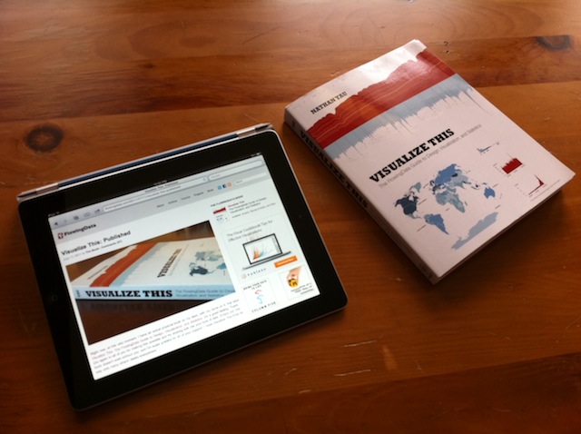
    Released just 2 weeks ago I got a copy of “Visualize This”, the new book by FlowingData Blog author Nathan Yau.

    Nathan Yau's Blog "FlowingData" and new book "Visualize This"

    You can of course get a lot of details on Nathan’s own website here as well as reviews on Amazon. Below are my first impressions after spending a few hours with this book.

    If you have followed Nathan’s blog you will recognize many topics in the book. The book gives a good introduction how to create graphs and visualizations to “tell a story” to the audience. It has comprehensive coverage of topics such as where to get data from, how to get them into the right format and validate them, which tools to use based on what type of aggregation or visualization you intend to create. He focuses specifically on R, a programming language for statistical computing and graphics. He also recommends using a box of tools to leverage the strengths of each of them, such as quickly creating a raw chart in R and then dressing it up in Adobe Illustrator. I’d certainly enjoy using the examples as a tutorial for learning the R language.

    The book deserves a lot of credit for being laid out well and using a lot of practical examples from everyday life (aging trends, crime rates, economic charts, unemployment data, company store location & growth, urban population, fertility rates, etc.) which most people can relate to. It’s enjoyable to read and makes its points in fluid, yet precise language.

    I already took away a few new ideas about aggregate matrix plots (such as Figure 6-9 Scatterplot matrix of crime rates) or using shapes to compare vectors of multiple variables (such as the star charts and Nightingale Charts in chapter 7). For example, I think the Nightingale chart in Figure 7-18 of crime rates by US state is a very useful visualization showing at a glance both the relative amount as well as the break-down into 6 different types of crime per state.

    Sample figure with Nightingale Charts displaying crime rates per US state

    Don’t expect to learn much in terms of statistics – this book doesn’t purport to go into any sort of statistical depth. It is focused primarily on how to get good visualizations, as compared to incorrect, misleading or even purposely distorting graphs – what Nathan refers to as “Ugly Visualizations” on his Blog.

    If I had one wish regarding the contents of this book – or perhaps a sequel some day – I’d say to focus a bit more on interactive graphics. This is obviously hard to do in a printed book, whose pages will always be static. However, there is so much innovation in this area and with the advent of electronic books and media players for interactive content. Together with the advent of mobile computing platforms such as the iPad and book readers such as the Kindle I’m convinced that interactive graphics will enable a whole new way to “tell the story”.

     
    1 Comment

    Posted by on July 27, 2011 in Industrial, Scientific


    Tags: ,

    Flight Pattern Visualization

    Aaron Koblin, an artist specializing in data and digital technologies and currently leader of the Data Arts team in Google’s Creative Lab, collaborated with Wired Magazine and FlightView Software to create beautiful graphics and illustrations of flights based upon tracking data by the FAA.

    Flight Patterns over the US by Aaron Koblin

    The following YouTube video is a time-lapse movie of flights over the US during a 24 hour period in 2008. One can clearly see the airspace come alive on the East Coast in the early morning hours and then calm down over night.

    It is amazing how much data is aggregated into such a visualization – covering over 200.000 flights! Aaron’s website has a section about the flight patterns project which is well worth exploring. There are other graphs where you can set filters for aircraft type, manufacturer, altitude etc. Some of these graphics have been sold as wallpaper or prints and graced various art exhibitions. There is beauty in properly visualized data.

     
    1 Comment

    Posted by on July 26, 2011 in Art, Industrial


    Tags: , ,

    Visualizing Player from Visualizing.org

    Visualizing.Org is a community of creative people working to make sense of complex issues through data and design… and it’s a shared space and free resource to help you achieve this goal. One of the main tools is the new visualization player. From their website:

    Great visualizations of all kinds — from high-res infographics to interactive HTML5 apps — deserve stellar representation always. Instead of settling for embedded screenshots or links, as of today people can now easily embed your actual project (under CC license) using the Visualizing Player. This is a first for the field and we hope it helps make including data visualizations in blog posts and articles easier and more satisfying to readers and gets you and your work more attention.

    It’s a free media player designed specifically for data visualization and interactive graphics; it currently supports 7 formats (HTML5, Java, Flash, PDF, Video, Image, and URL). Its easy to embed in other sites and there are a lot of example visualizations from the community hosted at visualization.org.

    One of them is Gregor Aisch’s interactive graphic on Europe’s Energy production, consumption, import/export and dependencies:

    After playing with many of the example visualizations I have two spontaneous reactions:

    First, there is a lot of opportunity and possibility to display dynamic and complex information interactively. Not all infographics are interactive, of course, but those that are give you a sense of the power of interacting with the underlying data and models.

    Second, there seems to be a lack of generally accepted standards to convey certain types of information. It’s a bit of a wild-west situation with lots of creative approaches to visualizing data – for example look at the many different approaches to the UN Global Pulse data on the above community visualizations page. It reminds me of the graphical user interface days before the standardizing advent of Windows. Not that this is a bad thing; it just feels a bit overwhelming at times.

    It’s going to be interesting to see which styles of interactive presentation will become widely adopted.

     
    1 Comment

    Posted by on July 26, 2011 in Industrial, Socioeconomic


    Tags: ,

    StockTouch – interactive stock monitoring tool

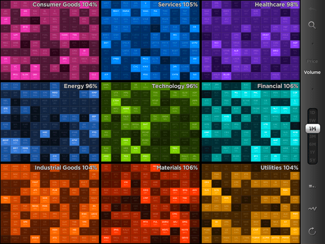
    Financial markets have always been an area of rapid innovation, with the evolution of graphical stock information being no exception. It looks like the famous stock-ticker could be replaced with the stock-toucher. A new iPad application by Visible Market Inc. provides an excellent example of the use of highly aggregated color graphics and touch-interaction. Here is the main UI showing 9 sectors and the 100 largest stocks (by market capitalization) in each sector:

    Market Overview by Sector, 100 largest market cap companies per sector, color-coded heat-map of volume changes.

    You can zoom in (expand- or tap-gesture), zoom out (pinch-gesture) to navigate between levels (market, sector, company) or use the auto-complete search-box for a list of company names matching the search string.

    The 10*10 items can be organized either alphabetically or by market cap. Display is of Price or Volume changes between current values compared to a variable time-period (time-frame slider with values {1D, 1W, 1M, 3M, 6M, 1Y, 5Y}) at the company level and averages at the sector level.

    From their website:

    “Our vision for StockTouch is that it represents the first of a new genre of apps that look at the financial markets in new, powerful and useful ways. It is our belief that the act of touching and diving into data will change the way users engage with this data, and consequently translate it into information and knowledge.”

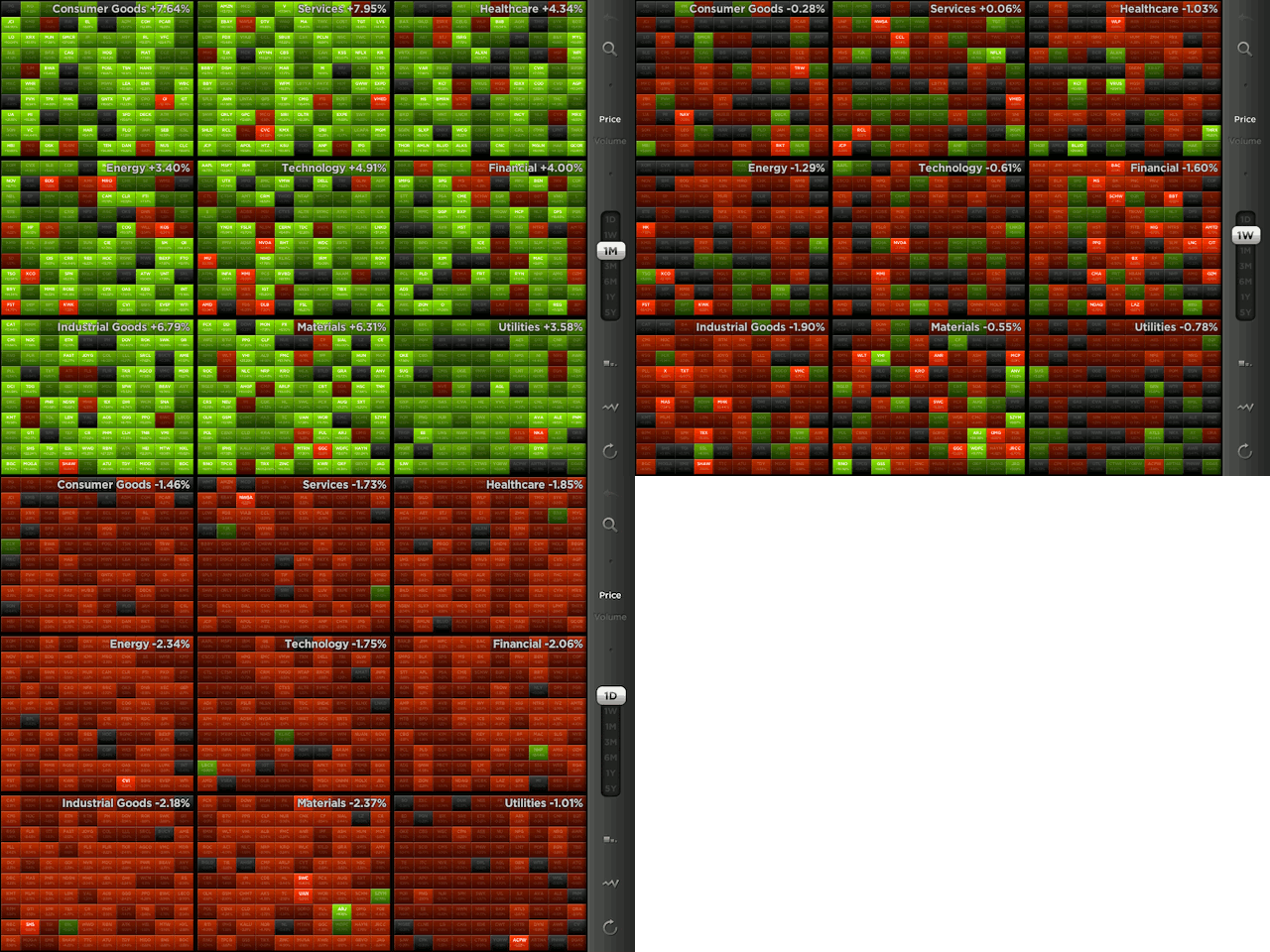
    Price changes of 100 largest market cap companies by sector, Green-Red color-coded heat-map. Note market trends for three timeframes: Last month (green = advance), last week (mixed), last day (red = retreat).

    The use of colors is particularly useful for Price changes: There is a heat map from light green (strong positive change) via darker tones (gray = neutral, no change) to light reds (strong negative change). This shows at a glance how the entire sector or market is doing. In the above example the last month saw a broad advance (majority of companies across all sectors in green); the last week more of a mixed bag, and the last day a broad retreat across the entire market (almost all red). Think about how much information is aggregated into this dashboard! 900 companies, grouped by sector, sorted by market cap, color-coded for price/volume change. No wonder they post a quote on their website:

    “StockTouch tells you more in five seconds than you would learn reading financial news all day.”

     
    3 Comments

    Posted by on July 11, 2011 in Financial


    Tags: , ,

    Visual Human Development Index

    Alex Simoes, MIT Media Lab student working with Professor Cesar Hidalgo, developed a graphical representation of the Human Development Index (HDI). The so-called HDI trees are based on data published in the United Nations 2010 edition of the Human Development Report. The interactive version on their website allows for comparisons between two countries, or between two years of one country.

    Human Development Index – HDI Tree Representation

    From Hidalgo’s website:

    The HDI Tree aggregates data in the Human Development Index graphically instead of numerically. A long standing criticism of the Human Development Index is that, because it averages indicators of Income, Health and Education, it is possible for countries to obtain the same score with different combinations of indicators. This creates the possibility of substituting Education for Health, Health for Income or Income for Education.

    The HDI tree deals with the numerical aggregation problem by using a graphical representation in which the total value of a country’s HDI is presented together with that of its components and subcomponents. This way it is possible to see immediately the contribution of each dimension to the value of a country’s HDI.

    Moreover, the HDI tree represents an alternative way of branding the idea of Human Development and communicating its message graphically to a wide audience. For more on the HDI tree, see the original report or this summary document.

    Inevitably, there are times when one wishes to collapse multiple dimensions or factors into one numerical score. However, one loses the details underlying the score. Such tree-like visual representations of aggregate information can be used for compound measurements used in business, such as the Balanced Scorecard.

    Note: Hidalgo’s gallery features many more interesting projects, such as Disease Network Data visualizing disease associations or the Product Space visualizing economic capabilities of countries based on their trading activities.

    Addendum: I did some more research on this and found a great summary on the HDI tree posted under the title “Visualizing Human Development” at Visualizing.org. One particularly interesting chart is a summary of 35 African nations, showing their respective HDI tree for both 1970 and 2005.

    From the original summary paper “A Visual HDI” by C. Hidalgo:

    The Development Tree also facilitates searching and comparing features over large volumes of data. For example, consider Figure [above], a chart in which the HDI trees of 35 African Nations are shown for both 1975 and 2005. This figure shows information on 420 numerical values (35 countries x 2 years x 6 values). In this chart, however, there are several observations that are easy to spot despite the large amount of information being presented. For instance, it is relatively easy to find out what are the countries in the set with higher levels of development. Algeria, Botswana, Libya, Mauritius, Morocco, South Africa and Tunisia in this case. Moreover, their increases are also rather conspicuous. Also, the lopsidedness of some nations also becomes conspicuous, as it can be seen in the examples of Botswana, South Africa and Swaziland, regarding the life dimension, and that of Libya in 1970, regarding high Income, or of Congo DRC in 2005, regarding low income.

    Again, I can easily picture applications of this visual representation of an aggregate score in a typical business environment. Consider an internal ranking of employees based on an aggregation of several orthogonal dimensions such as skill, teamwork, communication, innovation and business savvy. You could look at a dozen of these employees and their respective visual aggregate tree scores to spot trends, outliers, and relative strengths. Another example is the Balanced Scorecard approach mentioned above. Suppose you are aggregating measures about Finance, Schedule, Quality, Innovation, and People into the score of an Engineering organization. Then you could picture the tree for aggregate performance of this business unit over time (quarters or years) to spot trends.

     
    2 Comments

    Posted by on July 6, 2011 in Socioeconomic


    Tags: , , ,

    Interactive Visualization of Flight Information with Kayak

    Kayak.com is a powerful online search aggregator for travel planning, including flights, hotels, cars and more.

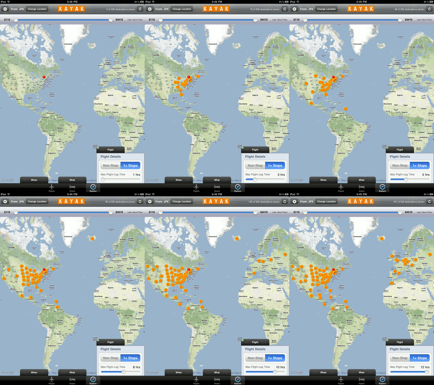
    The corresponding Kayak HD app on the iPad has an interesting feature called “Explore”. In this mode you specify an airport and then qualify various flight attributes such as duration, price, number of stops etc. You can then see search hits on a world map. As you move the sliders for the search parameters, the result set gets updated automatically on the map. Here is an example animated image which displays the increased number of resulting flights from JFK airport in NYC when varying the flight duration in hours:

    Animation Sequence of Flight Results from JFK by flight duration

    It is such dynamic display during in-context manipulation which makes interactive visualization a powerful tool to explore data and create insight.

     
    Leave a comment

    Posted by on July 1, 2011 in Industrial


    Tags: ,