Kayak.com is a powerful online search aggregator for travel planning, including flights, hotels, cars and more.
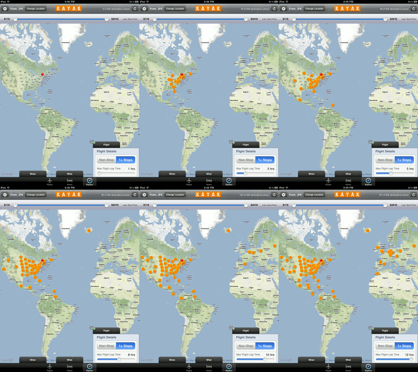
The corresponding Kayak HD app on the iPad has an interesting feature called “Explore”. In this mode you specify an airport and then qualify various flight attributes such as duration, price, number of stops etc. You can then see search hits on a world map. As you move the sliders for the search parameters, the result set gets updated automatically on the map. Here is an example animated image which displays the increased number of resulting flights from JFK airport in NYC when varying the flight duration in hours:
It is such dynamic display during in-context manipulation which makes interactive visualization a powerful tool to explore data and create insight.
