I just got back from a combined business and vacation trip around Easter to Germany and Austria. In Europe, public transportation is an important part of the infrastructure. Especially in the big cities many people commute daily by train or subway, some even live without a car.
One of the most important pieces of information for train and subway systems is the tube map. It is a schematic transit map showing the lines, stations and connections of the train or subway system. It’s main element is that it abstracts away geographical detail (where is what) and focuses on topological aspects: How do I need to transit to which other line to get to a particular station?
The Wikipedia tube map article details the origins around the London subway system which was called the tube (hence the name for this type of map) dating back to first schematic maps in 1931 by Harry Beck:
“Beck was a London Underground employee who realised that because the railway ran mostly underground, the physical locations of the stations were irrelevant to the traveller wanting to know how to get to one station from another — only the topology of the railway mattered.”
This style of map has been widely adopted and successively refined. Having grown up in Munich and having used its train (S-Bahn) and subway (U-Bahn) system for some 25 years, I came to realize that it is not only a convenient tool for the traveller. It can form the basis of mental models of the topology of a city. The first lines of the Munich S- and U-Bahn system were built for the Olympic Games in 1972. The history and evolution of the train and subway system over the 40 years since has been documented on this website. Let’s look at the tube maps and their evolution in roughly 10 year time intervals.
1971: Note the basic shape of a central track West-East shared by all S-Bahn lines which then fan out radially to the suburbs. The 45° angles help with the text labels and add simplicity to the layout. This simplicity is one key element for such tube maps to become a mental model of the city topology, i.e. of knowing what is where and how to get to it. Note that initially there are only two U-Bahn lines sharing most of their underground tracks.
1980: The design of the map evolves to “stretch” out the line-graph to both fill out the entire available rectangular space and to free up some more space in the center; here two additional U-Bahn lines require more space, also due to the fact that U-Bahn stations are closer together than S-Bahn stations in the periphery. The Text label “P+R” is introduced to designate Park & Ride facilities at the stations for commuters.
1992: Some additional U-Bahn lines and stations fill in the center. One of the S-Bahn lines is renamed (S3 -> S8) and extended to the North to connect to the new Munich airport (Erding). Also a few minor map changes (new color scheme, font and legend).
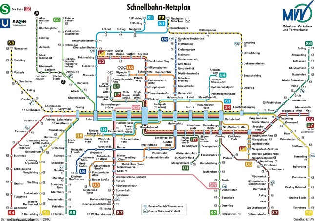
2001: S1 now also reaches the new airport, which simplifies travel from the Western part of the city and effectively creates a Northern loop. The map changes in the top section to reflect this new topology; this graphically compresses the U-Bahn system in the upper half. A new color (blue) for the stations represents he inner zone. This together with the new text label “XXL” represents tariff boundaries. (A similar approach with blue font color for inner zone station names was dropped after a brief version in 1997; it looked confusing.)
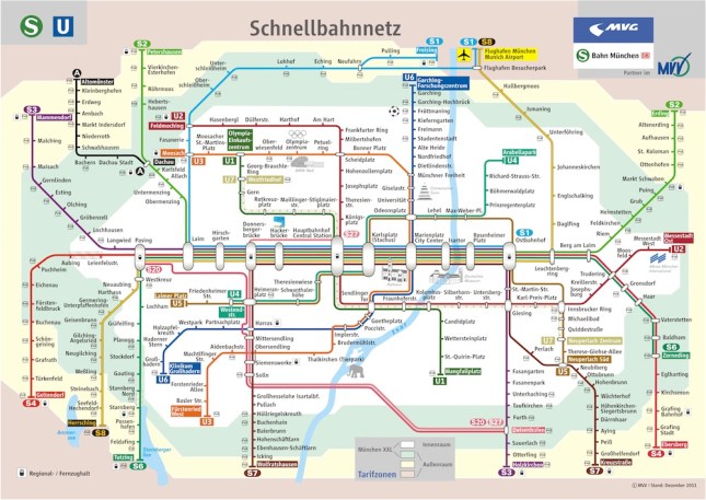
2012: The current map adds several graphical aspects such as the concentric rings of background color for tariff boundaries, a new font for cleaner look and less line breaks as well as icons for long distance train connections. It also shows some geographic features such as the Isar river and the two lakes in the South-West as well as icons for tourist attractions or land-marks such as the new soccer stadium, the ‘Deutsches Museum’ or the Zoo. For a hi-res map see this pdf file.
Such a sequence shows the evolution of schematic concepts and visual representations over the decades. When you take away some of the simplifying tube map abstractions such as the 45° angle, you get topographical maps like this:
While such a map gives you a more precise idea of where you are at any given station in the city, it is much harder to remember and to reconstruct in your head. I believe that this simplicity-by-design of modern tube maps makes it such a strong candidate for forming the basis of mental models of city topology.
Here is an interesting variation of the Munich transit system in a so called isochrone map using colors to display transit times say from the center to other city destinations. Robin Clarke created the following map and describes in this post how he did it.
A final example of using tube maps in an interactive graphic comes from Tom Carden. He created an applet that lets you click on any of the 200 London subway stations and get a isochronic map showing transit times from that origin to any other station. While not laid out as clean as the Beck-style tube maps, this interactive graphic represents 200 different maps all in one! (Click on the image to get to the interactive version.)
See also the more recent Blog post London Tube Map for additional examples of graph visualizations using the London underground as illustration object.
As a traveller arriving in an unknown city we often tend to take such subway infrastructure and its documentation for granted. What amazes me is to think about the amount of cumulative work – plan, design, construction, logistics, etc. – that has gone into building such an infrastructure. A few interesting facts about the Munich U-Bahn (subway) system: 6 lines, 100 stations, 103 km, ~ 1 million passengers /day. (Source: Wikipedia). Building a subway costs in the order of $100 million/km, so this represents an investment of about $10 billion! Think about that the next time you try to find your way through a new city…


