RSS

Monthly Archives: February 2012

Mobile Business Intelligence Market Study

Mobile Business Intelligence Market Study

Dresner Advisory Services publishes an annual study on Mobile Business Intelligence vendors, the latest in October 2011. It focuses on the mobile capabilities of BI platform vendors similar to those in the Gartner Magic Quadrant for Business Intelligence we recently looked at.

The ~50 page document has a good executive summary and provides insight from industry surveys and changes between 2010 and 2011. In terms of data visualizations, it generally does a poor job of conveying the study findings. There is an abundance of pie charts and stacked bar charts with often very confusing color codes. For example, consider this chart on BI vendor mobile platform priority:

Mobile BI Vendor Platform Priority (source: DAS)

Rank information shouldn’t be conveyed by color (better by vertical position). It is very confusing to see which platforms gained or lost in the ranking. A data visualization should first and foremost make it easy to spot patterns and thus provide insight. Not every dataset makes for a good Excel bar chart.

All that said, I found one very useful chart which shows all vendor Mobile BI capabilities at a glance:

Mobile BI Vendor Scores (source: DAS)

Regarding the vendor scoring, from the study:

Using the data that was provided by twenty-four different BI vendors, we constructed a model which scores them based on mobile platform support, platform integration and numbers of supported BI features (Figure 33).

Please carefully review the detailed vendor and product profiles on pages 47 – 52 and to consider both dimensions (i.e., platform and features) independent of each other.

It should be noted that this model reflects only two dimensions of a BI vendor’s product capability and is not intended to indicate “market leadership” only a convergence of capabilities for Mobile BI. Readers are encouraged to use other tools to understand the many other dimensions of vendor capability, such as our own Wisdom of Crowds Business Intelligence Market Study ®.

The full report can be downloaded from the Yellowfin website here.

 
1 Comment

Posted by on February 29, 2012 in Industrial


Tags: , ,

Probabilistic Project Management at NASA with Joint Confidence Level (JCL-PC)

Probabilistic Project Management at NASA with Joint Confidence Level (JCL-PC)

On the Strategic Project and Portfolio Management Blog by Simon Moore one can find many fascinating stories about project failures as well as a related collection of project management case studies. One entry there links to a project management method NASA is mandating internally since 2009 to estimate costs and schedule of their various aerospace projects. The method is called Joint Confidence Level – Probabilistic Calculator (JCL-PC). It’s a sophisticated method using historical data and insight into estimation psychology (like optimism bias) to arrive at corrective multipliers for project estimates based on project completion percentages with required confidence level. It’s also using Monte Carlo simulations to determine outcomes, leading to scatterplots of the simulated project runs on a Cost-vs.-Schedule plane. From there one can determine estimates with for example 70% confidence levels for what the cost and schedule overruns will likely be.

If you’re either already familiar with the method or if you are very good at abstract thinking the above paragraph will have meant something to you. If it didn’t, bear with me. In this post I make a brief attempt to explain what I understood about the method using the data visualizations from two sources (a 100+ page report and a 12 page FAQ). The report is fascinating on many levels, as it deals with the history of high-profile project overruns (Apollo program, Space Shuttle, Space Station) and the pervasive culture of under-estimation (optimism bias) through not accounting for project risks that are unknown, but historically evident.

JCL starts with historical observations of similar projects with regards to cost and schedule overruns. For example, the above cited report contains best fit histogram distributions for robotic missions.

Overrun Distributions of Cost and Schedule for Robotic Missions (Soucre: NASA)

The idea is to use a set of such distributions for probabilistic estimates of cost and schedule. The set of distributions needs to account for the fact that in the early stages of a project there are more unknowns and as such higher risk of overruns. From the report:

The JCL-PC estimating method is based on the hypotheses that in the beginning phases of a project there are many unknown risks – and over time the project will have a high probability of exceeding estimated costs and scheduled duration. … Work as it was initially planned will inevitably change. Quantifiable risks become clearer and NASA’s S-Curves will tend to lay down as the work goes forward. Keep in mind that it’s not the project that is becoming inherently riskier. It’s a matter of participants fully identifying the real work that was “out there” all along. Even though the scope of the work wasn’t fully perceived “back when” – progress has continued to identify the risks and quantify the corrective actions. History is written in real time and that history differs to a greater or lesser degree from what was anticipated. The JCL-PC helps us better plan for and manage that difference.

The JCL-PC method strikes a needed balance between subjectivity and anticipated risk variability leaving only one remaining probability influence factor to deal with. – namely, assigning the percentage complete of the subject project. This % complete factor includes both subjective and objective elements.

One of the key elements is the notion of a multiplier which implements this reduced-uncertainty-over-time as well as a so called optimism corrector and other project risk in line with historical aerospace project overruns. The multiplier is plotted below as a function of the project % complete parameter for different confidence levels:

Multiplier as function of project % complete for various confidence levels

The concept is illustrated via two charts of a fictitious $1m project (applied here to cost overruns, but equally applicable to schedule overruns): The first shows a point estimate and it’s S-curves (confidence bands) per project % complete.

The second shows the S-Curves after applying “the optimism corrector and some minor project risk, through a more typical project life cycle with project scope creep … As the project evolves the S-Curve moves slightly to the right and becomes more and more vertical.”
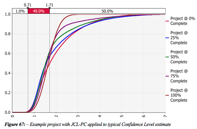
It would be great to have an interactive graphic where the S-Cruves are plotted in response to sliding the project % complete between 0% and 100%. The report lists the above multipliers in a numerical table spanning project % complete (in 1% increments) and four confidence levels (50%, 60%, 70%, 80%). Rather than copying the entire table I filtered this down to just 10% increments in project % complete. This table tells NASA officials at various confidence levels, how much money they will have to spend for a $1m project as a function of project % complete:
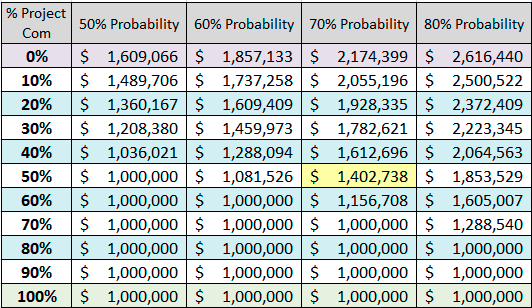
Cost Estimate Table with project % complete and confidence levels

The data point highlighted in yellow is described as follows:

When the project is 50% complete, you’ll notice that a 50% confidence level suggests that the project can be completed for the anticipated $1,000,000. However, if we adhere to the NASA standard of a 70% confidence level, we see that another $400,000+ will likely be needed to complete the project. No matter how well a project is managed, it rarely compensates for ultra- optimistic budget estimates that sooner or later return with a vengeance and overcome the most skillful leaders.

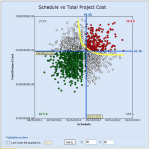
As a final illustration the FAQ document includes this scatterplot as JCL-PC output:

Scatter Plot of Monte Carlo simulation with JCL-PC

A Frontier Curve represents all possible combinations of cost and schedule that will give you a percent JCL. The plot shows the Frontier Curve for a 70% JCL in yellow. The green dots are simulated runs with outcomes below the selected cost and schedule (blue cross-hair, yellow labels). White dots have either cost or schedule overruns, red dots have both.

The report makes bold claims about the potential of JCL-PC, but also about the challenges inherent in attempting to change an entire management culture. I am not qualified to comment on these claims, but my impression is that such probabilistic project management methods will raise the bar in the field and should lead to more accurate estimates.

The more I think about such abstract concepts, the more I’m convinced that mental models are inherently visual. We remember some key visualizations or charts and anchor our understanding of the concept around those visual images. We also use them to communicate or teach the concepts to each other – hence the value of the whiteboard or even the napkin drawing. As such, the increasing computational ability to produce such visual images and ideally even interactive graphics is an important element of academic and scientific endeavors.

 
Leave a comment

Posted by on February 25, 2012 in Financial, Industrial, Scientific


Tags: , , ,

Gartner’s Magic Quadrant for Business Intelligence

Gartner’s Magic Quadrant for Business Intelligence

Note: See also the more recent update on the Magic Quadrant for Business Intelligence 2013.

The Gartner group publishes an annual report called Magic Quadrant of Business Intelligence. It compares various vendors in two dimensions: Ability to Execute and Completeness of Vision. These two dimensions span up four quadrants (leaders, challengers, visionaries, niche players).

The key graphic in the Gartner reports is the so called Magic Quadrant diagram. Here is the 2012 version (click the image to see the full report):

Magic Quadrant of BI 2012 (Source: Gartner)

Similar charts have been published for 2011, 2010, 2009, and 2008 (source: Google Image Search).

From these snapshots in time one can create a time-series and compare relative movement of vendors. Here is an interactive version of such a chart created with Tableau Public: (Click on chart below to interact.)

Interactive BI_MagicQuadrant 2008-2012

Disclaimer: There are at least two caveats here: One is the limited quality of the data. The other is the limited applicability of this type of visualization.

Quality: I have contacted two of the authors at Gartner and asked for the (x,y-coord) data of those Magic Quadrants. However, Gartner’s policy is to not disclose these data. Hence I screen-scraped the coordinates off the publicly available images. This brings with it limited accuracy to measure the positions from the images and the possibility of (my) clerical error in entering that data in a spreadsheet.

Applicability: The contacted authors (James Richardson and John Hagerty) both emphasized that due to subtle changes in the way the dimension score is calculated each year such sequential comparisons are not supported by Gartner. In other words, the data may show misleading or unintended conclusions.

Discussion: Of course the original Gartner reports provide a tremendous amount of detail, both around the methodology (which factors contribute to Vision and Execution scores) and on the various vendors, their products and other relevant business aspects like sales channels etc. One also needs to bear in mind that some of these companies emerge or disappear over time.

That said, the interactive time-series chart has many advantages over the individual snapshots:

  • You can select a subset of companies (for example all public companies)
  • Companies are identified by label and color
  • History can be traced for consecutive years
  • Trends are more easily detected (see also Disclaimer above)

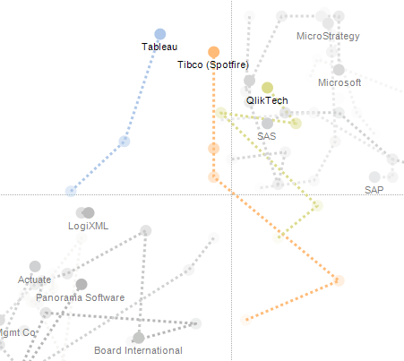
For example, smaller but rapidly growing companies like Tibco (Spotfire) and Tableau have somewhat vertical trajectories leading them into the “challenger” quadrant with strong increases in the ability to execute. Tibco and QlikTech are the only 2 (of 24) companies to change quadrants in the last 5 years, from visionary to challenger (Tibco) and leader (QlikTech), respectively.

MQ trajectory for Tableau, Tibco, and QlikTech

Some big public companies like IBM, SAP and Microsoft have invested heavily over the last years in the BI space. This has resulted in a more horizontal trajectory within the leader quadrant as they have increased the completeness of their vision, among others through acquisitions of smaller companies (SAP bought Business Objects, IBM bought Cognos).

MQ trajectory for IBM, SAP, and Microsoft

Some individual trajectories are more dynamic than others. For example MicroStrategy has had strong increases first in vision (2008-2009) and then in their ability to execute (2010-2012). By contrast, Actuate has fallen behind relative to others in both execution and vision in the first 3 years, only to stop (2011) and revert (2012) that trend in recent years.

MQ trajectory for Actuate and MicroStrategy

Bottom Line: Data presented via Interactive Charts invites exploration, discovery, and better understanding. Through Tableau Public these charts can easily be shared with others. The Magic Quadrant data is originally curated and presented by Gartner in the traditional snapshot moment-in-time format. IMHO, in this interactive time-series format the data comes to live and yields additional insight. I’d be interested to hear your thoughts and comments on the caveats from the authors about the limited applicability of the time series animation?

 
5 Comments

Posted by on February 20, 2012 in Industrial


Tags: , , ,

Side by Side: Apple, Microsoft, Google, Amazon

Side by Side: Apple, Microsoft, Google, Amazon

Ed Bott at ZDNet.com wrote a post with the title: Microsoft, Apple, and Google: where does the money come from? He looked at the quarterly reports of these companies (links to sources in the article) and displayed a pie-chart of the revenue mix for each of them. Inspired by that, I added a fourth company – Amazon (source: 10-K for 2011) – and aggregated those pie-charts into one graphic.

Revenue Mix for Apple, Microsoft, Google, and Amazon

All four are large consumer-oriented technology companies; like millions of customers, I use many of their products and services every day. They each operate with different businesses models:

  • Microsoft: Software
  • Apple: Hardware
  • Google: Advertising
  • Amazon: Retail

Yet as a consumer I rarely think about these differences. All of them use state-of-the-art technologies like cloud-computing and mobile devices to achieve integrated end-to-end experiences geared to increase revenues in personal computing (Microsoft), smart mobile devices (Apple), online search (Google) or shopping (Amazon). And arguably all of them derive major competitive advantage from their software, such as Apple’s iOS which introduced the touch interface.

Perhaps most surprising is Google’s almost singular reliance on advertising, which makes it a very different business model. They offer all their technology for free – from search to mapping to operating systems and social media – to grow and retain online attention as enabling condition for advertising revenue. For a business this big the near complete dependence on one source of revenue is unusual; perhaps its time for Google’s leadership to seriously consider a diversification strategy? Without it Google is arguably more prone to disruption (such as from Facebook) than the other companies. Speaking of disruption: Apple derives almost 3/4 of its revenue (73%) from iPhone and iPad, neither of which existed 5 years ago. As Ed Bott points out, those two products now drive an astonishing $33.5b revenue per quarter!

To compare the companies by their absolute numbers, here is a bar chart of market capitalization, revenue and profit: (all in billions of Dollars and for Q4 2011, market cap as of 2/3/12)

Market Cap, Revenue and Profit for Apple, Microsoft, Google, and Amazon

Market cap of these four companies combined is approaching $ 1 trillion. Much has been written about the differences in market valuations relative to revenue and most importantly profit. The markets undervalue Apple and overvalue Google and Amazon. Let’s compare these dimensions (and number of employees) in the following radar plot:

Relative business performance for Apple, Microsoft, Google, and Amazon

The plot shows the relative performance of all with the highest in each dimension normalized to 100%. Amazon shows by far the smallest profit in the last quarter. Given it’s retail nature, it’s profit margins have always been smaller; and CEO Jeff Bezos has long emphasized the strategy of investing in future growth at the expense of present profits. Microsoft continues to enjoy very solid profit margins in a large, well diversified business. Google has incredible talent and for now is the undisputed king of online advertising. But Apple leads in all three factors, and it achieves 2x Microsoft’s results with less than half the number of employees! Apple’s profit is 1.5 times that of the other three combined! And it makes more than 60% of the profit with less than 20% of the employees. In fact, Apple’s market capitalization is now higher than $10m per employee! It must feel pretty special to be one of them these days…

Postscript: On Feb-13 analyst Horace Dediu at Asymco.com published an article with time-series data for the above companies (except Amazon) over the last 18 quarters (since 2007). It shows the evolution over time as depicted in this chart:

Apple Microsoft Google - Revenue and Operating Income 2007-2011

The article is called “The World’s Biggest Startup“. It’s main point is this: Microsoft and Google both grew their businesses steadily, but did not change their type of business. Apple did some of that in its established business segments, but more importantly and disruptively it added new categories (iPhone and iPad) for dramatic growth. That’s what startups do. Just so happens that Apple – whose stock today for the first time hit $500 – is also the most highly capitalized company in the world (around $460B). If Apple is a startup now, what will they look like when they are fully established?

 
6 Comments

Posted by on February 6, 2012 in Financial, Industrial


Tags: , , , , , ,

Futuristic TouchScreen Visualization

Futuristic TouchScreen Visualization

Glass manufacturer Corning has published the second YouTube video in its series “A Day Made of Glass”. It provides a glimpse into the future of ubiquitous touchscreen glass displays, from the car dashboard to the kitchen refrigerator and wall-to-wall home display, the large school community table to the medical laboratory, even the glass wall in an outdoor theme park.

Corning Day Of Glass 2

Mashable writes in its story about the video that it “will blow your mind”. Hyperbole aside, it is worth watching (click on image above). The script goes through a typical day and shows various display applications; then it pauses the scenes and mentions the underlying technological challenges and whether the depicted displays are possible and feasible with today’s technology. From the video:

“Of course, this is not just a story about glass. It’s a story about a shift in the way we will communicate and use technology in the future. It’s a story about ubiquitous displays, open operating systems, shared applications, cloud media storage and unlimited bandwidth. We know there are many obstacles to be overcome before what we’ve just seen will become an attainable, reliable reality. But at Corning, we believe in this vision – and we are not waiting.”

Besides being a great corporate promotional piece, the 11 min video is a great example of how interactive, even immersive visualizations can change how we consume and interact with information and with one another.
Apple created a video back in 1987 titled “Knowledge Navigator” which seemed similarly futuristic at the time. Today, 25 years later, the iPad is in common use. Interactive touch screens have become the norm for smart phones since Apple launched the iPhone in 2007, just 5 years ago. Larger form factors exist, but are still expensive to build.

Regardless of how long it will take for touch screen displays to get bigger and become ubiquitous, the notion of interactive data visualization will only become more valuable.

 
Leave a comment

Posted by on February 5, 2012 in Industrial, Medical, Recreational, Scientific


Tags: , ,

Inequality Comparison

Inequality Comparison

In previous posts on this Blog we have looked at various inequalities as measured by their respective Gini Index values. Examples are the posts on Under-estimating Wealth Inequality, Inequality on Twitter, Inequality of Mobile Phone Revenue, and how to visualize as well as measure inequality.

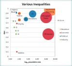
Here is a bubble chart comparison of 14 different inequalities:

Comparison of various Inequalities


Legend:

  • P1: Committee donations to 2012 presidential candidates (2011, Federal Election Commission)
  • P2: US political donations to members of congress and senate (2010, US Center for Responsive Politics)
  • A1: Twitter Followers (of my tlausser account) (2011, Visualign)
  • A2: Twitter Tweets (of my tlausser account) (2011, Visualign)
  • I1: Global Share of Tablet shipment by Operating System (2011, Asymco.com)
  • I2: Mobile Phone Shipments (revenue) (2009, Asymco.com)
  • I3: US Car Sales (revenue) (2011, WSJ.com)
  • I4: Market Cap of Top-20 Nasdaq companies (2011, Nasdaq)
  •  

    The x-axis shows the size of the population in logarithmic scale. The y-axis is the Gini value. The “80-20 rule” corresponds to a Gini value of 0.75. Bubble size is proportional to the log(size), i.e. redundant with the x-axis.

    Discussion:

    Most of the industrial inequalities studied have a small population (10-20); this is usually due to the small number of competitors studied or a focus on the Top-10 or Top-20 (for example in market capitalization). With small populations the Gini value can vary more as one outlier will have a disproportionately larger effect. For example, the Congressional Net Worth analysis (top-left bubble) was taken from a set of 25 congressional members representing Florida (Jan-22, 2012 article in the Palm Beach Post on net worth of congress). Of those 25, one (Vern Buchanan, owner of car dealerships and other investments) has a net worth of $136.2 million, with the next highest at $6.4 million. Excluding this one outlier would reduce the average net worth from $6.9 to $1.55 million and the Gini index from 0.91 (as shown in the Bubble Chart) to 0.66. Hence, Gini values of small sets should be taken with a grain of salt.

    The studied cases in attention inequality have very high Gini values, especially for the traffic to websites (top-right bubble), which given the very large numbers (Gini = 0.985, Size = 1 billion) is the most extreme type of inequality I have found. Attention in social media (like Twitter) is extremely unevenly distributed, with most of it going to very few alternatives and the vast number of alternatives getting practically no attention at all.

    Political donations are also very unevenly distributed, considerably above the 80-20 rule. The problem from a political perspective is that donations buy influence and such influence is very unevenly distributed, which does not seem to be following the democratic ideals of the one-person, one-vote principle of equal representation.

    Lastly, economic inequalities (wealth, income, capital gains, etc.) are perhaps the most discussed forms of inequality in the US. Inequalities at the level of all US households or citizens measure large populations (100 – 300 million). One obvious observation from this Bubble Chart is that capital gains inequality is far, far higher than income inequality.

    Tool comment: I have used Excel 2007 to collect the data and create this chart. Even though it is natively supported in Excel, the Bubble Chart has a few restrictions which make it cumbersome. For example, I haven’t found a way to use Data Point labels from the spread-sheet; hence a lot of manual editing is required. I also don’t know of a way to create animated Bubble-Charts (to follow the evolution of the bubbles over time) similar to those at GapMinder. Maybe I need to study the ExcelCharts Blog a bit more… If you know of additional tips or tweaks for BubbleCharts in Excel please post a comment or drop me a note. Same if you are interested in the Excel spread-sheet.

     
    Leave a comment

    Posted by on February 3, 2012 in Industrial, Socioeconomic


    Tags:

    Treemap of Top 1 Percent Occupations

    Treemap of Top 1 Percent Occupations

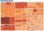
    On Jan 15, 2012 the New York Times published an interactive Treemap graphic with the title: “The Top 1 Percent: What Jobs Do They Have?”

    Treemap of Top 1 Percent Professions (Source: New York Times)

    It is a good example of the Treemap chart we have covered in previous posts (Treemap of the Market and Implementation of Treemap). From the chart legend:

    “Rectangles are sized according to the number of people in the top 1 percent. Color shows the percentage of people within that occupation and industry in the top 1 percent.”

    There are approx. 1.4 million households in the top 1 percent; they earn a minimum of about $500k per year, with an average annual income around $1.5m (according to this recent compilation of 10 fun facts about the top 1 percent).

    The largest and darkest area in the Treemap are Physicians. Chief Executives and Public Administrators as well as Lawyers are also doing very well, not surprisingly, especially in Security, commodity broker and investment companies. The graphic nicely conveys the general notion that big money is in health, financial and legal services.

    One thing to keep in mind is that the chart counts the number of individual workers living in households with an overall income in the top 1 percent nationwide. This skews the picture a bit, since an individual with a low-earning occupation can still live in a top 1 percent household through being married to a top-earning spouse. If you looked at individuals only, the number of top 1 percent earners in occupations such as teacher, receptionist, waiter, etc. would certainly be much smaller.

    P.S: I stumbled across this particular chart from Sha Hwang’s “UltraMapping” at PInterest, which is a great collection of maps and other graphics for design inspiration.

    UltraMapping collection of maps (source: Sha Hwang via Pinterest)

     
    Leave a comment

    Posted by on February 2, 2012 in Industrial, Socioeconomic


    Tags: , ,

     
    %d bloggers like this: