RSS

Tag Archives: mobile

Mobile Business Intelligence Market Study

Mobile Business Intelligence Market Study

Dresner Advisory Services publishes an annual study on Mobile Business Intelligence vendors, the latest in October 2011. It focuses on the mobile capabilities of BI platform vendors similar to those in the Gartner Magic Quadrant for Business Intelligence we recently looked at.

The ~50 page document has a good executive summary and provides insight from industry surveys and changes between 2010 and 2011. In terms of data visualizations, it generally does a poor job of conveying the study findings. There is an abundance of pie charts and stacked bar charts with often very confusing color codes. For example, consider this chart on BI vendor mobile platform priority:

Mobile BI Vendor Platform Priority (source: DAS)

Rank information shouldn’t be conveyed by color (better by vertical position). It is very confusing to see which platforms gained or lost in the ranking. A data visualization should first and foremost make it easy to spot patterns and thus provide insight. Not every dataset makes for a good Excel bar chart.

All that said, I found one very useful chart which shows all vendor Mobile BI capabilities at a glance:

Mobile BI Vendor Scores (source: DAS)

Regarding the vendor scoring, from the study:

Using the data that was provided by twenty-four different BI vendors, we constructed a model which scores them based on mobile platform support, platform integration and numbers of supported BI features (Figure 33).

Please carefully review the detailed vendor and product profiles on pages 47 – 52 and to consider both dimensions (i.e., platform and features) independent of each other.

It should be noted that this model reflects only two dimensions of a BI vendor’s product capability and is not intended to indicate “market leadership” only a convergence of capabilities for Mobile BI. Readers are encouraged to use other tools to understand the many other dimensions of vendor capability, such as our own Wisdom of Crowds Business Intelligence Market Study ®.

The full report can be downloaded from the Yellowfin website here.

 
1 Comment

Posted by on February 29, 2012 in Industrial


Tags: , ,

World Cartogram of Mobile Phone Adoption

World Cartogram of Mobile Phone Adoption

Under the slogan “Our Changing World”, FedEx has developed a website with various cartograms showing world-wide socio-economic changes based on publicly available data from sources such as World Bank, UNESCO, World Health Organization and others.

Cartograms visualize a particular metric by adjusting a country’s size corresponding to that metric. It leaves country neighborhood relationships (which we blogged about here) intact, but inflates or deflates countries, often dramatically so. Here is a series of three cartograms showing the adoption of mobile phones in the years 1995, 2000, and 2008. Size of each country is proportional to the density of mobile phones (average # mobile phones per 100 people).

Mobile Phone Density 1995

Mobile Phone Density 2000

Mobile Phone Density 2008

From the Topic Info on the Mobile Phone Presence display:

In 1996, mobile phones were a Nordic phenomenon. A Swede was twice as likely as an American to own one, and five times as likely as a German. Skip forward four years and the picture changed radically. Mobile phone usage boomed ten-fold across Europe; most European nations caught up with their northern neighbours. Eight years later. Africa suddenly loomed large. Mobile-phone penetration in same emerging economies now outstrips that of the developed world; Algeria tops the US. In most countries, mobile phone use is now ubiquitous. Lacking a mobile phone is more striking today than possessing one.

Indeed, it’s hard to find a country with very small mobile phone presence – and then to pinpoint it on the cartogram. One country I found was Cuba: While most countries in the Americas have between 50-100, Cuba has only 3 mobile phones per 100 people.

A few months ago Nathan Yau covered this topic on his FlowingData Blog here. As he already suggested, there are many more data to explore on FedEx’s website, so check it out for yourself here.

 
1 Comment

Posted by on November 20, 2011 in Industrial, Scientific, Socioeconomic


Tags: , ,

Share and Inequality of Mobile Phone Revenues and Volumes

Share and Inequality of Mobile Phone Revenues and Volumes

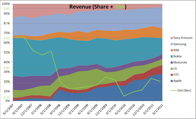
The analyst website Asymco.com visualizes various financial indicators of mobile phone companies in this interactive vendor bubble chart (follow link, select “Vendor Charts”). It covers the following 8 companies: Apple, HTC, LG, Motorola, Nokia, RIM, Samsung, Sony Ericsson. From the “vendor data” tab I downloaded the data and looked at the revenue and volume distributions for the last 4 years.

Revenue Share of Mobile Phones and corresponding Gini Index

Note the sharp reduction in inequality of revenue distribution in the 9/1/08 quarter, when Apple achieved nearly 10x in revenue (and volume) compared to the year before. While the iPhone 1 was introduced a year earlier in 2007, in commercial terms the iPhone 3G started to have strong market impact when introduced in the second half of 2008.

Volume Share of Mobile Phones and Gini Index

Volume inequality is considerably higher (average Gini = 0.61) than Revenue inequality (0.43) due to two dominant shippers (Nokia and Samsung), which continue to lead the peer group in volume. Only recently has the inequality been reduced, i.e. the volumes are distributed more evenly. Apple’s growth in volume share has come at the expense of other players (mainly Motorola and Sony Ericsson).

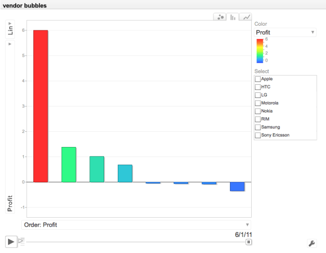
Volume share is a lagging indicator regarding a company’s innovation and success. It can be dominated for a long time by players who are past their prime and in financial distress (like Nokia). Revenue is more useful to predict a company’s future growth and success. But the real story is told when comparing Profit. Apple’s (Smart Phone) Profit dwarfs that of the other 7 competitors:

Profit Comparison between 8 Mobile Phone Vendors (Source: Asymco.com)

Click on the image to go to Asymco’s interactive chart (requires Flash). The bubble chart display over time is very revealing regarding Apple’s meteoric rise.

 
2 Comments

Posted by on October 22, 2011 in Financial, Industrial


Tags: , ,