RSS

Monthly Archives: August 2011

Oregon Coast Bike Map

Oregon Coast Bike Map

A good example of visualization for recreational purposes is the Oregon Coast Bike Map created by the Oregon Department of Transportation and published here. Here is a sample page of this 13 page document:

Sample Page from the Oregon Coast Bike Map

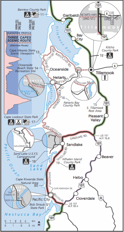
The map is full of useful information relevant to cyclists such as weather, traffic, campgrounds, attractions, etc. What I find particularly useful is the indication of distances and elevation profile. Unlike motorized traffic hills tend to slow cyclists down a lot, so estimating ride time to a goal not only depends on the distance, but also on the vertical elevation gain en route to that goal. For example, consider this enlarged area (inset C of above page) of the beautiful “3 Capes” region near Tillamook:

Inset of 3 Capes Region

Note the use of color to indicate type of road and traffic as well as shaded bands in elevation profile. I think this is a good example of creating insight by visualizing data. I should know, as I was riding this stretch 2 years ago in August of 2009 during my Panamerican Peaks cycling and climbing adventure. Not having the benefit of such a detailed map I decided to embark on the 3 capes route late in the afternoon, only to get caught by sunset in NetArts as the unexpected hills slowed me down…

Another excellent map also designed by ODOT is the Columbia River Gorge Bike Map. Check it out for another example of good visualization for recreational purposes.

 
Leave a comment

Posted by on August 30, 2011 in Recreational


Tags: ,

Infographics by Column Five, Taste Graph by Hunch

Recently I downloaded an iPad app called Infographics created by the company Column Five. I found it interesting not so much because of the app itself (which has limited functionality and the recent update crashes quite frequently), but because of the rather large amount of infographics it allows you to browse quickly (unfortunately not by category or keyword and there is no search).

Infographics App from Column Five, Browser Interface

There are about 200 infographics in the app at present; these appear to be the same that you can also browse on Column Five’s website infographics gallery. These specimen cover a variety of categories, with a large dose of social media and Internet related topics – likely due to the sponsors paying for the creation of such artifacts. When in Portrait Mode you can read a bit more about the content of the respective infographic.

Infographics Browser in Portrait Mode

On their website Column Five talks about “What is an infographic?” Rather than define the term, they describe it using categories like Data Visualization or Information Design. From the above page:

In the age of big data, we need to both make sense of the numbers and be able to easily share the story they tell. The practice of data visualization, which is the study of the visual representation of data, typically analyzes large data sets. It seeks to uncover trends by showing meta patterns, or to make single data points easily visible and extractable. The visual display of this data is the most interesting and universal way to make it accessible to a wide audience. And as with all infographic design, the display method is rooted in the context and desired message.

This practice is the most numbers-heavy, and typically is what a purist would describe as a “true” infographic. These visualizations also tend to be more complex, as they often are attempting to display a great number of data points. In some cases, these graphics functionally serve only as art pieces, if no message can be extracted. When properly executed, however, they should be both beautiful and meaningful, allowing the viewer to decipher data and recognize trends while admiring its aesthetic appeal.

The focus is on the display of information both effectively (you get the intended message…) and efficiently (… quickly and unequivocally), to “use design to communicate a message that is both clear and universal”. Interesting that there is an element of art. We have seen this before on this Blog, for example the aesthetic appeal of Tree Maps or of Flight Pattern Visualizations – often the creators of such visualizations describe themselves as artists. I suspect that beautiful visualizations are better able to communicate a message – which is what the infographics sponsor paid for – because they appeal to the viewer aesthetically and thus tap into additional bandwidth to transport the intended message (“both beautiful and meaningful”).

Infographic about Hunch and their big data "taste graph"

As an example, consider the infographic about The Ever-Expanding Taste Graph by Hunch, published by Hunch on their Blog in May 2011. This visualization explains in broad strokes how Hunch is building a data structure – the “taste graph” – by recording people’s affinity to all kinds of things as observed and recorded from their own answers to questions and other interactions on the web.

On the one hand, it’s amazing how much data is being tracked and what kind of predictive power results from that. A graph with 500 million people nodes and 30 billion edges, running on a supercomputer with 48 processors and 1 TeraByte of RAM. Talk about a company whose business model is centered around big data! For those like me who started in Computer Science some 20+ years ago, such numbers are truly amazing. The cost of storage and processing power has exponentially declined for several decades now. As Bill Gates used to say: The effects of Moore’s law are often over-estimated in the short-term, but even more under-estimated in the long-term.

There is a disconcerting side to this, though: Very little privacy on the Internet. For most people, our online history gets more and more detailed every day… And with the explosion of social media we are volunteering so much information about ourselves, using our own time and effort, with the side-effect of enriching the social media enterprises. This has led some to observe that for social media companies, you are not the customer. You are the product!

I played Hunch’s online Twitter Predictor game. By analyzing my Twitter account and a few questions I volunteered to answer on the Hunch website they correctly predicted 94% of my responses to test answers by looking at the affinities and preferences of other people sufficiently similar to me. While some of those questions are fairly easy to predict and for many Yes/No questions even random guessing would get you 50% correct responses, such high accuracy is still interesting. Well, I guess I am that predictable. Is being predictable a good or bad thing?

 
Leave a comment

Posted by on August 23, 2011 in Industrial, Socioeconomic


Tags: , ,

Business Benefits of Software Release in Multiple Increments

One of the main principles of Lean-Agile Software Development is to deliver fast and in small increments. Breaking a large system into multiple increments and delivering some of them early has many benefits to both the business and the customer such as: Earn returns for delivered value sooner. Obtain customer feedback sooner to clarify future features. Capture more market share due to early mover advantage. Reduce risk of obsolescence due to late delivery.

While these benefits are somewhat intuitive, how can we better illustrate and quantify such benefits? From a financial, cash-flow perspective, there are three main business benefits of switching from one single release to multiple release increments:

  • Sooner Break-Even
  • Smaller Investment
  • Higher Net Return

A visual model helps to reinforce and quantify them. In the following 4min demonstration I am using a simplified model to illustrate the above benefits:

The above demonstration is based on the book “Lean-Agile Software Development – Achieving Enterprise Agility” by Alan Shalloway, Guy Beaver and James Trott. (See chapter 2: The Business Case for Agility) I believe that having such dynamic visualizations can help explain these benefits and thus make a more compelling business case for using Lean-Agile Software Development.

Business Benefits of Two-Increment Release

Click on the above graphic to interact with the dynamic model using the Wolfram CDF Player.

 
1 Comment

Posted by on August 20, 2011 in Industrial


Tags: , , ,

Customer Profitability

Inequality is often at the root of structure and contrasts. Exposing inequality can often lead to insight. For example, take the well-known Pareto principle, which states that roughly 80% of the effects come from 20% of the causes (hence also referred to as the 80-20 rule).

From the above Wikipedia page on the Pareto principle, chapter on business:

The distribution shows up in several different aspects relevant to entrepreneurs and business managers. For example:
80% of your profits come from 20% of your customers
80% of your complaints come from 20% of your customers
80% of your profits come from 20% of the time you spend
80% of your sales come from 20% of your products
80% of your sales are made by 20% of your sales staff
Therefore, many businesses have an easy access to dramatic improvements in profitability by focusing on the most effective areas and eliminating, ignoring, automating, delegating or re-training the rest, as appropriate.

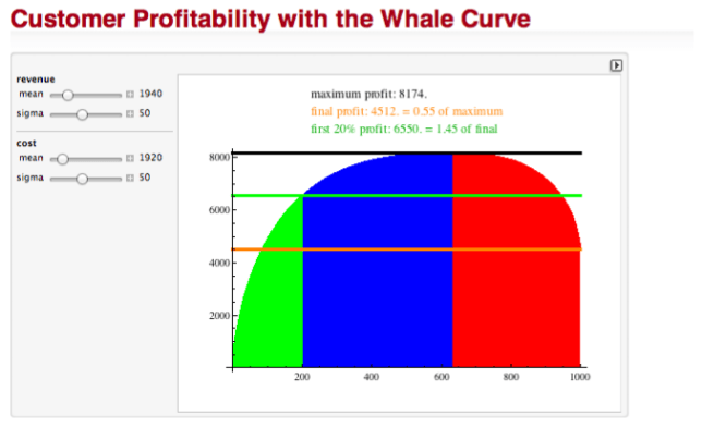
Visualization can be a powerful instrument for such analysis. For customer profitability, a graphical representation of this inequality is often used as a starting point for analysis. A commonly used visualization is the so-called Whale-Curve. I created a short, 4 min video recording of a dynamic Whale-Curve Demonstration:

In case you’re curious, the above demonstration uses an underlying model I created in Mathematica. You can dynamically interact with it yourself using the free CDF (Computable Document Format) Player:

I have provided it as a contribution to the Wolfram Demonstration project, so you can download it, and even look at the source code if you are a Mathematica user.

If you are interested in applying customer profitability analysis to your business, you may want to consider the company RapidBusinessModeling, which has an elaborate analysis approach starting with such Whale-Curves.

The underlying notion of Inequality is a fundamental concept. We will look at it in other contexts in a later post.

 
2 Comments

Posted by on August 18, 2011 in Financial, Industrial, Scientific


Tags: , , , ,

 
%d bloggers like this: