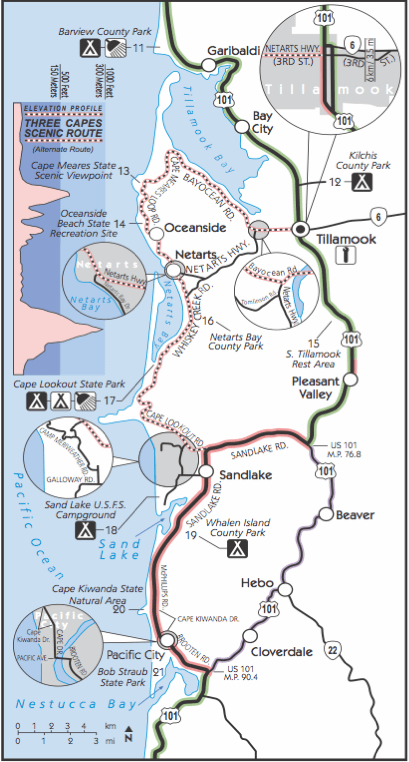
A good example of visualization for recreational purposes is the Oregon Coast Bike Map created by the Oregon Department of Transportation and published here. Here is a sample page of this 13 page document:
The map is full of useful information relevant to cyclists such as weather, traffic, campgrounds, attractions, etc. What I find particularly useful is the indication of distances and elevation profile. Unlike motorized traffic hills tend to slow cyclists down a lot, so estimating ride time to a goal not only depends on the distance, but also on the vertical elevation gain en route to that goal. For example, consider this enlarged area (inset C of above page) of the beautiful “3 Capes” region near Tillamook:
Note the use of color to indicate type of road and traffic as well as shaded bands in elevation profile. I think this is a good example of creating insight by visualizing data. I should know, as I was riding this stretch 2 years ago in August of 2009 during my Panamerican Peaks cycling and climbing adventure. Not having the benefit of such a detailed map I decided to embark on the 3 capes route late in the afternoon, only to get caught by sunset in NetArts as the unexpected hills slowed me down…
Another excellent map also designed by ODOT is the Columbia River Gorge Bike Map. Check it out for another example of good visualization for recreational purposes.

