RSS

Monthly Archives: June 2011

Visualizing Word Frequencies with Wordle

Jonathan Feinberg created a nice little app to generate and edit word clouds called “Wordle”. From the Wordle website:

Wordle is a toy for generating “word clouds” from text that you provide. The clouds give greater prominence to words that appear more frequently in the source text. You can tweak your clouds with different fonts, layouts, and color schemes. The images you create with Wordle are yours to use however you like. You can print them out, or save them to the Wordle gallery to share with your friends.

Here is a sample of a word cloud of a previous Visualign Blog post (Interactive and Visual Information):

Wordle generated word cloud of a previous Visualign post.

By default, common words of the English language (“the”, “is”, “and”, etc.) are stripped out to allow focus on substantive content words. One can also exclude individual words – such as the dominant word “information” above – and tweak many options. If one could create similar word clouds from recorded speech, this might be applied to visualize certain speech patterns and perhaps cure bad habits (such as repeating “Ummm” or other fill words).

Here is another sample screen shot of the Java applet after creating the word cloud from James Taylor’s RSS feed on Enterprise Decision Management:

Wordle Java applet with word cloud. Note the prominence of PMML (Predictive Model Markup Language).

While it’s not clear how to measure the impact or value of such word cloud visualizations, it does provide a novel way to use colors, frequencies, font sizes etc. to filter, highlight, and elucidate structure in textual data – something very close to Visualign’s philosophy.

 
Leave a comment

Posted by on June 28, 2011 in Linguistic


Tags: , ,

Branded Data Visualizations: LUMAscapes

In this article on the Spotfire Blog Amanda Brandon recently posed the question: Can Data Visualizations Change the Business Decision Game? The article recounts the creation of data visualizations by Terrence Kawaja to show the complex online advertising space with over 1200 companies involved in a $10b annual business. The graphics show the flow of information and involved service providers from advertiser to consumer. It is said that the original chart published in 2009 became a “go-to tool for advertising executives”.

Advertising Technology Landscape by Terrence Kawaja (2009)

Kawaja of investment firm LUMA Partners refined this approach and created six such landscapes called LUMAscapes for display, video, search, mobile, commerce, and social online advertising.

Search online advertising technology landscape (Source: Lumascapes from lumapartners.com)

The Spotfire Blog conlcudes with four takeaways for business analysts from the approach to use such visualizations:

Data visualizations are the ultimate content marketing. The simplification of complex data in a visually appealing format can take your information and brand viral. Giving away data on the major players and how they work together to drive an industry set the stage for authority and respect. …

Data visualizations can become an industry standard. Simply look at how Kawaja was able to help ad executives navigate the digital ad space.

Data visualizations can become a game-changer. Kawaja is branding these tools and using the graphics as a tool in generating business for his investment firm.

Data visualizations can be central to business decision-making. According to the WSJ, these new visualizations could enhance discussions at the Digital Media Summit, a meeting of top execs from the investment and Internet advertising space.

A picture can be worth more than a thousand words…

 
Leave a comment

Posted by on June 23, 2011 in Financial, Industrial


Tags: , ,

TreeMaps

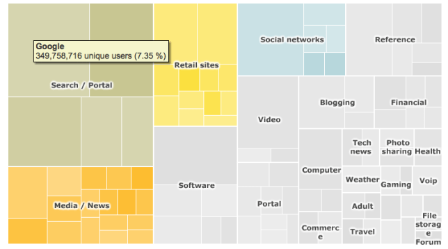
Around 1990 Ben Shneiderman invented TreeMaps as a way to visualize a hierarchy of nodes in a constrained space, for example a rectangle of fixed size. TreeMaps have since been integrated in various tools and are used for interactive graphics in several newspapers and magazines, such as the BBC and NYTimes in the following two examples.

Top 100 Internet sites (Source: BBC online article in Jan 2010)

TreeMap for the TOP 100 Internet Sites as of Jan 2010. In the interactive version (Flash-based) hovering over a rectangle will display the underlying data.

Trucks, Vans, S.U.V. sales in the US (Source: NYTimes article in Feb 2007)

Composite TreeMap of Truck, Van, S.U.V. sales performance in the US by manufacturer..

A history of TreeMaps with many beautiful examples has been compiled by Ben Shneiderman here. My favorite is this variation of a circular TreeMap by Kai Wetzel, a graph showing disk usage by folder with color code showing age of files.

Circular TreeMap showing disk usage (size) and file age (color) of a hierarchical directory structure.

Who says visualizing complex information can’t be informative and aesthetically pleasing at the same time?

 
3 Comments

Posted by on June 22, 2011 in Art, Industrial, Scientific


Tags:

Interactive and Visual Information

The way we create and consume documents to present and understand information is changing.

Online information has started this trend around 1995. Web page content has rapidly evolved from static content in the 1990’s to much more dynamic and somewhat interactive content. Most web sites today are continuously updated with streams of new information and allow the user to query for specific information, say about the weather in a particular region or the stock price of a particular company. Users can query databases to retrieve wanted information. Users can search the web and follow links to pages likely relevant to the search. Users can type in questions and receive answers, in some cases calculated from available models and data. I have written about the evolutionary impact of this on the presentation of information during meetings. (Technology also moves towards other forms of interaction without typing or touching, such as voice-recognition a la Google Voice or motion-detection a la Microsoft Kinect. But the focus here is not on the nature of the interaction format as much as on its impact on the information transfer.)

The composition of online information has also drastically changed. This goes far beyond hyperlinking documents for easy navigation. Instead of one area of text per site (as is the standard model in a book) we now routinely have multiple areas on the page showing different, often related pieces of information. Input fields and other controls allow for interaction, such as entering a stock ticker symbol and then hovering over the generated historical chart for analysis. Multiple widgets or components make up modern web sites, often highly customizable and aggregating information from various sources or feeds. With the advent of digital music, photo and video this turned into multimedia information. The latter offers the potential to re-shape the way information is produced and consumed in electronic books. The combination of new form factors (such as the iPad), nearly ubiquitous wireless Internet connectivity, tremendous processing power, increased battery life, rising popularity and adoption of eBook readers and constantly improving authoring tools ushers in a new era of content. An example of the sophisticated use of multimedia and touch interface on the iPad is the book (in custom app format) “Our Choice” from Al Gore, released by Push-Print-Press.

Map of solar power density across the U.S. Note interactive popup with location-specific detail (data both lookup and calculated).

No longer tethered to power outlets and network cables, we now have greater mobility of information than ever before. This leads to additional possibilities such as location-based services, as the presentation of information can be customized to the location of the reader. (“Where are some nearby restaurants or gas stations?”) Conversely, the location of the reader can be tracked over time and thus new location-based information and services are created.

Of particular interest is interactive information based on executable models which can simulate or calculate outcomes based on parameters interactively set by the reader. Conceptually, the document now acts as a container not just for text and images, but for models which can carry out computations. A simple example might be a mortgage calculator: Type in a loan amount, drag a slider to reflect interest rates and repayment time, and out comes the monthly payments and other details. Embedding such a calculator in a document transforms the passive reading experience into an interacting exploration.

Or think of a business model with parameters such as production volumes, storage, pricing and customer order rates. Now one can interact and explore ranges of model behavior as well as boundaries (profit/loss, break-even, etc.) Here are two examples of such business models of increasing complexity:

Just like Adobe coined the term PDF (Portable Document Format) trying to establish a standard for portability, Wolfram Research has coined the term CDF (Computable Document Format) trying to establish a standard for computability. The two above and many other examples can be found on Wolfram Research’s CDF demonstrations page. The best way to understand such models is to interact with them. (For CDF you will have to install a free browser plug-in.) A good article on the potential of CDF for presenting information in a business context is here.

Another very interesting example of the presentation of a dynamic nonlinear system is provided by Bret Victor below. It focuses on two fundamental concepts: Ubiquitous visualization and in-context manipulation. The ability to interact with the model and to see rich visuals while doing so is key to understanding its behavior. As this model does not seem to be publicly available yet the next best thing is to watch someone interact with it:

Interactive Exploration of a Dynamical System from Bret Victor on Vimeo.

As a final example, consider the Mandelbrot Set, an abstract mathematical object discovered around 1980. While it’s easy to specify in mathematical formal terms, its amazing complexity can so much better be experienced when you have the ability to explore this object, zoom in/out and discover the infinitely rich detail of its fractal boundary. With the computing power, rich color graphics and intuitive touch interface of the iPad 2 and a good app (like the $1.99 Fractile Plus) make this perhaps the most advanced case of model-based, interactive visualization to date.

Screenshot of Fractile Plus app on iPad. The experience of zooming and moving around via touch interface and fast visual feedback is amazing.

No amount of pictures displayed here can replace the interactive experience of such apps to explore and understand the beauty of this object. If you didn’t do so yet, get your own iPad and explore – you won’t regret it!

 
3 Comments

Posted by on June 8, 2011 in Industrial, Scientific, Socioeconomic


Tags:

Google Fusion Tables – Free Visualization Tool

Google does search very well. But Google does so much more than that. Think GMail and Blogger, YouTube and Picasa, Google Maps and Google Earth, to name just a few. The Google products page at present lists about 50 tools across categoires Web, Mobile, Media, Geo, Home & Office, Social, Specialized Search, and Innovation. In this last category is Google Fusion Tables, a free tool to share, analyze and visualize data on the web.

You can upload, display and edit your own data, do some filter, aggregate, merge operations, and leverage a series of typical visualization options (Table, Map, Line, Bar, Pie, Scatter…), similar to what you expect from a spreadsheet tool like Excel or Numbers. Through integration with Google Maps APIs it is easy to generate geographical maps and charts such as this demonstration of average cigarette use in countries across the world.

Sample Demonstration of Google Fusion Tables tool showing a world intensity map of cigarette use.

This makes the tool a good candidate to learn or teach about data visualization and play with the available sample data. The bucket of available public tables is rather unstructured – no taxonomy or hierarchical structure – and search for tables is surprisingly limited.
That said, there are plenty of documents, FAQ, APIs, and Forum discussions. And some of the demonstrations are quite useful, for example the website newspapermap.com which shows an interactive world-map with more than 10.000 newspapers in their respective geographies and color-coded in the published language:

Note the color-code for different languages.

 
Leave a comment

Posted by on June 8, 2011 in Industrial, Socioeconomic


Tags: , ,

MindMap Tool

A few weeks ago I came across iThoughtsHD, a nifty little tool for creating mind maps on the iPad. I started using it to jot down various ideas and it has grown on me. Here is a quick example of a visualization of content from a Wikipedia page on 7 Basic Tools of Quality:

Mind Map of 7 Basic Tools of Quality (created with iThoughtsHD on iPad, content from Wikipedia)

Note the highly visual nature of those basic tools of quality – something very closely aligned with Visualign’s philosophy.

This mind map was created in about 20 minutes on the iPad. Simple new mind map, 7 children nodes, each with Hyperlinks to and copied images from the respective Wikipedia page (heavy use of clipboard cut-&-paste there).

It is amazing how quickly one can generate useful material with the right tool (iThoughtsHD), platform (iPad) and information (Wikipedia) with literally just a few taps of your finger on a wireless 1 pound tablet on your lap! And the software only costs in the order of $10!

iThoughtsHD then supports many export features, for example via email in a variety of image and file formats, including PNG and PDF. For a full review of all its features, check it out in the Apple App Store or at the creator’s iThought website.

 
Leave a comment

Posted by on June 4, 2011 in Industrial


Tags: , ,

Composite Graphs

Today’s edition of the Wall Street Journal features an article on the nation-wide decline of housing values across the US. There is a good example of a composite graph illustrating a lot of data at once:

From the chart legend:

“Charts show percentage change since 2000 in S&P/Case-Shiller national quarterly home-price index and in monthly indexes for U.S. metropolitan areas through March 2011.”

Think about the amount of data aggregated in these charts! The S&P Case-Shiller home price index is calculated monthly using a three-month moving average and published with a two month lag on the Standard & Poors website. Each of the 8 metropolitan indices shown on the right is composed of thousands of individual data points on changes in property values in the respective area. (Specifically, those data points are measured using the repeat sales technology, which uses sales pairs of two successive transactions for one property to calculate home-price changes.) Every month that data is aggregated to one new data point, some 120+ of which compose the graph over more than 10 years. That’s already more than 100.000 data points aggregated in each of the 8 charts on the right. Looking at the National average on the left – which is an aggregate of all the 20 metropolitan areas in the index – you are literally looking at an aggregate of millions of data points!

An interesting exercise is to google for images on the S&P Case-Shiller index. Here is a collection of the first of some 300.000+ results:

Image search results on indices are an excellent source of examples on how to aggregate numerical data graphically.

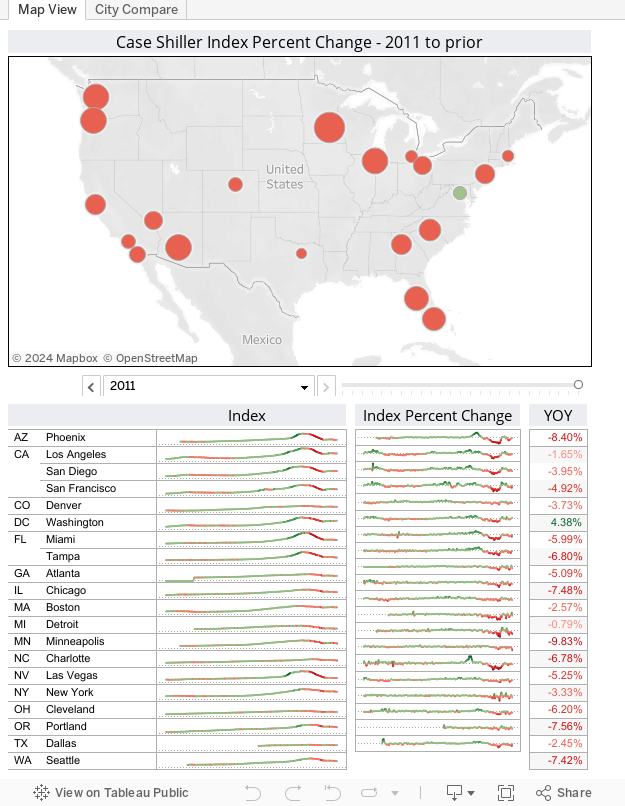
Addendum: Alex Kerin from Data Driven Consulting published this interactive chart of the Case-Shiller index using Tableau Public. It clearly shows how an interactive chart goes beyond static images in bringing data to live and telling the underlying story.


Leave a comment

Posted by on June 1, 2011 in Financial, Socioeconomic


Tags: ,