RSS

Tag Archives: tools

Connectograms and Circos Visualization Tool

Connectograms and Circos Visualization Tool

Yesterday (May 16) the Public Library of Science (PLoS) published a fascinating article titled “Mapping Connectivity Damage in the Case of Phineas Gage“. It analyzes the brain damage which the famous trauma victim sustained after an accident drove a steel rod through his skull. Railroad worker Phineas Gage survived the accident and continued to live for another 12 years, albeit with significant behavioral changes and anomalies. Those changes were severe enough for him to have to discontinue his work and also get estranged from his friends who stated he was “no longer Gage”. This has become a much studied case about the impact of brain damage on behavior anomalies. Since the accident happened more than 150 years ago there are no autopsy data or brain scans from Phineas Gage’s brain. So how did the scientists reconstruct the likely damage?

Since a few years there has been interest in the human connectome. Just like the genome is a map of human genes, the connectome is a map of the connectivity in the human brain. The human brain is enormously complex. Most estimates put the number of neurons in the hundreds of billions and the synaptic interconnections in the hundreds of trillions! Using diffusion weighted (DWI) and magnetic resonance imaging (MRI) one can identify detailed neuron connectivity. This is such a challenging endeavor that it drives the development of many new technologies, including the data visualization. The image resolution and post-processing power of modern instruments is now large enough to create detailed connectomes that show major pathways of neuronal fibers within the human brain.

The authors of the Laboratory of Neuro Imaging (LONI) in the Neurology Department at UCLA have studied the connectomes of a population of N=110 healthy young males (similar in age and dexterity to Phineas Gage at the time of his accident). From this they constructed a typical healthy connectome and visualized it as follows:

Circular representation of cortical anatomy of normal males (Source: PLoS ONE)

Details of the graphic are explained in the PLoS article. The outermost ring shows the various brain regions by lobe (fr – frontal, ins – insula etc.). The left (right) half of the connectogram figure represents the left (right) hemisphere of the brain and the brain stem is at the bottom, 6 o’clock position of the graph.

Connectograms are circular representations introduced by LONI researchers in their NeuroImage article “Circular representation of human cortical networks for subject and population-level connectomic visualization“:

This article introduces an innovative framework for the depiction of human connectomics by employing a circular visualization method which is highly suitable to the exploration of central nervous system architecture. This type of representation, which we name a ‘connectogram’, has the capability of classifying neuroconnectivity relationships intuitively and elegantly.

Back to Phineas Gage: His skull has been preserved and is on display at a museum. Through sophisticated spatial and neurobiological reasoning the researchers reconstructed the pathway of the steel rod and thus the damaging effects on white matter structure.

Phineas Gage Skull with reconstructed steel rod pathway and damage (Source: PLoS ONE)

Based upon this geospatial model of the damaged brain overlaid against the typical brain connectogram from the healthy population they created another connectogram indicating the connections between brain regions lost or damaged in the accident.

Mean connectivity affected in Phineas Gage by the accident damage (Source: PLoS ONE)

From the article:

The lines in this connectogram graphic represent the connections between brain regions that were lost or damaged by the passage of the tamping iron. Fiber pathway damage extended beyond the left frontal cortex to regions of the left temporal, partial, and occipital cortices as well as to basal ganglia, brain stem, and cerebellum. Inter-hemispheric connections of the frontal and limbic lobes as well as basal ganglia were also affected. Connections in grayscale indicate those pathways that were completely lost in the presence of the tamping iron, while those in shades of tan indicate those partially severed. Pathway transparency indicates the relative density of the affected pathway. In contrast to the morphometric measurements depicted in Fig. 2, the inner four rings of the connectogram here indicate (from the outside inward) the regional network metrics of betweenness centrality, regional eccentricity, local efficiency, clustering coefficient, and the percent of GM loss, respectively, in the presence of the tamping iron, in each instance averaged over the N = 110 subjects.

The point of the above quote is not to be precise in terms of neuroscience. Experts can interpret these images and advance our understanding of how the brain works – I’m certainly not an expert in this field, not even close. The point is to show how advances in imaging and data visualization technologies enable inter-disciplinary research which just a decade ago would have been impossible to conduct. There is also a somewhat artistic quality to these images, which reinforces the notion of data visualization being both art and science.

The tool used for these visualizations is called Circos. It was originally developed for genome and cancer research by Martin Krzywinski at the Genome Sciences Center in Vancouver, CA. Circos can be used for circular visualizations of any tabular data, and the above connectome visualization is a great application. Martin’s website is very interesting in terms of both visualization tools as well as projects. I have already started using Circos – which is available both for download and in an online tableviewer version – for some visualization experiments which I may blog about in the future.

 
6 Comments

Posted by on May 17, 2012 in Scientific


Tags: , , , ,

Visualizing Player from Visualizing.org

Visualizing.Org is a community of creative people working to make sense of complex issues through data and design… and it’s a shared space and free resource to help you achieve this goal. One of the main tools is the new visualization player. From their website:

Great visualizations of all kinds — from high-res infographics to interactive HTML5 apps — deserve stellar representation always. Instead of settling for embedded screenshots or links, as of today people can now easily embed your actual project (under CC license) using the Visualizing Player. This is a first for the field and we hope it helps make including data visualizations in blog posts and articles easier and more satisfying to readers and gets you and your work more attention.

It’s a free media player designed specifically for data visualization and interactive graphics; it currently supports 7 formats (HTML5, Java, Flash, PDF, Video, Image, and URL). Its easy to embed in other sites and there are a lot of example visualizations from the community hosted at visualization.org.

One of them is Gregor Aisch’s interactive graphic on Europe’s Energy production, consumption, import/export and dependencies:

After playing with many of the example visualizations I have two spontaneous reactions:

First, there is a lot of opportunity and possibility to display dynamic and complex information interactively. Not all infographics are interactive, of course, but those that are give you a sense of the power of interacting with the underlying data and models.

Second, there seems to be a lack of generally accepted standards to convey certain types of information. It’s a bit of a wild-west situation with lots of creative approaches to visualizing data – for example look at the many different approaches to the UN Global Pulse data on the above community visualizations page. It reminds me of the graphical user interface days before the standardizing advent of Windows. Not that this is a bad thing; it just feels a bit overwhelming at times.

It’s going to be interesting to see which styles of interactive presentation will become widely adopted.

 
1 Comment

Posted by on July 26, 2011 in Industrial, Socioeconomic


Tags: ,

StockTouch – interactive stock monitoring tool

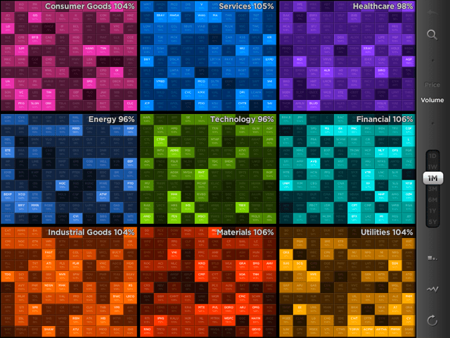
Financial markets have always been an area of rapid innovation, with the evolution of graphical stock information being no exception. It looks like the famous stock-ticker could be replaced with the stock-toucher. A new iPad application by Visible Market Inc. provides an excellent example of the use of highly aggregated color graphics and touch-interaction. Here is the main UI showing 9 sectors and the 100 largest stocks (by market capitalization) in each sector:

Market Overview by Sector, 100 largest market cap companies per sector, color-coded heat-map of volume changes.

You can zoom in (expand- or tap-gesture), zoom out (pinch-gesture) to navigate between levels (market, sector, company) or use the auto-complete search-box for a list of company names matching the search string.

The 10*10 items can be organized either alphabetically or by market cap. Display is of Price or Volume changes between current values compared to a variable time-period (time-frame slider with values {1D, 1W, 1M, 3M, 6M, 1Y, 5Y}) at the company level and averages at the sector level.

From their website:

“Our vision for StockTouch is that it represents the first of a new genre of apps that look at the financial markets in new, powerful and useful ways. It is our belief that the act of touching and diving into data will change the way users engage with this data, and consequently translate it into information and knowledge.”

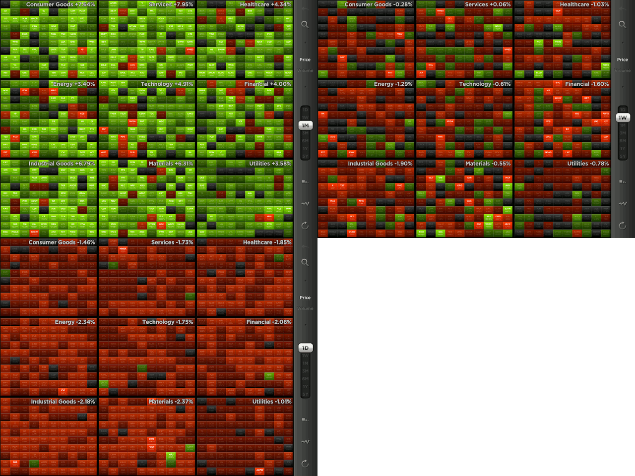
Price changes of 100 largest market cap companies by sector, Green-Red color-coded heat-map. Note market trends for three timeframes: Last month (green = advance), last week (mixed), last day (red = retreat).

The use of colors is particularly useful for Price changes: There is a heat map from light green (strong positive change) via darker tones (gray = neutral, no change) to light reds (strong negative change). This shows at a glance how the entire sector or market is doing. In the above example the last month saw a broad advance (majority of companies across all sectors in green); the last week more of a mixed bag, and the last day a broad retreat across the entire market (almost all red). Think about how much information is aggregated into this dashboard! 900 companies, grouped by sector, sorted by market cap, color-coded for price/volume change. No wonder they post a quote on their website:

“StockTouch tells you more in five seconds than you would learn reading financial news all day.”

 
3 Comments

Posted by on July 11, 2011 in Financial


Tags: , ,

Google Fusion Tables – Free Visualization Tool

Google does search very well. But Google does so much more than that. Think GMail and Blogger, YouTube and Picasa, Google Maps and Google Earth, to name just a few. The Google products page at present lists about 50 tools across categoires Web, Mobile, Media, Geo, Home & Office, Social, Specialized Search, and Innovation. In this last category is Google Fusion Tables, a free tool to share, analyze and visualize data on the web.

You can upload, display and edit your own data, do some filter, aggregate, merge operations, and leverage a series of typical visualization options (Table, Map, Line, Bar, Pie, Scatter…), similar to what you expect from a spreadsheet tool like Excel or Numbers. Through integration with Google Maps APIs it is easy to generate geographical maps and charts such as this demonstration of average cigarette use in countries across the world.

Sample Demonstration of Google Fusion Tables tool showing a world intensity map of cigarette use.

This makes the tool a good candidate to learn or teach about data visualization and play with the available sample data. The bucket of available public tables is rather unstructured – no taxonomy or hierarchical structure – and search for tables is surprisingly limited.
That said, there are plenty of documents, FAQ, APIs, and Forum discussions. And some of the demonstrations are quite useful, for example the website newspapermap.com which shows an interactive world-map with more than 10.000 newspapers in their respective geographies and color-coded in the published language:

Note the color-code for different languages.

 
Leave a comment

Posted by on June 8, 2011 in Industrial, Socioeconomic


Tags: , ,

MindMap Tool

A few weeks ago I came across iThoughtsHD, a nifty little tool for creating mind maps on the iPad. I started using it to jot down various ideas and it has grown on me. Here is a quick example of a visualization of content from a Wikipedia page on 7 Basic Tools of Quality:

Mind Map of 7 Basic Tools of Quality (created with iThoughtsHD on iPad, content from Wikipedia)

Note the highly visual nature of those basic tools of quality – something very closely aligned with Visualign’s philosophy.

This mind map was created in about 20 minutes on the iPad. Simple new mind map, 7 children nodes, each with Hyperlinks to and copied images from the respective Wikipedia page (heavy use of clipboard cut-&-paste there).

It is amazing how quickly one can generate useful material with the right tool (iThoughtsHD), platform (iPad) and information (Wikipedia) with literally just a few taps of your finger on a wireless 1 pound tablet on your lap! And the software only costs in the order of $10!

iThoughtsHD then supports many export features, for example via email in a variety of image and file formats, including PNG and PDF. For a full review of all its features, check it out in the Apple App Store or at the creator’s iThought website.

 
Leave a comment

Posted by on June 4, 2011 in Industrial


Tags: , ,

Wolfram|Alpha: The Second Anniversary

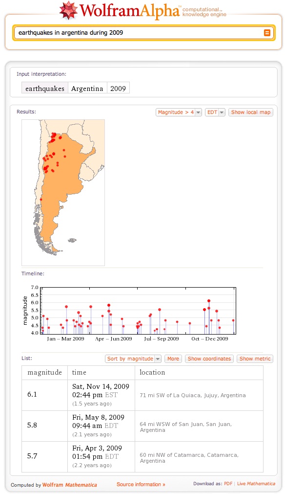
Wolfram|Alpha, the computational knowledge engine from Wolfram Research based on Mathematica has been online for two years. With its curated data, ability to compute answers (rather than lookup links to web-pages) and visualize results it is a very powerful tool. It’s app on the iPad brings this power to visualize data and create insight straight to your fingertips:

Note the interplay of curated data, computation and visualization.

Check out this webinar by Stephen Wolfram to learn about the new features and how this new tool is being used in a variety of domains:
Wolfram|Alpha Blog : Wolfram|Alpha: The Second Anniversary.

 
Leave a comment

Posted by on May 26, 2011 in Scientific


Tags: , ,

 
%d bloggers like this: