I’ve long held a particular fascination for data visualizations which aggregate a large amount of information. Especially if that information allows to compare fairly abstract socio-economic concepts like wealth, health, or even happiness. In many cases, such information is aggregated into an index, an abstract number which is mostly used for comparative rankings. One example we examined previously is the Human Development Index.
At the same time, I was often underwhelmed by how such information is presented: Often reading the report feels like studying the phonebook with endless text and tables, and the lack of visualizations or an interactive website made gaining insight from such data very difficult.
A positive surprise in this regard is the Global Innovation Index 2023, published by the WIPO (World Intellectual Property Organization). It is freely available as both a 250 page pdf file as well as an interactive ranking website.
The full report can be downloaded at www.wipo.int/global_innovation_index.
The 132 interactive GII economy briefs can be accessed at www.wipo.int/gii-ranking.
This post delves into some of the visualizations used in the above publications.
What is the Global Innovation Index (GII)?
Innovation is a crucial source of economic growth and thus ultimately for the improvement of human quality of life. The Global Innovation Index (GII) is an aggregate measure relating the world’s countries with regards to their abilities for and success with innovation. From the Wikipedia page on the methodology:
The index is computed by taking a simple average of the scores in two sub-indices, the Innovation Input Index and Innovation Output Index, which are composed of five and two pillars respectively. Each of these pillars describe an attribute of innovation, and comprise up to five indicators, and their score is calculated by the weighted average method.

In the 2023 edition, some 132 countries are ranked by aggregating data from 80 factors in the above 7 dimensions into the GII.
Interesting Visualizations of GII
The report contains a lot of data. Assessing the 80 factors for each of the 132 countries gives more than 10,500 datapoints. Clearly one needs to use visualizations to show patterns and to ultimately gain insight from all this data. Thankfully, this publication includes an interactive website where you can select a country and then see its position in the visuals and drill into more details. Let’s look at some interesting visualizations contained in the report.
Innovation relative to income level
A core visual illustrating the GII ranking space is a scatter plot showing countries position with income on the x-axis (in GPD per capita, log-scale) and the GII Score on the y-axis. Size of a dot is a function of the country population.

There is a cubic spline interpolation for the median line. It shows two bends, separating a middle regime of faster growth of innovation per income increase than the regimes below and above. This suggests that on average, as a country reaches the threshold of the first bend around $20,000 GDP / capita such as Mexico ($22,440 GDP/c; GII score 31), one can expect a rapid increase in innovation score for income gains. For most countries this increase rate in the GII score continues all the way up to the richest countries such as the .
Innovation overperformers

One can see that the two most populous countries, India (GII 38.1, rank 40, GDP/capita $8,293) and China (GII 55.3, rank 12, GDP/capita $21,291) are far above the median line. Their GII score (innovation capability) is far higher than what would be expected on average from their income level. They are both innovation overperformers.
The colors above indicate a four-level stratification in innovation leaders and those performing above, at, or below expectation for the level of income. The color scheme is consistently used in other charts as well.
It makes sense to group countries by the level of average income and thus development and to look for the leaders within each group. One such comparison is given in this table:
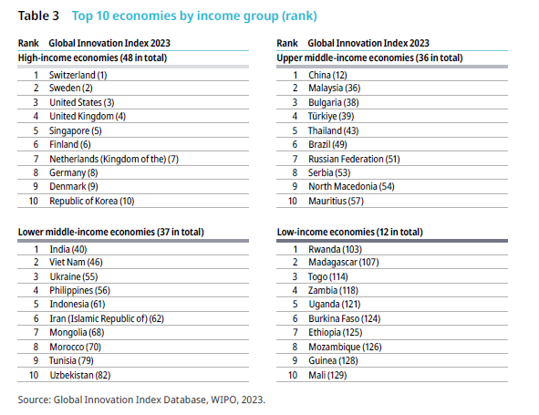
Note both India and China leading their resp. income quartile group. When highlighting all innovation overperformers in the low-income and lower middle-income economies, we see the following:

I didn’t expect to see Burundi, Rwanda or the Republic of Moldova as innovation overperformers (relative to their peer income group). This is one example of where one can use the interactive site to further investigate and look at which factors they excel in.
Innovation efficiency
As there are input pillars and output pillars, one can scatter plot the countries to show how their input and output scores correlate, i.e. how efficient they are in converting inputs into outputs when it comes to innovation.

It’s interesting to see that Switzerland and Singapore, both in the top-right corner of the above chart, differ in this regard. Switzerland achieves the highest output score overall, despite its input score being slightly lower than that of Singapore. Something is getting lost in Singapore‘s case, as their input is among the highest of all countries, but their output is lower than the Top 10.
Ranking Heatmap
Another intermediate visual combining the large detail of a text table with heatmap colors is the summary ranking table with 132 lines and 8 columns (rank in GII total and each of the seven pillars).


The four colors are used again to show the four quartiles of 33 countries each, sorted by total rank. Not surprisingly, the top and bottom quartiles show a lot of dark green and dark blue, respectively. I.e. many countries who end up in the top quartile total GII rank also have pillar ranks in the top quartile. The second and third quartile show more color variety and make occasional outliers easily visible. Some countries would generally be higher but for one or two low outliers or vice versa. For example, Bolivia (total rank 97) has four (of seven) dark blue lowest quartiles pillar ranks, with one of them (Institutions) being rank 132 the lowest of all countries, but it has one dark green positive outlier in Market Sophistication (rank 16), right after Germany (14) and the Netherlands (15)! Looking at the onepager reveals the details for Bolivia in both pillars:

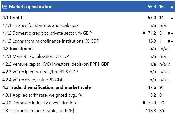
So even a country which is ranked dead-last on one pillar (Institutions) can be ranked first on a factor (4.1.3 Loans from microfinance institutions, % GDP) in another pillar (Market Sophistication)! While you may not be able to count on the rule of law in Bolivia, you’re likely to find good microfinance loans there.
One caveat here are the n/a areas where not enough data is available. Many other countries I checked for did not have any data on the above factor (4.1.3), so top rank may be relative in this context.
Compare Ranks
On the website you can select two countries and compare their ranks overall and drill-down by pillar and factors. Here is an example comparison between Mexico and the United States:
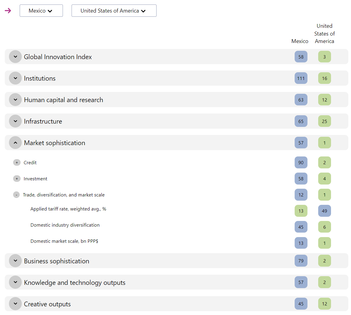
Although not too surprising (overall ranks Mexico 58 vs. USA 3), it’s interesting to see the degree of difference – say in market sophistication (ranks 57 vs. 1) or business sophistication (ranks 79 vs. 2). There are also some factors where the ranking is inverse to the overall picture (such as applied tariff rate, rank 13 vs. 49). In other words, even large differences in overall rank don’t imply that the higher ranked country is better in all factors contained in the GII.
This treeview chart also allows to explore the structure of the GII interactively. For each country, you can pull up a one-page summary showing all of those 80 factors and their respective values and subranks.

The printed report has 1 such summary page for each of the 132 countries – this is the section which reads like a phonebook. My only slight change request here would be to include the GII total score (not just the rank) on this page as well. The only way to see the GII score I found on the website was to use the tooltips on the ranking plot, such as here showing Mexico’s rank (58) and hovering over the USA (3) to see the scores (Mexico GII = 31.0, USA GII = 63.5).

One can also see a “bend” in the ranking plot where the absolute scores for the top half of all countries increase faster than for the bottom half.
Stratification by geography and by income
A common problem with data visualizations is information overload. Often less is more. Stratifying by income group and then just listing the top 3 gives an idea of which countries are leading in their region or peer group. Note again the leading ranks of both China and India.

GII Dynamo
One important aspect of annual rankings is the year-over-year change and thus the rank dynamics over time. In this diagram, the ranks (left-to-right) are plotted for the last 5 years (bottom-up). This makes lateral movements easy to spot. For example, the Republic of Korea made strong gains in 2021 (from rank 10 up to 5), but lost those again in 2023. Generally these rankings are fairly stable as can be seen by minor changes in the top 5 ranks. And Switzerland is the reigning champion in the GII rank (not just for the last 5, but for the last 13 years)!

I also find the chosen color map easy to understand and pleasing to the eye (although I would have swapped colors 7 and 9 to keep with the brightness gradient).
Summary
The Global Innovation Index publication provides a detailed analysis of seven pillars and 80 factors contributing to the index score for 132 countries. The presentation uses lots of charts and visualizations, as well as comprehensive one-page summary tables for each country.
There are many more aspects and factors than those discussed here, for example the number and value of unicorn companies, VC funding, listing of national companies and universities etc. There are even a few areas where the publication veers into policy guidance (how to best use the GII index with dos and don’ts) or geopolitical interpretations of the insights.
From my perspective it is a great example of modern data-driven publication, aggregating a broad set of curated data with source references into easy-to-understand charts and most importantly providing an interactive website for selection, pairwise comparison and drill-down into details. It is great to see such publications becoming part of a more data-driven discussion of national policy and even geopolitical trends.
Lastly, I can’t wait to see such aggregation being used more systematically for rankings in other areas where comparing is difficult to the broad range of factors, such as with consumer preferences, employee performance or company process maturity. Imagine an analyst firm ranking of sector companies in financial services where the top ranked companies could be analyzed in a similar way to the GII. That would be truly innovative.