Earlier this year we have looked at a powerful data visualization tool called Circos developed by Martin Krzywinski from the British Columbia Genome Science Center. The previous post looked at an example of how this tool can be used to show complex connectivity pathways in the human neocortex, so-called Connectograms.
The Circos tool can be used interactively on the above website. In that mode you upload jobs via tabular data- and configuration-files and have some limited control over the rendering of the resulting charts. For full expressive power and flexibility, Circos can also be downloaded freely and used on your computer for rendering with extensive customization control over the resulting charts.
I have been asked to review a new book titled “Circos Data Visualization How-to“, published by Packt Publishing here. It’s main goal is to guide through the above download + installation process and get you started with Circos charts and their modification. Here is a brief review of this book.
Although originally developed for visualizing genomic data, Circos has been applied to many other complex data visualization projects, incl. social sciences. One such study was done by Tom Schenk, who analyzed the relationships between college majors and the professions those graduates ended up in. It appears as if this work inspired the author to write this book to help others with using Circos.
I downloaded the book in Kindle format and read it on the Mac due to the color graphics and the much larger screen size. It’s well structured and around 70 pages in printed form. The book focuses first on the download and install part, then has a series of examples from first chart to more complex ones using customization such as colors, ribbons, heat maps or dynamic binding.

Flow Chart for creation of Circos charts
Circos is essentially a set of Perl modules combined with the GD graphics library.
The first part is on Installing Circos, with a chapter each on Windows 7 and on Linux or Mac OS. Working on MAC I went the latter route. I ended up right in the weeds and it took me about 4 hours to get everything installed and working. The description is derived from a Linux install and is generally somewhat terse. It assumes you have all prerequisite tools installed on your Mac or at least that you are savvy enough to figure out what’s missing and where to get it. I had to dust off some of my Unix skills and go hunting for solutions via Google to a list of install problems:
- directory permissions (I needed to warp the exact instructions with sudo)
- installing Xcode tools from Apple for my platform (make was not preinstalled)
- understanding cause of error messages (Google searches, Google group on Circos)
- locating and installing the GD graphics library (helpful installing-circos-on-os-x tips by Paulo Nuin)
- version and location issues (many libraries are in ongoing development; some sources have moved)
Others may find this part a lot easier, but I would say there should be an extra chapter for the Mac with tips and explanations to some of these speed bumps. On the plus side, the Google group seems to be very active and I found frequent and recent answers by Circos author Martin Krzywinski.
The next part of the book is easy to understand. One creates a simple hair-to-eye color relationship diagram. Then configuration files are introduced to customize colors and chart appearance. All required data and configuration files are also contained in the companion download from the Packt Publishing book page.

Chart of relationship between hair and eye colors
The last part of the book goes into more advanced topics such as customizing labels, links and ribbons, formatting links with rules, reducing links through bundling, and adding data tracks as heat maps or histograms. This is the meat for those who intend to use Circos in more advanced ways. I did not spend a lot of time here, but found the examples to be useful.
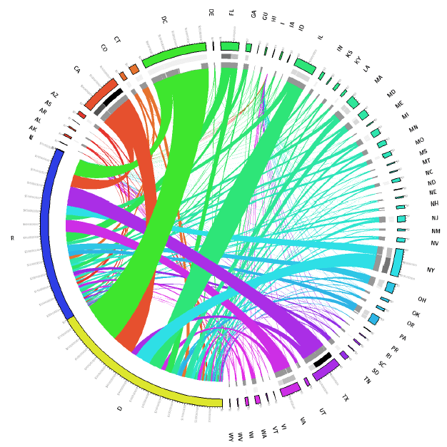
Contributions by State and Political party during 2012 U.S. Presidential Elections
This section ends abruptly. One gets the feel that there are other subtleties that could be explored and explained. A summary or outlook chapter would have been nice to wrap up the book and give perspective. For example, I would have liked to hear from the author how much time he spent with various features during the college major to professions project.
In summary: This book will get you going with Circos on your own machine. Installing can be a challenge on Mac, depending on how familiar you are with Unix and the open source tool stack. The examples for your first Circos charts are easy to follow and explain data and configuration files. The more advanced features are briefly touched upon, but require more experimentation and time to understand and appreciate.
Circos author Martin Krzywinski writes on his website: “To get your feet wet and hands dirty, download Circos and a read the tutorials, or dive into a full course on Circos.” The How-to book by Tom Schenk helps with this process, but you still need to come prepared. If you are a Unix power user this should feel familiar. If you are a Mac user who rarely ever opens a Terminal then you might be better off just using Circos via the tableviewer web interface.
Lastly, I would recommend buying the electronic version of this book, as you can cut & paste the code, leverage the companion code and documents. A printed version of this book would be of very limited use.

visualign
December 7, 2012 at 1:02 pm
A very nice example of using Circos comes from Davy Suvee in this article: http://architects.dzone.com/news/circle-through-your-google
He uses Google API to query website visit and path transition data, then stores them using the Neo4J Graph Data Store, transforms and cleans the data to the required Circos tabular format and uses the online Circos table viewer to render circular graphs ob pathways through the website.
Well done, Davy!