Today’s edition of the Wall Street Journal features an article on the nation-wide decline of housing values across the US. There is a good example of a composite graph illustrating a lot of data at once:

From the chart legend:
“Charts show percentage change since 2000 in S&P/Case-Shiller national quarterly home-price index and in monthly indexes for U.S. metropolitan areas through March 2011.”
Think about the amount of data aggregated in these charts! The S&P Case-Shiller home price index is calculated monthly using a three-month moving average and published with a two month lag on the Standard & Poors website. Each of the 8 metropolitan indices shown on the right is composed of thousands of individual data points on changes in property values in the respective area. (Specifically, those data points are measured using the repeat sales technology, which uses sales pairs of two successive transactions for one property to calculate home-price changes.) Every month that data is aggregated to one new data point, some 120+ of which compose the graph over more than 10 years. That’s already more than 100.000 data points aggregated in each of the 8 charts on the right. Looking at the National average on the left – which is an aggregate of all the 20 metropolitan areas in the index – you are literally looking at an aggregate of millions of data points!
An interesting exercise is to google for images on the S&P Case-Shiller index. Here is a collection of the first of some 300.000+ results:

Image search results on indices are an excellent source of examples on how to aggregate numerical data graphically.
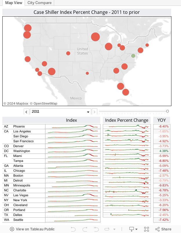
Addendum: Alex Kerin from Data Driven Consulting published this interactive chart of the Case-Shiller index using Tableau Public. It clearly shows how an interactive chart goes beyond static images in bringing data to live and telling the underlying story.