RSS

Tag Archives: infographic

Faceplant with Facebook?

With the Facebook IPO coming up this Friday there is a lot of attention around its business model and financials. I’m not an expert in this area, but my hunch is that a lot of people will lose a lot of money by chasing after Facebook shares. Why?

I think there are two types of answers. One from reasoning and one from intuition.

For reasoning one needs to look at a more technical assessment of the business model and financials. Some have written extensively about the comparative lack of innovation in Facebook’s business model and core product. Some have compared Facebook’s performance in advertising to Google – the estimates are that Google’s ad performance is 100x better than that of Facebook. Some have pointed out that many of Facebook’s core metrics such as visits/person, pages/visit or Click-Through-Rates have been declining for two years and go as far as calling this the Facebook ad scam. One can question the wisdom of the Instagram acquisition, buying a company with 12 employees and zero revenues for $1B. One can question the notion that the 28 year old founder will have 57% of the voting rights of the public company. One could look at stories about companies discontinuing their ad Facebook efforts such as the Forbes article about GM pulling a $10m account because they found it ineffective. The list goes on.

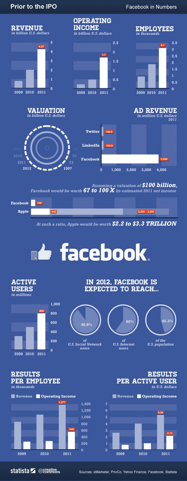
Here is a more positive leaning infographic from an article looking at “Facebook: Business Model, Hardware Patents and IPO“:

Analysis Infographic of pre-IPO Facebook (source: Gina Smith, anewdomain.net)

To value a startup at 100x last year’s income seems just extremely high – but then Amazon’s valuation is in similarly lofty territory. As for reasoning and predicting the financial success of Facebook’s IPO, people can cite numbers to justify their beliefs both ways. At the end of the day, it’s unpredictable and nobody can know for sure.

The other answer to why I am not buying into the hype is more intuitive and comes from my personal experience. Here is a little thought experiment as to how valuable a company is for your personal life: Imagine for a moment if the company with all its products and services would disappear overnight. How much of an impact would it have for you as an individual? If I think about companies like Apple, Google, Microsoft, or Amazon the impact for me would be huge. I use their products and services every day. Think about it:

No Apple = no iPhone, no iPad, no iTunes music on the iPod or via AppleTV on our home stereo. That would be a dramatic setback.

No Google = no Google search, no GMail, no YouTube, no Google maps, no Google Earth. Again, very significant impact for me personally. Not to mention the exciting research at Google in very different areas such as self-driving vehicles.

No Facebook = no problem (at least for me). I deactivated my own Facebook account months ago simply because it cost me a lot of time and I got very little value out of it. In fact, I got annoyed with compulsively looking at updates from mere acquaintances about mundane details of their lives. Why would I care? I finally got around to actually deleting my account, although Facebook makes that somewhat cumbersome (which probably inflates the account numbers somewhat).

I’m not saying Facebook isn’t valuable to some people. Having nearly 1B user accounts is very impressive. Hosting by far the largest photo collection on the planet is extraordinary. Facebook exploded because it satisfied our basic need of sharing, just like Google did with search, Amazon did with shopping or eBay did with selling. But the entry barrier to sharing is small (see LinkedIn, Twitter or Pinterest) and Facebook doesn’t seem to be particularly well positioned for mobile.

I strongly suspect that Facebook’s valuation is both initially inflated – the $50 per account estimate of early social networks doesn’t scale up with the demographics of the massive user base – as well as lately hyped up by greedy investors who sense an opportunity to make a quick buck. My hunch is that FB will trade below its IPO price within the first year, possibly well below. But then again, I have been surprised before…

I’m not buying the hype. What am I missing? Let me know what you think!

UPDATE 8/16/2012: Well, here we are after one quarter, and Facebook’s stock valuation hasn’t done so well. Look at the first 3 month chart of FB:

First 3 month of Facebook stock price (Screenshot of StockTouch on iPad)

What started as a $100b market valuation is now at $43b. One has to hand it to Mark Zuckerberg, he really extracted maximum value out of those shares. It turns out sitting on the sidelines was the right move for investors in this case.
 
2 Comments

Posted by on May 16, 2012 in Financial, Socioeconomic


Tags: , , , , , , ,

Infographics by Column Five, Taste Graph by Hunch

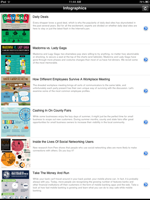
Recently I downloaded an iPad app called Infographics created by the company Column Five. I found it interesting not so much because of the app itself (which has limited functionality and the recent update crashes quite frequently), but because of the rather large amount of infographics it allows you to browse quickly (unfortunately not by category or keyword and there is no search).

Infographics App from Column Five, Browser Interface

There are about 200 infographics in the app at present; these appear to be the same that you can also browse on Column Five’s website infographics gallery. These specimen cover a variety of categories, with a large dose of social media and Internet related topics – likely due to the sponsors paying for the creation of such artifacts. When in Portrait Mode you can read a bit more about the content of the respective infographic.

Infographics Browser in Portrait Mode

On their website Column Five talks about “What is an infographic?” Rather than define the term, they describe it using categories like Data Visualization or Information Design. From the above page:

In the age of big data, we need to both make sense of the numbers and be able to easily share the story they tell. The practice of data visualization, which is the study of the visual representation of data, typically analyzes large data sets. It seeks to uncover trends by showing meta patterns, or to make single data points easily visible and extractable. The visual display of this data is the most interesting and universal way to make it accessible to a wide audience. And as with all infographic design, the display method is rooted in the context and desired message.

This practice is the most numbers-heavy, and typically is what a purist would describe as a “true” infographic. These visualizations also tend to be more complex, as they often are attempting to display a great number of data points. In some cases, these graphics functionally serve only as art pieces, if no message can be extracted. When properly executed, however, they should be both beautiful and meaningful, allowing the viewer to decipher data and recognize trends while admiring its aesthetic appeal.

The focus is on the display of information both effectively (you get the intended message…) and efficiently (… quickly and unequivocally), to “use design to communicate a message that is both clear and universal”. Interesting that there is an element of art. We have seen this before on this Blog, for example the aesthetic appeal of Tree Maps or of Flight Pattern Visualizations – often the creators of such visualizations describe themselves as artists. I suspect that beautiful visualizations are better able to communicate a message – which is what the infographics sponsor paid for – because they appeal to the viewer aesthetically and thus tap into additional bandwidth to transport the intended message (“both beautiful and meaningful”).

Infographic about Hunch and their big data "taste graph"

As an example, consider the infographic about The Ever-Expanding Taste Graph by Hunch, published by Hunch on their Blog in May 2011. This visualization explains in broad strokes how Hunch is building a data structure – the “taste graph” – by recording people’s affinity to all kinds of things as observed and recorded from their own answers to questions and other interactions on the web.

On the one hand, it’s amazing how much data is being tracked and what kind of predictive power results from that. A graph with 500 million people nodes and 30 billion edges, running on a supercomputer with 48 processors and 1 TeraByte of RAM. Talk about a company whose business model is centered around big data! For those like me who started in Computer Science some 20+ years ago, such numbers are truly amazing. The cost of storage and processing power has exponentially declined for several decades now. As Bill Gates used to say: The effects of Moore’s law are often over-estimated in the short-term, but even more under-estimated in the long-term.

There is a disconcerting side to this, though: Very little privacy on the Internet. For most people, our online history gets more and more detailed every day… And with the explosion of social media we are volunteering so much information about ourselves, using our own time and effort, with the side-effect of enriching the social media enterprises. This has led some to observe that for social media companies, you are not the customer. You are the product!

I played Hunch’s online Twitter Predictor game. By analyzing my Twitter account and a few questions I volunteered to answer on the Hunch website they correctly predicted 94% of my responses to test answers by looking at the affinities and preferences of other people sufficiently similar to me. While some of those questions are fairly easy to predict and for many Yes/No questions even random guessing would get you 50% correct responses, such high accuracy is still interesting. Well, I guess I am that predictable. Is being predictable a good or bad thing?

 
Leave a comment

Posted by on August 23, 2011 in Industrial, Socioeconomic


Tags: , ,

Branded Data Visualizations: LUMAscapes

In this article on the Spotfire Blog Amanda Brandon recently posed the question: Can Data Visualizations Change the Business Decision Game? The article recounts the creation of data visualizations by Terrence Kawaja to show the complex online advertising space with over 1200 companies involved in a $10b annual business. The graphics show the flow of information and involved service providers from advertiser to consumer. It is said that the original chart published in 2009 became a “go-to tool for advertising executives”.

Advertising Technology Landscape by Terrence Kawaja (2009)

Kawaja of investment firm LUMA Partners refined this approach and created six such landscapes called LUMAscapes for display, video, search, mobile, commerce, and social online advertising.

Search online advertising technology landscape (Source: Lumascapes from lumapartners.com)

The Spotfire Blog conlcudes with four takeaways for business analysts from the approach to use such visualizations:

Data visualizations are the ultimate content marketing. The simplification of complex data in a visually appealing format can take your information and brand viral. Giving away data on the major players and how they work together to drive an industry set the stage for authority and respect. …

Data visualizations can become an industry standard. Simply look at how Kawaja was able to help ad executives navigate the digital ad space.

Data visualizations can become a game-changer. Kawaja is branding these tools and using the graphics as a tool in generating business for his investment firm.

Data visualizations can be central to business decision-making. According to the WSJ, these new visualizations could enhance discussions at the Digital Media Summit, a meeting of top execs from the investment and Internet advertising space.

A picture can be worth more than a thousand words…

 
Leave a comment

Posted by on June 23, 2011 in Financial, Industrial


Tags: , ,

 
%d bloggers like this: