Inequality is often at the root of structure and contrasts. Exposing inequality can often lead to insight. For example, take the well-known Pareto principle, which states that roughly 80% of the effects come from 20% of the causes (hence also referred to as the 80-20 rule).
From the above Wikipedia page on the Pareto principle, chapter on business:
The distribution shows up in several different aspects relevant to entrepreneurs and business managers. For example:
80% of your profits come from 20% of your customers
80% of your complaints come from 20% of your customers
80% of your profits come from 20% of the time you spend
80% of your sales come from 20% of your products
80% of your sales are made by 20% of your sales staff
Therefore, many businesses have an easy access to dramatic improvements in profitability by focusing on the most effective areas and eliminating, ignoring, automating, delegating or re-training the rest, as appropriate.
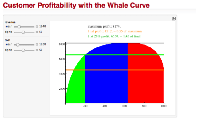
Visualization can be a powerful instrument for such analysis. For customer profitability, a graphical representation of this inequality is often used as a starting point for analysis. A commonly used visualization is the so-called Whale-Curve. I created a short, 4 min video recording of a dynamic Whale-Curve Demonstration:
In case you’re curious, the above demonstration uses an underlying model I created in Mathematica. You can dynamically interact with it yourself using the free CDF (Computable Document Format) Player:
I have provided it as a contribution to the Wolfram Demonstration project, so you can download it, and even look at the source code if you are a Mathematica user.
If you are interested in applying customer profitability analysis to your business, you may want to consider the company RapidBusinessModeling, which has an elaborate analysis approach starting with such Whale-Curves.
The underlying notion of Inequality is a fundamental concept. We will look at it in other contexts in a later post.


2 responses to “Customer Profitability”