In previous posts on this Blog we have looked at various inequalities as measured by their respective Gini Index values. Examples are the posts on Under-estimating Wealth Inequality, Inequality on Twitter, Inequality of Mobile Phone Revenue, and how to visualize as well as measure inequality.
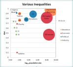
Here is a bubble chart comparison of 14 different inequalities:
Legend:
The x-axis shows the size of the population in logarithmic scale. The y-axis is the Gini value. The “80-20 rule” corresponds to a Gini value of 0.75. Bubble size is proportional to the log(size), i.e. redundant with the x-axis.
Discussion:
Most of the industrial inequalities studied have a small population (10-20); this is usually due to the small number of competitors studied or a focus on the Top-10 or Top-20 (for example in market capitalization). With small populations the Gini value can vary more as one outlier will have a disproportionately larger effect. For example, the Congressional Net Worth analysis (top-left bubble) was taken from a set of 25 congressional members representing Florida (Jan-22, 2012 article in the Palm Beach Post on net worth of congress). Of those 25, one (Vern Buchanan, owner of car dealerships and other investments) has a net worth of $136.2 million, with the next highest at $6.4 million. Excluding this one outlier would reduce the average net worth from $6.9 to $1.55 million and the Gini index from 0.91 (as shown in the Bubble Chart) to 0.66. Hence, Gini values of small sets should be taken with a grain of salt.
The studied cases in attention inequality have very high Gini values, especially for the traffic to websites (top-right bubble), which given the very large numbers (Gini = 0.985, Size = 1 billion) is the most extreme type of inequality I have found. Attention in social media (like Twitter) is extremely unevenly distributed, with most of it going to very few alternatives and the vast number of alternatives getting practically no attention at all.
Political donations are also very unevenly distributed, considerably above the 80-20 rule. The problem from a political perspective is that donations buy influence and such influence is very unevenly distributed, which does not seem to be following the democratic ideals of the one-person, one-vote principle of equal representation.
Lastly, economic inequalities (wealth, income, capital gains, etc.) are perhaps the most discussed forms of inequality in the US. Inequalities at the level of all US households or citizens measure large populations (100 – 300 million). One obvious observation from this Bubble Chart is that capital gains inequality is far, far higher than income inequality.
Tool comment: I have used Excel 2007 to collect the data and create this chart. Even though it is natively supported in Excel, the Bubble Chart has a few restrictions which make it cumbersome. For example, I haven’t found a way to use Data Point labels from the spread-sheet; hence a lot of manual editing is required. I also don’t know of a way to create animated Bubble-Charts (to follow the evolution of the bubbles over time) similar to those at GapMinder. Maybe I need to study the ExcelCharts Blog a bit more… If you know of additional tips or tweaks for BubbleCharts in Excel please post a comment or drop me a note. Same if you are interested in the Excel spread-sheet.
