In December 2017 the World Inequality Lab (WIL) published its first World Inequality Report 2018. The lab consists of a five-member board and 20+ researchers, mostly from the Paris School of Economics (Thomas Piketty et al.) and the University of California at Berkeley (Emmanuel Saez et al.). Compared to previous work on economic inequality it is fair to say that research has significantly advanced over the last 5 years along several directions:
- The free report itself is available both online as well as in various download formats and eight languages. It aims to become a data-driven foundation for societal and policy discussions about inequality.
- All underlying data are openly published (via the World Wealth & Income Database WID) to support reproducibility and stimulate further research.
- The methodology to aggregate data is encompassing more sources, more attributes (including age, gender, etc.) and better informed estimates, across a wider spectrum of countries and geographies (all important for policy discussions).
- The visualizations have evolved beyond limited measures such as the Gini-Index and now typically include interactive charts (such as the for example at http://wid.world/country/usa/)
This report is quite detailed and holistic. Aside from the Executive Summary, Introduction, Conclusion and Appendices, it consists of the following five parts:
- AIM OF THE WORLD INEQUALITY REPORT 2018
- NEW FINDINGS ON GLOBAL INCOME INEQUALITY
- EVOLUTION OF PRIVATE AND PUBLIC CAPITAL OWNERSHIP
- NEW FINDINGS ON GLOBAL WEALTH INEQUALITY
- FUTURE OF GLOBAL INEQUALITY AND HOW IT SHOULD BE TACKLED
There are many interesting findings. Let me just provide three examples in this Blog, together with respective visualizations telling the “story in the data”.
Example 1: Inequality rising everywhere, but at different speeds
Here is a Figure E2a showing the Top 10% income shares across several large geographies over the period 1980-2016:

From the report’s Executive Summary:
-
Since 1980, income inequality has increased rapidly in North America, China, India, and Russia. Inequality has grown moderately in Europe (Figure E2a). From a broad historical perspective, this increase in inequality marks the end of a postwar egalitarian regime which took different forms in these regions.
and further
-
The diversity of trends observed across countries since 1980 shows that income inequality dynamics are shaped by a variety of national, institutional and political contexts.
-
This is illustrated by the different trajectories followed by the former communist or highly regulated countries, China, India, and Russia (Figure E2a and b). The rise in inequality was particularly abrupt in Russia, moderate in China, and relatively gradual in India, reflecting different types of deregulation and opening-up policies pursued over the past decades in these countries.
-
The divergence in inequality levels has been particularly extreme between Western Europe and the United States, which had similar levels of inequality in 1980 but today are in radically different situations. While the top 1% income share was close to 10% in both regions in 1980, it rose only slightly to 12% in 2016 in Western Europe while it shot up to 20% in the United States. Meanwhile, in the United States, the bottom 50% income share decreased from more than 20% in 1980 to 13% in 2016 (Figure E3).
The latter is apparent from the supporting visualization in Figure E3, contrasting the Top 1% and Bottom 50% national income shares in the US with that of Western Europe:
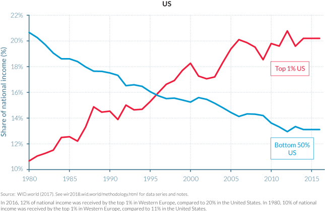

Although the y-axis does not start at 0% and is of different scale in both charts, the underlying story, i.e. the evolution of income shares of the rich (top 1%) and lower class (bottom 50%) over the last 35 years is apparent:
- Income shares have changed significantly in the US:
- The Top 1% nearly doubled their income share from 11% to 20%
- The Bottom 50% saw their income share almost cut in half from 21% to 13%
- Income shares have been fairly stable in Western Europe
Example 2: The elephant curve of global inequality
On this Blog we have written a lot about the Gini index. (See Gini posts) One of the limitations of the Gini index is that it reduces the entire inequality picture down to a single scalar value. Multiple distributions result in the same Gini index, which means that structural distribution changes may be masked out by a near constant Gini index.
For example, world inequality over the last 35 years has had both increasing effects (such as growth concentration at the top) as well as decreasing effects (raising hundreds of millions of people out of poverty in India and China). Visualizing the Gini index over time does not show this dynamic well.
Another chart to visualize this dynamic more clearly is the elephant curve – named after the shape of the animal. This curve lists all population groups in percentiles along the x-axis, sorted by increasing income from left to right. The first 99 % have the same x-axis spacing; the top 1% on the right is split into 10 subgroups of 0.1% each; the top 0.1% is again split into 10 subgroups of 0.01%, and finally the top 0.01% is again split into 10 subgroups of 0.001%. This gives a finer resolution near the top of the income distribution, highlighting the very disproportionate accrual of growth at the top. See Figure E4 for global inequality growth from 1980 – 2016:
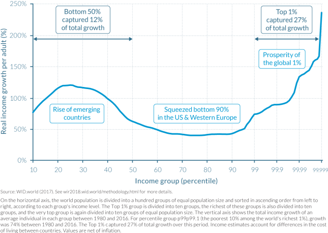
The big bump on the left (head of the elephant) represents the large number of people lifted out of poverty (mostly in India and China). The steep rise on the right (trunk of the elephant) represents the disproportionate gains at the top of the economic income distribution. Again, from the Executive Summary:
How has inequality evolved in recent decades among global citizens? We provide the first estimates of how the growth in global income since 1980 has been distributed across the totality of the world population. The global top 1% earners has captured twice as much of that growth as the 50% poorest individuals. The bottom 50% has nevertheless enjoyed important growth rates. The global middle class (which contains all of the poorest 90% income groups in the EU and the United States) has been squeezed.
To underscore the last statement, here is the elephant curve of income growth from 1980-2016 for just the US-Canada and Western Europe (Figure 2.1.2):

Note how in this chart, without China and India, the left side is flat, indicating that the lower economic classes have only had average or negligible income growth.
How did this translate into shares of growth captured by different groups? The top 1% of earners captured 28% of total growth—that is, as much growth as the bottom 81% of the population. The bottom 50% earners captured 9% of growth, which is less than the top 0.1%, which captured 14% of total growth over the 1980–2016 period. These values, however, hide large differences in the inequality trajectories followed by Europe and North America. In the former, the top 1% captured as much growth as the bottom 51% of the population, whereas in the latter, the top 1% captured as much growth as the bottom 88% of the population. (See chapter 2.3 for more details.)
It is noteworthy that the closer to the top, the higher the cumulative income growth, especially in the US. For example, Table 2.4.2 below shows that since 1980, US income has more than
- doubled for the Top 10% (growth = 121%)
- tripled for the Top 1% (204%)
- quadrupled for the Top 0.1% (320%)
- quintupled for the Top 0.01% (453%) and
- septupled for the Top 0.001% (636%)
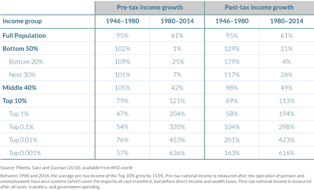
Another interesting finding from this is that pre-tax US income for the bottom 50% has essentially remained unchanged (growth = 1%) for an entire generation, with the bottom 20% even seeing their income shrink by 25%. Economic policies which exclude large portions of the population from growth for an entire generation are bound to increase tensions within that population, here primarily along the lines of economic class boundaries.
Example 3: Geographic breakdown of global income groups
In Part 2 the report looks at the share of Africans, Asians, Americans and Europeans in each of the global income groups and how this has changed over the last few decades. To illustrate, there are two snapshots in time, first at 1990 (Figure 2.1.5)
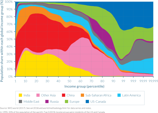
and then at 2016 (Figure 2.1.6):

Comparing these two area charts reveals a few interesting developments at the level of entire geographic regions:
In 1990, Asians were almost not represented within top global income groups. Indeed, the bulk of the population of India and China are found in the bottom half of the income distribution. At the other end of the global income ladder, US-Canada is the largest contributor to global top-income earners. Europe is largely represented in the upper half of the global distribution, but less so among the very top groups. The Middle East and Latin American elites are disproportionately represented among the very top global groups, as they both make up about 20% each of the population of the top 0.001% earners. It should be noted that this overrepresentation only holds within the top 1% global earners: in the next richest 1% group (percentile group p98p99), their share falls to 9% and 4%, respectively. This indeed reflects the extreme level of inequality of these regions, as discussed in chapters 2.10 and 2.11. Interestingly, Russia is concentrated between percentile 70 and percentile 90, and Russians did not make it into the very top groups. In 1990, the Soviet system compressed income distribution in Russia.
In 2016, the situation is notably different. The most striking evolution is perhaps the spread of Chinese income earners, which are now located throughout the entire global distribution. India remains largely represented at the bottom with only very few Indians among the top global earners.
The position of Russian earners was also stretched throughout from the poorest to the richest income groups. This illustrates the impact of the end of communism on the spread of Russian incomes. Africans, who were present throughout the first half of the distribution, are now even more concentrated in the bottom quarter, due to relatively low growth as compared to Asian countries. At the top of the distribution, while the shares of both North America and Europe decreased (leaving room for their Asian counterparts), the share of Europeans was reduced much more. This is because most large European countries followed a more equitable growth trajectory over the past decades than the United States and other countries, as will be discussed in chapter 2.3.
There are, of course, many more findings in this report. It is great to see that such rigorous data-driven analysis is made available free of charge and easy to consume (desktop, iPad, etc.). One can hope that such foundational work will lead to a more educated civic discussion about the current status of economic inequality, the impact of various policy tools as well as the geographic developments on these inequalities.
