The 2012 London Olympic Games ended this weekend with a colorful closing ceremony. Media coverage was unprecedented, with other forms of competition around who had the most social media presence or which website had the best online coverage of the games.
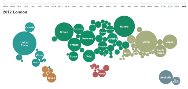
In this post I’m looking at the medal counts over the history of the Olympic Games (summer games only, 27 events over the last 116 years, no games in 1916, 1940, and 1944). Nearly 11.000 athletes from 205 countries competed for more than 900 medals in 302 events. The New York Times has an interactive chart of the medal counts on their London 2012 Results page:
Bubble size represents the number of medals won by the country, bubble position is roughly based on a world map and bubble color indicates the continent. Moving the slider to a different year changes the bubbles, which gives a dynamic grow or shrink effect.
Below this chart is a table listing all gold, silver, bronze winners for each sport in that year, grouped by type of sport such as Gymnastics, Rowing or Swimming. Selecting a bubble will filter this to entries where the respective country won a medal. This shows the domination of some sports by certain countries, such as Diving (8 events, China won 6 gold and 10 total medals) or Cycling – Track (10 events, Great Britain won 7 gold and 9 total medals). In two sports, domination by one country was 100%: Badminton (5 events, China won 5 gold and 8 total medals), Table Tennis (4 events, China won 4 gold and 6 total medals).
There is also a summary table ranking the countries by total medals. For 2012, the United States clearly won that competition, winning more gold medals (46) than all but 3 other countries (China, Russia, Britain) won total medals.
Of course countries vary greatly by population size. It is remarkable that a relatively small nations such as Jamaica (~2.7 million) won 12 medals (4, 4, 4), while India (~1.25 billion) won only 6 medals (0, 2, 4). In that sense, Jamaica is about 1000x more medal-decorated per population size than India! In another New York Times graphic there is an option to compare medal count adjusted for population size, i.e. with the medal count normalized to a standard population size of say 100 million.
Selecting any node in this graph will highlight countries with better, worse or comparable relative medal performance. (There are different ways to rank based on how different medals are weighted.)
The Guardian Data Blog has taken this a step further and written a piece called “alternative medals table“. This post not only discusses multiple factors like population, GDP, or number of athletes and how to deal with them statistically; it also provides all the data and many charts in a Google Docs spreadsheet. One article combines GDP adjustment with cartographical mapping across Europe:
If you want to do your own analysis, you can get the data in shared spreadsheets. To do a somewhat more historic analysis, I used a different source, namely Wolfram’s curated data source accessible from within Mathematica. Of course, once you have all that data, you can examine it in many different directions. Did you know that 14853 Olympic medals were awarded so far in 27 summer Olympiads? The average was 550 medals, growing about 29 medals per event with nearly 1000 awarded in 2008 and 2012.
A lot of attention was paid to who would win the most medals in London. China seemed in contention for the top spot, but in the end the United States won the most medals, as it did in the last 5 Olympiads. Only 7 countries won the most medals at any Olympiad. Greece (1896), France (1900), the United Kingdom (1908), Sweden (1912), and Germany (1936) did so just once. The Soviet Union (which no longer exists) did it 8 times. And the United States did it 14 times. China, which is only participating since 1984, has yet to win the most medals of any Olympiad.
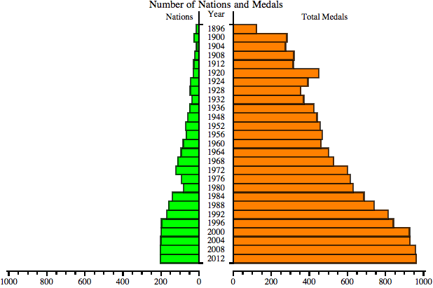
Aside from the top rank, I was curious about the distribution of medals over all countries. Both nations and events have increased, as is shown in the following paired bar chart:
The number of nations grew steadily with only two exceptions during the thirties and the seventies; presumably due to economic hardship many nations didn’t want to afford participation. 1980 also saw the Boycott of the Moscow Games by the United States and several other delegations over geopolitical disagreements. At just over 200 the number of nations seems to have stabilized.
The number of medals depends primarily on the number of events at each Olympiad. This year there were 302 events in 26 types of Sports. Total medal count isn’t necessarily exactly triple that since in some events there could be more than 1 Bronze (such as in Judo, Taekwondo, and Wrestling). Case in point, in 2012 there were 968 medals awarded, 62 more than 3 * 302 events.
What is the distribution of those medals over the participating nations? One measure would be the percentage of nations winning at least some medals. Another measure showing the degree of inequality in a distribution is the Gini index. Here I plotted the percentage of nations medaling and the Gini index of the medal distribution over all participating nations for every Olympiad:
Up until 1932 3 out of 4 nations won at least some medals. Then the percentage dropped down to levels around 40% and lower since the sixties. That means 6 of 10 nations go home without any medals. During the same time period the inequality grew from Gini of about .65 to near .90 One exception were the Third Games in 1904 in St. Louis. With only 13 nations competing the United States dominated so many sports to yield an extreme Gini of .92 All of the last five Games resulted in a Gini of about .86, so this still very large amount of medal winning inequality seems to have stabilized.
It would be interesting to extend this to the level of participating athletes. Of course we know which athlete ranks at the top as the most decorated Olympic athlete of all time: Michael Phelps with 22 medals.


