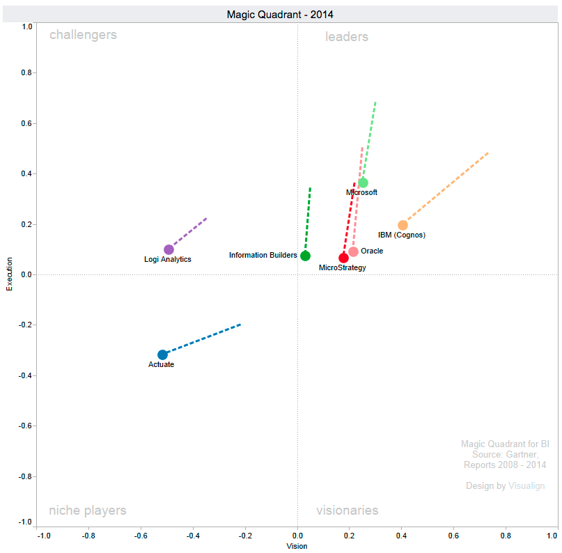
Every February the Gartner group publishes its Magic Quadrant (MQ) report on the Business Intelligence segment. As covered in previous years (2012, 2013, 2014), its centerpiece is a 2-dimensional quadrant of the Vision (x-axis) vs. Execution (y-axis) space. When this year’s report came out about 3 weeks ago, it completed a decade worth of data (each year from 2008 to 2017) on about 20-25 companies each year. Here is the latest 2017 picture (with trajectory from previous year):
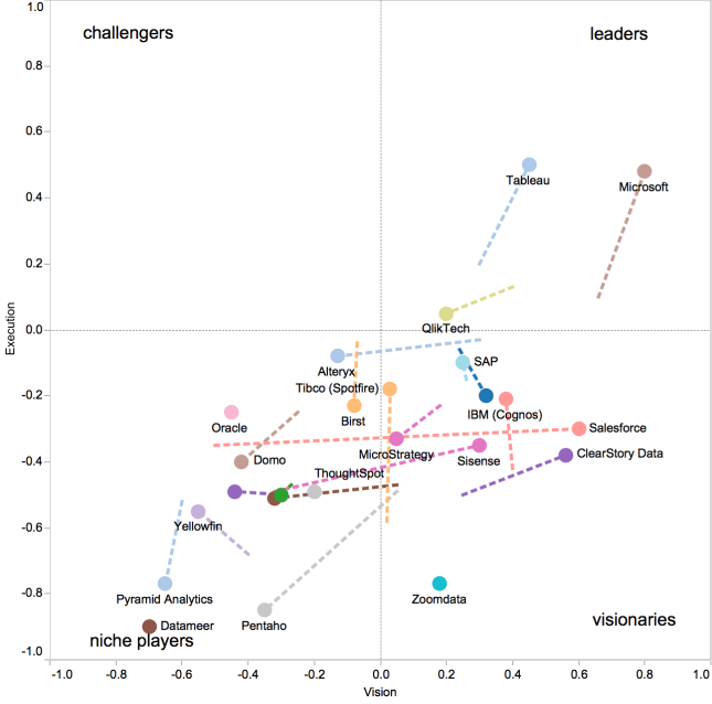
I have collected the MQ position data in a simple Google Docs spreadsheet here. The usual disclaimers are worth repeating:
- Gartner does not publish the x,y coordinates as they caution against using them directly for interpretation.
- To approximate the data, I screen-scraped them from images revealed by Google search, which introduces both inaccuracies and the possibility of (my) clerical transcription error.
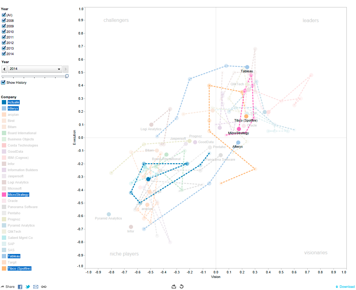
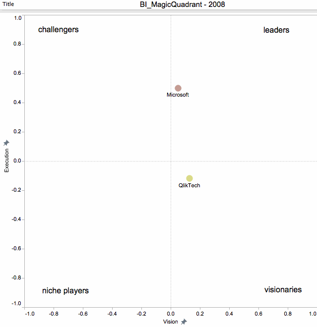
- Changes in the x,y coordinate for one company from one year to the next are a combination of how that company evolved as well as how Gartner’s formula (also not published) may have changed. For example, from 2015 to 2016 many companies “deteriorated” in the ranking as can be seen from the following graphic:

- It is unlikely that so many companies deteriorate in their execution in unison. More likely, the formula changed and shifted the evaluation landscape upwards, meaning companies that stayed the same on the previously used factors now slipped downwards. (I read somewhere that Gartner wanted to have only 3 companies in the leader quadrant – an instance of curve-fitting if you will.) Whatever the reason, this shift removed all but three companies from the upper rectangle on execution.
- That said, relative changes between companies in the same year are still meaningful, as they are all graded on the same formula.
Naturally, it is of interest to study the current leaders – Microsoft, Tableau and Qlik. Here is the dynamic evolution of these three competitors MQ positions over the last decade as GIF:
 From the entire trajectory (left) one can see that all of them have been leaders for many years.
Tableau joined the leader board in Feb-2013 from the status as challenger. It went public in May-2013 (ticker symbol DATA) and has grown into a company with close to $1B in annual revenue and > 3000 employees. It has had particularly consistent ratings on Execution scores since then. Many of the visualization metaphors it has introduced are commoditized by now, with a desktop designer tool for both Windows and Mac, a robust server product as well as a free public cloud-based option. For any company of such size it is a challenge to grow fast enough and it needs to both stay ahead of the competition as well as diversify into adjacent markets. Its stock price reached lofty heights of $127 (roughly $10B market cap) by mid-2015, but saw a drop to ~$80 by year-end 2015 and then cut in half one month later ($41 on Feb-1, 2016), from where it has only modestly recovered to around $52. Most SW products nowadays are offered as a service, which Tableau still hasn’t transitioned to as much as others have. That said, it’s Aug-2016 hiring of Adam Selipsky from Amazon Web Services indicates this transition and focus on Tableau Online and scale.
Microsoft is in a unique position for many reasons: It has a very healthy and diverse product portfolio across Windows, Office, Server, Cloud, and others. Most of these help build out a complete BI stack, helping it in the Vision dimension. Furthermore, it can subsidize the development of a large product and offer it free to capture market share. Unlike Tableau, the Power BI price point is near zero, which has helped it acquire a large community of developers, which in turn provides a growing gallery of solutions and plug-in visualization components. Lastly, Power BI is very well integrated with products such as Excel, SharePoint and SQL Server. Many enterprises already invested in the Microsoft stack will find it very easy to leverage the BI functionality.
I don’t have personal experience with QlikView, but enjoy reading on Andrei Pandre’s visualization Blog about it. Qlik was always a bit different, focusing on complex analytics more than mainstream tooling, and it having been taken private in Mar-2016 seems to have reduced its leadership status.
Another Blog I quite enjoy reading is blog.AtScale.com. (such as the 2017 article on the BI MQ by author Bruno Aziza).
I would summarize various factors influencing the BI solutions over the last few years:
- Visualization tools and galleries – BI tools have reached a high level of maturity around the generation of dashboards with interconnected components as well as complex interactive visuals such as treemaps or animated bubble charts. Composing the visual presentation is often the smallest part of a BI project, with proper data-mining often taking an order of magnitude more effort and resources.
- ETL Commoditization – the need to support data-wrangling as part of the solution, not a mix of add-on tools. Microsoft’s SSIS, Tableau’s Maestro, Alteryx Designer Tools, etc.
- Hybrid Cloud and On-Premise solution – Most enterprises want a combination of some (often historically invested) On-Premise data store / analytics capabilities with newer (typically subscription-based) Cloud-based services.
- Big Data abilities and Stream processing – Need to integrate popular data visualization tools (Excel, Tableau, Power BI, QlikView) with big data platforms such as Hadoop. Furthermore, ability to analyze data as it is ingested in real-time without the time-consuming post-processing for dimensional analysis (data cubes)
- Predictive Analytics and Machine Learning – Move focus from reporting (past, what happened?) via alerting (present, what’s happening?) to predicting (future, what will happen?)
Two weeks ago I attended the HIMSS’17 conference in Orlando (HIMSS = Healthcare Information Management System Society). I was particularly interested in the Clinical and Business Intelligence track and exhibitors in that space. My overall impression is that adoption of BI tools in Healthcare is still somewhat limited, with the bigger operational challenges around system interoperability and data exchanges, as well as adoption of digital tools (tablets, portals, Electronic Health Record, etc.) by patients, physicians, and providers.
I did see specialty solution providers such as Dimensional Insight. While impressive, their approach seems decidedly old school and traditional. I doubt that any company can sustain a lead in this space by maintaining a focus on their proprietary core technology (such as their Diver platform / data-cube technology). Proper componentization, standard interface support (such as HL7 FHIR) and easy-to-integrate building blocks will win broader practical acceptance than closed-system proprietary approaches.
There are some really interesting systems being applied to healthcare such as IBM’s Watson Health or the new Healthcare.ai platform from Health Catalyst. But that is a story for another Blog post…