RSS

Tag Archives: economics

TreeMap of the Market

TreeMap of the Market

SmartMoney has an interactive visual tool on their website called “Map of the Market”. It is an application of the TreeMap concept developed by Ben Shneiderman which I have blogged about before here.

The map lets you watch more than 500 stocks at once, with data updated every 15 minutes. Each colored rectangle in the map represents an individual company. The rectangle’s size reflects the company’s market cap and the color shows price performance. (Green means the stock price is up; red means it’s down. Dark colors are neutral). Move the mouse over a company rectangle and a little panel will pop up with more information.

Map Of The Market (Source: SmartMoney website)

For example, the above map shows the 26 week performance with the Top 5 Losers highlighted (hovered over RIMM). More information from the corresponding Map Instructions page.

This map is also quite similar in concept to the StockTouch iPad app which I covered here. StockTouch displays 900 companies, grouped into 9 sectors. The above Map of the Market is a free service, with an available upgrade to one showing 1000 companies for a subscription fee. While interesting in its own right, however, this is not about the business model of how to monetize the use of such information.

It might be interesting to put together a time-lapse video showing this map for every close of business day throughout one year. Not only would one see the up and down movement by color, but also the gradual shifts in the cumulative size of various sectors due to the area in the tree map.

Another fascinating set of tree map uses is on display at the Gallery of the Hive Group website. Their interactive tree map product HoneyComb has been used in many different industries. The Gallery shows many examples, ranging from sales performance to manufacturing / quality applications to public interest uses such as browsing Olympic Games results or data on Earthquakes. See the following example screenshot (click to interact on the Hive Group website):

TreeMap of Earthquakes (Source: HiveGroup)

While you won’t get the full benefit of seeing the details of all 540 items in one view, you can filter using the panel controls on the right or change the grouping and size and color attributes. This shows for example that the most powerful earthquakes are generally not the most deadly ones and vice versa.

Interacting with these sample tree maps again drives home the fundamental notion that interactive visualizations lead to quicker grasp and better understanding of data sets. This is similar to how walking around and seeing an object from different perspectives gives you a better idea of it’s 3-D structure than seeing it just in one 2-D picture. With multiple ways of interacting it feels almost as if you’re walking inside the data set to see it from multiple angles and perspectives. You have to do it yourself to appreciate the difference it makes.

Lastly, a good article on some of the pitfalls of tree map design with lots of links to good/bad examples comes from the folks at Juice Analytics in their Blog post titled “10 lessons in Treemap Design“.

 
4 Comments

Posted by on October 29, 2011 in Financial, Industrial


Tags: , ,

Market Capitalization Inequality in the Steve Jobs era

The excellent analyst website asymco.com recently published a post titled Visualizing the Steve Jobs era. In it they display an area chart of the relative size of market capitalization of about 15 companies they have tracked for the last 15 years.

Since I had looked at the Gini index of a similar set of companies in an earlier post on Visualizing Inequality I contacted the author Dirk Schmidt. Thankfully he shared the underlying data. From that I calculated the Gini index for every quarter and overlaid a line chart with their area chart.

Share of Market Capitalization Area Chart overlaid with Gini Index

Dirk elaborated in his post and identified three distinct periods in his post:

  • Restructuring of Apple 1997-2000 – Gini remains very high near 0.85 due to MSFT dominance
  • iTunes era 2001-2006 – Gini decreases to ~ 0.55 due to AAPL increase and taking share from other established players
  • Mobile devices era 2007-2011 – Gini increases again to 0.65 due to increasing dominance of AAPL and irrelevance of smaller players

Regardless of the absolute value of the Gini index – note the caveat from the earlier post that it is very sensitive to the number of contributors – the trend in the Gini can be an interesting signal. One company dwarfing every other like a monopoly corresponds to high Gini (here 0.85 due to MSFT dominance). A return to lower Gini values (here down to ~0.5) signals stronger competition with multiple entrants. The recent reversal of the Gini trend (up to 0.65 due to AAPL dominance) is a sign that investors see less choices when it comes to buying shares in those tech companies. Whether that’s a leading indicator for consumers seeing less choices in the marketplace is another question…

 
Leave a comment

Posted by on September 29, 2011 in Financial, Industrial


Tags: , , ,

StockTouch – interactive stock monitoring tool

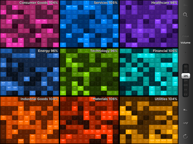
Financial markets have always been an area of rapid innovation, with the evolution of graphical stock information being no exception. It looks like the famous stock-ticker could be replaced with the stock-toucher. A new iPad application by Visible Market Inc. provides an excellent example of the use of highly aggregated color graphics and touch-interaction. Here is the main UI showing 9 sectors and the 100 largest stocks (by market capitalization) in each sector:

Market Overview by Sector, 100 largest market cap companies per sector, color-coded heat-map of volume changes.

You can zoom in (expand- or tap-gesture), zoom out (pinch-gesture) to navigate between levels (market, sector, company) or use the auto-complete search-box for a list of company names matching the search string.

The 10*10 items can be organized either alphabetically or by market cap. Display is of Price or Volume changes between current values compared to a variable time-period (time-frame slider with values {1D, 1W, 1M, 3M, 6M, 1Y, 5Y}) at the company level and averages at the sector level.

From their website:

“Our vision for StockTouch is that it represents the first of a new genre of apps that look at the financial markets in new, powerful and useful ways. It is our belief that the act of touching and diving into data will change the way users engage with this data, and consequently translate it into information and knowledge.”

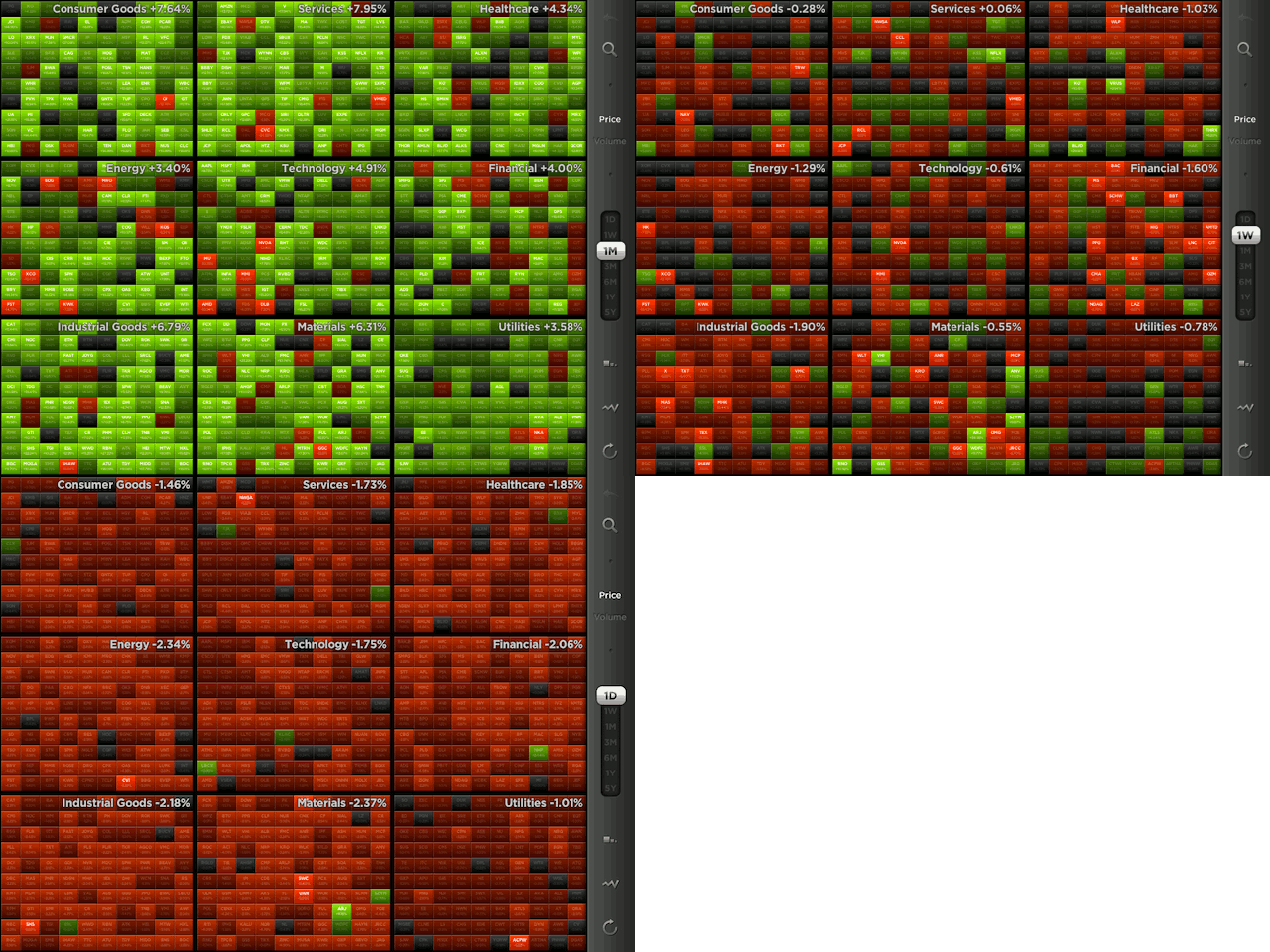
Price changes of 100 largest market cap companies by sector, Green-Red color-coded heat-map. Note market trends for three timeframes: Last month (green = advance), last week (mixed), last day (red = retreat).

The use of colors is particularly useful for Price changes: There is a heat map from light green (strong positive change) via darker tones (gray = neutral, no change) to light reds (strong negative change). This shows at a glance how the entire sector or market is doing. In the above example the last month saw a broad advance (majority of companies across all sectors in green); the last week more of a mixed bag, and the last day a broad retreat across the entire market (almost all red). Think about how much information is aggregated into this dashboard! 900 companies, grouped by sector, sorted by market cap, color-coded for price/volume change. No wonder they post a quote on their website:

“StockTouch tells you more in five seconds than you would learn reading financial news all day.”

 
3 Comments

Posted by on July 11, 2011 in Financial


Tags: , ,