RSS

Author Archives: visualign

Unknown's avatar

About visualign

Visualize Data. Improve Performance.

Share and Inequality of Mobile Phone Revenues and Volumes

Share and Inequality of Mobile Phone Revenues and Volumes

The analyst website Asymco.com visualizes various financial indicators of mobile phone companies in this interactive vendor bubble chart (follow link, select “Vendor Charts”). It covers the following 8 companies: Apple, HTC, LG, Motorola, Nokia, RIM, Samsung, Sony Ericsson. From the “vendor data” tab I downloaded the data and looked at the revenue and volume distributions for the last 4 years.

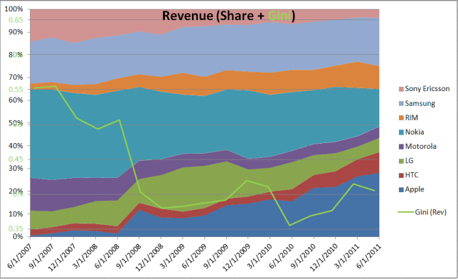
Revenue Share of Mobile Phones and corresponding Gini Index

Note the sharp reduction in inequality of revenue distribution in the 9/1/08 quarter, when Apple achieved nearly 10x in revenue (and volume) compared to the year before. While the iPhone 1 was introduced a year earlier in 2007, in commercial terms the iPhone 3G started to have strong market impact when introduced in the second half of 2008.

Volume Share of Mobile Phones and Gini Index

Volume inequality is considerably higher (average Gini = 0.61) than Revenue inequality (0.43) due to two dominant shippers (Nokia and Samsung), which continue to lead the peer group in volume. Only recently has the inequality been reduced, i.e. the volumes are distributed more evenly. Apple’s growth in volume share has come at the expense of other players (mainly Motorola and Sony Ericsson).

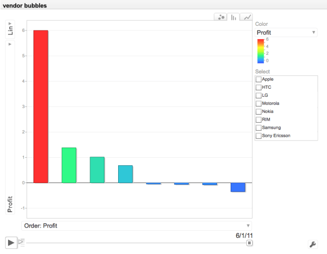
Volume share is a lagging indicator regarding a company’s innovation and success. It can be dominated for a long time by players who are past their prime and in financial distress (like Nokia). Revenue is more useful to predict a company’s future growth and success. But the real story is told when comparing Profit. Apple’s (Smart Phone) Profit dwarfs that of the other 7 competitors:

Profit Comparison between 8 Mobile Phone Vendors (Source: Asymco.com)

Click on the image to go to Asymco’s interactive chart (requires Flash). The bubble chart display over time is very revealing regarding Apple’s meteoric rise.

 
2 Comments

Posted by on October 22, 2011 in Financial, Industrial


Tags: , ,

Number of Neighbors for World Countries

Number of Neighbors for World Countries

One important geographical aspect in economy is whether a country is land-locked. Another aspect is the number of neighbors a given country shares a border with. If we sort all 239 world countries, 75 (31%, almost one third) of them are island countries such as Madagascar or Australia where this number is zero. On the opposite end are countries with the most border connections. Here are the top 6 countries in descending order: China (16), Russia (14), Brazil (10), Sudan, Germany, and Democratic Republic of Congo (9 each). All other countries have 8 or less neighbors. Here is a visual breakdown:

The histogram shows the high frequency of island states; the range from 1 to 5 neighbors is fairly common, with a steep drop off in the frequency of 6 or more neighbors. Here is a world map with the same color-code:

WorldMap color-coded by number of neighboring countries

Large countries tend to have more neighbors (Russia (14), China (16), Brazil (10)), but there are obvious exceptions to this tendency (Canada (1), United States (2)). The number of neighbors depends not just on the size of the country itself, but on it’s neighbors’ sizes as well; for example, a small country such as Austria (land area size world rank: 116th) has a rather high number of 8 neighbors because many of them in turn are relatively small (Switzerland, Liechtenstein, Slovenia, etc.).

The average number of neighbors is about 2.7 and there are 323 such border relationships. These can be visualized as graphs with countries as vertices and borders as edges. (Note that to simplify the graphs I excluded all 75 islands = disconnected vertices except Australia.) There are two main partitions of this graph following the land-border geography: One with Europe, Asia and Africa and one with the Americas.

Border-Connected Countries in Europe, Asia, Africa

With the graph layout changed from “Spring Embedding” to “Spring Electrical Embedding” one obtains this interesting variation of the same graph which looks like a sword fish:

The "EurAsiAfrica Sword-fish"

The other partition of the Americas can be visualized in a circular embedding layout:

Europe, Asia, Africa (left) and Americas (right)

It is also interesting to look at the numbers for lengths of pairwise borders between two countries:

  • Number: 323 border-pairs
  • Minimum: 0.34 [km]
  • Maximum: 8893 [km]
  • Mean: 789.6 [km]
  • Total: 255048 [km]
  • Most pairwise borders are between 100 – 1000 km long, but they can as short as 1/3 km (China – Macau) or almost 9000 km (Canada – United States).

    When we look at the entire border length for each country, we see familiar names on top of the ranking:
    China: 22147 [km], Russia: 20293 [km], Brazil: 16857 [km], India: 14103 [km], Kazakhstan: 12185 [km], United States: 12034 [km]. It seems likely that the first four, the so called “BRIC” countries, owe part of their economic strength to their geography: Size, length of borders and number of neighbors influence the number of local trading partners and routes to them. There are many more correlations one can analyze such as between border length / number of neighbors and GDP / length of road network etc. One thing seems likely when it comes to the economy of world countries: Size matters, and so does Geography!

    Epilog: This analysis was all performed using Wolfram’s Mathematica 8. The built-in curated CountryData provides access to more than 200 properties of the world countries, including things like Population, Area, GDP, etc. Some cleaning of the borders lengths data was required to deal with different spellings of the same country. (If you’re interested in the data or source-code, please contact me via email.) List manipulation and mathematical operations such as summation are very easy to do in the functional programming paradigm of Mathematica. Graphs are first-order data structures with numerous vertex and edge operators. Charting is also fairly powerful with BarCharts, ListPlots and more advanced graph charting options. Which other software provides all this flexibility in one integrated package?

     
    6 Comments

    Posted by on October 6, 2011 in Recreational, Socioeconomic


    Tags: , , , ,

    Market Capitalization Inequality in the Steve Jobs era

    The excellent analyst website asymco.com recently published a post titled Visualizing the Steve Jobs era. In it they display an area chart of the relative size of market capitalization of about 15 companies they have tracked for the last 15 years.

    Since I had looked at the Gini index of a similar set of companies in an earlier post on Visualizing Inequality I contacted the author Dirk Schmidt. Thankfully he shared the underlying data. From that I calculated the Gini index for every quarter and overlaid a line chart with their area chart.

    Share of Market Capitalization Area Chart overlaid with Gini Index

    Dirk elaborated in his post and identified three distinct periods in his post:

    • Restructuring of Apple 1997-2000 – Gini remains very high near 0.85 due to MSFT dominance
    • iTunes era 2001-2006 – Gini decreases to ~ 0.55 due to AAPL increase and taking share from other established players
    • Mobile devices era 2007-2011 – Gini increases again to 0.65 due to increasing dominance of AAPL and irrelevance of smaller players

    Regardless of the absolute value of the Gini index – note the caveat from the earlier post that it is very sensitive to the number of contributors – the trend in the Gini can be an interesting signal. One company dwarfing every other like a monopoly corresponds to high Gini (here 0.85 due to MSFT dominance). A return to lower Gini values (here down to ~0.5) signals stronger competition with multiple entrants. The recent reversal of the Gini trend (up to 0.65 due to AAPL dominance) is a sign that investors see less choices when it comes to buying shares in those tech companies. Whether that’s a leading indicator for consumers seeing less choices in the marketplace is another question…

     
    Leave a comment

    Posted by on September 29, 2011 in Financial, Industrial


    Tags: , , ,

    Fractals

    While browsing the web for some Mathematica resources I came across Paul Nylander’s website on Fractals and other computer-created illustrations. Amazing stuff! Here are just a few images from his website. He has lots of information and often source-code with the images as well. Go check it out.

     
    Leave a comment

    Posted by on September 27, 2011 in Art, Scientific


    Tags: ,

    Visualizing Inequality

    Visualizing Inequality

    Measuring and visualizing inequality is often the starting point for further analysis of underlying causes. Only with such understanding can one systematically influence the degree of inequality or take advantage of it. In previous posts on this Blog we have already looked at some approaches, such as the Lorenz-Curve and Gini-Index or the Whale-Curve for Customer Profitability Analysis. Here I want to provide another visual method and look at various examples.

    Inequality is very common in economics. Competitors have different share of and capitalization in a market. Customers have different profitability for a company. Employees have different incomes across the industry. Countries have different GDP in the world economy. Households have different income and wealth in a population.

    The Gini Index is an aggregate measure for the degree of inequality of any given distribution. It ranges from 0.0 or perfect equality, i.e. every element contributes the same amount to 1.0 or the most extreme inequality, i.e. one element contributes everything and all other elements contribute nothing. (The previous post referenced above contains links to articles for the definition and calculation of the Gini index.)

    There are several ways to visualize inequality, including the Lorenz-Curve. Here we look at one form of pie-charts for some discrete distributions. As a first example, consider the distribution of market capitalization among the Top-20 technology companies (Source: Nasdaq, Date: 9/17/11):

    Market Cap of Top 20 Technology Companies on the Nasdaq

    Apple, the largest company by far, is bigger than the bottom 10 combined. The first four (20%) companies – Apple, Microsoft, IBM, Google – are almost half of the entire size and thus almost the size of the other 16 (80%) combined. The pie-chart gives an intuitive sense of the inequality. The Gini Index gives a precise mathematical measure; for this discrete distribution it is 0.47

    Another example is a look at the top PC shipments in the U.S. (Source: IDC, Date: Q2’11)

    U.S. PC Shipments in Q2'11

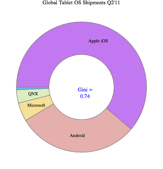
    There is a similar degree of inequality (Gini = 0.46). In fact, this degree of inequality (Gini index ~ 0.5) is not unusual for such distributions in mature industries with many established players. However, consider the tablet market, which is dominated by Apple’s iOS (Source: Strategy Analytics, Date: Q2’11)

    Worldwide Tablet OS shipments in Q2'11

    Apple’s iOS captures 61%, Android 30%, and the other 3 categories combined are under 10%. This is a much stronger degree of inequality with Gini = 0.74

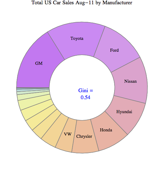
    To pick an example from a different industry, here are the top 18 car brands sold in the U.S. (Source: Market Data Center at WSJ.COM; Date: Aug-2011):

    U.S. Total Car Sales in Aug-11

    When comparing different the Gini index values for these kinds of distributions it is important to realize the impact of the number of elements. More elements in the distribution (say Top-50 instead of Top-20) usually increases the Gini index. This is due to the impact of additional very small players. Suppose for example, instead of the Top-18 you left out the two companies with the smallest sales, namely Saab and Subaru, and plotted only the Top-16. Their combined sales are less than 0.4% of the total, so one wouldn’t expect to miss much. Yet you get a Gini index of 0.49 instead of 0.54. So with discrete distributions and a relatively small number elements one risks comparing apples to oranges when there are different number of elements.

    Consider as a last example a comparison of the above with two other distributions from my own personal experience – the list of base salaries of 30 employees reporting to me at one of my previous companies as well as the list of contributions to a recent personal charity fundraising campaign.

    Gini Index Comparison

    What’s interesting is that the salary distribution has by far the lowest amount of inequality. You wouldn’t believe that from the feelings of employees where many believe they are not getting their fair share and others are getting so much more… In fact, the skills and value contributions to the employer are probably far more unequal than the salaries! (Check out Paul Graham’s essays on “Great Hackers” for more on this topic!)
    And when it comes to donations, the amount people are willing to give to charitable causes differs immensely. We have seen this already in a previous post on Gini-Index with recent U.S. political donations showing an astounding inequality of Gini index = 0.89. I challenge you to find a distribution across so many elements (thousands) which has greater inequality. If you find one, please comment on this Blog or email me as I’d like to know about it.

     
    8 Comments

    Posted by on September 22, 2011 in Industrial, Scientific, Socioeconomic


    Tags: , ,

    Bit.ly link analysis on half-life of web content

    The team at URL-shortening website Bit.ly has posted an interesting analysis on the attention span to links shared on the Internet via different social media platforms. This provides some quantification to what some have termed internet impatience. Most shared web links experience an initial burst of attention immediately after publication followed by a steep decay to near-zero relative activity. A useful measure is a link’s half-life, defined as the time interval between its peak frequency and half of the rest of all clicks over its lifetime.

    From the Bit.ly Blog:

    So we looked at the half life of 1,000 popular bitly links and the results were surprisingly similar. The mean half life of a link on twitter is 2.8 hours, on facebook it’s 3.2 hours and via ‘direct’ sources (like email or IM clients) it’s 3.4 hours. So you can expect, on average, an extra 24 minutes of attention if you post on facebook than if you post on twitter.

    Distribution of web link half-lifes (Source: Bit.ly Blog)

    This half-life distribution plot (x-axis 1 day = 86.400 seconds) of content shared via bit.ly links shows some interesting patterns:

    • In general, content half-life is about 3 hours (10.000 sec)
    • Content half-life does not depend on the medium through which it is shared
    • YouTube content has a different distribution and a considerably longer half-life (about 7 hours)

    One is tempted to relate such stats to one’s own browsing experience or look at systematic analysis of how people deal with shared links. For example, Microsoft’s Outlook team did extensive usability research on how people deal with incoming email so as to improve the usability of their mail reader. It was found that most emails fall into one of three categories (Open & Read immediately, Ignore & Discard, File & Flag for future reading). I speculate that bit.ly links received in Twitter or email will be similar, perhaps with the added category of retweet or forward (in the case of a story going viral). YouTube being different can perhaps be attributed to the fact that many videos require more time so we make a more deliberate decision as to whether and when we want to spend that time. For instance, one might say I want to watch this video tonight when I get home from work, which would fit with the 7 hours half-life.

    In any event, such statistics show us that when it comes to clicking on shared links, our behavior is fairly predictable and probably driven by simple habits rather than complex thought. On one hand this allows good estimates for the expected life-time clicks. On the other hand, it can be a bit disconcerting to realize that our clicking behavior may be controlled by rather simple behavioral drivers (habitual classification, desire for instant gratification, out-of-sight out-of-mind, etc.). For instance, we usually give the most recent incoming news priority over other criteria of personal content preference. But is the latest really the greatest? I suspect that just like impulse-shopping there is a lot of impulse-clicking. And who does not know the exhausted feeling of getting lost while browsing and in hindsight regretting not having made the best use of one’s time… Perhaps this hints at more opportunities for more personalized and content-preference filtered news delivery mechanisms (such as the News reader app Zite, recently acquired by CNN).

     
    1 Comment

    Posted by on September 9, 2011 in Scientific, Socioeconomic


    Tags: , ,

    Inequality, Lorenz-Curves and Gini-Index

    In a previous post we looked at inequality of profits and the useful abstraction of the Whale-Curve to analyze Customer Profitability. Here I want to focus on inequality and its measurement and visualization in a broader sense.

    A fundamental graphical representation of the form of a distribution is given by the Lorenz-Curve. It plots the cumulative contribution to a quantity over a contributing population. It is often used in economics to depict the inequality of wealth or income distribution in a population.

    Lorenz Curve (Source: Wikipedia)

    The Lorenz-Curve shows the y% contribution of the bottom x% of the population. The x-axis has the population sorted by increasing contributions; (i.e. the poorest on the left and the richest on the right). Hence the Lorenz-Curve is always at or below the diagonal line, which represents perfect equality. (By contrast, the x-axis of the Whale-Curve sorts by decreasing profit contributions.)

    The Gini-Index is defined as G =  A / (A + B) , G = 2A  or G = 1 – 2B

    Since each axis is normalized to 100%, A + B = 1/2 and all of the above are equivalent. Perfect equality means G = 0. Maximum inequality G = 1 is achieved if one member of the population contributes everything and everybody else contributes nothing.

    An interesting interactive graph demonstrating Lorenz-Curves and corresponding Gini-Index values can be found here at the Wolfram Demonstration project.

    The GINI Index is often used to indicate the income or wealth inequality of countries. The corresponding values of the GINI index are typically between 0.25 and 0.35 for modern, developed countries and higher in developing countries such as 0.45 – 0.55 in Latin America and up to 0.70 in some African countries with extreme income inequality.

    GINI index of world countries in 2009 (Source: Wikipedia)

    Graphically, many different shapes of the Lorenz-Curve can lead to the same areas A and B, and hence many different distributions of inequality can lead to the same GINI index. How can one determine the GINI index? If one has all the data, one can numerically determine the value from all the differences for each member of the population. An example of that is shown here to determine the inequality of market share for 10 trucking companies.
    Another approach is to model the actual distribution using a formal statistical distribution with known properties such as Pareto, Log-Normal or Weibull. With a given formal distribution one can often calculate the GINI index analytically. See for example the paper by Michel Lubrano on “The Econometrics of Inequality and Poverty“. In another example, Eric Kemp-Benedict shows in this paper on “Income Distribution and Poverty” how well various statistical distributions match the actually measured data. It is commonly held that at the high end of the income the Pareto distribution is a good model (with its inherent Power law characteristic), while overall the Log-Normal is the best approximation.

    After studying several of these papers I started to ask myself: If x% of the population contribute y% to the total, what’s the corresponding GINI index? For example, for the famous “80-20 rule” with 20% of the population contributing 80% of the result, what’s the GINI index for the 80-20 rule?

    To answer this question I created a simple model of inequality based on a Pareto distribution. Its shape parameter controls the curvature of the distribution, which in turn determines the GINI index. The latter is visualized as color-coded bands using a 2D contour plot in the following graphic:
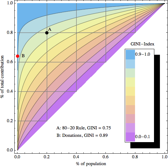
    GINI index contour plot based on Pareto distribution model

    The sample data point “A” corresponds to the 80-20 rule, which leads to a GINI index of about 0.75 (strongly unequal distribution). Data point “B” is an example of an extremely unequal distribution, namely US political donations (data from 2010 according to a statistic from the Center of Responsive Politics recently cited by CNNMoney):

    “…a relatively small number of Americans do wield an outsized influence when it comes to political donations. Only 0.04% of Americans give in excess of $200 to candidates, parties or political action committees — and those donations account for 64.8% of all contributions”

    0.04% contribute 64.8% of the total! Here is another way of describing this: If you had 2500 donors, the top donor gives twice as much as the other 2499 combined. This extreme amount of inequality corresponds to a GINI index of 0.89 (needless to say that this does not seem like a very democratic process…)

    As for US income I created a separate graphic with data points from the high end of the income spectrum (where the underlying Pareto distribution model is a good fit): The top 1% (who earn 18% of all income), top 0.1% (8%), and top 0.01% (3.5%).

    GINI Index Contour Plot with high end US Income distribution data points

    These 3 data points are taken from Timothy Noah’s “The United States of Inequality“, a 10-part article series on Slate, which in turn is based on data and research from 2008 by Emmanuel Saez and visualizations by Catherine Mulbrandon of VisualizingEconomics.com. This shows the 2008 US income inequality has a GINI Index of approximately 0.46, which is unusually high for a developed country. Income inequality has grown in the US since around 1970, and the above article series analyzes potential factors contributing to that – but that’s a topic for another post. In the spirit of visualizing data to create insight, I’ll just leave you with this link to the corresponding 10-part visual guide to inequality:

    Postscript: In April 2012 I came across a nice interactive visualization on the DataBlick website created by Anya A’Hearn using Tableau. It shows the trends of US income inequality over the last 90 years with 7 different categories (Top x% shares) and makes a good showcase for the illustrative power of interactive graphics.

     
    6 Comments

    Posted by on September 2, 2011 in Financial, Industrial, Scientific, Socioeconomic


    Tags: , ,

    Oregon Coast Bike Map

    Oregon Coast Bike Map

    A good example of visualization for recreational purposes is the Oregon Coast Bike Map created by the Oregon Department of Transportation and published here. Here is a sample page of this 13 page document:

    Sample Page from the Oregon Coast Bike Map

    The map is full of useful information relevant to cyclists such as weather, traffic, campgrounds, attractions, etc. What I find particularly useful is the indication of distances and elevation profile. Unlike motorized traffic hills tend to slow cyclists down a lot, so estimating ride time to a goal not only depends on the distance, but also on the vertical elevation gain en route to that goal. For example, consider this enlarged area (inset C of above page) of the beautiful “3 Capes” region near Tillamook:

    Inset of 3 Capes Region

    Note the use of color to indicate type of road and traffic as well as shaded bands in elevation profile. I think this is a good example of creating insight by visualizing data. I should know, as I was riding this stretch 2 years ago in August of 2009 during my Panamerican Peaks cycling and climbing adventure. Not having the benefit of such a detailed map I decided to embark on the 3 capes route late in the afternoon, only to get caught by sunset in NetArts as the unexpected hills slowed me down…

    Another excellent map also designed by ODOT is the Columbia River Gorge Bike Map. Check it out for another example of good visualization for recreational purposes.

     
    Leave a comment

    Posted by on August 30, 2011 in Recreational


    Tags: ,

    Infographics by Column Five, Taste Graph by Hunch

    Recently I downloaded an iPad app called Infographics created by the company Column Five. I found it interesting not so much because of the app itself (which has limited functionality and the recent update crashes quite frequently), but because of the rather large amount of infographics it allows you to browse quickly (unfortunately not by category or keyword and there is no search).

    Infographics App from Column Five, Browser Interface

    There are about 200 infographics in the app at present; these appear to be the same that you can also browse on Column Five’s website infographics gallery. These specimen cover a variety of categories, with a large dose of social media and Internet related topics – likely due to the sponsors paying for the creation of such artifacts. When in Portrait Mode you can read a bit more about the content of the respective infographic.

    Infographics Browser in Portrait Mode

    On their website Column Five talks about “What is an infographic?” Rather than define the term, they describe it using categories like Data Visualization or Information Design. From the above page:

    In the age of big data, we need to both make sense of the numbers and be able to easily share the story they tell. The practice of data visualization, which is the study of the visual representation of data, typically analyzes large data sets. It seeks to uncover trends by showing meta patterns, or to make single data points easily visible and extractable. The visual display of this data is the most interesting and universal way to make it accessible to a wide audience. And as with all infographic design, the display method is rooted in the context and desired message.

    This practice is the most numbers-heavy, and typically is what a purist would describe as a “true” infographic. These visualizations also tend to be more complex, as they often are attempting to display a great number of data points. In some cases, these graphics functionally serve only as art pieces, if no message can be extracted. When properly executed, however, they should be both beautiful and meaningful, allowing the viewer to decipher data and recognize trends while admiring its aesthetic appeal.

    The focus is on the display of information both effectively (you get the intended message…) and efficiently (… quickly and unequivocally), to “use design to communicate a message that is both clear and universal”. Interesting that there is an element of art. We have seen this before on this Blog, for example the aesthetic appeal of Tree Maps or of Flight Pattern Visualizations – often the creators of such visualizations describe themselves as artists. I suspect that beautiful visualizations are better able to communicate a message – which is what the infographics sponsor paid for – because they appeal to the viewer aesthetically and thus tap into additional bandwidth to transport the intended message (“both beautiful and meaningful”).

    Infographic about Hunch and their big data "taste graph"

    As an example, consider the infographic about The Ever-Expanding Taste Graph by Hunch, published by Hunch on their Blog in May 2011. This visualization explains in broad strokes how Hunch is building a data structure – the “taste graph” – by recording people’s affinity to all kinds of things as observed and recorded from their own answers to questions and other interactions on the web.

    On the one hand, it’s amazing how much data is being tracked and what kind of predictive power results from that. A graph with 500 million people nodes and 30 billion edges, running on a supercomputer with 48 processors and 1 TeraByte of RAM. Talk about a company whose business model is centered around big data! For those like me who started in Computer Science some 20+ years ago, such numbers are truly amazing. The cost of storage and processing power has exponentially declined for several decades now. As Bill Gates used to say: The effects of Moore’s law are often over-estimated in the short-term, but even more under-estimated in the long-term.

    There is a disconcerting side to this, though: Very little privacy on the Internet. For most people, our online history gets more and more detailed every day… And with the explosion of social media we are volunteering so much information about ourselves, using our own time and effort, with the side-effect of enriching the social media enterprises. This has led some to observe that for social media companies, you are not the customer. You are the product!

    I played Hunch’s online Twitter Predictor game. By analyzing my Twitter account and a few questions I volunteered to answer on the Hunch website they correctly predicted 94% of my responses to test answers by looking at the affinities and preferences of other people sufficiently similar to me. While some of those questions are fairly easy to predict and for many Yes/No questions even random guessing would get you 50% correct responses, such high accuracy is still interesting. Well, I guess I am that predictable. Is being predictable a good or bad thing?

     
    Leave a comment

    Posted by on August 23, 2011 in Industrial, Socioeconomic


    Tags: , ,

    Business Benefits of Software Release in Multiple Increments

    One of the main principles of Lean-Agile Software Development is to deliver fast and in small increments. Breaking a large system into multiple increments and delivering some of them early has many benefits to both the business and the customer such as: Earn returns for delivered value sooner. Obtain customer feedback sooner to clarify future features. Capture more market share due to early mover advantage. Reduce risk of obsolescence due to late delivery.

    While these benefits are somewhat intuitive, how can we better illustrate and quantify such benefits? From a financial, cash-flow perspective, there are three main business benefits of switching from one single release to multiple release increments:

    • Sooner Break-Even
    • Smaller Investment
    • Higher Net Return

    A visual model helps to reinforce and quantify them. In the following 4min demonstration I am using a simplified model to illustrate the above benefits:

    The above demonstration is based on the book “Lean-Agile Software Development – Achieving Enterprise Agility” by Alan Shalloway, Guy Beaver and James Trott. (See chapter 2: The Business Case for Agility) I believe that having such dynamic visualizations can help explain these benefits and thus make a more compelling business case for using Lean-Agile Software Development.

    Business Benefits of Two-Increment Release

    Click on the above graphic to interact with the dynamic model using the Wolfram CDF Player.

     
    1 Comment

    Posted by on August 20, 2011 in Industrial


    Tags: , , ,